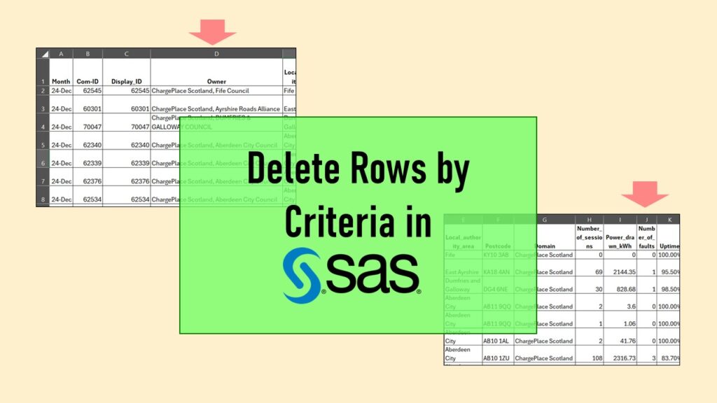
Tag Archives: clinical data

NHANES Data: Pitfalls, Pranks, Possibilities, and Practical Advice

If you are interested in population-level surveillance data, you might have thought about using NHANES data in portfolio projects.

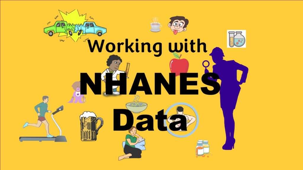
NHANES data piqued your interest? It’s not all sunshine and roses. Read my blog post to see the pitfalls of NHANES data, and get practical advice about using them in a project.

Defaults in PowerPoint: Setting Them Up for Data Visualizations

The defaults in PowerPoint are really set up for making presentations, not data visualizations.

Defaults in PowerPoint are set up for slides – not data visualizations. Read my blog post for tips on reconfiguring PowerPoint to make it easy for dataviz!

Shapes and Images in Dataviz: Making Choices for Optimal Communication

If you use good judgment in choosing chapes and images to add to your data visualizations, your audience will be enlightened.

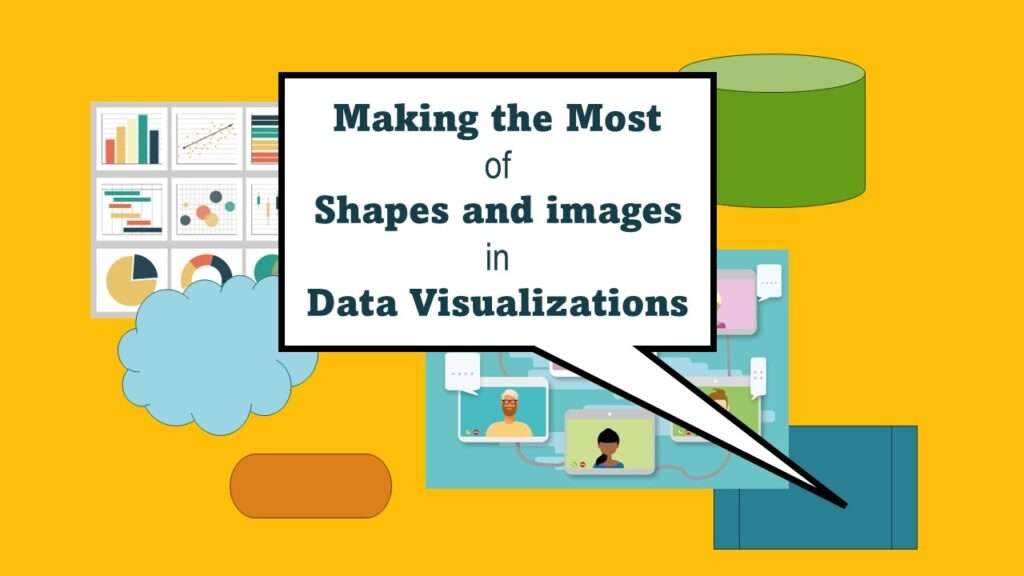
Shapes and images in dataviz, if chosen wisely, can greatly enhance the communicative value of the visualization. Read my blog post for tips in selecting shapes for data visualizations!

Statistics Trivia for Data Scientists

Public health, artificial intelligence, and data science trivia! Fun! Educational! Test your knowledge!

Statistics trivia for data scientists will refresh your memory from the courses you’ve taken – or maybe teach you something new! Visit my blog to find out!

Testimonials for Monika Wahi’s Linked In Data Science Courses

If you have questions about your journey toward a data science career, sometimes you can get them answered with online resources, but sometimes you do not get the information.

Testimonials for Monika Wahi’s data science courses on LinkedIn Learning are posted here. Read what learners are saying to help you decide if you want to take the courses!

Making Upset Plots with R Package UpSetR Helps Visualize Patterns of Attributes

If you are having trouble setting options using R making plots, then you should read this blog post.

Making upset plots with R package UpSetR is an easy way to visualize patterns of attributes in your data. My blog post demonstrates making patterns of co-morbidities in health survey respondents from the BRFSS, and walks you through setting text and color options in the code.

Convert CSV to RDS When Using R for Easier Data Handling

If you want to use R for a project and the source CSV is very big, it can improve input/output efficiency to convert the file to an RDS.

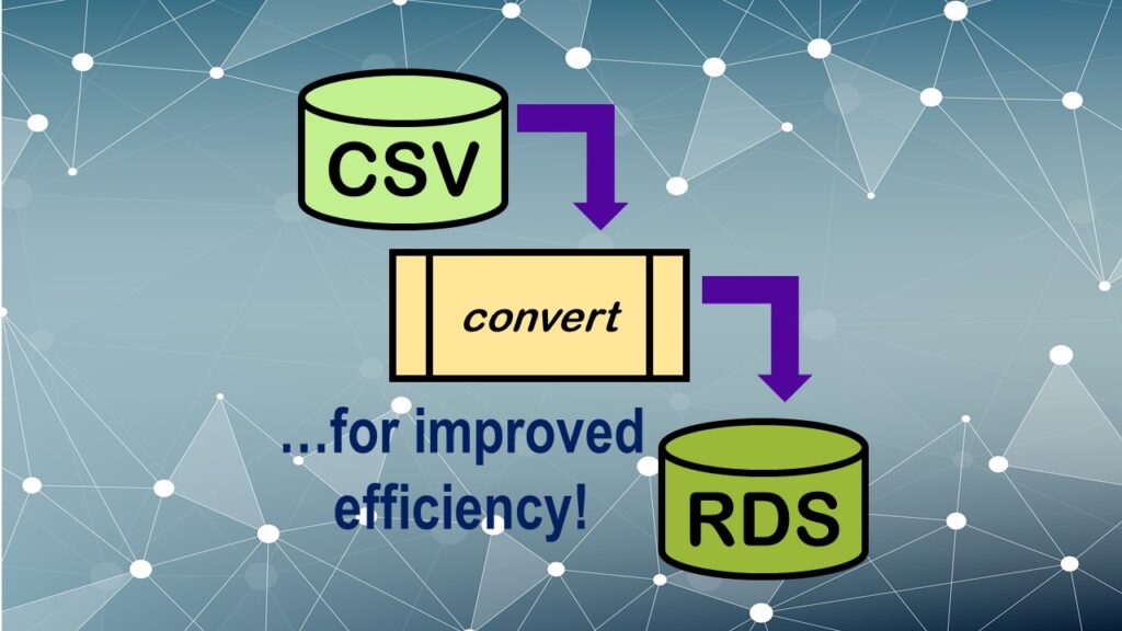
Convert CSV to RDS is what you want to do if you are working with big data files in R GUI and want to improve efficiency. Read my blog post for an explanation and video demonstrations of this process!

Querying the GHDx Database: Demonstration and Review of Application

Many data scientists interested in health are looking to query the Global Burden of Disease database, also known as the GHDx

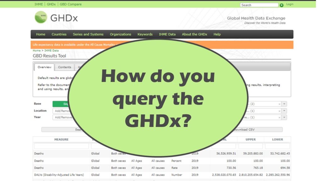
Querying the GHDx database is challenging because of its difficult user interface, but mastering it will allow you to access country-level health data for comparisons! See my demonstration!

Counting Rows in SAS and R Use Totally Different Strategies

If you are a data scientist working with large datasets, you need to learn the commands to count both columns and rows in the dataset, whether you are using SAS or R.

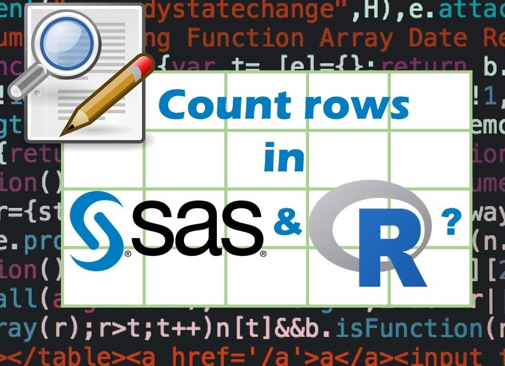
Counting rows in SAS and R is approached differently, because the two programs process data in different ways. Read my blog post where I describe both ways.

Data Science YouTube Channel Planned Expansion for 2022 – Please Subscribe!

In 2022 I am going to be putting new content on my YouTube channel focused on teaching data science, and providing educational resources.

Data science YouTube channel that brings you educational resources, career advice, live interactive sessions, and keeps you up-to-date in innovation and analytics – that’s what I have planned for 2022! Read my blog post for details.

Verified by MonsterInsights