Tag Archives: application development teams

Classification Crosswalks: Strategies in Data Transformation

What if you have too many categories in a categorical variable? Your cardinality is too high for a chi-square analysis.

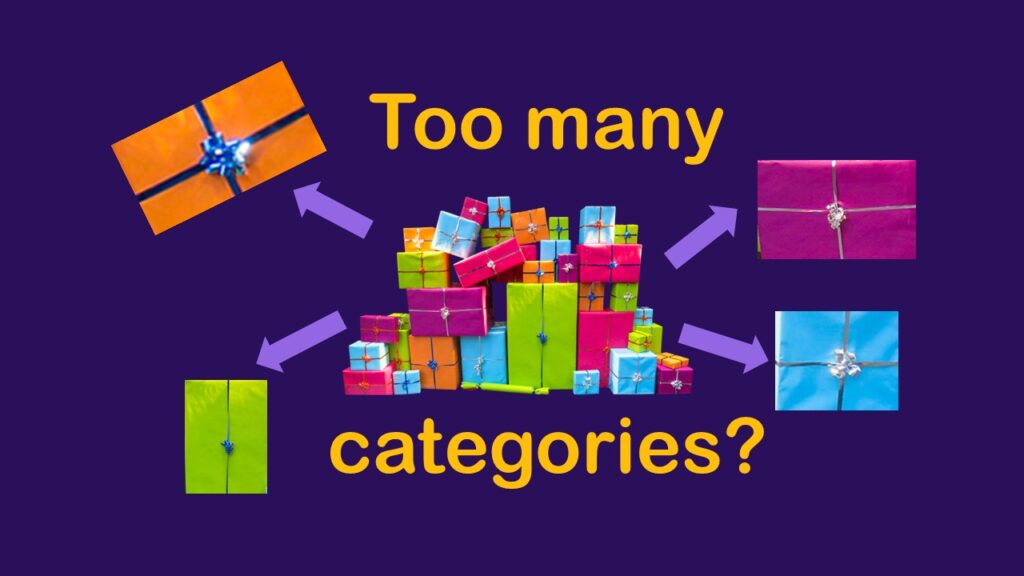
Classification crosswalks are easy to make, and can help you reduce cardinality in categorical variables, making for insightful data science portfolio projects with only descriptive statistics. Read my blog post for guidance!

NHANES Data: Pitfalls, Pranks, Possibilities, and Practical Advice

If you are interested in population-level surveillance data, you might have thought about using NHANES data in portfolio projects.

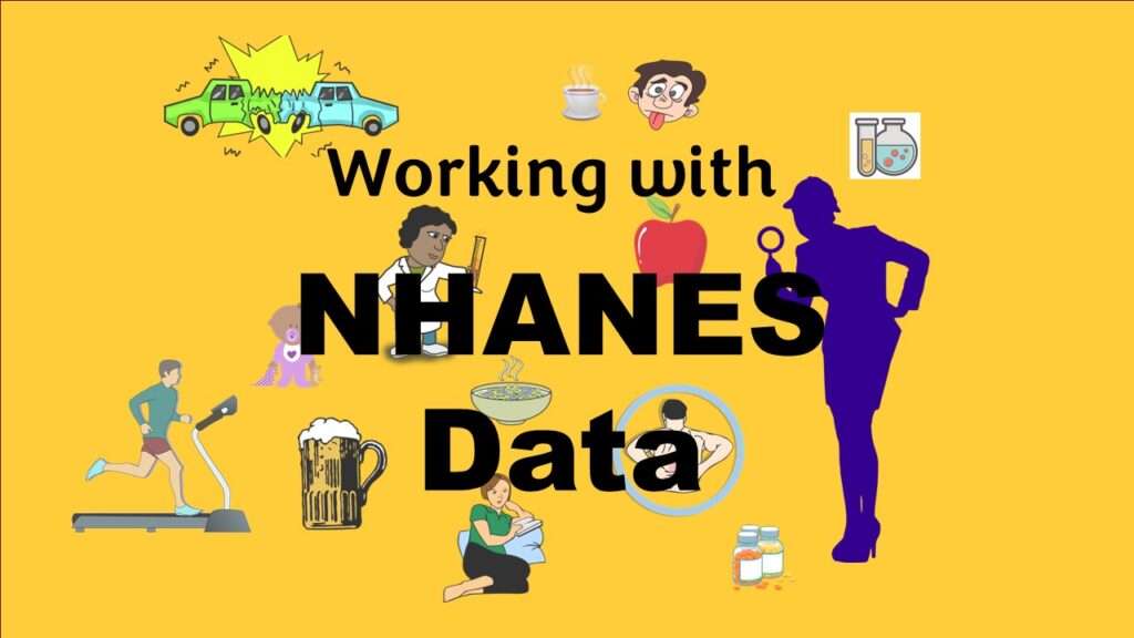
NHANES data piqued your interest? It’s not all sunshine and roses. Read my blog post to see the pitfalls of NHANES data, and get practical advice about using them in a project.

Text and Arrows in Dataviz Can Greatly Improve Understanding

Adding text and arrows to diagrams can help your audience navigate the image, and understand what you are trying to communicate.

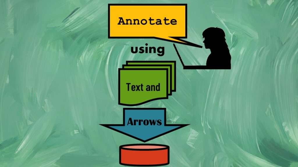
Text and arrows in dataviz, if used wisely, can help your audience understand something very abstract, like a data pipeline. Read my blog post for tips in choosing images for your data visualizations!

Data Science Services: Which Level Is Right for You?

If you want to learn about data science online, then you want to check out all of our online learning resources, such as YouTube videos and tutorials.

Data science services online in the comfort of your own home? That’s our specialty! We give you online educational events, learning resources, courses, coaching and more!

Shapes and Images in Dataviz: Making Choices for Optimal Communication

If you use good judgment in choosing chapes and images to add to your data visualizations, your audience will be enlightened.

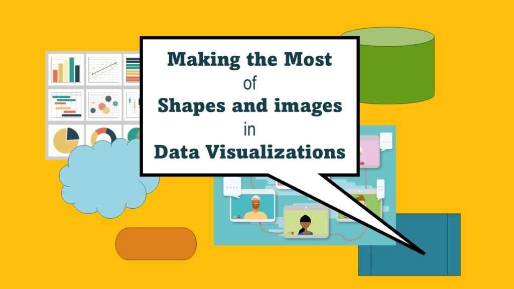
Shapes and images in dataviz, if chosen wisely, can greatly enhance the communicative value of the visualization. Read my blog post for tips in selecting shapes for data visualizations!

PowerPoint for Visualizations: A Simple Tool for Minimizing Complexity

You can make data visualizations in PowerPoint without learning other software applications or needing to buy new licenses.

PowerPoint for visualizations is an easy choice – but you have to do a lot of hacks and configurations to get the software to do what you want. Take my online course and learn my tricks!

Verified by MonsterInsights