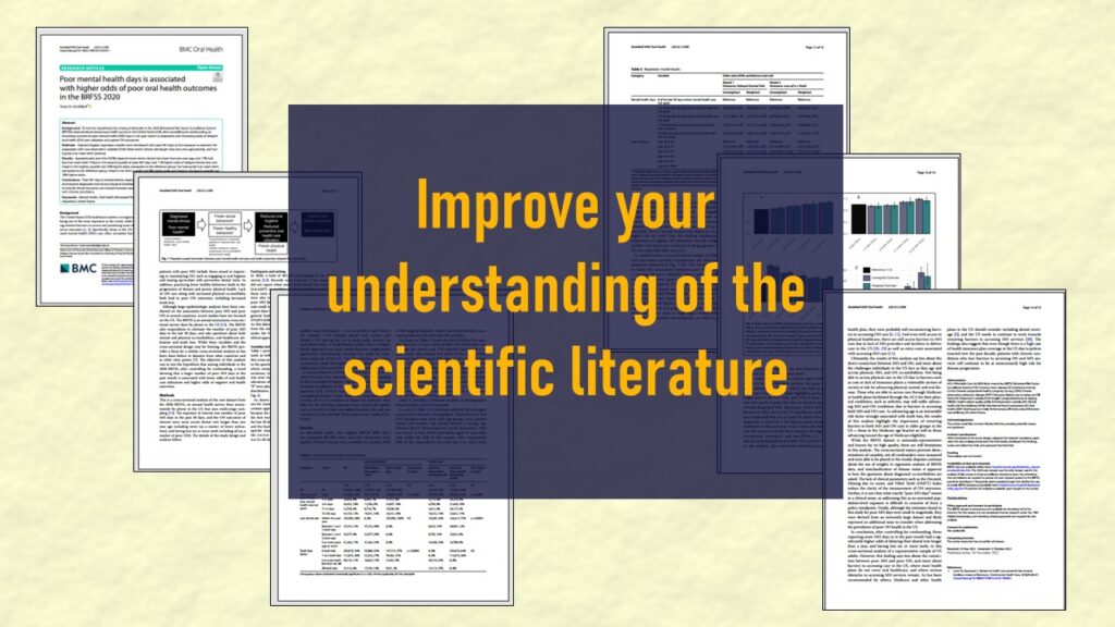
Identify elements in research reports, and you’ll be able to understand them much more easily. My blog post shows you how!
Tag Archives: create color palettes in PowerPoint

22
Nov
Nov
FAERS data are like any post-market surveillance pharmacy data – notoriously messy. But if you apply strong study design skills and a scientific approach, you can use the FAERS online dashboard to obtain a dataset and develop an enlightening portfolio project. I show you how in my blog post!
Data Science
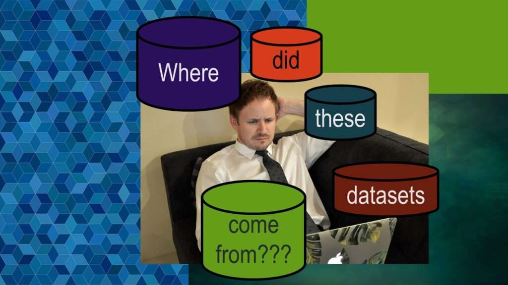
Dataset Source Documentation: Necessary for Data Science Projects with Multiple Data Sources
09
Nov
Nov
Dataset source documentation is good to keep when you are doing an analysis with data from multiple datasets. Read my blog to learn how easy it is to throw together some quick dataset source documentation in PowerPoint so that you don’t forget what you did.

07
Nov
Nov
Joins in base R must be executed properly or you will lose data. Read my tutorial on how to correctly execute left joins in base R.

06
Oct
Oct
Defaults in PowerPoint are set up for slides – not data visualizations. Read my blog post for tips on reconfiguring PowerPoint to make it easy for dataviz!
04
Oct
Oct
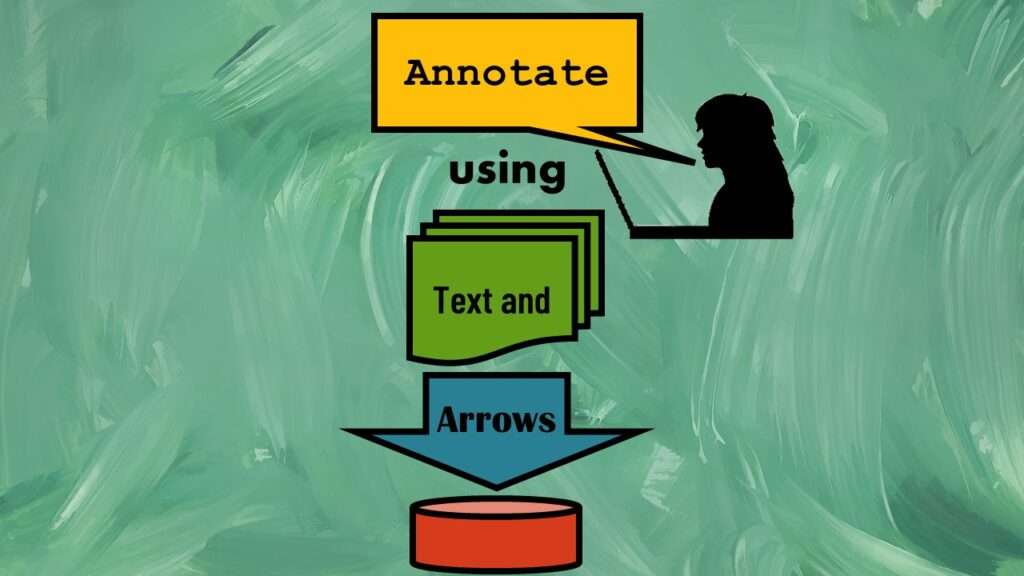
Text and arrows in dataviz, if used wisely, can help your audience understand something very abstract, like a data pipeline. Read my blog post for tips in choosing images for your data visualizations!