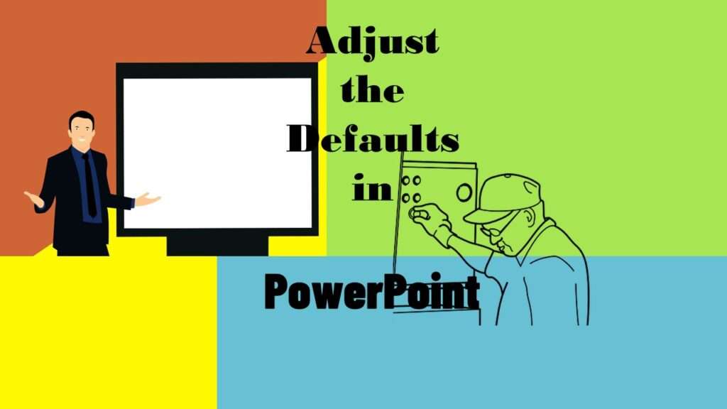
Defaults in PowerPoint are great if you want to make slides for a presentation. But if you want to use PowerPoint for data visualizations, or data curation, the settings often fight with you.
But how do you even impact the default settings in PowerPoint? It used to be easy when PowerPoint was new. But as it evolved, it added many different menus. Now, you can do the same thing in many different menus. Unfortunately, this makes it hard to find defaults in PowerPoint, and change the settings to something better for data curation.

In the online course, “PowerPoint for Visualizations”, I teach you how to configure defaults in PowerPoint that make it easier for to make dataviz for data science.
Here are two main topics taught in the course:
The Slide Master
I explain what the slide master is, and what it does for a slide presentation. I show you how to access it and modify it. As part of this, I show you how to modify the default formats of slides, including changing the font and layout.
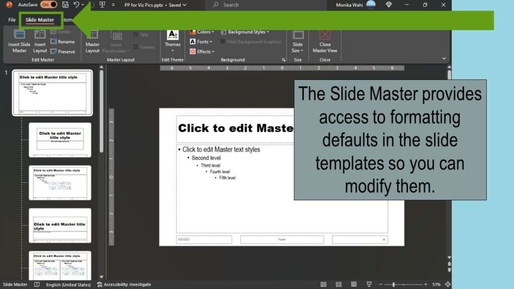
Watch my recorded livestream for a demonstration!
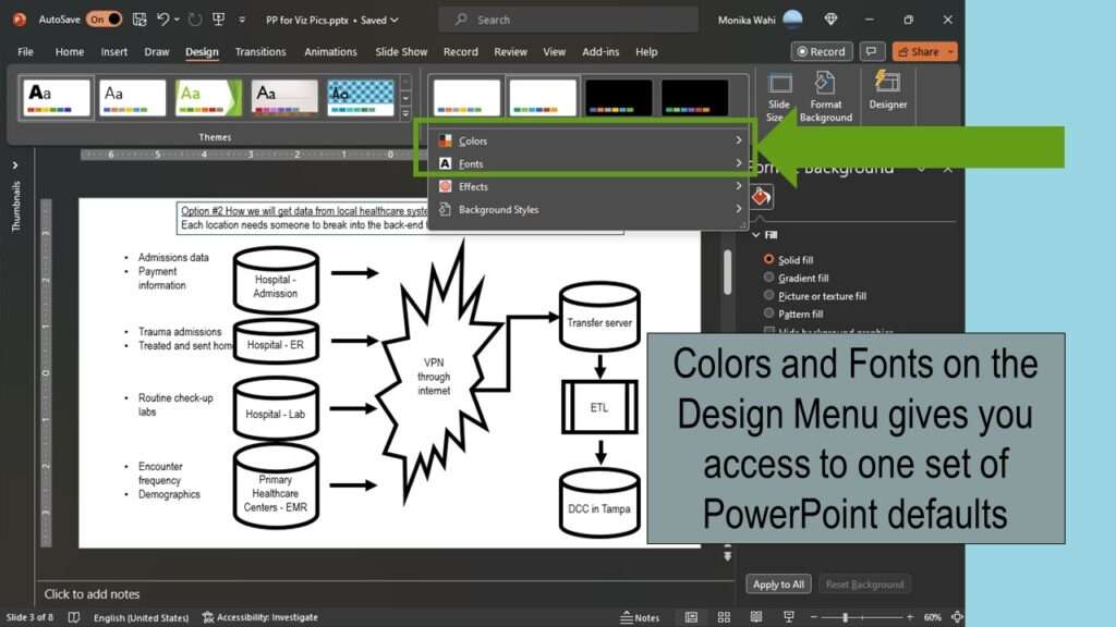
The Design Menu
I show you what the design menu is, and how to access and use it. As part of this, I show you how to set default colors, and create a default color palette. I also show you how to set up default fonts so that when you use font, it always is the one you select and not Calibri.
I also teach you how to place and modify text, lines, arrows and shapes. I show you multiple menus to use to access these, and how to make modifications that improve the value of the visual communication of the diagram.
Updated October 1, 2023. Added video October 28, 2023.
Try all of our courses and learning programs!
Data Curation Course: Learn Data Curation Online from LinkedIn Learning!
Curation files are especially helpful for communicating about data on teams. Learn more about what [...]
Oct
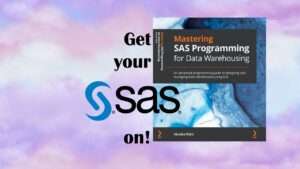
Announcing the Publication of my New SAS Book on Data Warehousing
SAS is known for big data and data warehousing, but how do you actually design [...]
Oct
Testimonials for Monika Wahi’s Linked In Data Science Courses
Testimonials for Monika Wahi’s data science courses on LinkedIn Learning are posted here. Read what [...]
Apr
Defaults in PowerPoint are set up for slides – not data visualizations. Read my blog post for tips on reconfiguring PowerPoint to make it easy for dataviz!