
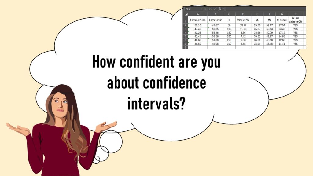
Confidence intervals (CIs) help you get a solid estimate for the true population measure. Read my blog and try my CI calculator!
02
Jun
Jun
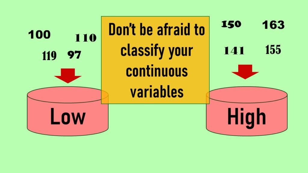
Continuous variable categorized can open up a world of possibilities for analysis. Read about it on my blog!
26
May
May
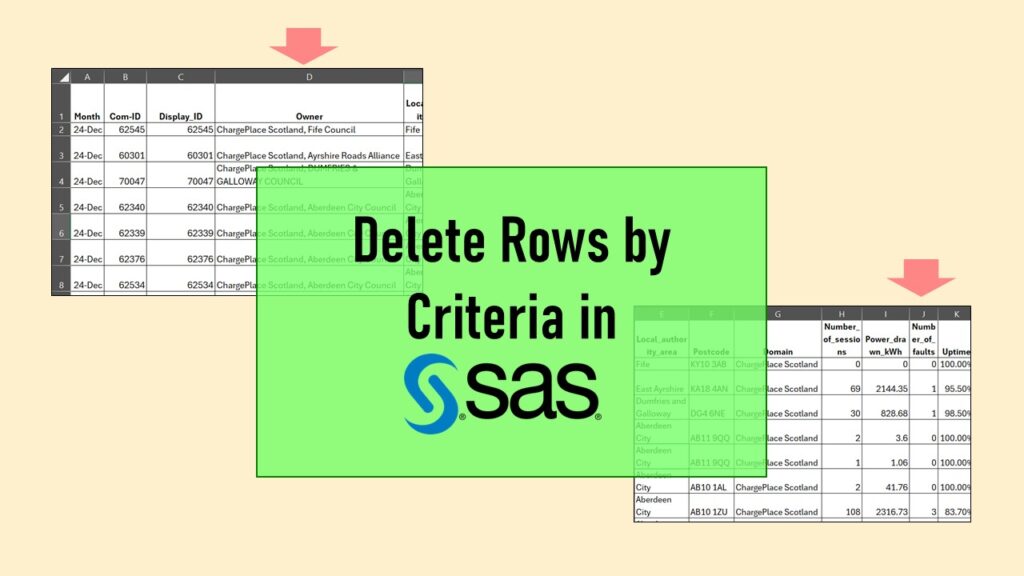
Delete if rows meet a certain criteria is a common approach to paring down a dataset. Read my blog for an example in SAS!

12
May
May
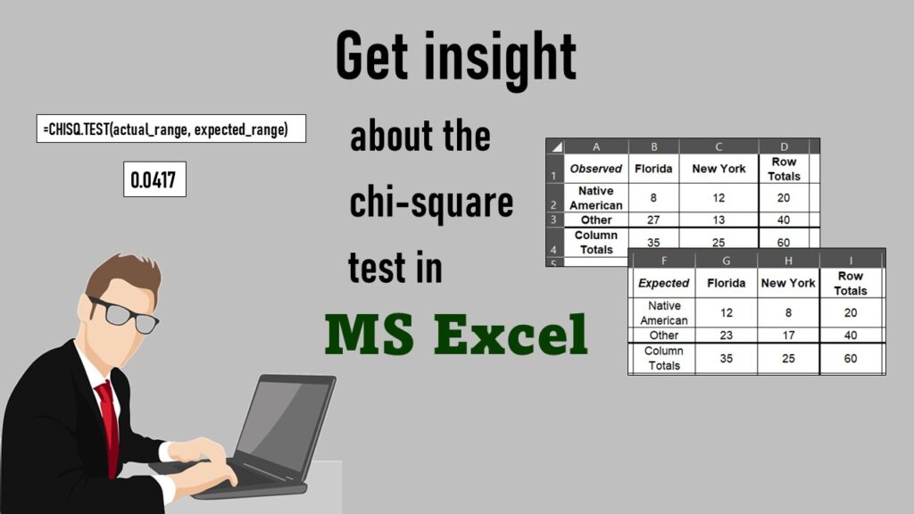
Chi-square test is hard to grasp – but doing it in Microsoft Excel can give you special insight. Read about it on my blog!
05
May
May
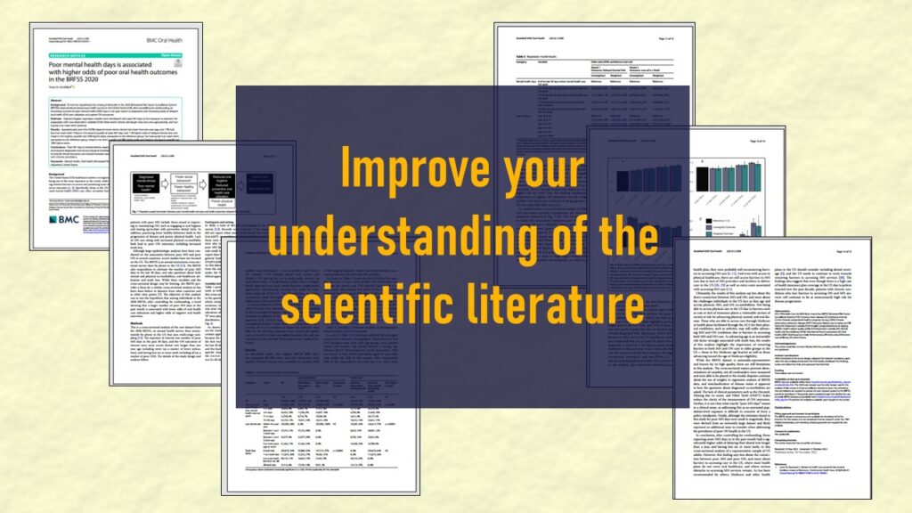
Identify elements in research reports, and you’ll be able to understand them much more easily. My blog post shows you how!
28
Apr
Apr
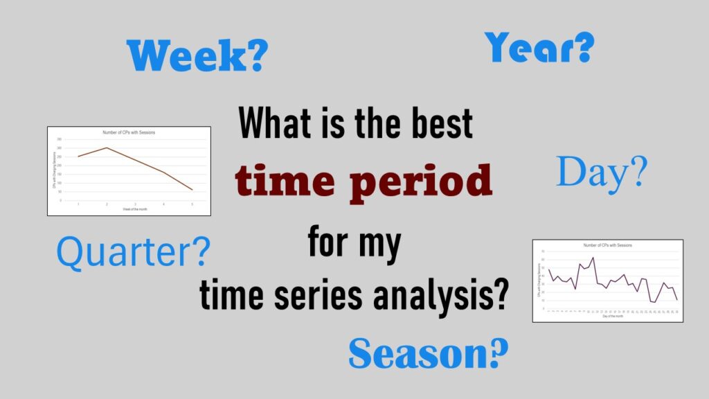
Time periods are important when creating a time series visualization that actually speaks to you! Get advice on my blog.
24
Apr
Apr
DPS Update: I’m doing better and working again! Check out my updated LinkedIn Learning courses and books for sale!

25
Nov
Nov
DPS temporary closure as of December 31, 2024 because I have become too disabled to work. Learn the details in my blog post.
11
Nov
Nov
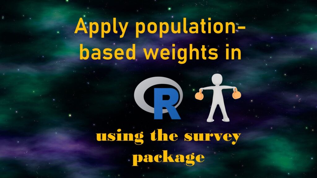
Apply weights to get weighted proportions and counts! Read my blog post to learn how to use the survey package in R.