Internship strategy for data science is not obvious, and even if you are in a college program, they often expect you to find your own internship. Download our internship strategy guide and get the experience you want!
25
Jun
Jun
Project management terminology is often used around epidemiologists, biostatisticians, and health data scientists, and it’s often hard for us to admit we aren’t familiar with some of the terms. Watch my videos and take my Applications Basics course to get up to speed with vocabulary from the health application development domain.
22
Jun
Jun
“Rapid application development” (RAD) refers to an approach to designing and developing computer applications. In public health and healthcare, we are not taught about application development – but it’s good for us to learn about it, since we have to deal with data from health applications. My blog post talks about the RAD approach I […]
19
Jun
Jun
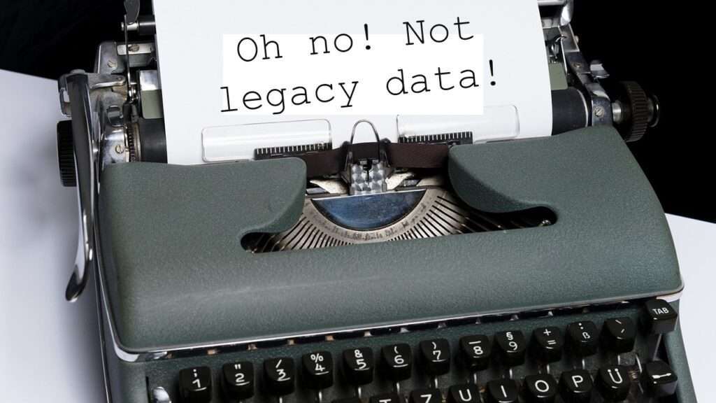
Understanding legacy data is necessary if you want to analyze datasets that are extracted from old systems. This knowledge is still relevant, as we still use these old systems today, as I discuss in my blog post.
16
Jun
Jun
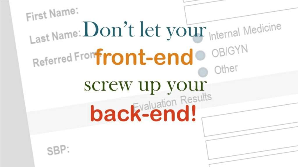
Front-end decisions are made when applications are designed. They are even made when you design a survey in SurveyMonkey. What health data analysts often don’t realize is that these decisions have a profound impact on the quality and accuracy of the data that are collected through these front-ends, which is the focus of this blog […]

13
Jun
Jun
Reducing query cost is especially important in SAS – but do you know how to do it, or what it even means? Read my blog post to learn why this is important in health data analytics.
31
May
May
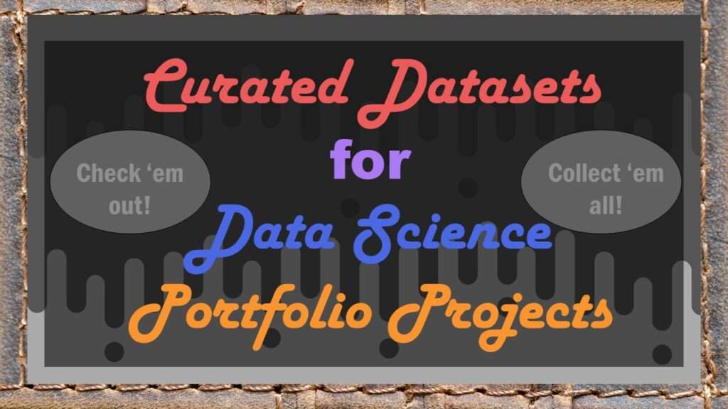
Curated datasets are useful to know about if you want to do a data science portfolio project on your own. I made this blog post for our group mentoring program. Check out the ones I am promoting on my blog!
12
Apr
Apr
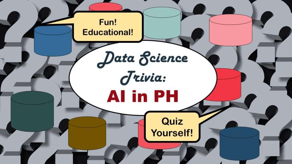
Statistics trivia for data scientists will refresh your memory from the courses you’ve taken – or maybe teach you something new! Visit my blog to find out!
23
Mar
Mar
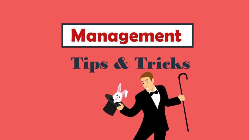
Management tips for data scientists can be used by anyone – at work and in your personal life! Get the details in my blog post.
21
Mar
Mar
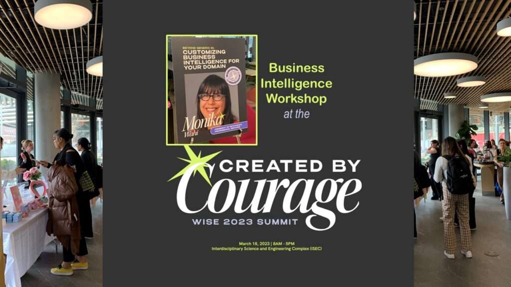
WISE Summit 2023 at Northeastern University was the biggest and best one so far! I was honored to lead a business intelligence workshop, as I talk about in my blog post.