Monthly Archives: October 2023

Color in Visualizations: Using it to its Full Communicative Advantage

When using big data, you will want to make visualizations. How do you use color to the greatest communicative advantage?

Color in visualizations of data curation and other data science documentation can be used to enhance communication – I show you how!

Defaults in PowerPoint: Setting Them Up for Data Visualizations

The defaults in PowerPoint are really set up for making presentations, not data visualizations.

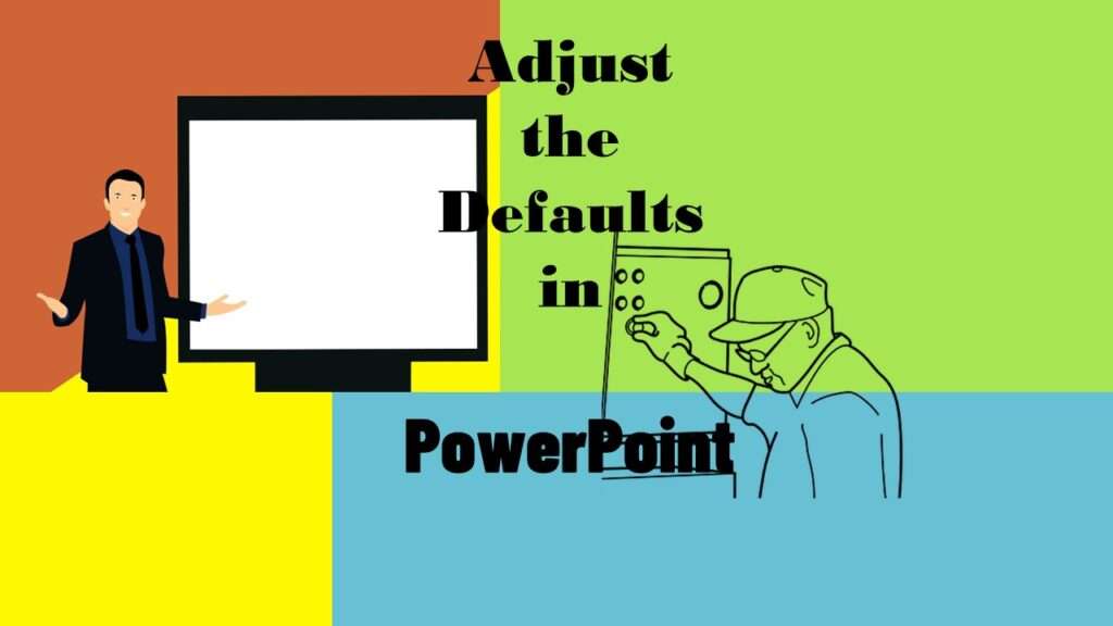
Defaults in PowerPoint are set up for slides – not data visualizations. Read my blog post for tips on reconfiguring PowerPoint to make it easy for dataviz!

Text and Arrows in Dataviz Can Greatly Improve Understanding

Adding text and arrows to diagrams can help your audience navigate the image, and understand what you are trying to communicate.

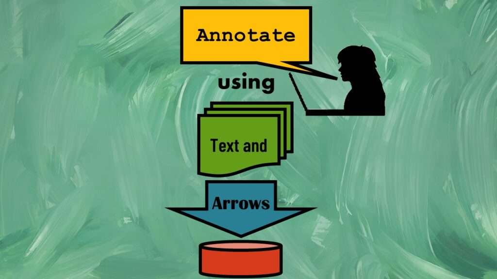
Text and arrows in dataviz, if used wisely, can help your audience understand something very abstract, like a data pipeline. Read my blog post for tips in choosing images for your data visualizations!

Data Science Services: Which Level Is Right for You?

If you want to learn about data science online, then you want to check out all of our online learning resources, such as YouTube videos and tutorials.

Data science services online in the comfort of your own home? That’s our specialty! We give you online educational events, learning resources, courses, coaching and more!

Shapes and Images in Dataviz: Making Choices for Optimal Communication

If you use good judgment in choosing chapes and images to add to your data visualizations, your audience will be enlightened.

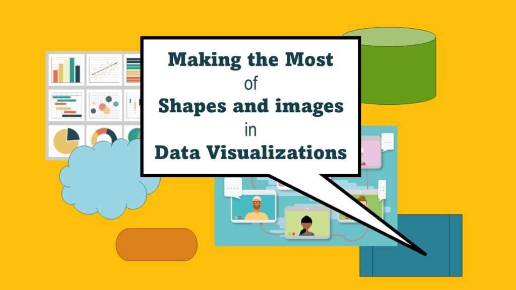
Shapes and images in dataviz, if chosen wisely, can greatly enhance the communicative value of the visualization. Read my blog post for tips in selecting shapes for data visualizations!

Verified by MonsterInsights