Shapes and images in dataviz are new to many of my customers. I serve a lot of customers in the healthcare and public health domain who have not been formally trained in business applications or computer science. So they do not recognize some common flow chart shapes and images in dataviz that have a particular meaning, and therefore, they do not understand that meaning.
For example, sometimes I see learners using cloud or cloudlike shapes and images in dataviz where there is no network or internet being depicted in the visualization. What I realized is that they do not know that there are certain shapes that always mean something in visualizations. Some are from traditional flowchart shapes, and others are just useful shapes for visual communication. I’ll go over a few of my favorites here.

Watch the video to learn more about flow chart shapes in PowerPoint!
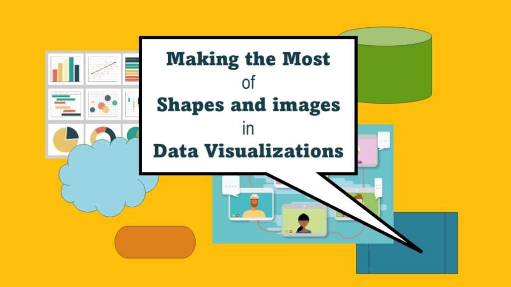
Shapes and Images in Dataviz: Useful Flow Chart Shapes
There are roughly two kinds of shapes and images used in data curation: Official flow chart shapes, and other images that are helpful for communication. Here, I will describe a few flow chart shapes I like to use in my data curation.
Terminator Shape
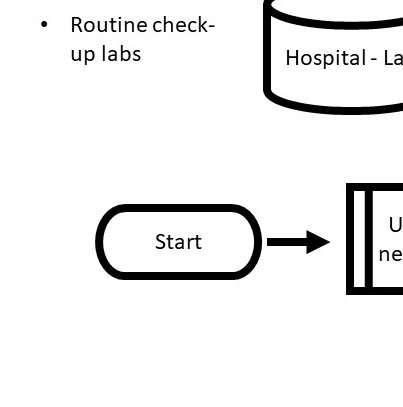
This hot dog shape represents the beginning or the end of a process. More than one process can start or end with a terminator shape. It helps the reader know where to start reading the diagram.
Predetermined Process
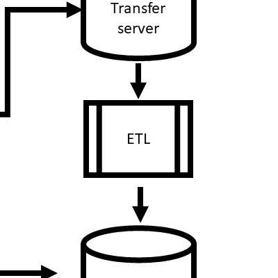
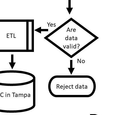
This rectangle shape with an extra set of parallel lines indicates a predetermined process. The rectangle shape alone without the extra lines is just a process – but I like to use the predetermined process shape because I always have some sort of policy dictating the process!
Decision
This diamond shape represents a decision. Usually, there are one or more arrows going into it, and then one arrow coming out that says what happens if “yes”, and the other arrow for what happens if “no”. If you have a multiple choice situation, you have to reduce it to several yes/no scenarios and do a decision tree.
Using Other Shapes and Images in Dataviz
Although the shapes and images I go over here aren’t official flowchart shapes, they are very helpful in visualizations and data curation.
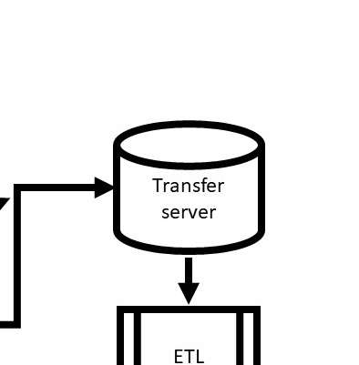
Data Shape
This can shape represents a database. It could be seen as a data source, or even a spreadsheet. It could also represent any sort of data system or data store.
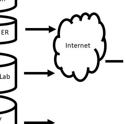
Cloud
This cloud graphic usually represents the internet, but it can also represent a network of some sort. It means that data are passing through a particular environment. Internet clouds can be different shapes.

Icons, Clip Art, or Other Graphics
Sometimes a picture is worth a thousand words. This graphic is one I use a lot to indicate a videoconference, or else an online course (in an application pipeline). I generally get royalty-free graphics like this from Pixabay, but there are a lot of sources.
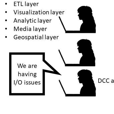
Callouts or Voice Balloons
Sometimes callouts are helpful because they indicate what people are saying or thinking. They can be used to indicate feedback or discussion.
Updated October 1, 2023.
Try all of our courses and learning programs!

Data Curation Course: Learn Data Curation Online from LinkedIn Learning!
Curation files are especially helpful for communicating about data on teams. Learn more about what [...]
Oct

Announcing the Publication of my New SAS Book on Data Warehousing
SAS is known for big data and data warehousing, but how do you actually design [...]
Oct

Testimonials for Monika Wahi’s Linked In Data Science Courses
Testimonials for Monika Wahi’s data science courses on LinkedIn Learning are posted here. Read what [...]
Apr
Shapes and images in dataviz, if chosen wisely, can greatly enhance the communicative value of the visualization. Read my blog post for tips in selecting shapes for data visualizations!