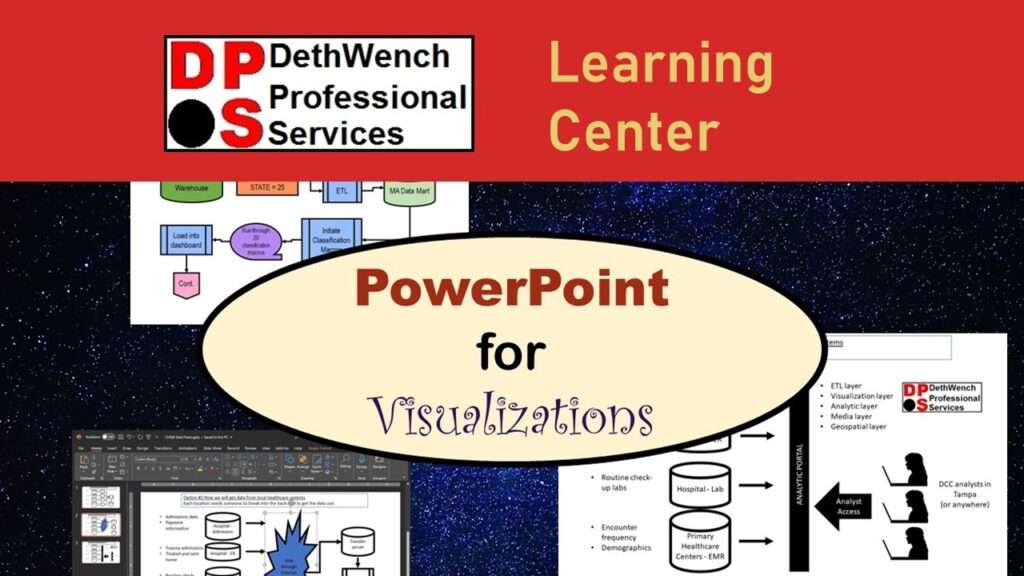
Learners who take my data curation course on LinkedIn Learning were introduced to using PowerPoint for visualizations in data science. Since a lot of us already have PowerPoint skills for making presentations, it shouldn’t be that hard to transfer these skills to using PowerPoint for visualizations…right?
Course Information

18 lessons

1 hour of video content

2.5 hours of course activities

6 video demonstrations

3 chapter quizzes and 1 final challenge

Cost: $50.00
Using PowerPoint for Visualizations in Data Science? It Will Fight With You!
PowerPoint is perfectly happy if you are making a boring slide deck with a blue background, yellow titles, and white bullet-points. But try to make an application flow diagram, and sure enough, PowerPoint will put up a fight.
If you try to use PowerPoint for visualizations in data science, you will find that you need to use certain features differently than you do when you are making slide decks. Here are some differences you will have to overcome:
- The default color palettes in PowerPoint don’t work well for data science visualizations,
- The default font and other settings are also problematic when making data science visualizations,
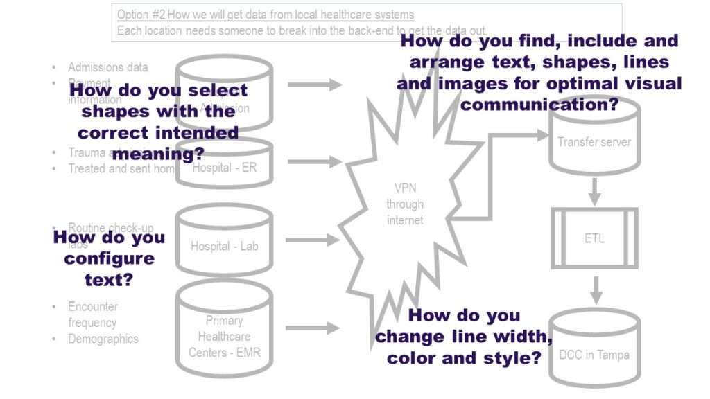
- Shapes and lines become very important in data science visualizations – so you need to know how to set options on these for maximize the value of your visual communication,

This is why I made the short, online course “PowerPoint for Visualizations”. In the 2.5 hour course, I teach you just the hacks you need to know in PowerPoint in order to make gorgeous data visualizations! After taking the course, you’ll be able to:
- Add some dazzle to your data flows!
- Add some pizzazz to your application pipelines!
- Send your colleagues over the moon with your organizational charts!
- Add some magnificence to your data mapping diagrams!
…and more! Here’s what we cover in the course.

Chapter 1: Introduction
Here, I introduce what will be covered in the course. All the didactic material is in Chapter 2. The didactic material shows demonstrations of configuring a set of basic slides I included in the course materials.
Next, in Chapter 3, you are given a challenge! You are given a list of changes, configurations, and modifications to make to the basic slides included in the course materials. See if you can do all the changes properly with what knowledge you’ve gained in the course! If you have any trouble, no worries – I created an example solution for you, so you can compare yours to mine.
Finally, in Chapter 4, we wrap it up with a conclusion, and I tell you next steps you can do as you develop your data curation skills.

Chapter 2: Configurations in PowerPoint
What you learn: This is the main part of the course. Here is a laundry list of all of the topics covered in this section: How to set color schemes, approaches to choosing a color scheme for visualizations, how to set default font, how menus in PowerPoint behave differently in different environments, locating the same items on different menus, finding and configuring hidden or confusing menus, what is the PowerPoint Master, how to access and configure the Master, choosing between different types of arrows, arrow configurations, what different shapes mean, choosing different looks or styles, considering placement or “real estate” on the slide, adding text and considering how to present the text, how to add external images such as logos and clip art, how to leverage visual components such as shapes, line, color and images to maximize the value of visual communication.
How you learn it: There are five videos in this section. In each of them, I take the basic slides I provided as part of the course and show you how I edit them in real time to bring about the configurations listed above. The purpose of these videos is to show you how PowerPoint actually behaves while you are using it so you can successfully complete the challenge in Chapter 3.


Chapter 3: Challenge – Reformat a PowerPoint Visualization
In Chapter 2, as I said above, I include videos demonstrating me editing some basic slides that I provide with the course. In Chapter 3, I challenge you – the learner – to make your own edits to those slides! I give you a laundry list of changes I want you to make to these basic slides, and see how you do!

Chapter 4: Conclusion
In the conclusion chapter, I introduce you to other data curation resources – such as my intense boot camp designed for data scientists in the clinical research domain, called “How to do Data Close-out: Boot Camp”. In order to complete this intense curation course, you will need to first have the skills provided to you in this shorter, simpler course, “PowerPoint for Visualizations”.
Updated September 29, 2023. Revised banners and added course information May 8, 2024.
Try all of our courses and learning programs!
Applications Basics for Data Analysts and Statisticians
Applications basics are now essential knowledge if you want to do data science in healthcare. [...]
3 Comments
Jun
Data Curation Course: Learn Data Curation Online from LinkedIn Learning!
Curation files are especially helpful for communicating about data on teams. Learn more about what [...]
Oct
Data Reduction Diagram Enables Data Scientists to Evaluate Selection Bias
Data reduction diagram is used for evaluating selection bias. If you want to be seen [...]
Apr
Data Science of Data Collection: Free Course and Course Series!
Learn the “data science of data collection” through my free introductory course! If you want [...]
May
Data Close-out Course: Learn How to do Data Close-out Online!
Data close-out course is what you need if you want to combine data from multiple [...]
May
Bivariate Table: How to Make a Descriptive Statistical Summary in Excel
Bivariate table is full descriptive summaries of the variables in the analytic dataset being used [...]
Jun
PowerPoint for Visualizations: A Simple Tool for Minimizing Complexity
PowerPoint for visualizations is an easy choice – but you have to do a lot [...]
Sep

Excel for Managing Research: Learn How to Use Microsoft Excel as a Research Management Tool
Excel for Managing Research is a short, practical course that will give you the skills [...]
May
PowerPoint for visualizations is an easy choice – but you have to do a lot of hacks and configurations to get the software to do what you want. Take my online course and learn my tricks!