

Problems with PRISMA? You’re not the only one. The PRISMA framework does not work well for most reviews. Read my blog post to learn what you should do instead.
Tag Archives: academic publication
25
Sep
Sep
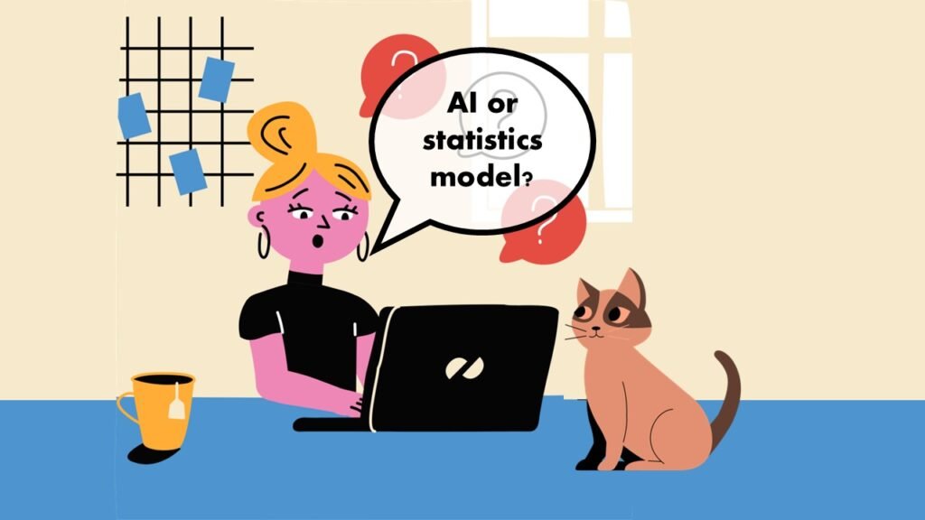
AI or statistics – two different, interrelated approaches you can use in your scientific publication. But which one should you pick? Read my blog post and find out!

17
Sep
Sep
Learn SAS online, and extend your expertise so you can take on new projects. Take my LinkedIn Learning courses and get comfortable using the SAS interface and syntax.
Data Science
CDC Wonder for Studying Vaccine Adverse Events: The Shameful State of US Open Government Data

24
Jun
Jun
CDC Wonder is an online query portal that serves as a gateway to many government datasets. Although antiquated, it still works for extracting data, and my blog post shows you how.
24
Nov
Nov
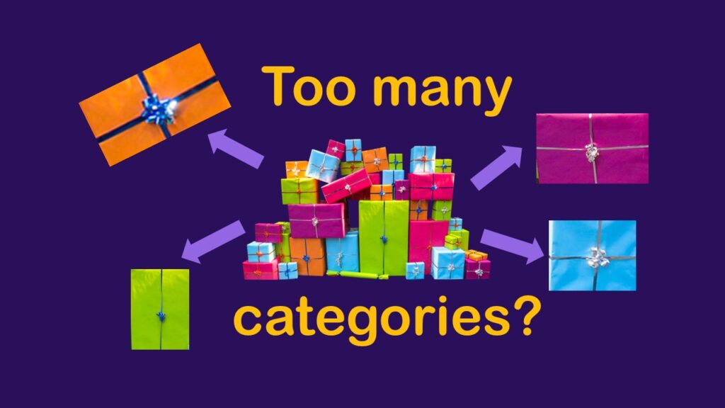
Classification crosswalks are easy to make, and can help you reduce cardinality in categorical variables, making for insightful data science portfolio projects with only descriptive statistics. Read my blog post for guidance!
02
Nov
Nov
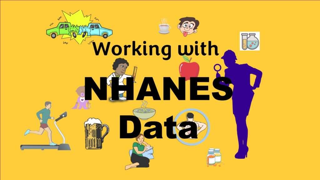
NHANES data piqued your interest? It’s not all sunshine and roses. Read my blog post to see the pitfalls of NHANES data, and get practical advice about using them in a project.

09
Oct
Oct
Color in visualizations of data curation and other data science documentation can be used to enhance communication – I show you how!
01
Oct
Oct
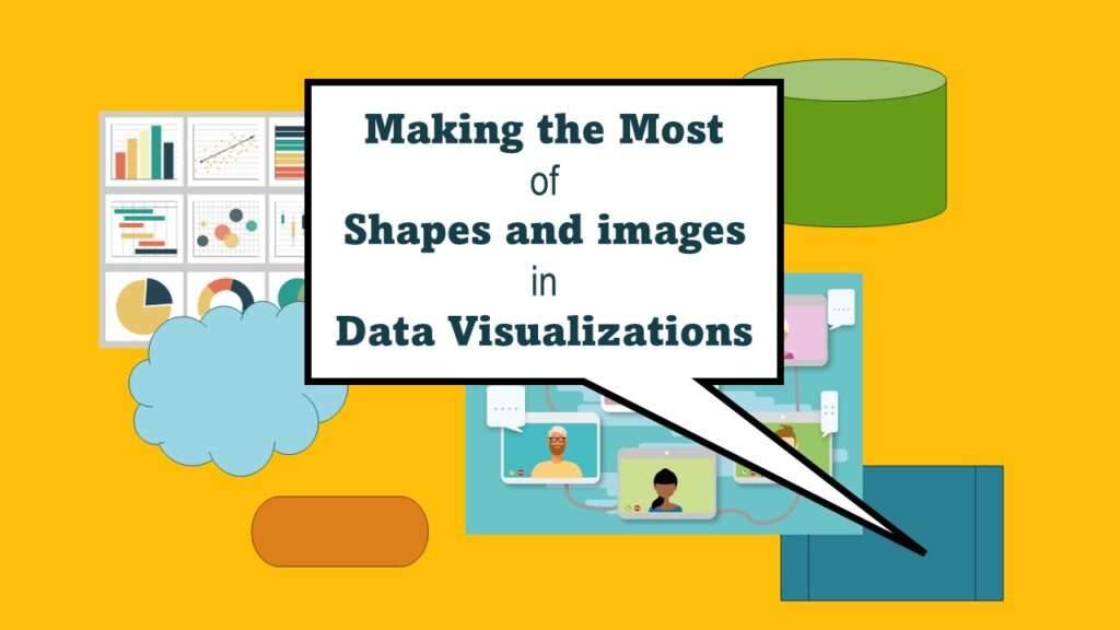
Shapes and images in dataviz, if chosen wisely, can greatly enhance the communicative value of the visualization. Read my blog post for tips in selecting shapes for data visualizations!

22
Jun
Jun
“Rapid application development” (RAD) refers to an approach to designing and developing computer applications. In public health and healthcare, we are not taught about application development – but it’s good for us to learn about it, since we have to deal with data from health applications. My blog post talks about the RAD approach I […]
12
Mar
Mar
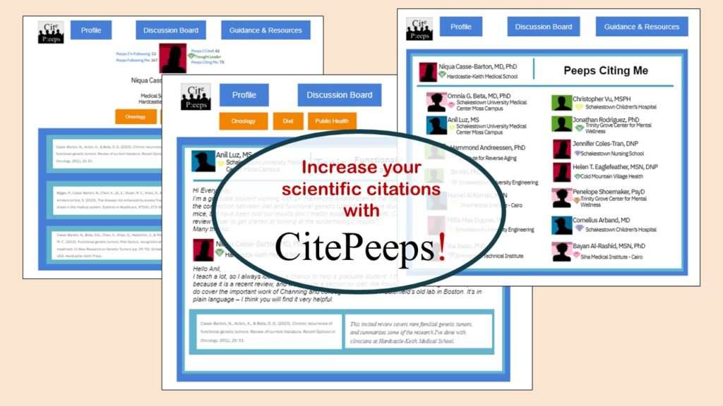
CitePeeps is a new online community of scientific authors focused on increasing the number of citations to their published works. Join us!
- 1
- 2