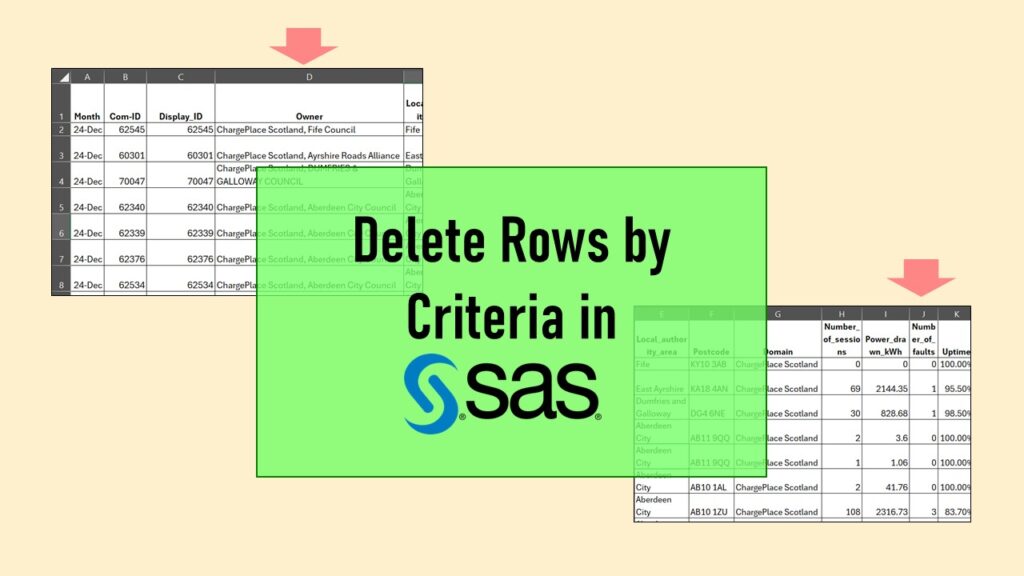
Delete if rows meet a certain criteria is a common approach to paring down a dataset. Read my blog for an example in SAS!
Tag Archives: power calculation

04
Oct
Oct
Text and arrows in dataviz, if used wisely, can help your audience understand something very abstract, like a data pipeline. Read my blog post for tips in choosing images for your data visualizations!

30
Sep
Sep
Ask me anything about data science or public health every month! Subscribe to my “Ask Me Anything” membership, and get all your questions answered in real time!

22
Jun
Jun
“Rapid application development” (RAD) refers to an approach to designing and developing computer applications. In public health and healthcare, we are not taught about application development – but it’s good for us to learn about it, since we have to deal with data from health applications. My blog post talks about the RAD approach I […]
12
Oct
Oct
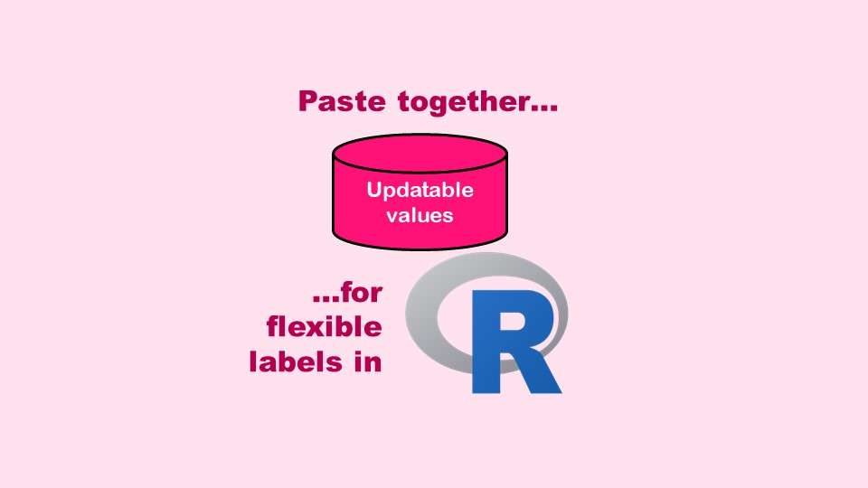
The paste command in R is used to concatenate strings. You can leverage the paste command to make refreshable label objects for reports and plots, as I describe in my blog post.
11
Apr
Apr
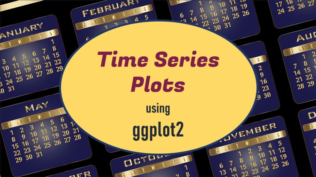
Time series plots in R are totally customizable using the ggplot2 package, and can come out with a look that is clean and sharp. However, you usually end up fighting with formatting the x-axis and other options, and I explain in my blog post.
Educational Resources
If You Want to Increase Conversions, Try my A/B Testing Course on LinkedIn Learning

26
Oct
Oct
A/B testing seems straightforward, but there are a lot of picky details. What A and B conditions do you actually test? How long do you run the test? How do you calculate the statistics for the test? Answer your questions by taking this LinkedIn Learning course.