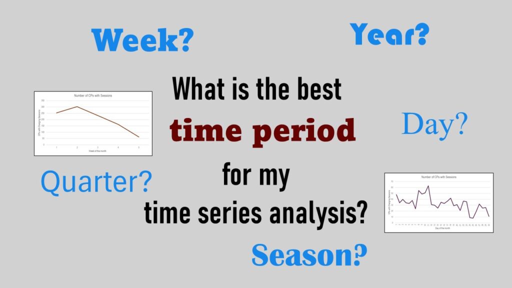
Time periods are important when creating a time series visualization that actually speaks to you! Get advice on my blog.
Tag Archives: analyze rates over time
28
Feb
Feb
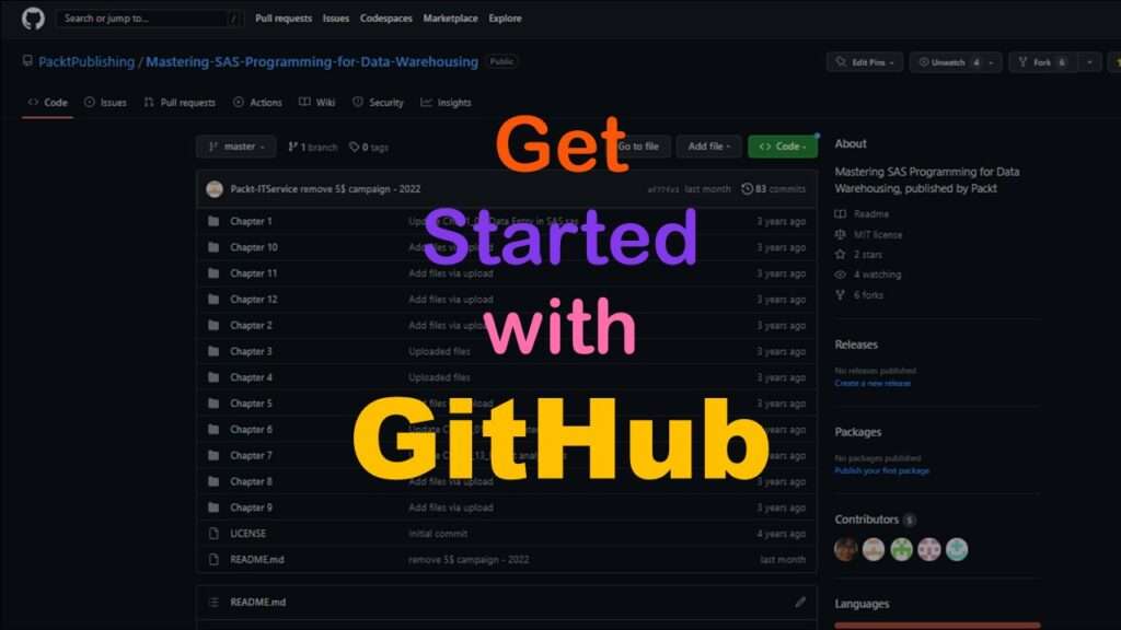
GitHub beginners – even in data science – often feel intimidated when starting their GitHub accounts and trying to interact with the web page. Don’t be shy! Catch the highlights from a recent GitHub beginners workshop I held!
11
Oct
Oct
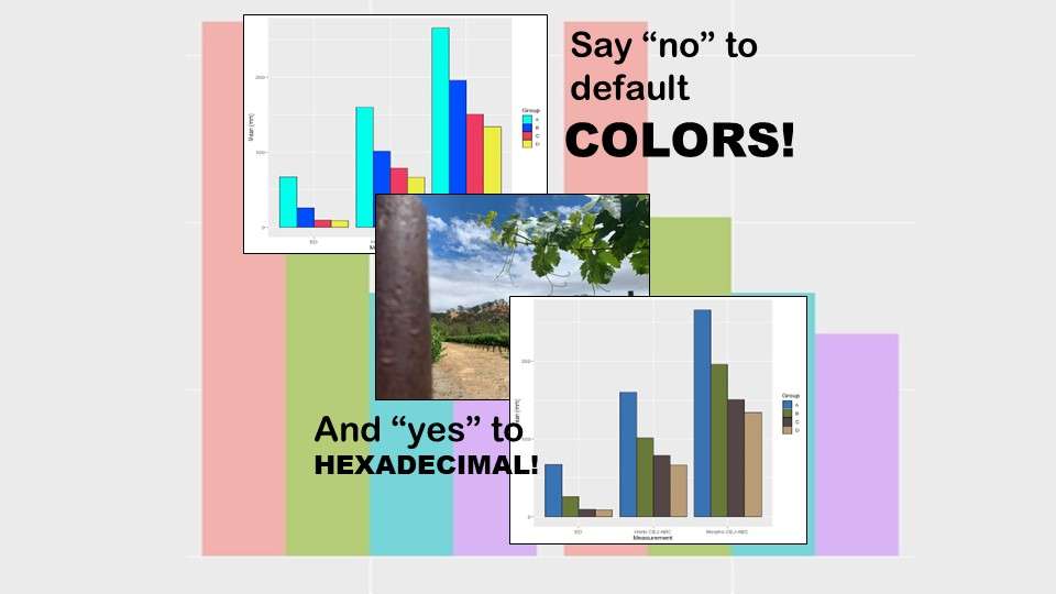
Recoloring plots in R? Want to learn how to use an image to inspire R color palettes you can use in ggplot2 plots? Read my blog post to learn how.
11
Apr
Apr
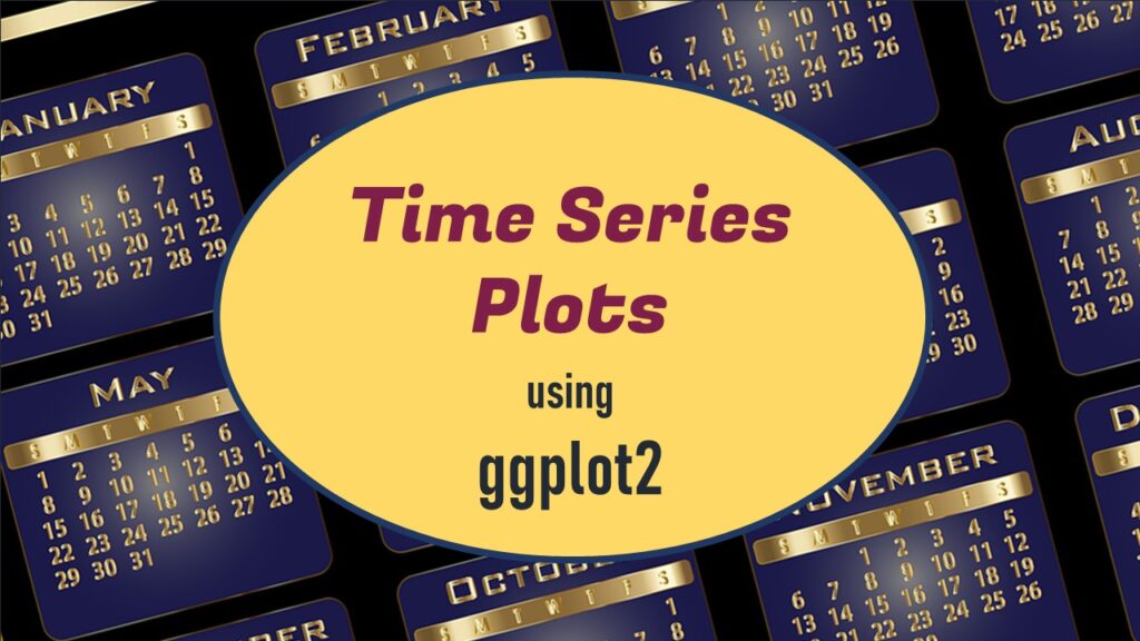
Time series plots in R are totally customizable using the ggplot2 package, and can come out with a look that is clean and sharp. However, you usually end up fighting with formatting the x-axis and other options, and I explain in my blog post.
Public Health Alphabet Soup
Review of Boston University MPH Online Learning Modules for Teaching Graduate Level Public Health Online

10
Mar
Mar
If you are learning epidemiology or refreshing your memory of your formal study of it, you always want to have credible scientific definitions at hand of terms such as “measures of association”. Read my blog post for quick links to Boston University’s online educational module!