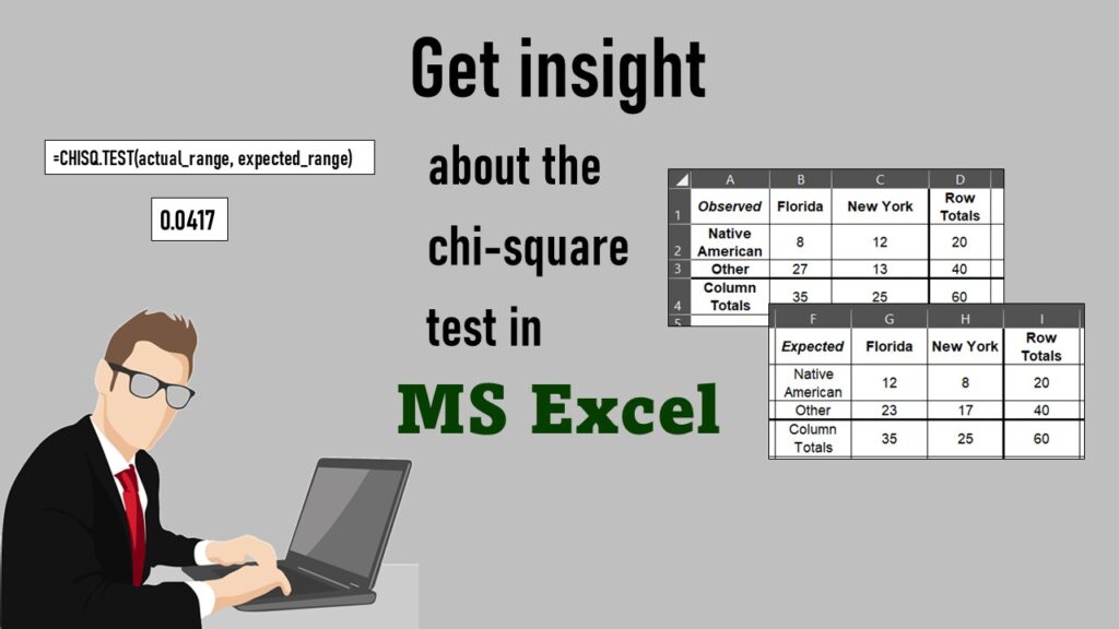
Tag Archives: explainable model

Bivariate Table: How to Make a Descriptive Statistical Summary in Excel

Do you know how to do descriptive statistics? Learn how to make better visualizations.

Bivariate table is full descriptive summaries of the variables in the analytic dataset being used in a research analysis. To learn how to make one, take my online course, “How to Make a Bivariate Table in Excel”.

Excel for Managing Research: Learn How to Use Microsoft Excel as a Research Management Tool

I have used Excel for managing research since the early 1990s, when I was mentored by a grants administrator who took me under her wing. She showed me how to use abstract deadline grids, grant submission grids, and action item grids to manage research activities. Now, I’ve made these skills available to you through my online course, “MS Excel for Managing Research”!

Excel for Managing Research is a short, practical course that will give you the skills you need to run research teams and activities using this simple, flexible tool!

Data Science Services: Which Level Is Right for You?

If you want to learn about data science online, then you want to check out all of our online learning resources, such as YouTube videos and tutorials.

Data science services online in the comfort of your own home? That’s our specialty! We give you online educational events, learning resources, courses, coaching and more!

Free Learning Resources Online for the Do-it-Yourself Data Scientist

Do you like to learn new programming languages on your own? Then you will enjoy using our free online learning resources for data science.

Free learning resources for data scientists are available online on my blog and YouTube channel! Try my free online courses, and subscribe to my weekly e-newsletter!

Connecting SAS to Other Applications: Different Strategies

Did you know it is possible to integrate SAS with other data environments, like Microsoft SQL or Excel?

Connecting SAS to other applications is often necessary, and there are many ways to do it. Read this blog post for a couple of use-cases of SAS data integration using various SAS components.

Time Series Plots in R Using ggplot2 Are Ultimately Customizable

Time series plots can be customized if you use package ggplot2 in R. You can place labels and configure axes.

Time series plots in R are totally customizable using the ggplot2 package, and can come out with a look that is clean and sharp. However, you usually end up fighting with formatting the x-axis and other options, and I explain in my blog post.

Paid Mentoring for Data Science: Is it Worth the Cost?

If you are wondering if you should set up a paid mentoring relationship with a data science mentor, you definitely want to read this. You want to make sure you get your money's worth.

Paid mentoring for data science can be worth the cost in certain circumstances – but not others. My blog post provides guidance on hiring a paid mentor.

This Course in Explainable AI will Get you Ready for the Future!

What do the data say when a machine learning algorithm is applied, and which features are important?

We experience artificial intelligence all the time on the internet in terms of friend suggestions on social media, internet ads that reflect what we have been searching for, and “smart” recommendations from online stores. But the reality is that even the people who build those formulas cannot usually explain why you were shown a certain […]

Verified by MonsterInsights