
CDC Wonder is an online query portal that serves as a gateway to many government datasets. Although antiquated, it still works for extracting data, and my blog post shows you how.
Tag Archives: decision-making
24
Nov
Nov
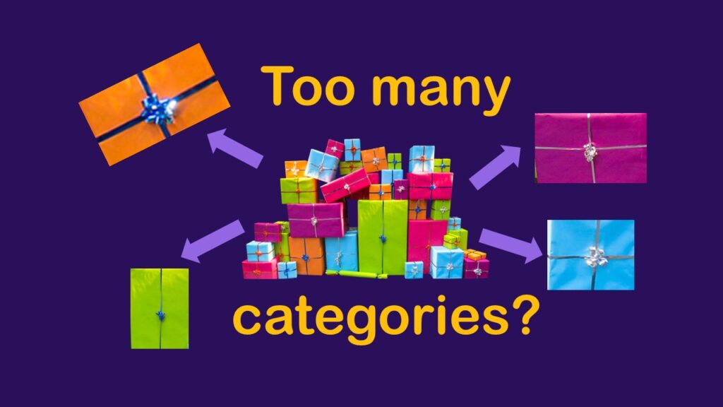
Classification crosswalks are easy to make, and can help you reduce cardinality in categorical variables, making for insightful data science portfolio projects with only descriptive statistics. Read my blog post for guidance!

09
Oct
Oct
Color in visualizations of data curation and other data science documentation can be used to enhance communication – I show you how!
04
Oct
Oct
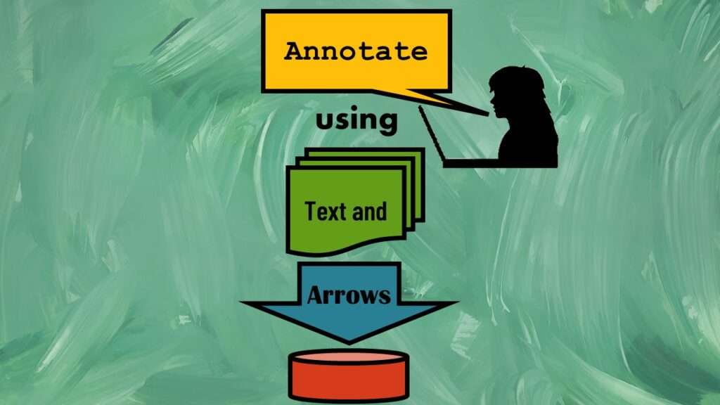
Text and arrows in dataviz, if used wisely, can help your audience understand something very abstract, like a data pipeline. Read my blog post for tips in choosing images for your data visualizations!
24
Aug
Aug
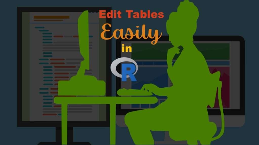
Table editing in R is easier than in SAS, because you can refer to columns, rows, and individual cells in the same way you do in MS Excel. Read my blog post for example R table editing code.
12
Apr
Apr
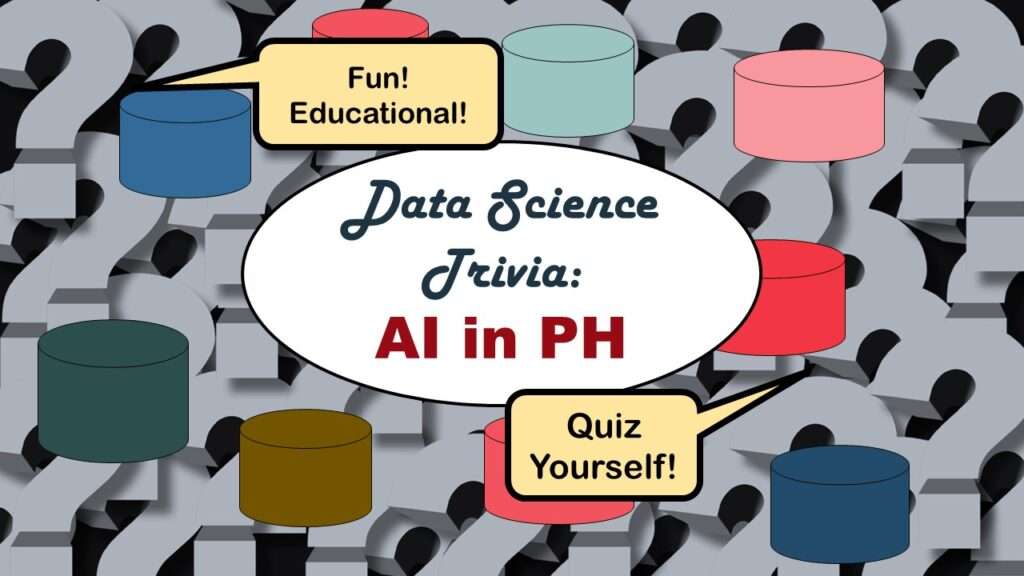
Statistics trivia for data scientists will refresh your memory from the courses you’ve taken – or maybe teach you something new! Visit my blog to find out!

23
Mar
Mar
Management tips for data scientists can be used by anyone – at work and in your personal life! Get the details in my blog post.
12
Oct
Oct
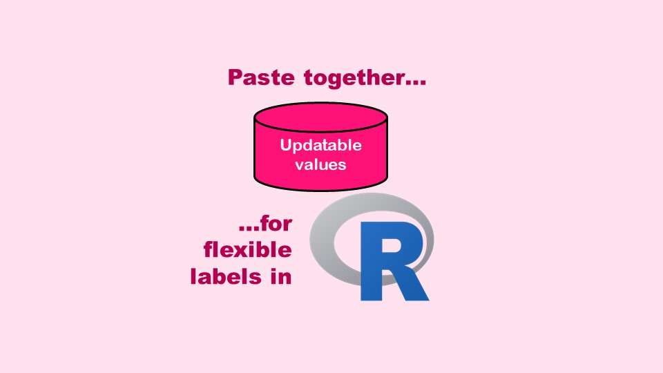
The paste command in R is used to concatenate strings. You can leverage the paste command to make refreshable label objects for reports and plots, as I describe in my blog post.
11
Oct
Oct
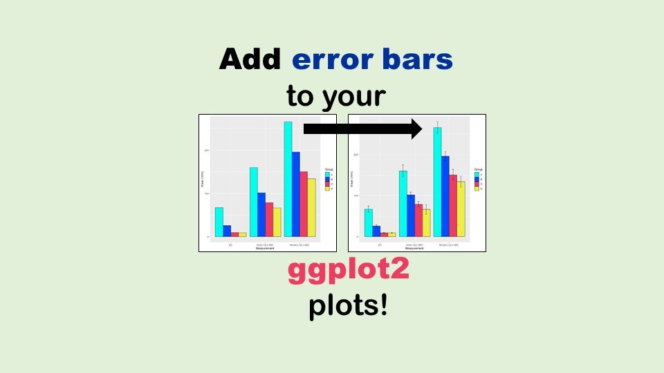
Adding error bars to ggplot2 in R plots is easiest if you include the width of the error bar as a variable in your plot data. Read my blog post to see an example.
08
Apr
Apr
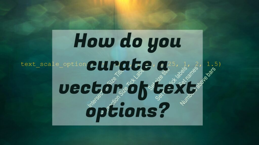
Data curation solution that I posted recently with my blog post showing how to do upset plots in R using the UpSetR package was itself kind of a masterpiece. Therefore, I thought I’d dedicate this blog post to explaining how and why I did it.
- 1
- 2