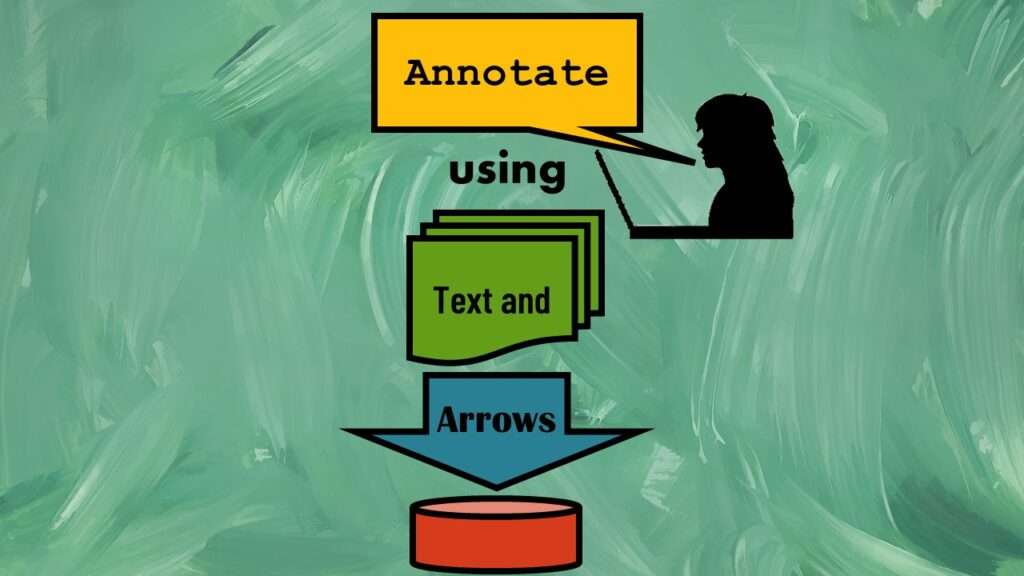
Text and arrows in dataviz are useful for visual communication. All flow charting tools offer text and arrows, but did you know that you can make text and arrows in dataviz in PowerPoint pretty easily? Making data visualizations and data curation is a central part of our group online mentoring program. PowerPoint offers you a variety of options and alternatives for arrows as well as text.
Text and Arrows in Dataviz: Using Text
You can use text just floating around in the diagram, or to label shapes in the diagram. In any case, you want the text to be easy to read.
- I prefer sans serif text for diagrams because I think it is easier to read, and fights less with the other parts of the diagram.
- I prefer Arial family font for diagrams because it is true-type and is easy to fit on shapes.
- I prefer Arial Narrow for default body text, because you can fit a lot of text in a small space.
- For text size, I try not to make my text smaller than 18 point, and I try to make it at least 24 point if I can.
Watch my video for a demonstration of using flow chart shapes in PowerPoint!
Text can be part of the shape, or you can make text boxes separately from the shape and place them on the shape. I usually start by trying to make the text part of the shape, but there are some formatting limitations with this approach. If I run into those, I create and configure a text box separately, then place it on the shape.
Text and Arrows in Dataviz: Using Arrows
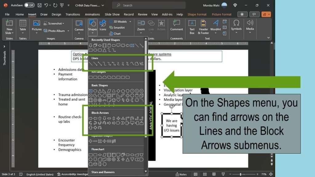
Arrows are available on different menus.
- Under the Shapes menu, there are multiple subcategories with arrows in them, including Lines and Block Arrows.
- You can make skinny arrows by using Lines and then adding arrowheads.
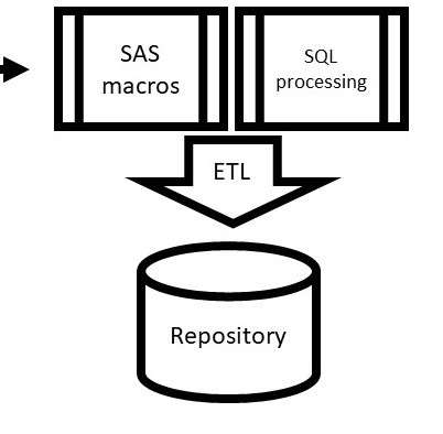
- You can make wider arrows using arrow shapes. These are good for adding text.
- You can make straight arrows, or ones that bend at 90 degrees like are needed in flow charts.
Skinny Arrows
Straight, skinny arrows are okay for simple relationships between objects, especially if there are not too many of them in one diagram. If there are many arrows, consider alternatives, like wide ones, or bendable ones.
Wide Arrows
Sometimes wide arrows are useful because they indicate a general process, or many things in that process. You can also add text to them for clarity as to what you mean by the arrow.
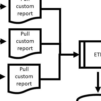
Bendable Arrows
Bendable arrows are useful when several processes all lead into one process. They are neater than using straight skinny arrows that might have to overlap one another.
Added video October 28, 2023.
Try all of our courses and learning programs!

Data Curation Course: Learn Data Curation Online from LinkedIn Learning!
Curation files are especially helpful for communicating about data on teams. Learn more about what [...]
Oct

Announcing the Publication of my New SAS Book on Data Warehousing
SAS is known for big data and data warehousing, but how do you actually design [...]
Oct

Testimonials for Monika Wahi’s Linked In Data Science Courses
Testimonials for Monika Wahi’s data science courses on LinkedIn Learning are posted here. Read what [...]
Apr
Text and arrows in dataviz, if used wisely, can help your audience understand something very abstract, like a data pipeline. Read my blog post for tips in choosing images for your data visualizations!