Tag Archives: learn to program SAS

Jul
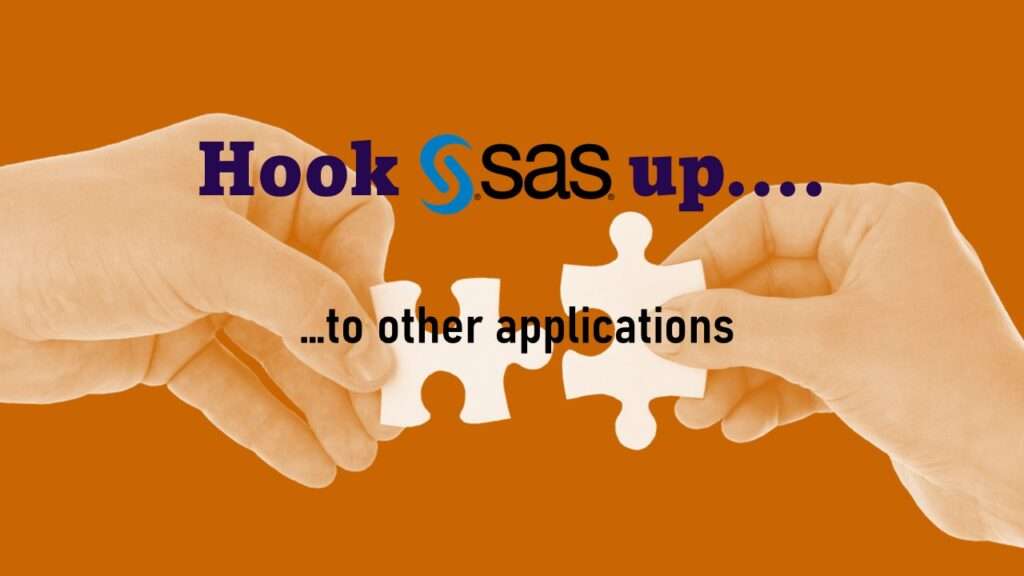
Connecting SAS to other applications is often necessary, and there are many ways to do it. Read this blog post for a couple of use-cases of SAS data integration using various SAS components.

Jun
Project management terminology is often used around epidemiologists, biostatisticians, and health data scientists, and it’s often hard for us to admit we aren’t familiar with some of the terms. Watch my videos and take my Applications Basics course to get up to speed with vocabulary from the health application development domain.
Jun
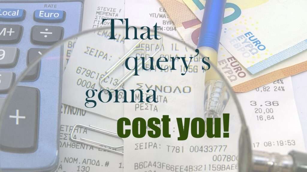
Reducing query cost is especially important in SAS – but do you know how to do it, or what it even means? Read my blog post to learn why this is important in health data analytics.
Feb
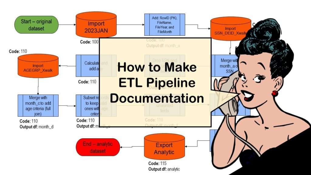
ETL pipeline documentation is great for team communication as well as data stewardship! Read my blog post to learn my tips and tricks.
Oct
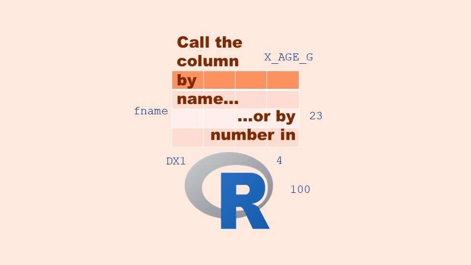
Referring to columns in R can be done using both number and field name syntax. Although field name syntax is easier to use in programming, my blog demonstrates how you can use column numbers to make automation easier.

Jun
“AI on the edge” was a new term for me that I learned from Marc Staimer, founder of Dragon Slayer Consulting, who was interviewed in a podcast. Marc explained how AI on the edge poses a data storage problem, and my blog post proposes a solution!
Apr
Testimonials for Monika Wahi’s data science courses on LinkedIn Learning are posted here. Read what learners are saying to help you decide if you want to take the courses!
Apr
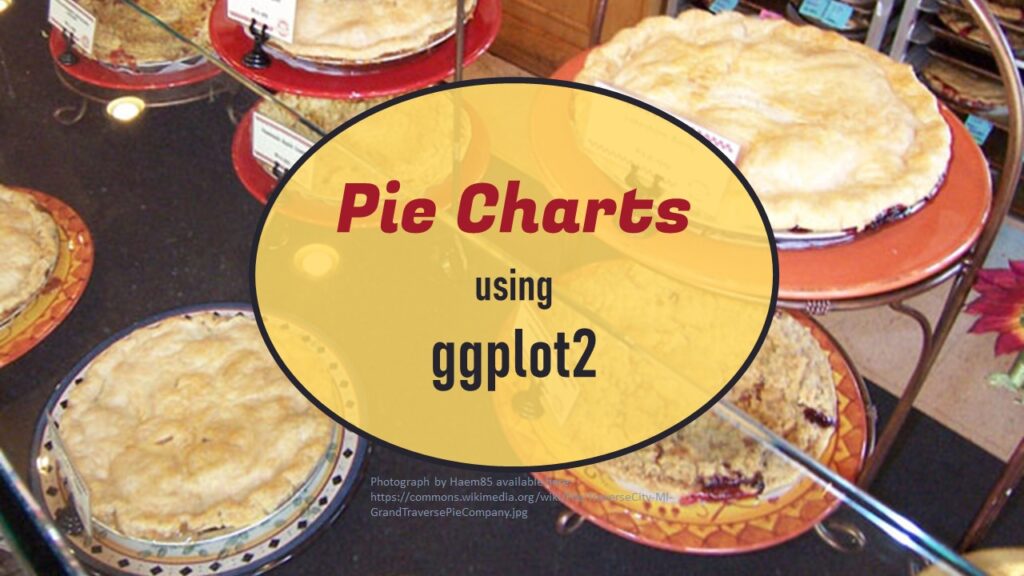
Pie chart ggplot style is surprisingly hard to make, mainly because ggplot2 did not give us a circle shape to deal with. But I explain how to get around it in my blog pot.

Apr
Making upset plots with R package UpSetR is an easy way to visualize patterns of attributes in your data. My blog post demonstrates making patterns of co-morbidities in health survey respondents from the BRFSS, and walks you through setting text and color options in the code.
- 1
- 2