
Making upset plots is not something you do every day, admittedly. Upset plots are only useful in certain situations – but in those situations, they are entirely useful. It’s was hard for me to visualize a use-case, but let me list a few I have seen here:
- The most common demonstration I have seen of upset plots on the internet have been to try to characterize attributes of movies. This is probably because the creators of the package I use for upset plots, UpSetR, posted this example using movies with their documentation. They showed how some movies really have just one attribute – they are romance movies, or comedy movies. But then, where do you put the romantic comedy – the rom-com? That’s what the upset plot solves.
- My forever intern Natasha and I used it in a dashboard visualizing patterns of nosocomial infections in patients. Here, one patient can be infected with multiple organisms. We want to see what the patterns are of organism infection among the patients.
- Like we did with nosocomial data, the Gehlenborg Lab is doing with genomic data. See their short blog post about how they are making upset plots there.
To be honest, I did not find many good use-cases or examples of people using upset plots. I was analyzing data from the Behavioral Risk Factor Surveillance Survey (BRFSS) the other day, and I thought I’d share with you my upset plot.
Making Upset Plots for Co-morbidities
My colleague and I had a list of respondents from the BRFSS who had said “yes” to having one or more of the following co-morbidities: asthma, heart attack, coronary heart disease (CHD), stroke, chronic obstructive pulmonary disease (COPD), arthritis, depression, kidney disease, and/or diabetes. The “and/or” was the key. As soon as we got our sample, we wondered: Do these people all have a bunch of diseases? Or do most of them just have one disease? I recommended making upset plots to visualize these patterns.
Preparing the Data for UpSetR
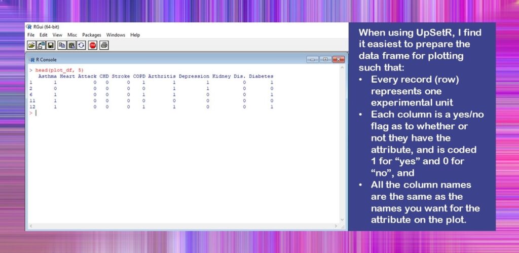
The UpSetR package is actually quite flexible and can take in data in different formats. However, the easiest way I have found to use the package to get the upset plot I want is to prepare a dataset has this format:
- Every record (row) represents one experimental unit
- Each column is a yes/no flag as to whether or not they have the attribute, and is coded 1 for “yes” and 0 for “no”, and
- All the column names are the same as the names you want for the attribute on the plot.
I did this, and put it on Github for you here. The dataset is called Figure_Data.rds, and you will see that the code imports it, and then we can look at it.
#read in analytic
plot_df <- readRDS(file = "Figure_Data.rds")

#look at colnames and what the data look like
colnames(plot_df)
head(plot_df, 5)
You will see I named our dataframe plot_df when I imported it into R. That’s because you usually have to create a special plot dataset in R when you want to plot something. This is different from SAS, where you usually just plot the whole dataset, and SAS figures it out for you (which is why it often runs a lot more slowly than R, but that’s another discussion altogether!).
You will also notice that instead of showing you the dataframe in Excel, I used the head() command to show the first five rows. This is because I was keeping this file as an RDS to improve data handling since it was such a large file, so it was never in Excel or *.csv format.
Here is what the console looks like when you run the head() code.
Setting Text Scale Options
The reason why setting text scale options is so challenging in the upset plot is because there is so much text. Please see below how I annotated my upset plot to show you the names of the text items that can be set in UpSetR. I also put a little “cheat sheet” on how you can make a vector (I called mine text_scale_options) with all these options set, which is what I did.
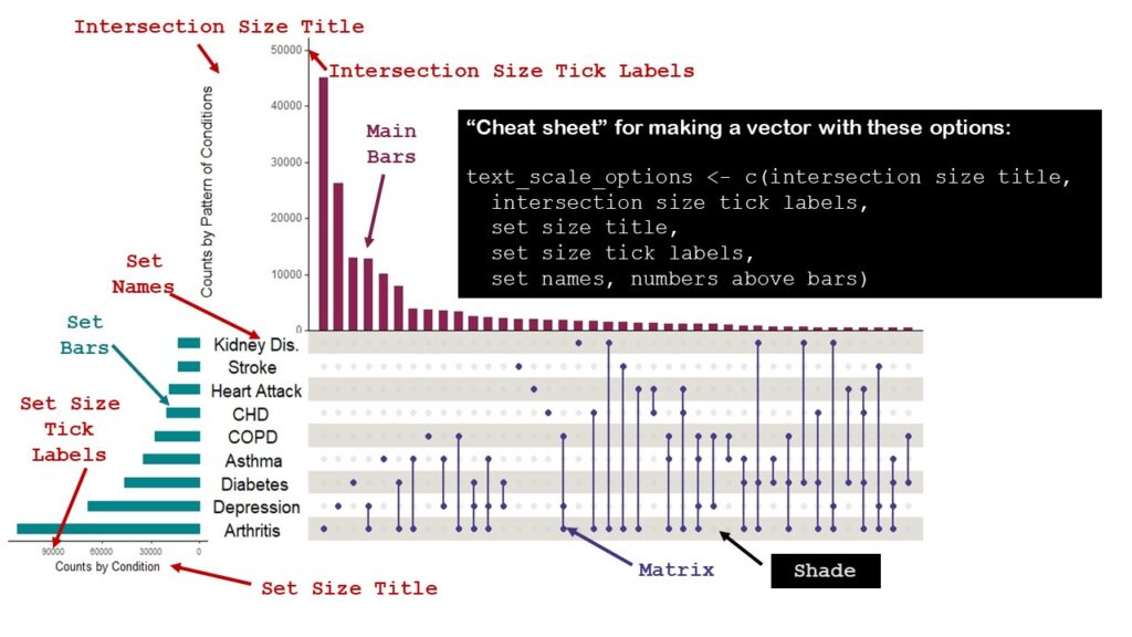
I did not choose to have data labels appear above the bars, but had I, could have set a text scale option for that, too. I wasn’t sure what options I’d choose, so I made a few sets, naming them 1, 2, and 3.
#I created different options so I could see which
  ones I liked best
text_scale_options1 <- c(1, 1, 1, 1, 0.75, 1)
text_scale_options2 <- c(1.3, 1.3, 1, 1, 2, 0.75)
text_scale_options3 <- c(1.5, 1.25, 1.25, 1, 2, 1.5)
You will see when we get to the upset plot code that I end up using text_scale_options3.
Setting Colors
If you look at my graphic above, you will see that in addition to the text options, I named a few things that I colored: the main bars, the set bars, the matrix, and the shade. I also colored the labels on the graphic the same color as the items on the plot. That was to explain to you how I set the colors. I created four variables: main_bar_col, sets_bar_col, matrix_col, and shade_col, and set them to the colors I wanted for the main bars, the sets bars, the matrix, and the shade. Then, like with the text_scale_options3 vector, I used these variables when I ran the plot.
You can match the code below to the colors on the graphic.
#setting colors
#this can also be done with hexadecimal
main_bar_col <- c("violetred4")
sets_bar_col <- c("turquoise4")
matrix_col <- c("slateblue4")
shade_col <- c("wheat4")

Setting MB Ratio and Set Variables
To quote the authors from their documentation,
“To change the proportions of the plot heights assigned to the matrix and intersection size bar plot, use the mb.ratio parameter entered as percentages.”
I had a lot of trouble visualizing this. I found the best way to handle this was to create an mb.ratio vector (I called mb_ratio1), and then change it in my code, and make more vectors with different proportions if I didn’t like my first choices. As you will see by my code, I liked my first choices, so I only had one of them.
#I called it "1" because I anticipated others
#but never needed them
mb_ratio1 <- c(0.55,0.45)

Next, in the upset plot, you have to tell R which variables are the “set” variables – meaning which ones have your 1,0 flags in them. If you set your dataframe up as I recommended, then literally all of your variables are set variables.
In any case, again, it’s best to make a vector of the set variables. It’s important to note that the names of the columns in the dataframe will be the labels of your sets on the upset plot – so if you have weird variable names, you will want to change them before you make the plot.
- In that case, you could make a vector of plot-friendly variable names with the same number of entries as you have columns in your dataframe, and just use the names() command to rename all your columns.
- Also, if your dataframe already has the perfect set names, you could just use the colnames() command to create this vector.
In fact, I later realized that I could have done the second maneuver I described above – but I am satisfied with the way I have demonstrated it, because if you happen to have a dataframe with more variables in it than you want to plot, you would want to do it my way, which is just writing out the variable names in a character vector and saving it as set_vars.
set_vars <- c("Asthma", "Heart Attack", "CHD", "Stroke",
	"COPD", "Arthritis", "Depression", "Kidney Dis.",
        "Diabetes")

Making Upset Plots – Finally!
Before you make the plot, you need to make sure you install package UpSetR, and then run the library() command for UpSetR and ggplot2 (which I assume you have already installed since most R users have, but if not, you’ll need to install this one, too).
So here is the plot code:
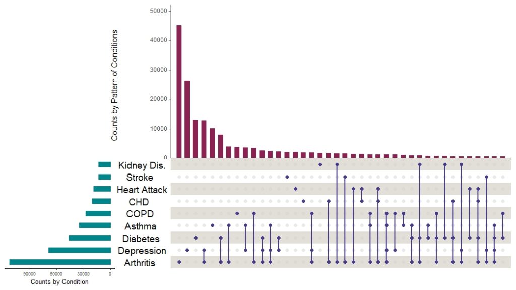
upset(plot_df,
	sets = set_vars,
	mb.ratio = mb_ratio1,
	mainbar.y.label = "Counts by Pattern of Conditions",
	sets.x.label = "Counts by Condition",
	order.by = "freq",
	show.numbers = FALSE,
	point.size = 2,
	line.size = 1,
	text.scale=text_scale_options3,
	main.bar.color = main_bar_col,
	sets.bar.color = sets_bar_col,
	matrix.color = matrix_col,
	shade.color = shade_col)
And here is the plot without all that markup on it:
I want to point out a few things about making upset plots this way:
- First, please try to identify in the code where I used all the variables and vectors I set up. I find that is the best approach when making complex plots in R packages.
- You will see that I turned off the data labels with show.numbers = FALSE. That’s where you could turn them on, and set their text size in the options.
- You can see where I hardcoded labels in there. This is another place where you could put a vector, but I didn’t see myself fussing with these, so I hardcoded them.
- If you use this code to help you make an upset plot, and then you want to set other options I did not set, please read the documentation. I believe there are more ways to modify this plot, but the ones I presented are the ones I use most often.
As it turns out, the plot answered my question. The top three main bars were all singular conditions: arthritis, depression, and diabetes. The first pattern shows up as the fourth bar, and that one is arthritis plus depression. We found this visualization very helpful when we wrote our paper, because it demonstrated the distribution of conditions across our sample.
Published April 3, 2022. Added banners March 6, 2023. Revised banners June 19, 2023.
Read all of our data science blog posts!

Confidence Intervals are for Estimating a Range for the True Population-level Measure
Confidence intervals (CIs) help you get a solid estimate for the true population measure. Read [...]
1 Comment
Jun

Continuous Variable? You Can Categorize it!
Continuous variable categorized can open up a world of possibilities for analysis. Read about it [...]
2 Comments
Jun

Delete if the Row Meets Criteria? Do it in SAS!
Delete if rows meet a certain criteria is a common approach to paring down a [...]
May


Chi-square Test: Insight from Using Microsoft Excel
Chi-square test is hard to grasp – but doing it in Microsoft Excel can give [...]
May

Identify Elements of Research in Scientific Literature
Identify elements in research reports, and you’ll be able to understand them much more easily. [...]
May

Design the Most Useful Time Periods for Your Conversions
Time periods are important when creating a time series visualization that actually speaks to you! [...]
Apr

Apply Weights? It’s Easy in R with the Survey Package!
Apply weights to get weighted proportions and counts! Read my blog post to learn how [...]
Nov

Make Categorical Variable Out of Continuous Variable
Make categorical variables by cutting up continuous ones. But where to put the boundaries? Get [...]
Nov

Remove Rows in R with the Subset Command
Remove rows by criteria is a common ETL operation – and my blog post shows [...]
Oct

CDC Wonder for Studying Vaccine Adverse Events: The Shameful State of US Open Government Data
CDC Wonder is an online query portal that serves as a gateway to many government [...]
Jun

AI Careers: Riding the Bubble
AI careers are not easy to navigate. Read my blog post for foolproof advice for [...]
Jun

Descriptive Analysis of Black Friday Death Count Database: Creative Classification
Descriptive analysis of Black Friday Death Count Database provides an example of how creative classification [...]
Nov

Classification Crosswalks: Strategies in Data Transformation
Classification crosswalks are easy to make, and can help you reduce cardinality in categorical variables, [...]
Nov

FAERS Data: Getting Creative with an Adverse Event Surveillance Dashboard
FAERS data are like any post-market surveillance pharmacy data – notoriously messy. But if you [...]
4 Comments
Nov

Dataset Source Documentation: Necessary for Data Science Projects with Multiple Data Sources
Dataset source documentation is good to keep when you are doing an analysis with data [...]
Nov

Joins in Base R: Alternative to SQL-like dplyr
Joins in base R must be executed properly or you will lose data. Read my [...]
Nov

NHANES Data: Pitfalls, Pranks, Possibilities, and Practical Advice
NHANES data piqued your interest? It’s not all sunshine and roses. Read my blog post [...]
Nov

Color in Visualizations: Using it to its Full Communicative Advantage
Color in visualizations of data curation and other data science documentation can be used to [...]
Oct

Defaults in PowerPoint: Setting Them Up for Data Visualizations
Defaults in PowerPoint are set up for slides – not data visualizations. Read my blog [...]
Oct

Text and Arrows in Dataviz Can Greatly Improve Understanding
Text and arrows in dataviz, if used wisely, can help your audience understand something very [...]
Oct

Shapes and Images in Dataviz: Making Choices for Optimal Communication
Shapes and images in dataviz, if chosen wisely, can greatly enhance the communicative value of [...]
Oct

Table Editing in R is Easy! Here Are a Few Tricks…
Table editing in R is easier than in SAS, because you can refer to columns, [...]
Aug

R for Logistic Regression: Example from Epidemiology and Biostatistics
R for logistic regression in health data analytics is a reasonable choice, if you know [...]
272 Comments
Aug

Connecting SAS to Other Applications: Different Strategies
Connecting SAS to other applications is often necessary, and there are many ways to do [...]
Jul

Portfolio Project Examples for Independent Data Science Projects
Portfolio project examples are sometimes needed for newbies in data science who are looking to [...]
Jul

Project Management Terminology for Public Health Data Scientists
Project management terminology is often used around epidemiologists, biostatisticians, and health data scientists, and it’s [...]
Jun

Rapid Application Development Public Health Style
“Rapid application development” (RAD) refers to an approach to designing and developing computer applications. In [...]
Jun

Understanding Legacy Data in a Relational World
Understanding legacy data is necessary if you want to analyze datasets that are extracted from [...]
Jun

Front-end Decisions Impact Back-end Data (and Your Data Science Experience!)
Front-end decisions are made when applications are designed. They are even made when you design [...]
Jun

Reducing Query Cost (and Making Better Use of Your Time)
Reducing query cost is especially important in SAS – but do you know how to [...]
Jun

Curated Datasets: Great for Data Science Portfolio Projects!
Curated datasets are useful to know about if you want to do a data science [...]
May

Statistics Trivia for Data Scientists
Statistics trivia for data scientists will refresh your memory from the courses you’ve taken – [...]
Apr

Management Tips for Data Scientists
Management tips for data scientists can be used by anyone – at work and in [...]
Mar

REDCap Mess: How it Got There, and How to Clean it Up
REDCap mess happens often in research shops, and it’s an analysis showstopper! Read my blog [...]
Mar

GitHub Beginners in Data Science: Here’s an Easy Way to Start!
GitHub beginners – even in data science – often feel intimidated when starting their GitHub [...]
Feb

ETL Pipeline Documentation: Here are my Tips and Tricks!
ETL pipeline documentation is great for team communication as well as data stewardship! Read my [...]
Feb

Benchmarking Runtime is Different in SAS Compared to Other Programs
Benchmarking runtime is different in SAS compared to other programs, where you have to request [...]
Dec

End-to-End AI Pipelines: Can Academics Be Taught How to Do Them?
End-to-end AI pipelines are being created routinely in industry, and one complaint is that academics [...]
Nov

Referring to Columns in R by Name Rather than Number has Pros and Cons
Referring to columns in R can be done using both number and field name syntax. [...]
Oct

The Paste Command in R is Great for Labels on Plots and Reports
The paste command in R is used to concatenate strings. You can leverage the paste [...]
Oct

Coloring Plots in R using Hexadecimal Codes Makes Them Fabulous!
Recoloring plots in R? Want to learn how to use an image to inspire R [...]
5 Comments
Oct

Adding Error Bars to ggplot2 Plots Can be Made Easy Through Dataframe Structure
Adding error bars to ggplot2 in R plots is easiest if you include the width [...]
Oct

AI on the Edge: What it is, and Data Storage Challenges it Poses
“AI on the edge” was a new term for me that I learned from Marc [...]
Jun

Pie Chart ggplot Style is Surprisingly Hard! Here’s How I Did it
Pie chart ggplot style is surprisingly hard to make, mainly because ggplot2 did not give [...]
5 Comments
Apr

Time Series Plots in R Using ggplot2 Are Ultimately Customizable
Time series plots in R are totally customizable using the ggplot2 package, and can come [...]
Apr

Data Curation Solution to Confusing Options in R Package UpSetR
Data curation solution that I posted recently with my blog post showing how to do [...]
Apr

Making Upset Plots with R Package UpSetR Helps Visualize Patterns of Attributes
Making upset plots with R package UpSetR is an easy way to visualize patterns of [...]
11 Comments
Apr

Making Box Plots Different Ways is Easy in R!
Making box plots in R affords you many different approaches and features. My blog post [...]
Mar

Convert CSV to RDS When Using R for Easier Data Handling
Convert CSV to RDS is what you want to do if you are working with [...]
Mar

GPower Case Example Shows How to Calculate and Document Sample Size
GPower case example shows a use-case where we needed to select an outcome measure for [...]
Feb

Querying the GHDx Database: Demonstration and Review of Application
Querying the GHDx database is challenging because of its difficult user interface, but mastering it [...]
Feb

Variable Names in SAS and R Have Different Restrictions and Rules
Variable names in SAS and R are subject to different “rules and regulations”, and these [...]
Feb

Referring to Variables in Processing Data is Different in SAS Compared to R
Referring to variables in processing is different conceptually when thinking about SAS compared to R. [...]
Jan

Counting Rows in SAS and R Use Totally Different Strategies
Counting rows in SAS and R is approached differently, because the two programs process data [...]
Jan

Native Formats in SAS and R for Data Are Different: Here’s How!
Native formats in SAS and R of data objects have different qualities – and there [...]
Jan

SAS-R Integration Example: Transform in R, Analyze in SAS!
Looking for a SAS-R integration example that uses the best of both worlds? I show [...]
Dec

Dumbbell Plot for Comparison of Rated Items: Which is Rated More Highly – Harvard or the U of MN?
Want to compare multiple rankings on two competing items – like hotels, restaurants, or colleges? [...]
2 Comments
Sep

Data for Meta-analysis Need to be Prepared a Certain Way – Here’s How
Getting data for meta-analysis together can be challenging, so I walk you through the simple [...]
Jul

Sort Order, Formats, and Operators: A Tour of The SAS Documentation Page
Get to know three of my favorite SAS documentation pages: the one with sort order, [...]
Nov

Confused when Downloading BRFSS Data? Here is a Guide
I use the datasets from the Behavioral Risk Factor Surveillance Survey (BRFSS) to demonstrate in [...]
2 Comments
Oct

Doing Surveys? Try my R Likert Plot Data Hack!
I love the Likert package in R, and use it often to visualize data. The [...]
3 Comments
Oct

I Used the R Package EpiCurve to Make an Epidemiologic Curve. Here’s How It Turned Out.
With all this talk about “flattening the curve” of the coronavirus, I thought I would [...]
Mar

Which Independent Variables Belong in a Regression Equation? We Don’t All Agree, But Here’s What I Do.
During my failed attempt to get a PhD from the University of South Florida, my [...]
Aug
Making upset plots with R package UpSetR is an easy way to visualize patterns of attributes in your data. My blog post demonstrates making patterns of co-morbidities in health survey respondents from the BRFSS, and walks you through setting text and color options in the code.
Hi Monika,
Thanks for the great and extensive explanation, it helped me a lot! In my dataset I have some cases that have missing values. So in your example, some individuals would have left one yes/no answer on the presence of a disease open. It know excludes these cases completely. Do you know if there is a way to still include the n/a’s?
Kind regards,
Frederique
Hi there,
Thank you for your comment! Yes, you are right. To restate what you are saying, I have reduced everyone to having a two-state flag – 1 or 0 – Yes or No. But what if the answer is “don’t know” – like, we don’t know if this person has arthritis because they never went to a physician and underwent a diagnostic visit?
Maybe you can see where I am going. I don’t think there is any value to including the prevalence or distribution of an unknown state in an upset plot. I have never gone for an arthritis diagnosis because I do not have any symptoms – but I’m pretty sure I don’t have it. People who go to a physician and undergo a diagnostic visit find out if they have it – yes or no – and then tell us when we ask in a survey.
So for this case, the two-state flag works. But if your measurement instrument is not that good – like, you are asking people what dishes they like from India, and they don’t know anything about Indian cuisine – well, you should probably rethink your measurement instrument. I guess that is where I’d finally come down on the question of graphing NA’s on an upset plot.
Hi Monika,
Thank you so much for this code! I’m having some trouble setting up an UpSet plot with it however. I’ve used your code exactly, except for importing my own data from excel in the format you recommended. But I get the following error:
Error in `data[, start_col:end_col]`:
! Can’t subset columns past the end.
i Location 22 doesn’t exist.
i There are only 21 columns.
Run `rlang::last_error()` to see where the error occurred.
Warning messages:
1: In xtfrm.data.frame(x) : cannot xtfrm data frames
2: In xtfrm.data.frame(x) : cannot xtfrm data frames
3: In xtfrm.data.frame(x) : cannot xtfrm data frames
4: In xtfrm.data.frame(x) : cannot xtfrm data frames
5: In xtfrm.data.frame(x) : cannot xtfrm data frames
Do you have any idea how to solve this?
Hello dear,
Well, it’s hard to troubleshoot in the comments, but I’ll try. I see “Error in ‘data[,start_col:end_col]'” which suggests that there is some error reading in your data. I had a boss who taught me to “Google your error messages” so when I Googled “In xtfrm.data.frame(x) : cannot xtfrm data frames” (because I see that being repeated) and I find a few different causes of this error. I think the most revealing part of the error is “Location 22 doesn’t exist – there are only 21 columns”. You may need to regenerate your dataframe (I get this from reading the different doco about your error message). Here is one way – to make a matrix first then convert it to a dataframe: https://youtu.be/E8wl_P6yZkw Sorry I couldn’t be of more help, but feel free to provide more info, and I can try again. Hopefully a little messing around with code fixes it. Good luck!
-Monika
Hey Monika,
The dataset seems so interesting. Can you send it to me by email? I am a PhD student at the University of Utah working with UpSet Plot’s inventor! We are currently collecting data for research purposes.
Regards,
Ishrat Jahan Eliza
Visualization Design Lab
Hi, I am new to using R. What sort of data can be represented on an UpSet Plot? Can you please simplify? I work with NGS data—variants detected in solid tumours. I cannot find this specific example anywhere in the making of and UpSet plot. Thank you