
FAERS data from the United States Food and Drug Administration (USFDA) is no better quality than any other post-market surveillance adverse event data, and they don’t pretend to be. FAERS stands for “FDA Adverse Event Reporting System”, and the Feds provide a public dashboard for all of us to use!
Even though these data are free on the web, FAERS data – like other community-reported medication adverse reaction data – include a lot of “suspect” reports (which I will define more clearly later). Nevertheless, I will make a solid case in this blog post that if you are the type of person with knowledge of and experience with adverse event data who devotes the time and patience necessary to manually classify the data, you can uncover some interesting truths with even a descriptive analysis of the FAERS data. You just need to put on your thinking cap and get creative! A project like this would make a great addition to a data science portfolio project.

FAERS Data Dashboard: Initial Approach
Let’s access the FAERS data in the simplest way – through the FAERS online dashboard.
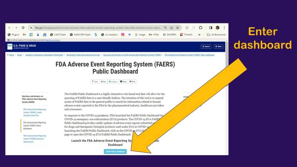
As shown in the graphic, you click to enter the dashboard, then you have to agree to a disclaimer. After that, you arrive at a web page that looks like this.
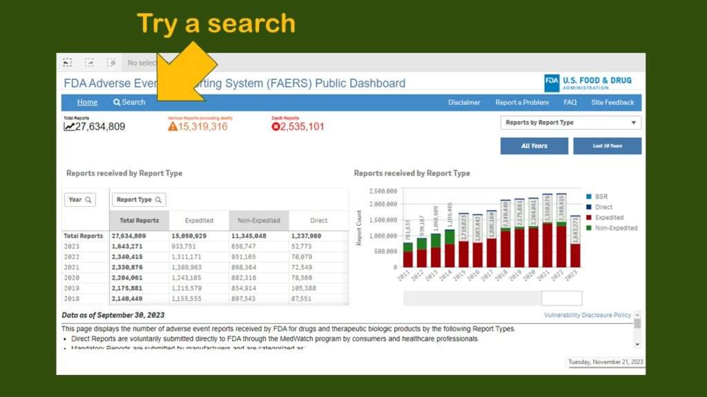
As you can see, you are presented with a very busy dashboard – and no obvious menu. I really did not know what to do next. I realize it is hard to design intuitive dashboards – but everyone is basically going to look for a menu or some buttons or something. Since I couldn’t find any, I just clicked on “search” to try a search.
I was helping someone with an analysis of Ozempic, the trending diabetes/weight loss drug, so I looked to see what happened when I searched for that.
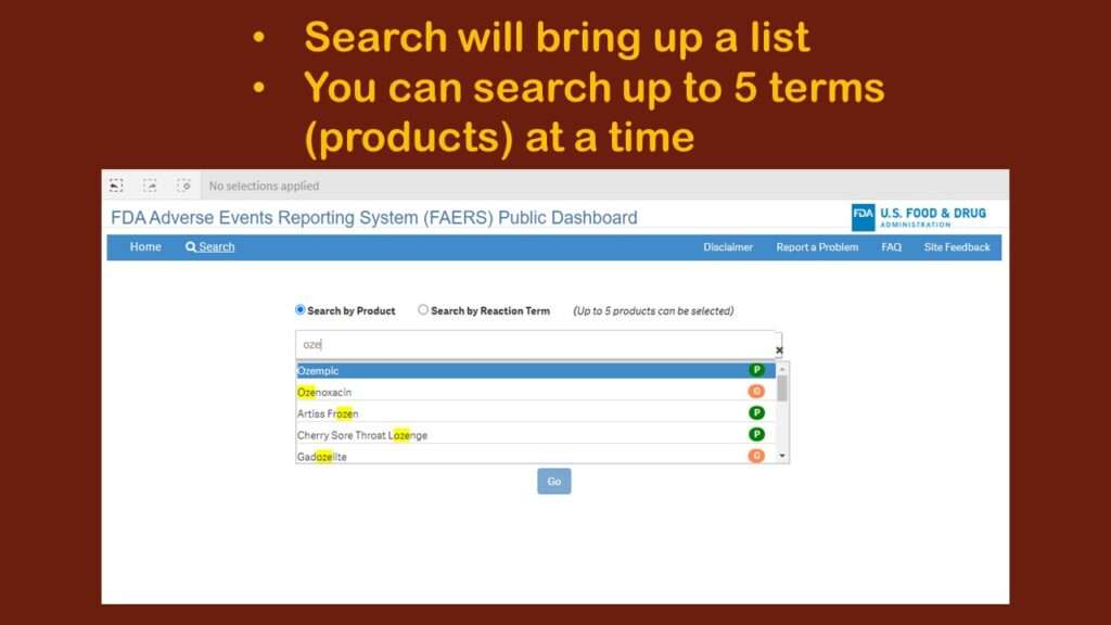
As you can see in the graphic, it was executing sort of a “smart” search, looking for any entry with “oze” in it. I immediately realized that this was fine for a very unique item like Ozempic. But what if I wanted to study adverse events associated with lipid-lowering drugs? There are many of them – much more than five, but the search only allows you to include five products.
Time Out for a Little Study Design Advice
Indeed, there are other ways to access FAERS data that might make it easier for the analyst to pick out all the lipid-lowering drugs. However, such a research question would not be easily answerable with this particular dashboard. So if you are just trying to do a portfolio project, you might want to select your topic carefully, based on what can reasonably be extrapolated from the data as they are served up in the dashboard (in a rather unclassified way).
It still needs to be scientifically relevant, but there are ways of using design to make your life easier. For example, you might find just three lipid-lowering drugs that are implicated, then compare the adverse event types between them. As I seem to always find myself recommending, do a quick search of Google Scholar and throw your results in Zotero before you go too far with your study design.

Filtering and Downloading FAERS Dashboard Data
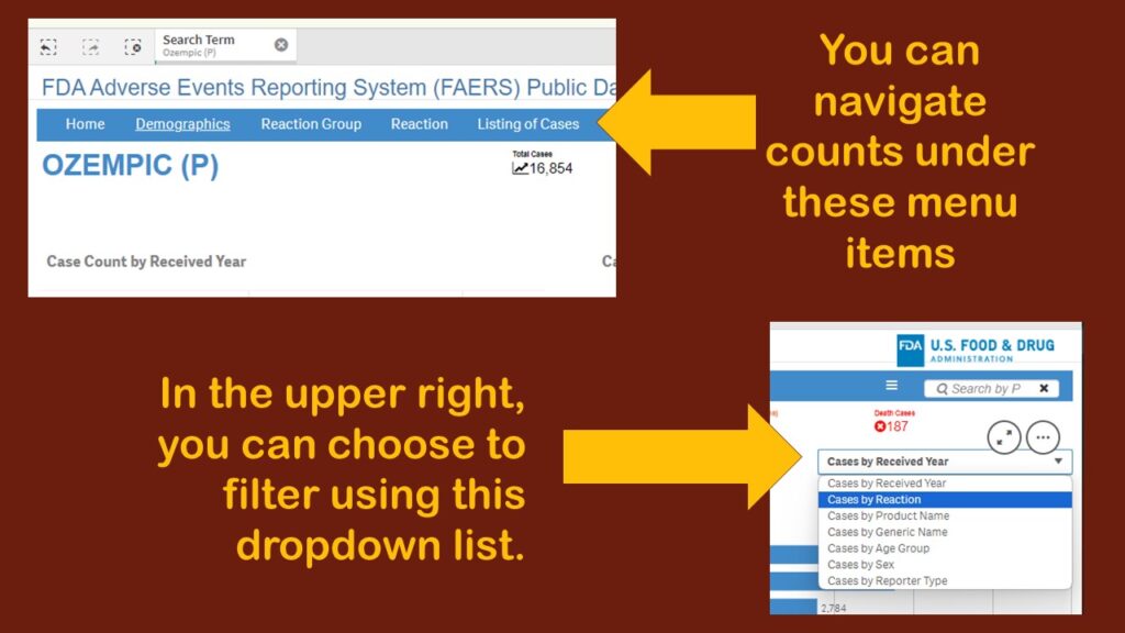
For this demonstration, I chose “Ozempic” from the dropdown in the search, and this brought me to this page (in the graphic). At first, I wasn’t sure anything had happened – but then I could see that a filter had been applied.
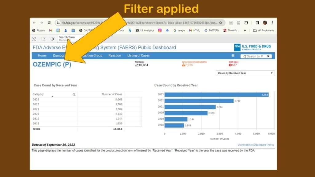
As you can see, the default display showed adverse events reports by year. Obviously, that’s not very interesting. Again, I was confused about menus. Where are they? And what do they do? I tried a few on the blue horizontal bar menu (where “search” had been), and I found different types of counts. I kept having to leave the dashboard, then retrace my steps to figure out what happened. It was very frustrating.
On the third or fourth time I retraced my steps to get to this page, I finally noticed a dropdown in the upper right corner. Although as you can see in the graphic, there are several choices, I chose “Cases by Reaction”, thinking that would be the obvious thing to examine in this database.
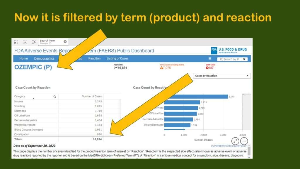
This produced a display more like what I had been expecting to see – where we have the frequencies by reaction for Ozempic.
Issues with Downloaded Data Structure and Format
I was intrigued by the dataset that I downloaded. It was in *.xlsx format, and was named a long string of random characters. I opened it and lightly formatted it so it was easier to read, and made a graphic to describe my observations.
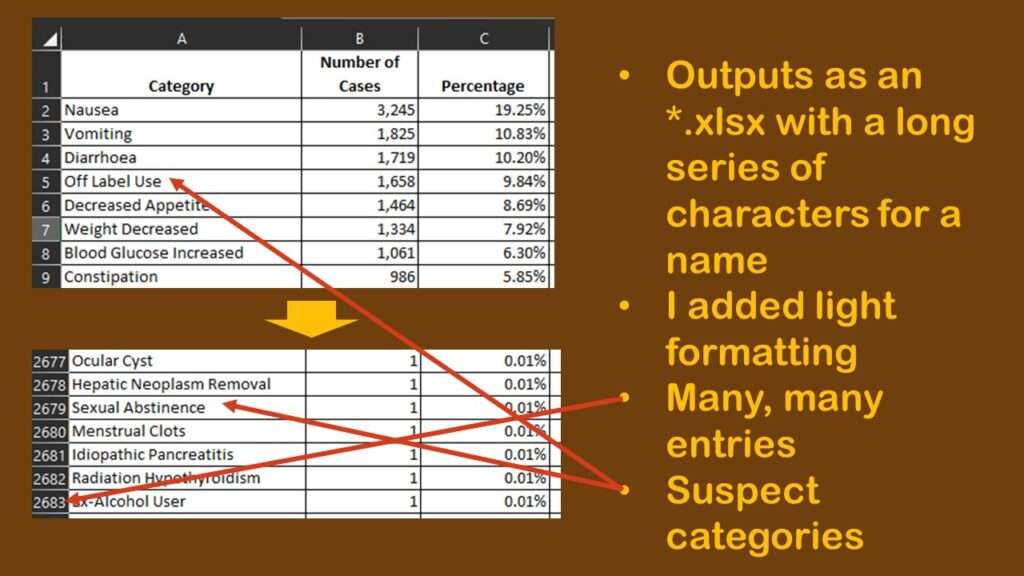
As shown in the graphic, to my chagrin, there were many rows – 2,682 to be exact. As a reminder, each row is a unique type of adverse reaction reported about Ozempic during the time period represented by the data. Each row has a “number of cases” count, so that means each one of those rows has at least one case in it. So just looking at the spreadsheet, we know we have 2,682 types of reactions to consider for Ozempic, but the total number of cases per type of reaction, and the distribution of cases per type of reaction is another thing we want to know as well.
However, that is going to be hard to figure out from the data, as you can see in the graphic. Nausea, the most prevalent adverse event in the dataset with 3,245 cases, makes up 19.25% of the reports. The second and third more prevalent adverse reactions are vomiting and diarrhea, which, like nausea, are also common adverse reactions to other medications.
But then we see the fourth most common so-called “adverse event” is “off-label use”. It is possible that off-label use caused an adverse event, but just the use of Ozempic off-label isn’t in itself an adverse event. Also, some of the entries are pretty suspect. How can “sexual abstinence” be caused by Ozempic?

Getting Creative with FAERS Data
I study healthcare quality, and I was wondering if I could classify these different rows into whether or not there was a “use error”. I saved the dataset as “Download from web page_edited.xlsx” and started editing it. I manually added a row identifier (primary key) I called Order, because I populated it with a sequence. That way, I could remember what order the rows were originally in when I downloaded them.
Next, I added a column called UseError. As values, I wanted 1 to represent some sort of use error, and 2 to represent some other cause of an adverse event. UseError could refer to the off-label use and also include other health-quality-related errors, such as dosing errors, or incorrect administration.
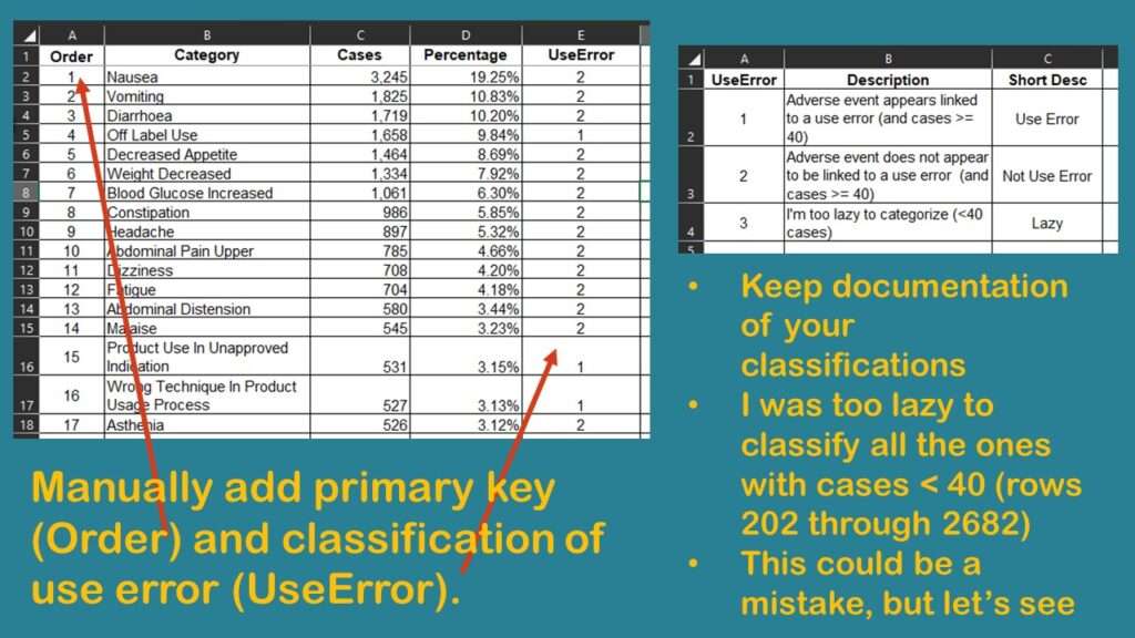
As shown in the graphic, I found that the only way to correctly code UseError was for me to carefully read and manually code each row. Of course, I had to keep careful documentation of what I was doing in my coding approach.
I finally got down to rows for adverse events that were attributed to < 40 cases. That constituted about 2,400 rows (from row 202 to row 2,682). As the graphic shows, I was too lazy to code all those rows. I wondered if it mattered that I left them out, so I decided to do a quick analysis to see if I was on the right track.
Quick Analysis: How Important is it to Classify Every Single Row?
I decided to use R for this exercise, and you can download my code from GitHub here.
First, to read in the edited Excel file, I used the readxl package in R. I set the working directory, and then I imported the file using the read_excel command from the package. This command produces a tibble – a data format in R that I do not like to use – so I wrapped that command in a data.frame command to output a regular R dataframe. I named this dataframe ae_a. I also ran an nrow on it to see the number of rows.

Code:
ae_a <- data.frame(read_excel("Download from web page_edited.xlsx"))
nrow(ae_a)

Output:
[1] 2682
This checks out as exactly the number of rows we’d expect, so we feel pretty good about the import operation.
We know the total number rows – which represents all the different types of adverse events reported – but we do not know the total number of cases represented by these rows. I was curious about this, so I calculated the variable total_cases by summing the entire column Cases from the dataframe.
total_cases <- sum(ae_a$Cases)
The value of total_cases was 53,149. This means about 53,000 people reported one of these Ozempic adverse events in this dataset all told. But what worried me is that in my laziness, I was not classifying enough of the cases represented in the dataset.
To further examine the consequences of my choice to be lazy, I calculated three “numerators” that I could use with total_cases as the denominator. The first was total_useerrors. The value of this variable is the sum of the Cases column where UseError is set to 1 (as the earlier graphic documented).
total_useerrors <- sum(ae_a$Cases[ae_a$UseError == 1])
Next, I will calculate total_unclass, which is the sum of the Cases where UseError is set to 3 – these are the ones I did not categorize because I was lazy.
total_unclass <- sum(ae_a$Cases[ae_a$UseError == 3])
Finally, I will calculate total_nonuseerrors by summing the Cases where UseError is set to 2 – meaning they are adverse events with 40 or more cases that were not related to use error.
total_nonuseerrors <- total_cases - (total_useerrors + total_unclass)
To check my work, I used the identical command to compare the denominator, total_cases, with the three numerators added together.
Code:
identical(total_cases, total_nonuseerrors + total_useerrors + total_unclass)

Output:
[1] TRUE
Because the identical command compared the two arguments and returned a TRUE, it means the two arguments are identical (which is equal in this case). So now, using these values, we can examine the proportion of cases that remained unclassified because I was too lazy to do it.

I want to use ggplot2 to make a pie chart like I do in this blog post. So to start out, I need to make a dataframe to feed the plot. I will use a trick I love to assemble the dataframe in R. I want the dataframe to have two variables: a description of the levels – Use Errors, Other Errors, and Unclassified – and the proportions of cases in each level. So, I will make a vector of each of these things, and then meld them together with a data.frame command.
Type <- c("Use Errors", "Other Errors", "Unclassified")
Proportion <- c(total_useerrors/total_cases,
			total_nonuseerrors/total_cases,
			total_unclass/total_cases)
plot_df <- data.frame(Type, Proportion)
As you can see, I made a dataframe called plot_df by joining together the vector named Type with the vector named Proportion. Type was just a character vector with a description of the three levels in it, while Proportion was a numerical vector where I used the variables I made to calculate each of the three proportions. I made sure to put the items in the vectors in the same order so the data were not incorrect when I fused the two vectors together into a dataframe.
> plot_df
          Type Proportion
1   Use Errors 0.09593784
2 Other Errors 0.67741632
3 Unclassified 0.22664584
Before making the plot, I decided to pick out three colors to use for the pie chart. I put them in a vector called pie_colors.
pie_colors <- c("paleturquoise4","orchid4",
  "palegreen4")
Finally, it was time to call up the library ggplot2 and construct the code to create the pie chart, using pie_colors to color the chart.
library(ggplot2)

pie <- ggplot(plot_df, aes("", Proportion, fill = Type)) +
    	geom_bar(width = 1, size = 1, color = "white",
          stat = "identity") +
    	coord_polar("y") +
    	geom_text(aes(label = paste0(round(Proportion*100,0), "%")),
              position = position_stack(vjust = 0.5)) +
    	labs(x = NULL, y = NULL, fill = NULL,
         title = "Distribution of Error Classifications") +
    	guides(fill = guide_legend(reverse = TRUE)) +
    	scale_fill_manual(values = pie_colors) +
    	theme_classic() +
   	theme(axis.line = element_blank(),
          axis.text = element_blank(),
          axis.ticks = element_blank(),
          plot.title = element_text(hjust = 0.5,
            color = "black"))
Also, I added a ggsave command to export the final figure as a *.png called “pie.png”.
ggsave(file = "pie.png",
	units = c("in"),
	width = 8,
	height = 5.5,
	dpi = 300,
	pie)
FAERS Data Analysis: Don’t be Lazy…
The results of my little exploratory analysis provide strong evidence that it is a bad idea to get lazy with the FAERS data.
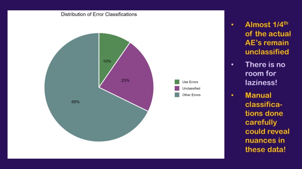
As can be seen here, by only bothering to classify the rows that contained 40 or more cases, I was only able to classify 78% of the dataset, which is a little over three-fourths. The orchid-colored pie slice (or should I say orchid4-colored?) represents all the cases from rows I was too lazy to classify. That’s 23% of the cases.
That’s no good. If we were really going to do this analysis and have it mean anything, I would really have to go through and classify many more of the rows – if not all. Otherwise, we are greatly limited in our interpretation. On one hand, we know that the largest percentage that could be use errors is the 10% we classified plus the 23% that are unclassified, which is 33% – a third!
…Be Creative!
On the other hand, we know that if the entire orchid slice was found to include none of the use errors, the smallest percentage the use errors could represent of all the cases is 10% – which seems high. If the floor is 10%, and the ceiling is 33% – that’s bad! That’s too high!
Of course, to do justice to this project would require much more work. I’d need to make sure whatever classification I did made sense as a “use error”. I might need to actually talk to a pharmacist and make sure I’m doing it right. Also, it’s important to look in the scientific literature to get a better idea of the issues around any adverse event topic you might be studying.
As can be seen by this demonstration using FAERS data exported from the public, online dashboard, you can do a relatively meaningful descriptive analysis with these data, even though post-market surveillance data are notoriously messy. You just need plan a strong descriptive study design, to do some manual work on the data, and aim to build upon the scientific literature when you report your results.
Published November 23, 2023. Added video January 19, 2024. Added another video January 30, 2024.
Read all of our data science blog posts!

Confidence Intervals are for Estimating a Range for the True Population-level Measure
Confidence intervals (CIs) help you get a solid estimate for the true population measure. Read [...]
1 Comment
Jun

Continuous Variable? You Can Categorize it!
Continuous variable categorized can open up a world of possibilities for analysis. Read about it [...]
2 Comments
Jun

Delete if the Row Meets Criteria? Do it in SAS!
Delete if rows meet a certain criteria is a common approach to paring down a [...]
May


Chi-square Test: Insight from Using Microsoft Excel
Chi-square test is hard to grasp – but doing it in Microsoft Excel can give [...]
May

Identify Elements of Research in Scientific Literature
Identify elements in research reports, and you’ll be able to understand them much more easily. [...]
May

Design the Most Useful Time Periods for Your Conversions
Time periods are important when creating a time series visualization that actually speaks to you! [...]
Apr

Apply Weights? It’s Easy in R with the Survey Package!
Apply weights to get weighted proportions and counts! Read my blog post to learn how [...]
Nov

Make Categorical Variable Out of Continuous Variable
Make categorical variables by cutting up continuous ones. But where to put the boundaries? Get [...]
Nov

Remove Rows in R with the Subset Command
Remove rows by criteria is a common ETL operation – and my blog post shows [...]
Oct

CDC Wonder for Studying Vaccine Adverse Events: The Shameful State of US Open Government Data
CDC Wonder is an online query portal that serves as a gateway to many government [...]
Jun

AI Careers: Riding the Bubble
AI careers are not easy to navigate. Read my blog post for foolproof advice for [...]
Jun

Descriptive Analysis of Black Friday Death Count Database: Creative Classification
Descriptive analysis of Black Friday Death Count Database provides an example of how creative classification [...]
Nov

Classification Crosswalks: Strategies in Data Transformation
Classification crosswalks are easy to make, and can help you reduce cardinality in categorical variables, [...]
Nov

FAERS Data: Getting Creative with an Adverse Event Surveillance Dashboard
FAERS data are like any post-market surveillance pharmacy data – notoriously messy. But if you [...]
4 Comments
Nov

Dataset Source Documentation: Necessary for Data Science Projects with Multiple Data Sources
Dataset source documentation is good to keep when you are doing an analysis with data [...]
Nov

Joins in Base R: Alternative to SQL-like dplyr
Joins in base R must be executed properly or you will lose data. Read my [...]
Nov

NHANES Data: Pitfalls, Pranks, Possibilities, and Practical Advice
NHANES data piqued your interest? It’s not all sunshine and roses. Read my blog post [...]
Nov

Color in Visualizations: Using it to its Full Communicative Advantage
Color in visualizations of data curation and other data science documentation can be used to [...]
Oct

Defaults in PowerPoint: Setting Them Up for Data Visualizations
Defaults in PowerPoint are set up for slides – not data visualizations. Read my blog [...]
Oct

Text and Arrows in Dataviz Can Greatly Improve Understanding
Text and arrows in dataviz, if used wisely, can help your audience understand something very [...]
Oct

Shapes and Images in Dataviz: Making Choices for Optimal Communication
Shapes and images in dataviz, if chosen wisely, can greatly enhance the communicative value of [...]
Oct

Table Editing in R is Easy! Here Are a Few Tricks…
Table editing in R is easier than in SAS, because you can refer to columns, [...]
Aug

R for Logistic Regression: Example from Epidemiology and Biostatistics
R for logistic regression in health data analytics is a reasonable choice, if you know [...]
272 Comments
Aug

Connecting SAS to Other Applications: Different Strategies
Connecting SAS to other applications is often necessary, and there are many ways to do [...]
Jul

Portfolio Project Examples for Independent Data Science Projects
Portfolio project examples are sometimes needed for newbies in data science who are looking to [...]
Jul

Project Management Terminology for Public Health Data Scientists
Project management terminology is often used around epidemiologists, biostatisticians, and health data scientists, and it’s [...]
Jun

Rapid Application Development Public Health Style
“Rapid application development” (RAD) refers to an approach to designing and developing computer applications. In [...]
Jun

Understanding Legacy Data in a Relational World
Understanding legacy data is necessary if you want to analyze datasets that are extracted from [...]
Jun

Front-end Decisions Impact Back-end Data (and Your Data Science Experience!)
Front-end decisions are made when applications are designed. They are even made when you design [...]
Jun

Reducing Query Cost (and Making Better Use of Your Time)
Reducing query cost is especially important in SAS – but do you know how to [...]
Jun

Curated Datasets: Great for Data Science Portfolio Projects!
Curated datasets are useful to know about if you want to do a data science [...]
May

Statistics Trivia for Data Scientists
Statistics trivia for data scientists will refresh your memory from the courses you’ve taken – [...]
Apr

Management Tips for Data Scientists
Management tips for data scientists can be used by anyone – at work and in [...]
Mar

REDCap Mess: How it Got There, and How to Clean it Up
REDCap mess happens often in research shops, and it’s an analysis showstopper! Read my blog [...]
Mar

GitHub Beginners in Data Science: Here’s an Easy Way to Start!
GitHub beginners – even in data science – often feel intimidated when starting their GitHub [...]
Feb

ETL Pipeline Documentation: Here are my Tips and Tricks!
ETL pipeline documentation is great for team communication as well as data stewardship! Read my [...]
Feb

Benchmarking Runtime is Different in SAS Compared to Other Programs
Benchmarking runtime is different in SAS compared to other programs, where you have to request [...]
Dec

End-to-End AI Pipelines: Can Academics Be Taught How to Do Them?
End-to-end AI pipelines are being created routinely in industry, and one complaint is that academics [...]
Nov

Referring to Columns in R by Name Rather than Number has Pros and Cons
Referring to columns in R can be done using both number and field name syntax. [...]
Oct

The Paste Command in R is Great for Labels on Plots and Reports
The paste command in R is used to concatenate strings. You can leverage the paste [...]
Oct

Coloring Plots in R using Hexadecimal Codes Makes Them Fabulous!
Recoloring plots in R? Want to learn how to use an image to inspire R [...]
5 Comments
Oct

Adding Error Bars to ggplot2 Plots Can be Made Easy Through Dataframe Structure
Adding error bars to ggplot2 in R plots is easiest if you include the width [...]
Oct

AI on the Edge: What it is, and Data Storage Challenges it Poses
“AI on the edge” was a new term for me that I learned from Marc [...]
Jun

Pie Chart ggplot Style is Surprisingly Hard! Here’s How I Did it
Pie chart ggplot style is surprisingly hard to make, mainly because ggplot2 did not give [...]
5 Comments
Apr

Time Series Plots in R Using ggplot2 Are Ultimately Customizable
Time series plots in R are totally customizable using the ggplot2 package, and can come [...]
Apr

Data Curation Solution to Confusing Options in R Package UpSetR
Data curation solution that I posted recently with my blog post showing how to do [...]
Apr

Making Upset Plots with R Package UpSetR Helps Visualize Patterns of Attributes
Making upset plots with R package UpSetR is an easy way to visualize patterns of [...]
11 Comments
Apr

Making Box Plots Different Ways is Easy in R!
Making box plots in R affords you many different approaches and features. My blog post [...]
Mar

Convert CSV to RDS When Using R for Easier Data Handling
Convert CSV to RDS is what you want to do if you are working with [...]
Mar

GPower Case Example Shows How to Calculate and Document Sample Size
GPower case example shows a use-case where we needed to select an outcome measure for [...]
Feb

Querying the GHDx Database: Demonstration and Review of Application
Querying the GHDx database is challenging because of its difficult user interface, but mastering it [...]
Feb

Variable Names in SAS and R Have Different Restrictions and Rules
Variable names in SAS and R are subject to different “rules and regulations”, and these [...]
Feb

Referring to Variables in Processing Data is Different in SAS Compared to R
Referring to variables in processing is different conceptually when thinking about SAS compared to R. [...]
Jan

Counting Rows in SAS and R Use Totally Different Strategies
Counting rows in SAS and R is approached differently, because the two programs process data [...]
Jan

Native Formats in SAS and R for Data Are Different: Here’s How!
Native formats in SAS and R of data objects have different qualities – and there [...]
Jan

SAS-R Integration Example: Transform in R, Analyze in SAS!
Looking for a SAS-R integration example that uses the best of both worlds? I show [...]
Dec

Dumbbell Plot for Comparison of Rated Items: Which is Rated More Highly – Harvard or the U of MN?
Want to compare multiple rankings on two competing items – like hotels, restaurants, or colleges? [...]
2 Comments
Sep

Data for Meta-analysis Need to be Prepared a Certain Way – Here’s How
Getting data for meta-analysis together can be challenging, so I walk you through the simple [...]
Jul

Sort Order, Formats, and Operators: A Tour of The SAS Documentation Page
Get to know three of my favorite SAS documentation pages: the one with sort order, [...]
Nov

Confused when Downloading BRFSS Data? Here is a Guide
I use the datasets from the Behavioral Risk Factor Surveillance Survey (BRFSS) to demonstrate in [...]
2 Comments
Oct

Doing Surveys? Try my R Likert Plot Data Hack!
I love the Likert package in R, and use it often to visualize data. The [...]
3 Comments
Oct

I Used the R Package EpiCurve to Make an Epidemiologic Curve. Here’s How It Turned Out.
With all this talk about “flattening the curve” of the coronavirus, I thought I would [...]
Mar

Which Independent Variables Belong in a Regression Equation? We Don’t All Agree, But Here’s What I Do.
During my failed attempt to get a PhD from the University of South Florida, my [...]
Aug
FAERS data are like any post-market surveillance pharmacy data – notoriously messy. But if you apply strong study design skills and a scientific approach, you can use the FAERS online dashboard to obtain a dataset and develop an enlightening portfolio project. I show you how in my blog post!