
GPower case example is useful for many different data scientists, even those who are very familiar with GPower. GPower is easy to use for sample size calculation (and also free to download!). The challenge lies in choosing what inputs to enter into GPower, selecting what exact functions in GPower to use for your situation, and documenting the resulting sample size calculations for the various scenarios you envision.
GPower case example I’m presenting here does NOT attempt to show you how to use GPower for calculating sample size in general. That would require a course in itself, because GPower has so many possible functions and options. It is really an amazing software! Instead, I just want to show you an example of when I worked with a Principal Investigator (PI) on a project, and we first had to choose an outcome measurement for the study (which had two options). Once we did that, we had to use a measurement of the selected outcome in GPower to calculate how many participants we needed in each group in our study. You will see that above in my recorded livestream,
GPower Case Example Scenario
Gingivitis
Gingivitis is a condition where the gums in the mouth become inflamed and bleed. The oral health practitioner can tell this by probing the gums with a dental probe; if they bleed, then it is called “bleeding on probing” (BOP), and it is a sign of inflammation and gingivitis. To calculate BOP, oral health practitioners probe multiple sites on a patient’s mouth, then calculate the proportion (or percentage) of sites that bled upon probing.
Treatment
The standard treatment for gingivitis is regular use of chlorhexidine mouthwash (abbreviated CX). It works very well, but it has alcohol in it, so some patients do not like using it. Also, it stains the teeth.
So the PI, who is an innovator, developed a natural mouthwash alternative to CX called NSM. Our goal in this study was to test NSM and see if it performed at least as well as CX (if not better) in the treatment of gingivitis. Therefore, after enrolling participants, we’d randomize them double-blind style to either NSM or CX. We were able to do this design because the NSM and CX appeared identical, and we knew we could get away with a double-blind if we prepackaged the mouthwash, and labeled it with study ID numbers for the randomization.

Study Visits, Outcome Measurement and Statistical Approach
Our study would have several visits.
- At baseline (Visit 1, or V1), we’d measure an outcome we chose that we are trying to impact with CX and NSM that is a marker of gingivitis.
- We thought we’d use BOP, as is standard in studies, which has a range of 0 to 1.0 (if using the proportion version).
- But we wanted to also try another experimental measure we developed, which has a range of 1 to 25.
- The participant would undergo treatment after Visit 1, and finally, on the last visit, Visit 3 (V3), we would measure the outcome again.
To evaluate the outcome, we’d use a paired t-test between the measurement at V1 and at V3. If that was statistically significant at p < 0.05 (i.e., we set α at 0.05), then we’d say the treatment worked (that is, if the BOP or other measure decreased – not increased – to cause the statistical significance!).
However, that was not our main outcome. We were looking for at least equivalence, so difference in change in BOP was our main outcome. This made the power calculation more challenging, because we didn’t want to have to get too many people to show differing effect sizes that we could not defend. This was a clinical setting, and the difference between 20 and 25 participants mattered in terms of cost, time duration, and other resources.
So therefore, we just calculated how many people we thought we’d need to show a difference if there was one from V1 to V3 in each group (i.e., paired t-test independently for both groups). Here was our rationale:
- Given CX’s track record, we felt that it would definitely be statistically significant, even at a small level of sample, especially if we chose the outcome of BOP (as this was demonstrated over and over in the literature).
- If NSM was also statistically significant at the same small level of sample, then we could compare this to CX, and see if the changes were clinically comparable.
- But if NSM was not statistically significant, then there is no point in pursuing it. We will stay with CX!
Pilot Study to get Estimates
The PI did a pilot study where she measured 25 people with gingivitis and 26 people without it, and gave me the mean and standard deviation (sd) for each group. We could now use that in GPower to make our estimates.
How We Did the GPower Case Example Calculation
In the main window, our specifications were:
Test family
T-tests.
Statistical test
Means: Difference between two dependent means (matched pairs)
Type of power analysis
A priori: Compute required sample size – given α, power, and effect size
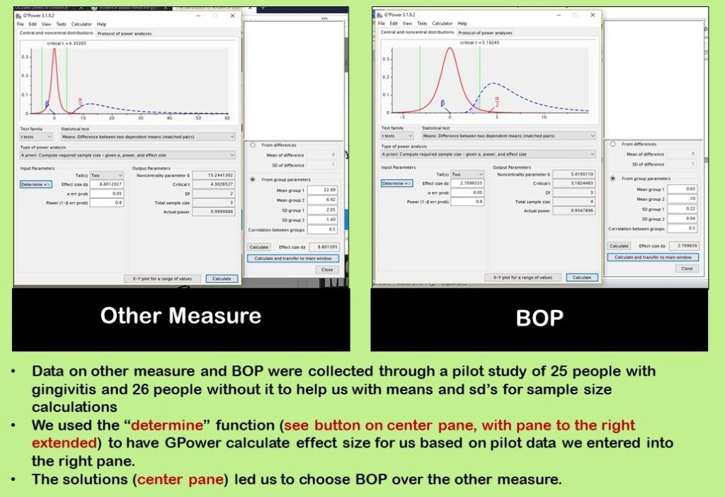
As you can see in our diagram, we used the “determine” function to calculate effect size. Effect size (“Effect size dz”) has to be included in the center pane because the calculation says “given α, power, and effect size”. We already chose α = 0.05 and power = 0.80, so we needed effect size.
The “determine” button makes the right panel extend out. In the right panel, we entered data from our pilot study. We did a separate estimate for the other measure and for BOP as shown in the diagram. After entering data in the right panel, we clicked “calculate and transfer to main window” which is a button at the bottom of the right panel. This populated the “Effect size dz” field which was empty. Now, we could click “calculate” and get our estimate.
As you can see in our diagram, we looked at using BOP as well as the other measure. As a result of our pilot study and calculations, we chose to use BOP as the outcome, so we went on to calculate sample size for BOP.
Documenting Sample Size Estimates from GPower Case Example
For documentation (data curation files) on this project, I kept:
- A Word document, with notes and actual screen shots from GPower that documented which settings I used for my queries, and
- A spreadsheet with multiple tabs. I made an example for you to download here, and these screen shots below are taken from this example.
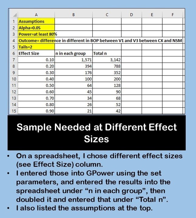
Since BOP is in a range from 0 to 1.0, I decided to start by calculating sample size for different effect sizes that could only range from 0 to 1.0. I assembled these effect sizes on a spreadsheet, along with the assumptions I was entering into GPower with my calculation, and filled in the spreadsheet.
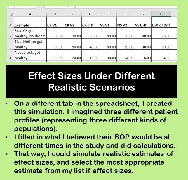
But then, I realized I didn’t have any realistic idea of what effect sizes could even be. So I decided to do a simulation on a different tab in the spreadsheet. In this first simulation, I made up three imaginary patient scenarios, and tried to simulate what their BOP would be (and change in BOP) from visit to visit.
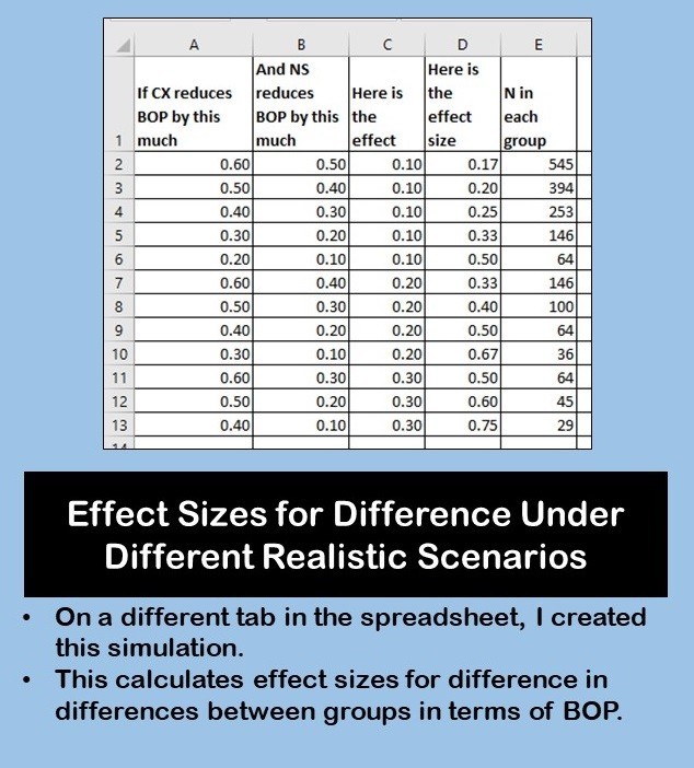
This gave me a more realistic idea of what to expect in real patients. I also wanted to calculate effect sizes for differences in BOP – again, another simulation. I did that on this spreadsheet tab shown here.

Interpretation – What Choice Should We Make?
In this GPower case example, we could look at the “n in each group” column from the first spreadsheet tab, and also consult the second simulation and look at “n in each group” column in that one. I believe I advised the PI that if she wanted to be safe, she’d get 50 in each group (total = 100). If you look at the bottom four scenarios in the second simulation, you’ll see 50 is more than or close to these estimates.
However, their clinic did not have that many gingivitis patients, so we thought it might take a long time to get that many. I figured if we lowered it to 30 in each group, we could collect data from those 30, then run the numbers and see what we got. If we felt we needed more sample, we could recruit more at that point. If NSM just didn’t work, we’d eventually be able to tell.
Monika’s General Rule of Clinical Power Calculations
As a general rule, there really should not be less than 30 people per group in a clinical study. No one can convince me that 10 or 12 or 14 people in a sample is scientific when it comes to healthcare studies. There is too much unmeasured confounding, bias, and measurement error. As my professor Dr. Yiliang Zhu at the University of South Florida put it to us students once,
“Do you really believe these 10 people adequately represent this whole population?”
I can probably force out a “yes” or a “maybe” if the number in that sentence is “30”, but I would not trust anything lower than that, personally.
What about you? Do you have any rules you follow when you have power calculations? Feel free to make a comment and share with all of us!
Updated November 13, 2023 – added video and banners.
Read all of our data science blog posts!

Confidence Intervals are for Estimating a Range for the True Population-level Measure
Confidence intervals (CIs) help you get a solid estimate for the true population measure. Read [...]
1 Comment
Jun

Continuous Variable? You Can Categorize it!
Continuous variable categorized can open up a world of possibilities for analysis. Read about it [...]
2 Comments
Jun

Delete if the Row Meets Criteria? Do it in SAS!
Delete if rows meet a certain criteria is a common approach to paring down a [...]
May


Chi-square Test: Insight from Using Microsoft Excel
Chi-square test is hard to grasp – but doing it in Microsoft Excel can give [...]
May

Identify Elements of Research in Scientific Literature
Identify elements in research reports, and you’ll be able to understand them much more easily. [...]
May

Design the Most Useful Time Periods for Your Conversions
Time periods are important when creating a time series visualization that actually speaks to you! [...]
Apr

Apply Weights? It’s Easy in R with the Survey Package!
Apply weights to get weighted proportions and counts! Read my blog post to learn how [...]
Nov

Make Categorical Variable Out of Continuous Variable
Make categorical variables by cutting up continuous ones. But where to put the boundaries? Get [...]
Nov

Remove Rows in R with the Subset Command
Remove rows by criteria is a common ETL operation – and my blog post shows [...]
Oct

CDC Wonder for Studying Vaccine Adverse Events: The Shameful State of US Open Government Data
CDC Wonder is an online query portal that serves as a gateway to many government [...]
Jun

AI Careers: Riding the Bubble
AI careers are not easy to navigate. Read my blog post for foolproof advice for [...]
Jun

Descriptive Analysis of Black Friday Death Count Database: Creative Classification
Descriptive analysis of Black Friday Death Count Database provides an example of how creative classification [...]
Nov

Classification Crosswalks: Strategies in Data Transformation
Classification crosswalks are easy to make, and can help you reduce cardinality in categorical variables, [...]
Nov

FAERS Data: Getting Creative with an Adverse Event Surveillance Dashboard
FAERS data are like any post-market surveillance pharmacy data – notoriously messy. But if you [...]
4 Comments
Nov

Dataset Source Documentation: Necessary for Data Science Projects with Multiple Data Sources
Dataset source documentation is good to keep when you are doing an analysis with data [...]
Nov

Joins in Base R: Alternative to SQL-like dplyr
Joins in base R must be executed properly or you will lose data. Read my [...]
Nov

NHANES Data: Pitfalls, Pranks, Possibilities, and Practical Advice
NHANES data piqued your interest? It’s not all sunshine and roses. Read my blog post [...]
Nov

Color in Visualizations: Using it to its Full Communicative Advantage
Color in visualizations of data curation and other data science documentation can be used to [...]
Oct

Defaults in PowerPoint: Setting Them Up for Data Visualizations
Defaults in PowerPoint are set up for slides – not data visualizations. Read my blog [...]
Oct

Text and Arrows in Dataviz Can Greatly Improve Understanding
Text and arrows in dataviz, if used wisely, can help your audience understand something very [...]
Oct

Shapes and Images in Dataviz: Making Choices for Optimal Communication
Shapes and images in dataviz, if chosen wisely, can greatly enhance the communicative value of [...]
Oct

Table Editing in R is Easy! Here Are a Few Tricks…
Table editing in R is easier than in SAS, because you can refer to columns, [...]
Aug

R for Logistic Regression: Example from Epidemiology and Biostatistics
R for logistic regression in health data analytics is a reasonable choice, if you know [...]
272 Comments
Aug

Connecting SAS to Other Applications: Different Strategies
Connecting SAS to other applications is often necessary, and there are many ways to do [...]
Jul

Portfolio Project Examples for Independent Data Science Projects
Portfolio project examples are sometimes needed for newbies in data science who are looking to [...]
Jul

Project Management Terminology for Public Health Data Scientists
Project management terminology is often used around epidemiologists, biostatisticians, and health data scientists, and it’s [...]
Jun

Rapid Application Development Public Health Style
“Rapid application development” (RAD) refers to an approach to designing and developing computer applications. In [...]
Jun

Understanding Legacy Data in a Relational World
Understanding legacy data is necessary if you want to analyze datasets that are extracted from [...]
Jun

Front-end Decisions Impact Back-end Data (and Your Data Science Experience!)
Front-end decisions are made when applications are designed. They are even made when you design [...]
Jun

Reducing Query Cost (and Making Better Use of Your Time)
Reducing query cost is especially important in SAS – but do you know how to [...]
Jun

Curated Datasets: Great for Data Science Portfolio Projects!
Curated datasets are useful to know about if you want to do a data science [...]
May

Statistics Trivia for Data Scientists
Statistics trivia for data scientists will refresh your memory from the courses you’ve taken – [...]
Apr

Management Tips for Data Scientists
Management tips for data scientists can be used by anyone – at work and in [...]
Mar

REDCap Mess: How it Got There, and How to Clean it Up
REDCap mess happens often in research shops, and it’s an analysis showstopper! Read my blog [...]
Mar

GitHub Beginners in Data Science: Here’s an Easy Way to Start!
GitHub beginners – even in data science – often feel intimidated when starting their GitHub [...]
Feb

ETL Pipeline Documentation: Here are my Tips and Tricks!
ETL pipeline documentation is great for team communication as well as data stewardship! Read my [...]
Feb

Benchmarking Runtime is Different in SAS Compared to Other Programs
Benchmarking runtime is different in SAS compared to other programs, where you have to request [...]
Dec

End-to-End AI Pipelines: Can Academics Be Taught How to Do Them?
End-to-end AI pipelines are being created routinely in industry, and one complaint is that academics [...]
Nov

Referring to Columns in R by Name Rather than Number has Pros and Cons
Referring to columns in R can be done using both number and field name syntax. [...]
Oct

The Paste Command in R is Great for Labels on Plots and Reports
The paste command in R is used to concatenate strings. You can leverage the paste [...]
Oct

Coloring Plots in R using Hexadecimal Codes Makes Them Fabulous!
Recoloring plots in R? Want to learn how to use an image to inspire R [...]
5 Comments
Oct

Adding Error Bars to ggplot2 Plots Can be Made Easy Through Dataframe Structure
Adding error bars to ggplot2 in R plots is easiest if you include the width [...]
Oct

AI on the Edge: What it is, and Data Storage Challenges it Poses
“AI on the edge” was a new term for me that I learned from Marc [...]
Jun

Pie Chart ggplot Style is Surprisingly Hard! Here’s How I Did it
Pie chart ggplot style is surprisingly hard to make, mainly because ggplot2 did not give [...]
5 Comments
Apr

Time Series Plots in R Using ggplot2 Are Ultimately Customizable
Time series plots in R are totally customizable using the ggplot2 package, and can come [...]
Apr

Data Curation Solution to Confusing Options in R Package UpSetR
Data curation solution that I posted recently with my blog post showing how to do [...]
Apr

Making Upset Plots with R Package UpSetR Helps Visualize Patterns of Attributes
Making upset plots with R package UpSetR is an easy way to visualize patterns of [...]
11 Comments
Apr

Making Box Plots Different Ways is Easy in R!
Making box plots in R affords you many different approaches and features. My blog post [...]
Mar

Convert CSV to RDS When Using R for Easier Data Handling
Convert CSV to RDS is what you want to do if you are working with [...]
Mar

GPower Case Example Shows How to Calculate and Document Sample Size
GPower case example shows a use-case where we needed to select an outcome measure for [...]
Feb

Querying the GHDx Database: Demonstration and Review of Application
Querying the GHDx database is challenging because of its difficult user interface, but mastering it [...]
Feb

Variable Names in SAS and R Have Different Restrictions and Rules
Variable names in SAS and R are subject to different “rules and regulations”, and these [...]
Feb

Referring to Variables in Processing Data is Different in SAS Compared to R
Referring to variables in processing is different conceptually when thinking about SAS compared to R. [...]
Jan

Counting Rows in SAS and R Use Totally Different Strategies
Counting rows in SAS and R is approached differently, because the two programs process data [...]
Jan

Native Formats in SAS and R for Data Are Different: Here’s How!
Native formats in SAS and R of data objects have different qualities – and there [...]
Jan

SAS-R Integration Example: Transform in R, Analyze in SAS!
Looking for a SAS-R integration example that uses the best of both worlds? I show [...]
Dec

Dumbbell Plot for Comparison of Rated Items: Which is Rated More Highly – Harvard or the U of MN?
Want to compare multiple rankings on two competing items – like hotels, restaurants, or colleges? [...]
2 Comments
Sep

Data for Meta-analysis Need to be Prepared a Certain Way – Here’s How
Getting data for meta-analysis together can be challenging, so I walk you through the simple [...]
Jul

Sort Order, Formats, and Operators: A Tour of The SAS Documentation Page
Get to know three of my favorite SAS documentation pages: the one with sort order, [...]
Nov

Confused when Downloading BRFSS Data? Here is a Guide
I use the datasets from the Behavioral Risk Factor Surveillance Survey (BRFSS) to demonstrate in [...]
2 Comments
Oct

Doing Surveys? Try my R Likert Plot Data Hack!
I love the Likert package in R, and use it often to visualize data. The [...]
3 Comments
Oct

I Used the R Package EpiCurve to Make an Epidemiologic Curve. Here’s How It Turned Out.
With all this talk about “flattening the curve” of the coronavirus, I thought I would [...]
Mar

Which Independent Variables Belong in a Regression Equation? We Don’t All Agree, But Here’s What I Do.
During my failed attempt to get a PhD from the University of South Florida, my [...]
Aug
GPower case example shows a use-case where we needed to select an outcome measure for our study, then do a power calculation for sample size required under different outcome effect size scenarios. My blog post shows what I did, and how I documented/curated the results.