Descriptive analysis in statistics refers to an analysis that is not hypothesis-driven. There do not have to be any statistical tests in a descriptive analysis. If you think about making means and percentages – that’s what I mean. It’s usually the most basic thing we learn how to do in statistics.
A lot of people tell me that they are not good at inferential statistics – in fact, they do not even remember when they took it in college. Many people with doctoral-level degrees in a clinical field (such as nursing) do not remember their complex statistics classes from college. The good news is that you do not need to remember inferential statistics to do a good job on a data science portfolio project. You can do descriptive statistics and have a very compelling story to tell.
How to Make a Descriptive Analysis Interesting
You might think that it is pretty boring to take data with premade classifications in it – like year of event – and make percentages of those classifications. If you think that, you are correct – it is totally boring.
It can also be annoying. In a related blog post, I show you how I took a categorical variable that had 77 levels to begin with and reduced them down to 10. If I had kept them at 77, it would have been annoying. Those are too many classifications.
But sometimes, you don’t really have any classifications to go on. Then you have to get creative and add your own classifications to make the analysis interesting. I will demonstrate an example of this using the Black Friday Death Count database.

Black Friday Death Count Database
Just to clarify – in the United States (US), we have a holiday called Thanksgiving that always falls on a Thursday in November. The Friday after Thanksgiving – called Black Friday – is considered the first shopping day before Christmas, which is at the end of December.
The idea is that stores have huge sales on Black Friday. Back in the 1980s and 1990s, when I was young, people used to wake up early and stand in line before the stores opened on Black Friday in order to get the deals before they ran out. Also, people were known to physically fight over scarce merchandise – which is where the Black Friday Death Count database comes in.
I was going down the rabbit hole on YouTube listening to verbal essays about how Black Friday has changed over time (thanks to internet shopping) when I learned about this online database. It isn’t very big, and I don’t know how complete it is. It lists incidents that were reported in the news, and provides links to original articles.
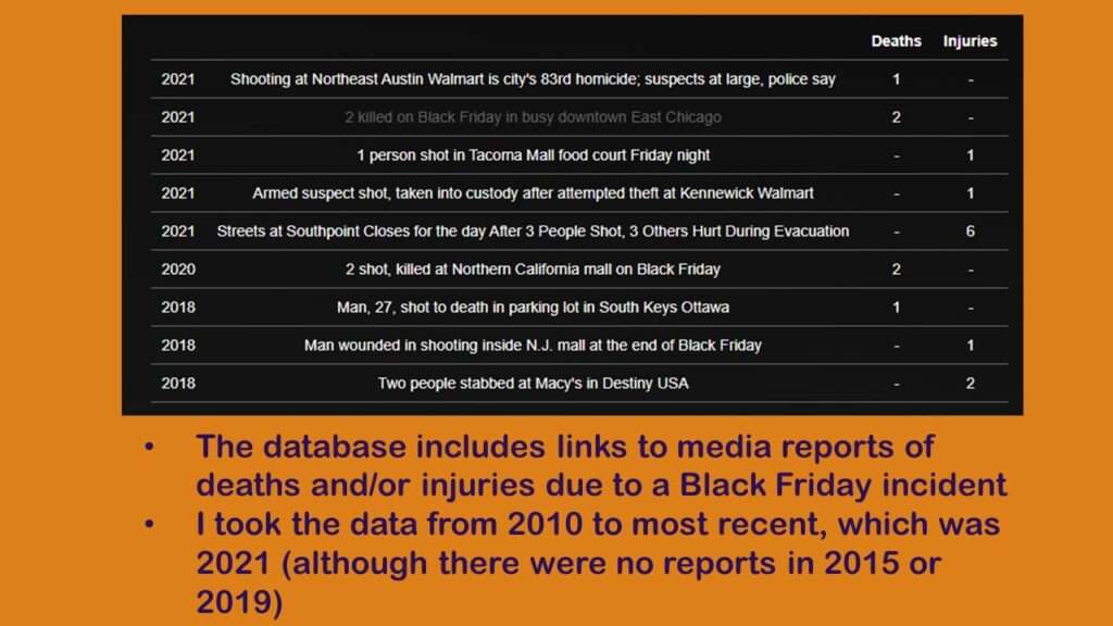
As you can see from the screen shot, the data are short and sweet. I only included reports from 2010 until the most recent report, which was 2021. I use the term “report” because some of the articles reported multiple incidents (including deaths and injuries). Also, it looks like even if there was more than one news outlet that reported it, the database just links to one news report. In total, my analysis was going to include 48 reports.
Data Processing
Using Word in a kludgy way, I copied the data from the web page onto a Microsoft Excel spreadsheet which you can download from GitHub here. I added a column called Order as a primary key (PK), and that’s what I used to count out all 48 reports. I kept the Year, Description, Deaths, and Injuries, and made sure if there were no deaths or injuries, the data said zero.
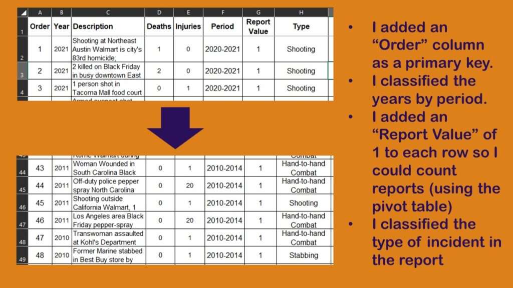
But as you can see, after looking at the years of the reports, I decided to make a grouping variable called Period. I categorized the reports into three periods: 2010-2014, 2016-2019, and 2020-2021 (the years I skipped were ones without reports). I also wanted to classify each report by type of primary incident (such as shooting, or a stampede, or people brawling over merchandise).
If you read my other blog post about classifying provider types, you’ll recognize my approach here. As I said in that other blog post, I like to use pivot tables in Excel to sum up categories. But in this example – unlike the other example – I do not have a column I want to add up in the native data (since I’m not interested in summing the deaths or the injuries). That’s why I added a column called Report Value and made it say 1 in every row. That is the column I will sum in the pivot table.
Conducting a Creative Descriptive Analysis
Here is where we will see the power of using classifications to kick up a descriptive analysis and make it interesting – even with a small (and possibly incomplete) dataset.
Let’s start by looking at a simple time series analysis by year.
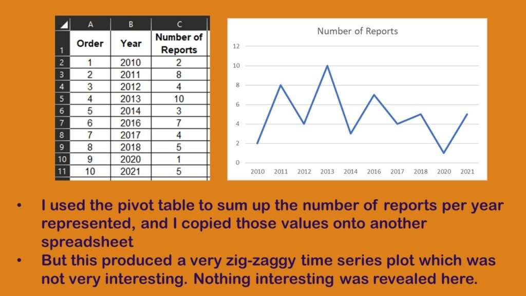
As you can see, the pivot table added everything up well, but the resulting plot looks like the zig zag on Charlie Brown’s shirt, which is not easy to interpret. Now, let’s look at the same data in a bar chart (that is technically a frequency histogram) with the new Period variable across the x-axis.
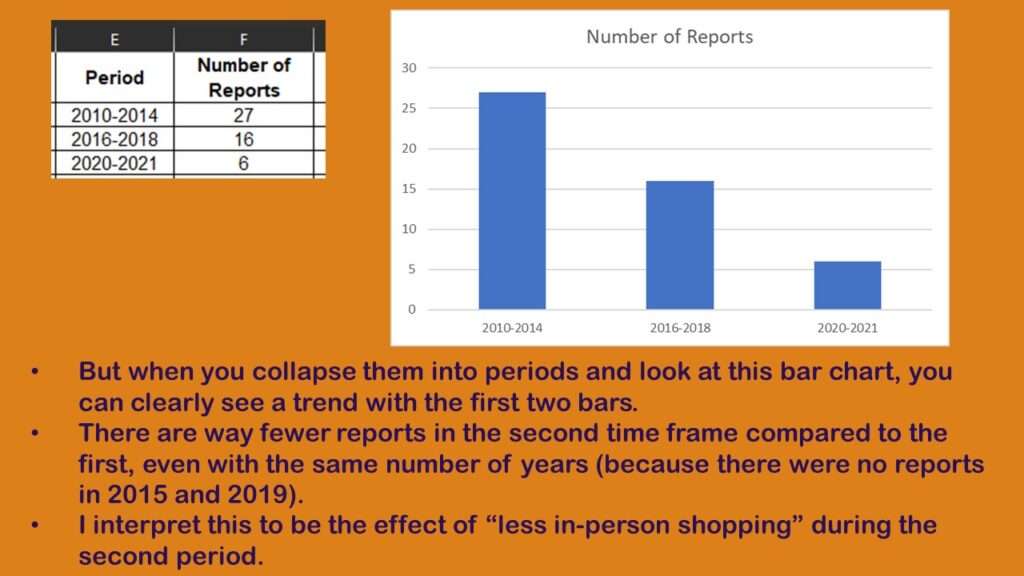
Admittedly, the third bar – containing just two years, 2020 and 2021 – is not very interesting, because you cannot really compare it fairly to either of the other two bars. But the first two are comparable, and reveal a downward trend. In four years, from 2010 through 2014, there were 27 reports, whereas there were almost half in the next time period, which had only 16 (noting that 2015 and 2019 had zero reports).
Why did it go down so drastically in the second period compared to the first? I think it is because this is a “numerator”, with the “denominator” is number of shoppers, and the denominator went down also. In other words, I don’t think people became less likely to kill or injure each other on Black Friday in the second period. Instead, I think there were a lot more people shopping online than in person in the second period, so therefore, the number of reports of people getting killed or injured went down as well.
Let’s next look at the distribution of the type of incidents described in the reports.
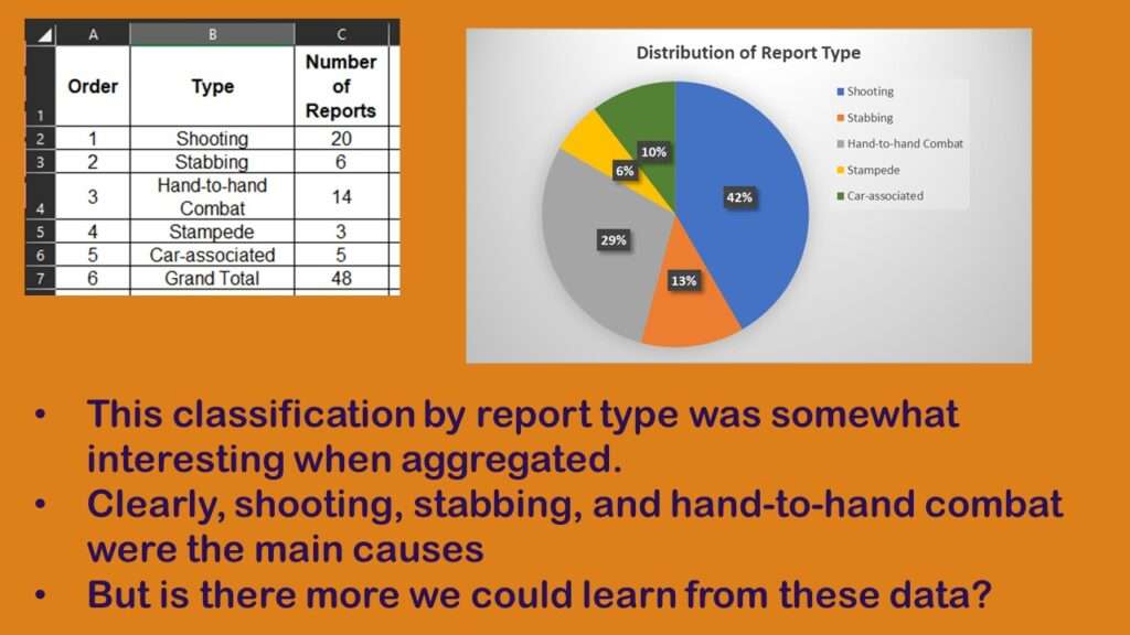
As you can see, I used the pivot table to sum up the number of reports by type, and I made a pie chart. Almost half the reports were of shootings, and the next two most popular types were stabbing and hand-to-hand combat. But is there more that we can learn from these data?
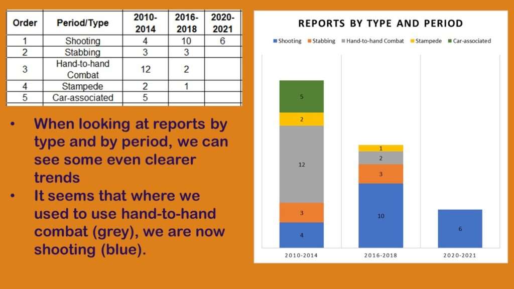
When I turned that earlier histogram into a stacked bar chart by type of report, I saw a pattern. As you can see, as we advance from the first to the third period, the hand-to-hand combat reports go down, and the shooting reports go up. This reflects a background effort in the US to implement policies that promote gun violence and reduce public safety.
So the bad news is that if you are involved in a Black Friday incident today in the US, the likelihood that you’ll be shot is pretty high. The good news is that because there are fewer shoppers out there on Black Friday, the likelihood you will be involved in an incident is much lower today.
Added video January 19, 2024. Updated banners May 8, 2025.
Read all of our data science blog posts!

Confidence Intervals are for Estimating a Range for the True Population-level Measure
Confidence intervals (CIs) help you get a solid estimate for the true population measure. Read [...]
1 Comment
Jun

Continuous Variable? You Can Categorize it!
Continuous variable categorized can open up a world of possibilities for analysis. Read about it [...]
2 Comments
Jun

Delete if the Row Meets Criteria? Do it in SAS!
Delete if rows meet a certain criteria is a common approach to paring down a [...]
May


Chi-square Test: Insight from Using Microsoft Excel
Chi-square test is hard to grasp – but doing it in Microsoft Excel can give [...]
May

Identify Elements of Research in Scientific Literature
Identify elements in research reports, and you’ll be able to understand them much more easily. [...]
May

Design the Most Useful Time Periods for Your Conversions
Time periods are important when creating a time series visualization that actually speaks to you! [...]
Apr

Apply Weights? It’s Easy in R with the Survey Package!
Apply weights to get weighted proportions and counts! Read my blog post to learn how [...]
Nov

Make Categorical Variable Out of Continuous Variable
Make categorical variables by cutting up continuous ones. But where to put the boundaries? Get [...]
Nov

Remove Rows in R with the Subset Command
Remove rows by criteria is a common ETL operation – and my blog post shows [...]
Oct

CDC Wonder for Studying Vaccine Adverse Events: The Shameful State of US Open Government Data
CDC Wonder is an online query portal that serves as a gateway to many government [...]
Jun

AI Careers: Riding the Bubble
AI careers are not easy to navigate. Read my blog post for foolproof advice for [...]
Jun

Descriptive Analysis of Black Friday Death Count Database: Creative Classification
Descriptive analysis of Black Friday Death Count Database provides an example of how creative classification [...]
Nov

Classification Crosswalks: Strategies in Data Transformation
Classification crosswalks are easy to make, and can help you reduce cardinality in categorical variables, [...]
Nov

FAERS Data: Getting Creative with an Adverse Event Surveillance Dashboard
FAERS data are like any post-market surveillance pharmacy data – notoriously messy. But if you [...]
4 Comments
Nov

Dataset Source Documentation: Necessary for Data Science Projects with Multiple Data Sources
Dataset source documentation is good to keep when you are doing an analysis with data [...]
Nov

Joins in Base R: Alternative to SQL-like dplyr
Joins in base R must be executed properly or you will lose data. Read my [...]
Nov

NHANES Data: Pitfalls, Pranks, Possibilities, and Practical Advice
NHANES data piqued your interest? It’s not all sunshine and roses. Read my blog post [...]
Nov

Color in Visualizations: Using it to its Full Communicative Advantage
Color in visualizations of data curation and other data science documentation can be used to [...]
Oct

Defaults in PowerPoint: Setting Them Up for Data Visualizations
Defaults in PowerPoint are set up for slides – not data visualizations. Read my blog [...]
Oct

Text and Arrows in Dataviz Can Greatly Improve Understanding
Text and arrows in dataviz, if used wisely, can help your audience understand something very [...]
Oct

Shapes and Images in Dataviz: Making Choices for Optimal Communication
Shapes and images in dataviz, if chosen wisely, can greatly enhance the communicative value of [...]
Oct

Table Editing in R is Easy! Here Are a Few Tricks…
Table editing in R is easier than in SAS, because you can refer to columns, [...]
Aug

R for Logistic Regression: Example from Epidemiology and Biostatistics
R for logistic regression in health data analytics is a reasonable choice, if you know [...]
272 Comments
Aug

Connecting SAS to Other Applications: Different Strategies
Connecting SAS to other applications is often necessary, and there are many ways to do [...]
Jul

Portfolio Project Examples for Independent Data Science Projects
Portfolio project examples are sometimes needed for newbies in data science who are looking to [...]
Jul

Project Management Terminology for Public Health Data Scientists
Project management terminology is often used around epidemiologists, biostatisticians, and health data scientists, and it’s [...]
Jun

Rapid Application Development Public Health Style
“Rapid application development” (RAD) refers to an approach to designing and developing computer applications. In [...]
Jun

Understanding Legacy Data in a Relational World
Understanding legacy data is necessary if you want to analyze datasets that are extracted from [...]
Jun

Front-end Decisions Impact Back-end Data (and Your Data Science Experience!)
Front-end decisions are made when applications are designed. They are even made when you design [...]
Jun

Reducing Query Cost (and Making Better Use of Your Time)
Reducing query cost is especially important in SAS – but do you know how to [...]
Jun

Curated Datasets: Great for Data Science Portfolio Projects!
Curated datasets are useful to know about if you want to do a data science [...]
May

Statistics Trivia for Data Scientists
Statistics trivia for data scientists will refresh your memory from the courses you’ve taken – [...]
Apr

Management Tips for Data Scientists
Management tips for data scientists can be used by anyone – at work and in [...]
Mar

REDCap Mess: How it Got There, and How to Clean it Up
REDCap mess happens often in research shops, and it’s an analysis showstopper! Read my blog [...]
Mar

GitHub Beginners in Data Science: Here’s an Easy Way to Start!
GitHub beginners – even in data science – often feel intimidated when starting their GitHub [...]
Feb

ETL Pipeline Documentation: Here are my Tips and Tricks!
ETL pipeline documentation is great for team communication as well as data stewardship! Read my [...]
Feb

Benchmarking Runtime is Different in SAS Compared to Other Programs
Benchmarking runtime is different in SAS compared to other programs, where you have to request [...]
Dec

End-to-End AI Pipelines: Can Academics Be Taught How to Do Them?
End-to-end AI pipelines are being created routinely in industry, and one complaint is that academics [...]
Nov

Referring to Columns in R by Name Rather than Number has Pros and Cons
Referring to columns in R can be done using both number and field name syntax. [...]
Oct

The Paste Command in R is Great for Labels on Plots and Reports
The paste command in R is used to concatenate strings. You can leverage the paste [...]
Oct

Coloring Plots in R using Hexadecimal Codes Makes Them Fabulous!
Recoloring plots in R? Want to learn how to use an image to inspire R [...]
5 Comments
Oct

Adding Error Bars to ggplot2 Plots Can be Made Easy Through Dataframe Structure
Adding error bars to ggplot2 in R plots is easiest if you include the width [...]
Oct

AI on the Edge: What it is, and Data Storage Challenges it Poses
“AI on the edge” was a new term for me that I learned from Marc [...]
Jun

Pie Chart ggplot Style is Surprisingly Hard! Here’s How I Did it
Pie chart ggplot style is surprisingly hard to make, mainly because ggplot2 did not give [...]
5 Comments
Apr

Time Series Plots in R Using ggplot2 Are Ultimately Customizable
Time series plots in R are totally customizable using the ggplot2 package, and can come [...]
Apr

Data Curation Solution to Confusing Options in R Package UpSetR
Data curation solution that I posted recently with my blog post showing how to do [...]
Apr

Making Upset Plots with R Package UpSetR Helps Visualize Patterns of Attributes
Making upset plots with R package UpSetR is an easy way to visualize patterns of [...]
11 Comments
Apr

Making Box Plots Different Ways is Easy in R!
Making box plots in R affords you many different approaches and features. My blog post [...]
Mar

Convert CSV to RDS When Using R for Easier Data Handling
Convert CSV to RDS is what you want to do if you are working with [...]
Mar

GPower Case Example Shows How to Calculate and Document Sample Size
GPower case example shows a use-case where we needed to select an outcome measure for [...]
Feb

Querying the GHDx Database: Demonstration and Review of Application
Querying the GHDx database is challenging because of its difficult user interface, but mastering it [...]
Feb

Variable Names in SAS and R Have Different Restrictions and Rules
Variable names in SAS and R are subject to different “rules and regulations”, and these [...]
Feb

Referring to Variables in Processing Data is Different in SAS Compared to R
Referring to variables in processing is different conceptually when thinking about SAS compared to R. [...]
Jan

Counting Rows in SAS and R Use Totally Different Strategies
Counting rows in SAS and R is approached differently, because the two programs process data [...]
Jan

Native Formats in SAS and R for Data Are Different: Here’s How!
Native formats in SAS and R of data objects have different qualities – and there [...]
Jan

SAS-R Integration Example: Transform in R, Analyze in SAS!
Looking for a SAS-R integration example that uses the best of both worlds? I show [...]
Dec

Dumbbell Plot for Comparison of Rated Items: Which is Rated More Highly – Harvard or the U of MN?
Want to compare multiple rankings on two competing items – like hotels, restaurants, or colleges? [...]
2 Comments
Sep

Data for Meta-analysis Need to be Prepared a Certain Way – Here’s How
Getting data for meta-analysis together can be challenging, so I walk you through the simple [...]
Jul

Sort Order, Formats, and Operators: A Tour of The SAS Documentation Page
Get to know three of my favorite SAS documentation pages: the one with sort order, [...]
Nov

Confused when Downloading BRFSS Data? Here is a Guide
I use the datasets from the Behavioral Risk Factor Surveillance Survey (BRFSS) to demonstrate in [...]
2 Comments
Oct

Doing Surveys? Try my R Likert Plot Data Hack!
I love the Likert package in R, and use it often to visualize data. The [...]
3 Comments
Oct

I Used the R Package EpiCurve to Make an Epidemiologic Curve. Here’s How It Turned Out.
With all this talk about “flattening the curve” of the coronavirus, I thought I would [...]
Mar

Which Independent Variables Belong in a Regression Equation? We Don’t All Agree, But Here’s What I Do.
During my failed attempt to get a PhD from the University of South Florida, my [...]
Aug
Descriptive analysis of Black Friday Death Count Database provides an example of how creative classification can make a quick and easy data science portfolio project!