
NHANES data are from the National Health and Nutrition Examination Survey, which is an annual cross-sectional health survey done in the United States (US). NHANES data have some unique features, in that NHANES is an in-person survey that has been going on in the US since the late 1960s. Because the survey is in-person, the NHANES data include some very unique, hard-to-find measurements, like the results of examinations and laboratory tests.
But as you can probably tell by the headline, NHANES data have a lot of problems in terms of structure, and those issues can greatly impact your analysis. This blog post is to give you guidance if you are thinking about designing a project using NHANES data.
NHANES Data Typical Use Case
I will start by walking you through the documentation so you can shop around for variables in the NHANES data. To facilitate this, I’ll first present a scenario to follow through this blog post to help you understand how you can apply the NHANES documentation to your specific context.
A lot of the NHANES questionnaire questions are similar to the ones on the BRFSS, which I know pretty well, and I have had some experience with the NHANES oral health exam data. It is also well-documented that people in the US have a lack of access to oral health care.
Based on that, I imagined a scenario where we might be looking at respondents who did not spend their entire lives in the US. Instead, they immigrated to the US five, ten, twenty, or more years ago. If they had good oral healthcare in their home country, it may deteriorate when they get to the US. So we can see if we have markers of good or poor oral health in them as well. Since tobacco use greatly impacts oral health, we will need variables about this as well. This sets us up for a cross-sectional study of how time living in the US, oral health status, and tobacco use are all associated, with “time living in the US” as an independent variable, “oral health status” as a dependent variable, and “tobacco use” as a confounder.

NHANES Data Documentation: Better Than Nothing
What this subheading means is that for data documentation, NHANES give you some bare bones codebook info in a difficult, old-fashioned format, and from that, you are expected to somehow cobble together a project. This means you will definitely need to make your own documentation based on what you find using their documentation.
NHANES used to release their datasets annually, and there were almost 10,000 respondents in it each year. But since the pandemic, I noticed that they combined 2017 through 2020 together. There are no newer datasets available, as I have noticed the US government is getting out of the business of surveillance, because many of the questions from the BRFSS have been removed. However, the old datasets will follow the same structure as this large combined one, so we will plan our analysis based on that one.
Navigating the Online Documentation
Here is a link to the main page of online documentation for that dataset (shown in the graphic).
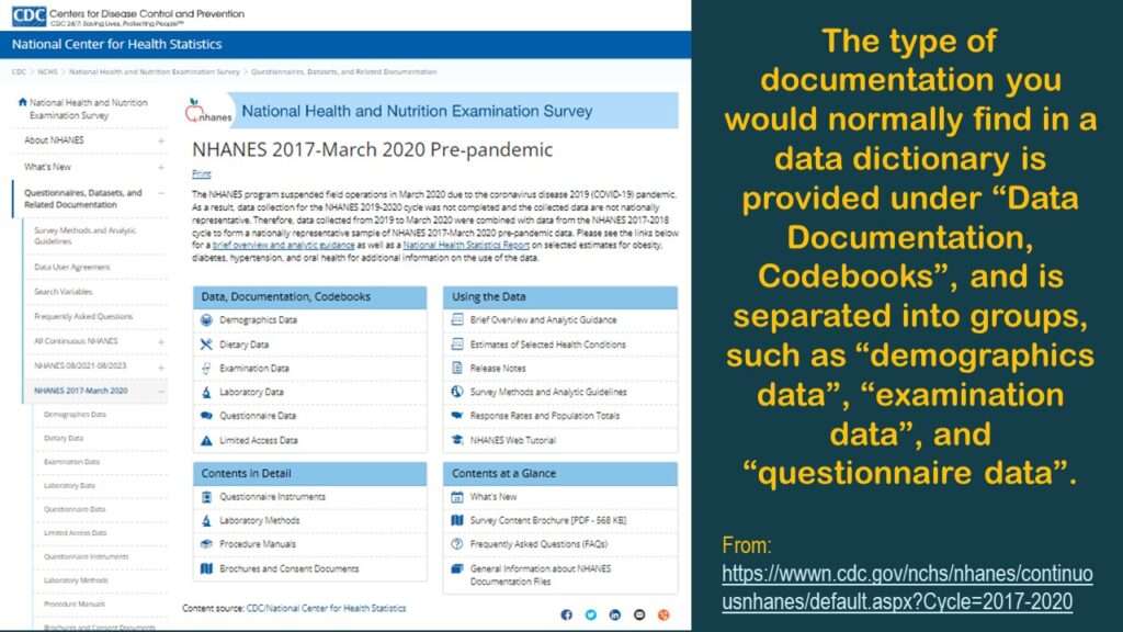
As you can see in the graphic, for each dataset, there are actually multiple datasets you have to piece together. Under “Data, Documentation, and Codebooks” on the left side of the graphic, there are multiple entries indicating different type of data: demographics, diet, exams, labs, and questionnaires. By contrast, BRFSS data – which is also from a cross-sectional surveillance effort – is served up in one table. So why do we have all these fragmented tables? This complexity is not necessary, but there it is.
Always Start with the Demographic Dataset
With NHANES, no matter what your research question is, you always want to start with the demographic dataset. If you click on “Demographics”, you will get to a page that provides you access to only one dataset – the demographic dataset. Consider this the denominator dataset. This has a list of every respondent who is represented in any of those other tables. So, if you theoretically wanted to assemble that big flat table BRFSS-style, you would need to use this demographics table as the left table in a left join, so to speak.
You will see from the graphic that there is a link to download the dataset in SAS XPT format, and there is a link to go to a documentation (“doc”) file.
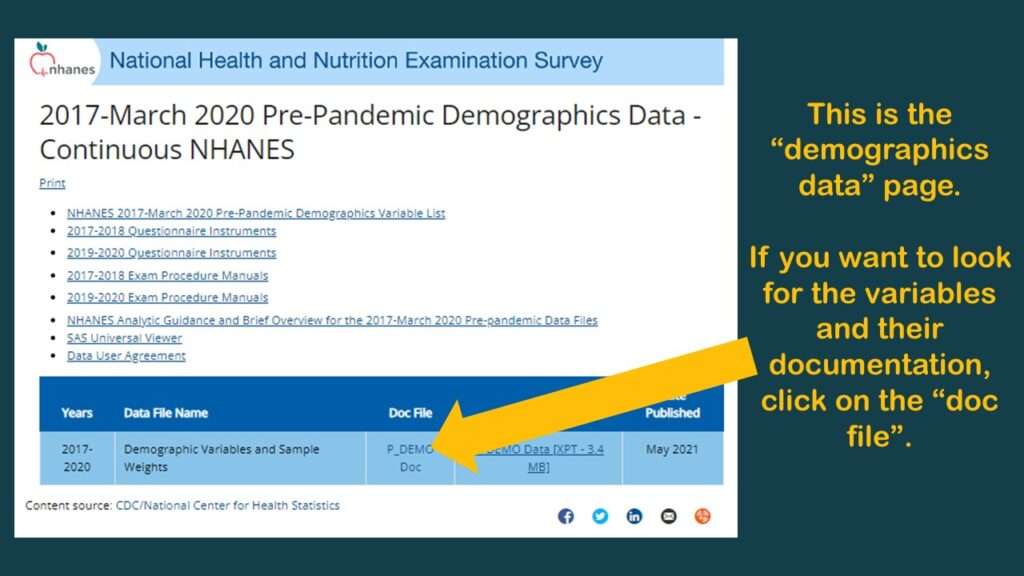
If you click on the “doc” link, it brings you to another page that is programmed in an old-fashioned way (early 2000s web navigation). As you can see in the graphic, it is basically a long web page with a pane on the right side with links that help you navigate along that page. It’s kind of like when we see a set of bookmarks on the left side of a PDF to help us navigate through a report – only this navigation pane is on the right.
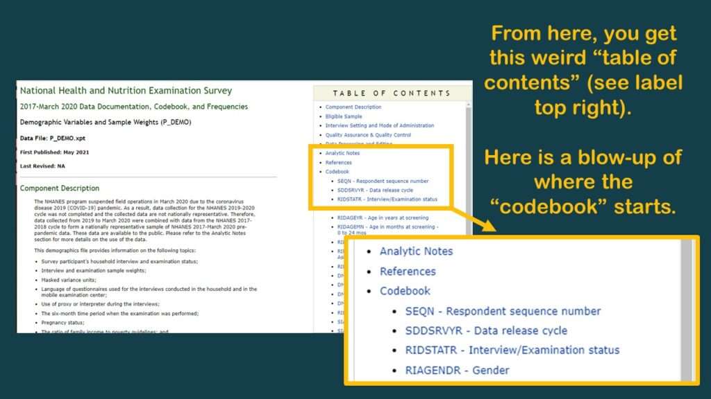
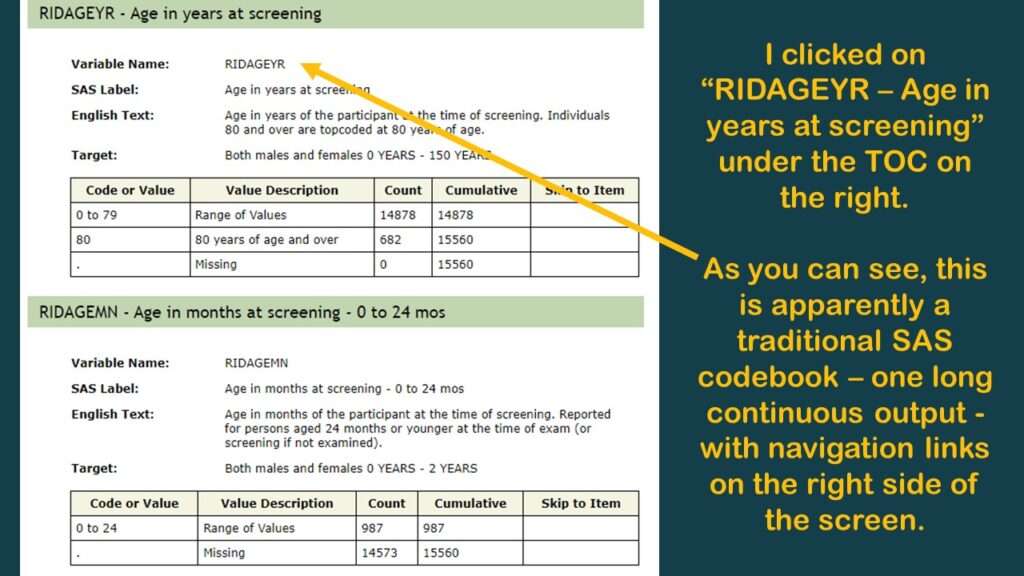
In the pane on the right, I immediately recognized my old friend RIDAGEYR, which is also the age variable from BRFSS. But as you can see by the documentation I put in the graphic, it really doesn’t tell you anything about what is in that variable. So, the documentation is like I said – better than nothing – and you are going to have to do your own investigations, and make your own documentation to support any decisions you make about the data.

In NHANES, SEQN is the Primary Key
The variable SEQN (unfortunate abbreviation for “sequence number”, numeric) is the primary key in this big theoretical table. You can also see the SEQN as the Study ID variable. So, you know what this means when we have fragmented, federated tables like we do in the NHANES dataset. It means we have to keep the SEQN in each extract we take so we can assemble the extracts together IKEA-style into a flat table later.
Shopping for Variables in the Demographic Dataset
Beyond SEQN and variables we call “the usual suspects” in epidemiology (age, gender, ethnicity, and so on), there aren’t many data points useful for analysis in the demographic dataset. However, I did find the variable DMDYRUSZ, which represents “length of time participant has been in the US”, which I put in a graphic.
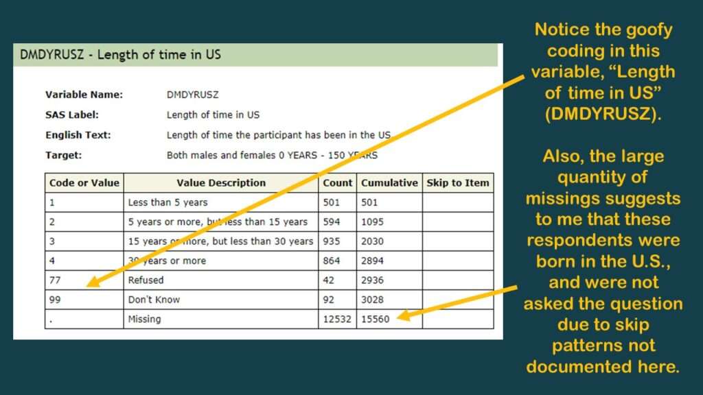
As you can tell in the graphic, there is a very high codebook count of missing, so I believe this was only asked of respondents not born in the US. I believe all the missings in this one could be coded as “all my life”, but of course, there is no documentation about skip patterns – at least, not in this online codebook. It’s better than nothing, but not much better than nothing.
Using the NHANES Documentation to Specify Data Extracts
I make a data dictionary in Microsoft Excel each time I do a project like this. It has multiple tabs, and I have a framework as to what I put on the tabs.
Starting the Data Dictionary
I typically have a tab called “main” which specifies the variables in the main table. I made a graphic of a screen shot of the top of this tab of the data dictionary for this project.
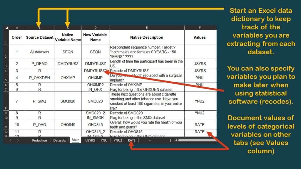
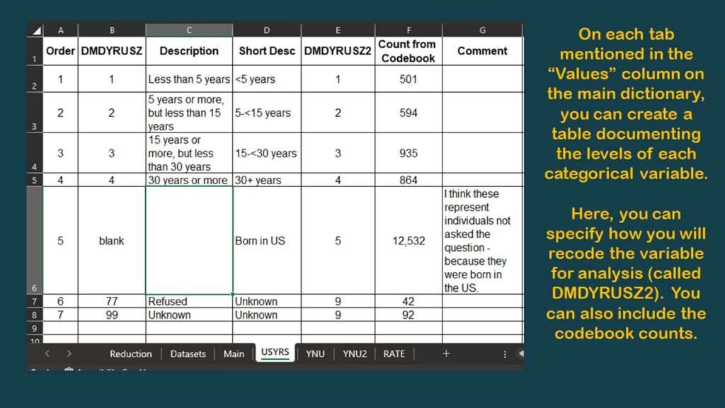
As you can see in the graphic, I have documented the source dataset and native variable names for SEQN, and for DMDYRUSZ, the two demographic variables we selected. Notice in the graphic that under the column labeled “Values”, for DMDYRUSZ, it says USYRS. That refers to a tab in the spreadsheet where the levels of that variable are documented. Basically, I transferred the documentation from the online NHANES codebook to this tab (see graphic).
Now, using this framework, as you shop for the other variables you need from other datasets in the NHANES documentation, you can keep track of your decisions as to what variables to keep and how to use them later in your data dictionary.
Finding and Documenting the Rest of the Variables
In our scenario, we were interested in oral health data, as we wanted to see if living in the US for a longer time was a risk factor for poor oral health. Since we have the “time in US” variable from the demographics dataset, we now need to look for our oral health variables.
Specifying Oral Health Variables
As you can see in the graphic of the dataset documentation on the web, under the “examination” category, there are actually two oral health datasets: Oral Health – Dentition, and Oral Health – Recommendation of Care.
I had a hazy memory of the trying to use a summary measure from the Oral Health – Dentition dataset before, such as “number of teeth”. Obviously, the fewer teeth you have lost, the better your oral health is, so I decided to go back and look for that variable.
Also, the World Health Organization defines the DMFT measurement as the “sum of the number of Decayed, Missing due to caries, and Filled Teeth in permanent teeth”. I admit I do not know what my personal DMFT is, but I’m sure the population-based DMFT is lower in the state I am living in compared to other states, because I know our oral healthcare access is better than other states.
“Number of teeth”, DMFT, and other summary measurements of oral health would be useful in an analysis looking at the association of “time in the US” with “oral health status”, so I went to look for them in the Oral Health – Dentition dataset.
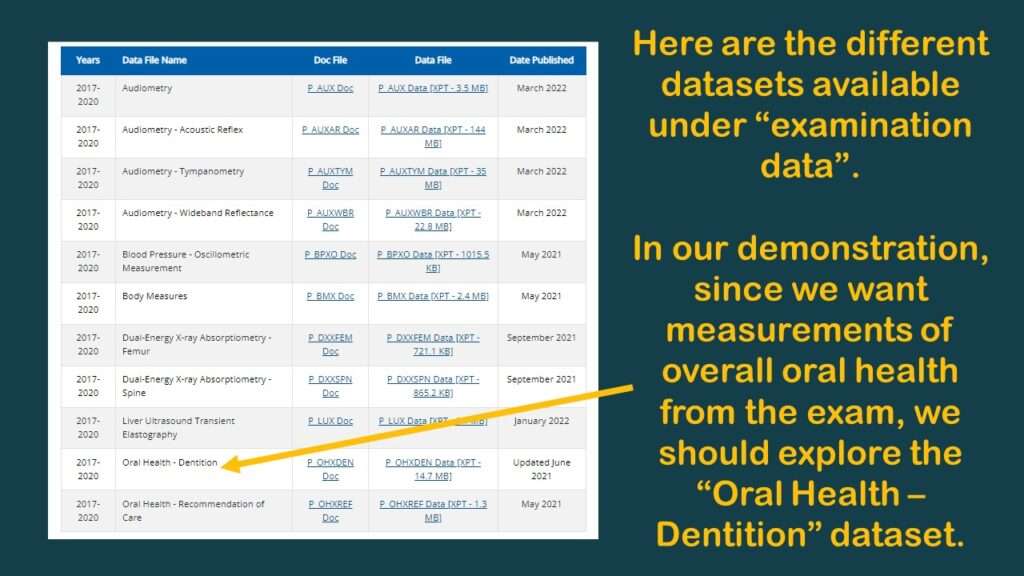
After I clicked on it, I had a flashback, which reminded me why my colleague and I had planned the study I was describing – with an overall oral health variable in it – but we never did it. That’s because there were no usable oral health variables that measure “overall” oral health in that dataset.
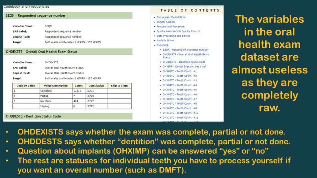
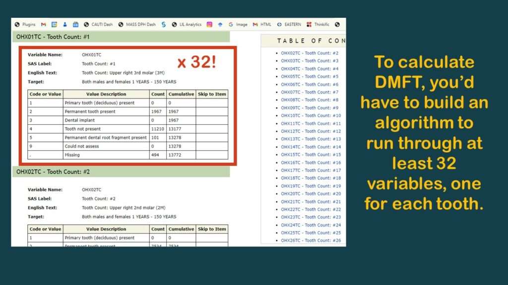
As you can see in the graphic, the few variables available are not very useful. As you can also probably see, the reason why there are no “overall” measurements like “number of teeth” or DMFT is because the analyst has to calculate them herself.
To make this demonstration, I found a simpler variable to use (although it is probably not very meaningful) – and that is OHXIMP, which is, “Do you have a tooth replaced with a surgical implant?”, with simple coding: 1 = Yes and 2 = No (and the rest missing). I documented the levels for this variable on the YNU (for “yes, no unknown”) tab in my data dictionary. Of course, those with implants have worse teeth than those without, so it is a very lame proxy measure for oral health. It’s not good epidemiology, but it’s good enough for a code demonstration.
NHANES Data: Pitfalls and Pranks
Remember the headline? This is what I mean by the “pitfalls and pranks” included in NHANES data. It’s basically a prank to serve up data in a completely raw context. It’s a way of ensuring absolutely no one will use them.
The only reason to invest the kind of time required into calculating DMFT is if you think you are going to get a very useful estimate at the end. But as you’ll see by the end of this blog post, this probably not a worthwhile endeavor due to other structural problems with the dataset that lead to what I feel is insurmountable bias.
Missing Data Across Datasets
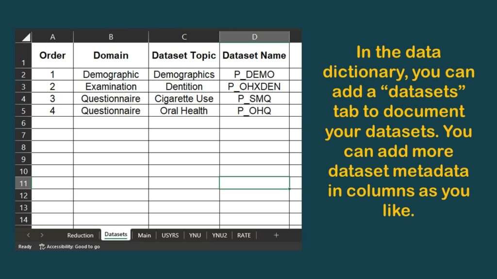
So, as you can imagine, if the datasets are all fragmented like this, it is hard to cobble together a dataset with values on the variables you need. Because in NHANES, you end up using a lot of different datasets, I keep documentation in my data dictionary on a tab.
If you look at the graphic of the examination dataset list earlier in this blog post, you might notice that there is a link to download each dataset. The datasets are in SAS XPT format, which I explain in my book “Mastering SAS Programming for Data Warehousing” and I cover in my LinkedIn Learning course on SAS.
Now we will get into some code, which you can download from GitHub if you are interested. If you use the foreign package in R, you can easily unpack these into datasets in the R environment. As you can see below, I import the demographic data into a dataset named demo_a and the oral health data into a dataset called dent_a.

library(foreign)
demo_a <- read.xport("P_DEMO.XPT")
dent_a <- read.xport("P_OHXDEN.XPT")
This imports all the variables, but we don’t want all the variables. In fact, we know we just one two variables from each dataset: SEQN, and DMDYRUSZ from the demographics, and OHXIMP from the dentition dataset. Here is the code I used:
keep_demo <- c("SEQN", "DMDYRUSZ")
keep_dent <- c("SEQN", "OHXIMP")

nrow(demo_a)
demo_b <- demo_a[keep_demo]
nrow(demo_b)
ncol(demo_b)
colnames(demo_b)

nrow(dent_a)
dent_b <- dent_a[keep_dent]
nrow(dent_b)
ncol(dent_b)
colnames(dent_b)
As you can see, I “cheat” by first creating vectors containing the list of variable names for variables I want to keep, and I name the vectors after the dataset to which they are referring (e.g., keep_dent). Then, I use the vector name in brackets to trim off the columns I don’t want. Using the keep_dent vector against the original dataset I imported and named dent_a, I create dent_b.
Basically, I would go through all the datasets I had to use, and as a first step, just trim off the variable I need in each dataset. This would be what I do before I merged the dataset to evaluate the level of loss of sample caused by adding more variables to my analysis.

Okay, now let’s do our first left join, with demo_b on the left. Sorry, I’m very clumsy with dplyr syntax, so I don’t use dplyr much. Alas, you’ll have to suffer with me using base R.
nrow(demo_b)
merged_a <- merge(demo_b, dent_b, by = c("SEQN"), all.x=TRUE)
nrow(merged_a)
colnames(merged_a)
So we use merge and all.x to left join dent_b onto demo_b and create merged_a. You will notice I checked the number of rows to ensure the left join worked, and it looks like it did.
> nrow(demo_b)
[1] 15560
> merged_a <- merge(demo_b, dent_b, by = c("SEQN"), all.x=TRUE) > nrow(merged_a)
[1] 15560
Notice that the demographic table says that the total universe of possible respondents is 15,560 in this dataset. But even though all of those records joined (because we forced them), we don’t know if the variable we wanted, which was OHXIMP this time, is any good. So, let’s run a one-way frequency on it and request that it include missings (which is NA in R).
Code:
table(merged_a$OHXIMP, useNA = c("always"))

Output:
   1    2
 358 9390 5812
As you can see, there were 358 people who said “Yes” to OHXIMP (they have an tooth implant), and there were 9,390 who said “No”. But we don’t know what the other 5,812 said – and we don’t know if the reason it is NA is because it was already set to missing in the dent_b dataset, or because it wasn’t in the dent_b dataset and is missing because a record failed to join.
This stupid coding relates back to the pitfalls and pranks I was talking about. None of these variables should be missing in the native datasets. There should be a code in every single categorical variable in BRFSS and NHANES, and that code should say the status of that variable. Is that variable really missing? Then fine – assign it a code – like 9, or 99, or really anything that is an actual code and not blank – and fill in the variable with that code before you serve up the data.
You might wonder why they never filled in these records with a code that means “missing” before they served up the data for download. The reason why the values are missing in the first place has to do with limitations on data storage that happened before many people reading this were born. These policies have not been revised, and so we still have this confusing native data. Basically, it’s bad governance.

Keeping Data That Are Not Missing
So to keep the records from merged_a that actually have a usable value imported from the dental dataset, I need to create a two-state flag which I call IN_OHX, where 1 means “keep this record”. I do this by setting IN_OHX to 1 where OHXIMP is coded either 1 or 2 (but basically not nothing).
Code:
table(merged_a$OHXIMP, merged_a$IN_OHX, useNA = c("always"))

Output:
          0    1   NA
  1       0  358    0
  2       0 9390    0
  NA   5812    0    0
Note: I removed the greater than and less than signs around the NAs in the output because they interfered with WordPress. You will have to use your imagination!
Okay, now let’s patch on our next variable, which is SMQ020 originating in the tobacco dataset. The question is, “Have you smoked at least 100 cigarettes in your entire life?” and the potential answers are documented on a tab in my data dictionary named YNU2 (because YNU had been used for OHXIMP). The valid values for SMQ020 according to the documentation are: 1 = Yes, 2 = No, 7 = Refused, 9 = Don’t Know, and missing.
I’m sure you can see the problem with this coding. Values 7, 9, and missing are all essentially the same as having no data on that variable. So when we make our flag, let’s plan to again include only the valid values 1 and 2, then see what data we have left.
So getting back to our data, imagine we have already prepared the smoking data as smok_b, and now, we use merged_a and left join smok_b onto it to create merged_b.
nrow(merged_a)
merged_b <- merge(merged_a, smok_b, by = c("SEQN"), all.x=TRUE)
nrow(merged_b)
Now, let’s see how this limited our data.
Code:
table(merged_b$SMQ020, useNA = c("always"))
Output:
1 2 7 9 NA
3889 5799 2 3 5867
As we predicted, values 7, 9, and NA indicate “no useful data from SMQ020”. So we will create the conservatively-programmed flag I described earlier as IN_SMOK to use as an indicator of usable data from the smoking dataset.
Code:
merged_b$IN_SMOK <- 0
merged_b$IN_SMOK[merged_b$SMQ020 %in% c(1:2)] <- 1
table(merged_b$SMQ020, merged_b$IN_SMOK, useNA = c("always"))
Output:
0 1 NA
1 0 3889 0
2 0 5799 0
7 2 0 0
9 3 0 0
NA 5867 0 0

NHANES Data: Evaluating Selection Bias
Well, I might be overstating the encouragement to evaluate selection bias, because you don’t really have anything to go on. But the fact that you are removing a lot of your dataset because we simply don’t have values on those variables, or we are missing records, strongly suggests that we are adding more and more selection bias as we add variables. Consider the following coding:
box_one <- merged_b
nrow(box_one)
box_two <- subset(box_one, IN_OHX == 1)
nrow(box_two)
box_three <- subset(box_two, IN_SMOK == 1)
nrow(box_three)
Now, you might have noticed a few graphics back that my data dictionary spreadsheet had a tab called “Reduction”. I will show you what is on that tab.
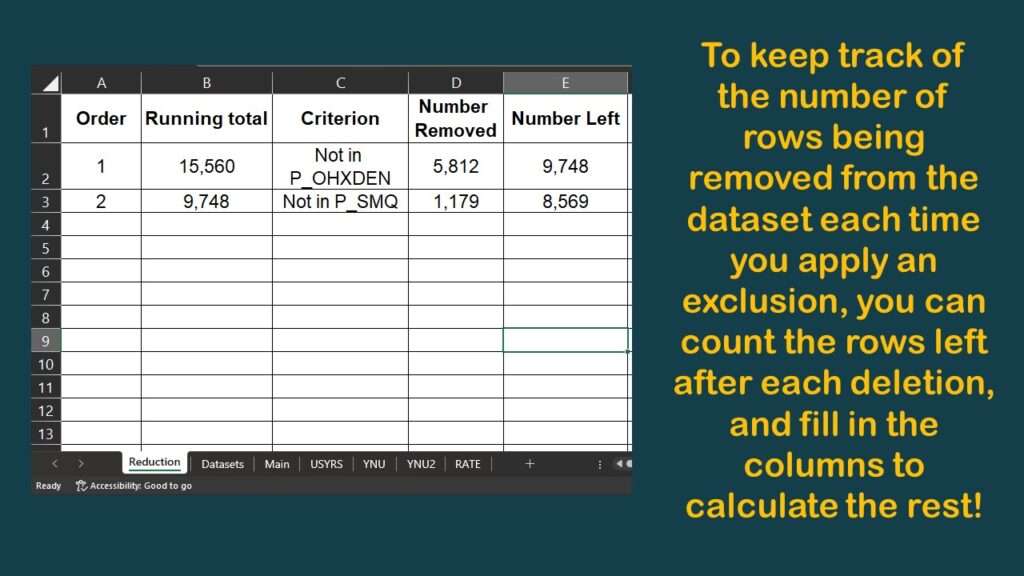
As you can see, I harvested the results from those nrow commands onto the spreadsheet, which allowed me to make this diagram.
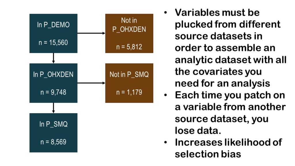
As you can see by the graphic, we have gone from an initial count of over 15,000 and cut it almost in half so far, with a running n = 8,569. The question is: If we add any more variables, will we have any more data left?
NHANES Data: Possibilities and Practical Advice
The NHANES data are not completely useless, so long as you do not have a very epidemiologic question. For example, some of the dietary data have been used to develop models, and I think a student interested in biology would be able to do a project with the laboratory data. I just feel uncomfortable making epidemiologic inferences from such a patchy dataset.
However – unfortunately – a lot of people don’t know epidemiology, but somehow, they are in a position to command students to use the NHANES dataset. That has happened to at least two of my customers. The project was long and involved, and the result was underwhelming.
But they both graduated! So as you can see, with NHANES data, there are possibilities. But my practical advice is to not hang your hat on them, and instead, sashay away.
Added video November 21, 2023.
Read all of our data science blog posts!

Confidence Intervals are for Estimating a Range for the True Population-level Measure
Confidence intervals (CIs) help you get a solid estimate for the true population measure. Read [...]
1 Comment
Jun

Continuous Variable? You Can Categorize it!
Continuous variable categorized can open up a world of possibilities for analysis. Read about it [...]
2 Comments
Jun

Delete if the Row Meets Criteria? Do it in SAS!
Delete if rows meet a certain criteria is a common approach to paring down a [...]
May


Chi-square Test: Insight from Using Microsoft Excel
Chi-square test is hard to grasp – but doing it in Microsoft Excel can give [...]
May

Identify Elements of Research in Scientific Literature
Identify elements in research reports, and you’ll be able to understand them much more easily. [...]
May

Design the Most Useful Time Periods for Your Conversions
Time periods are important when creating a time series visualization that actually speaks to you! [...]
Apr

Apply Weights? It’s Easy in R with the Survey Package!
Apply weights to get weighted proportions and counts! Read my blog post to learn how [...]
Nov

Make Categorical Variable Out of Continuous Variable
Make categorical variables by cutting up continuous ones. But where to put the boundaries? Get [...]
Nov

Remove Rows in R with the Subset Command
Remove rows by criteria is a common ETL operation – and my blog post shows [...]
Oct

CDC Wonder for Studying Vaccine Adverse Events: The Shameful State of US Open Government Data
CDC Wonder is an online query portal that serves as a gateway to many government [...]
Jun

AI Careers: Riding the Bubble
AI careers are not easy to navigate. Read my blog post for foolproof advice for [...]
Jun

Descriptive Analysis of Black Friday Death Count Database: Creative Classification
Descriptive analysis of Black Friday Death Count Database provides an example of how creative classification [...]
Nov

Classification Crosswalks: Strategies in Data Transformation
Classification crosswalks are easy to make, and can help you reduce cardinality in categorical variables, [...]
Nov

FAERS Data: Getting Creative with an Adverse Event Surveillance Dashboard
FAERS data are like any post-market surveillance pharmacy data – notoriously messy. But if you [...]
4 Comments
Nov

Dataset Source Documentation: Necessary for Data Science Projects with Multiple Data Sources
Dataset source documentation is good to keep when you are doing an analysis with data [...]
Nov

Joins in Base R: Alternative to SQL-like dplyr
Joins in base R must be executed properly or you will lose data. Read my [...]
Nov

NHANES Data: Pitfalls, Pranks, Possibilities, and Practical Advice
NHANES data piqued your interest? It’s not all sunshine and roses. Read my blog post [...]
Nov

Color in Visualizations: Using it to its Full Communicative Advantage
Color in visualizations of data curation and other data science documentation can be used to [...]
Oct

Defaults in PowerPoint: Setting Them Up for Data Visualizations
Defaults in PowerPoint are set up for slides – not data visualizations. Read my blog [...]
Oct

Text and Arrows in Dataviz Can Greatly Improve Understanding
Text and arrows in dataviz, if used wisely, can help your audience understand something very [...]
Oct

Shapes and Images in Dataviz: Making Choices for Optimal Communication
Shapes and images in dataviz, if chosen wisely, can greatly enhance the communicative value of [...]
Oct

Table Editing in R is Easy! Here Are a Few Tricks…
Table editing in R is easier than in SAS, because you can refer to columns, [...]
Aug

R for Logistic Regression: Example from Epidemiology and Biostatistics
R for logistic regression in health data analytics is a reasonable choice, if you know [...]
272 Comments
Aug

Connecting SAS to Other Applications: Different Strategies
Connecting SAS to other applications is often necessary, and there are many ways to do [...]
Jul

Portfolio Project Examples for Independent Data Science Projects
Portfolio project examples are sometimes needed for newbies in data science who are looking to [...]
Jul

Project Management Terminology for Public Health Data Scientists
Project management terminology is often used around epidemiologists, biostatisticians, and health data scientists, and it’s [...]
Jun

Rapid Application Development Public Health Style
“Rapid application development” (RAD) refers to an approach to designing and developing computer applications. In [...]
Jun

Understanding Legacy Data in a Relational World
Understanding legacy data is necessary if you want to analyze datasets that are extracted from [...]
Jun

Front-end Decisions Impact Back-end Data (and Your Data Science Experience!)
Front-end decisions are made when applications are designed. They are even made when you design [...]
Jun

Reducing Query Cost (and Making Better Use of Your Time)
Reducing query cost is especially important in SAS – but do you know how to [...]
Jun

Curated Datasets: Great for Data Science Portfolio Projects!
Curated datasets are useful to know about if you want to do a data science [...]
May

Statistics Trivia for Data Scientists
Statistics trivia for data scientists will refresh your memory from the courses you’ve taken – [...]
Apr

Management Tips for Data Scientists
Management tips for data scientists can be used by anyone – at work and in [...]
Mar

REDCap Mess: How it Got There, and How to Clean it Up
REDCap mess happens often in research shops, and it’s an analysis showstopper! Read my blog [...]
Mar

GitHub Beginners in Data Science: Here’s an Easy Way to Start!
GitHub beginners – even in data science – often feel intimidated when starting their GitHub [...]
Feb

ETL Pipeline Documentation: Here are my Tips and Tricks!
ETL pipeline documentation is great for team communication as well as data stewardship! Read my [...]
Feb

Benchmarking Runtime is Different in SAS Compared to Other Programs
Benchmarking runtime is different in SAS compared to other programs, where you have to request [...]
Dec

End-to-End AI Pipelines: Can Academics Be Taught How to Do Them?
End-to-end AI pipelines are being created routinely in industry, and one complaint is that academics [...]
Nov

Referring to Columns in R by Name Rather than Number has Pros and Cons
Referring to columns in R can be done using both number and field name syntax. [...]
Oct

The Paste Command in R is Great for Labels on Plots and Reports
The paste command in R is used to concatenate strings. You can leverage the paste [...]
Oct

Coloring Plots in R using Hexadecimal Codes Makes Them Fabulous!
Recoloring plots in R? Want to learn how to use an image to inspire R [...]
5 Comments
Oct

Adding Error Bars to ggplot2 Plots Can be Made Easy Through Dataframe Structure
Adding error bars to ggplot2 in R plots is easiest if you include the width [...]
Oct

AI on the Edge: What it is, and Data Storage Challenges it Poses
“AI on the edge” was a new term for me that I learned from Marc [...]
Jun

Pie Chart ggplot Style is Surprisingly Hard! Here’s How I Did it
Pie chart ggplot style is surprisingly hard to make, mainly because ggplot2 did not give [...]
5 Comments
Apr

Time Series Plots in R Using ggplot2 Are Ultimately Customizable
Time series plots in R are totally customizable using the ggplot2 package, and can come [...]
Apr

Data Curation Solution to Confusing Options in R Package UpSetR
Data curation solution that I posted recently with my blog post showing how to do [...]
Apr

Making Upset Plots with R Package UpSetR Helps Visualize Patterns of Attributes
Making upset plots with R package UpSetR is an easy way to visualize patterns of [...]
11 Comments
Apr

Making Box Plots Different Ways is Easy in R!
Making box plots in R affords you many different approaches and features. My blog post [...]
Mar

Convert CSV to RDS When Using R for Easier Data Handling
Convert CSV to RDS is what you want to do if you are working with [...]
Mar

GPower Case Example Shows How to Calculate and Document Sample Size
GPower case example shows a use-case where we needed to select an outcome measure for [...]
Feb

Querying the GHDx Database: Demonstration and Review of Application
Querying the GHDx database is challenging because of its difficult user interface, but mastering it [...]
Feb

Variable Names in SAS and R Have Different Restrictions and Rules
Variable names in SAS and R are subject to different “rules and regulations”, and these [...]
Feb

Referring to Variables in Processing Data is Different in SAS Compared to R
Referring to variables in processing is different conceptually when thinking about SAS compared to R. [...]
Jan

Counting Rows in SAS and R Use Totally Different Strategies
Counting rows in SAS and R is approached differently, because the two programs process data [...]
Jan

Native Formats in SAS and R for Data Are Different: Here’s How!
Native formats in SAS and R of data objects have different qualities – and there [...]
Jan

SAS-R Integration Example: Transform in R, Analyze in SAS!
Looking for a SAS-R integration example that uses the best of both worlds? I show [...]
Dec

Dumbbell Plot for Comparison of Rated Items: Which is Rated More Highly – Harvard or the U of MN?
Want to compare multiple rankings on two competing items – like hotels, restaurants, or colleges? [...]
2 Comments
Sep

Data for Meta-analysis Need to be Prepared a Certain Way – Here’s How
Getting data for meta-analysis together can be challenging, so I walk you through the simple [...]
Jul

Sort Order, Formats, and Operators: A Tour of The SAS Documentation Page
Get to know three of my favorite SAS documentation pages: the one with sort order, [...]
Nov

Confused when Downloading BRFSS Data? Here is a Guide
I use the datasets from the Behavioral Risk Factor Surveillance Survey (BRFSS) to demonstrate in [...]
2 Comments
Oct

Doing Surveys? Try my R Likert Plot Data Hack!
I love the Likert package in R, and use it often to visualize data. The [...]
3 Comments
Oct

I Used the R Package EpiCurve to Make an Epidemiologic Curve. Here’s How It Turned Out.
With all this talk about “flattening the curve” of the coronavirus, I thought I would [...]
Mar

Which Independent Variables Belong in a Regression Equation? We Don’t All Agree, But Here’s What I Do.
During my failed attempt to get a PhD from the University of South Florida, my [...]
Aug
NHANES data piqued your interest? It’s not all sunshine and roses. Read my blog post to see the pitfalls of NHANES data, and get practical advice about using them in a project.