
Time series plots are required often, so if you do a lot of data analytics, you will find yourself making them often. I wanted to provide you two use-cases of time series plots I have made using the famous R visualization package ggplot2. I wanted to illustrate two concepts.
- If you format your dataframe properly, it is very easy to get the basic plot to run. That’s both a blessing and a challenge with ggplot2 code, but after you make a few plots, you can get used to it.
- Once you get your basic plot, you will likely find yourself staying up all night customizing your plot. It’s actually totally awesome that ggplot2 allows for such customization, but it does mean you will dump a lot of time into formatting your time series plots just right.
When you prepare to stay up all night customizing your plot, you will probably have fun when it comes to some of the modifications – choosing colors, and fussing with certain labels. But sometimes you run into challenges – usually with formatting axes or legends – that will ruin your night. I wanted to give you these two examples, because maybe my experience will help you troubleshoot whatever issue you are encountering in your ggplot2 time series plots.
Time Series Plots: Mentions in the Literature over Time
Our first plot showcased today is from an article by my colleague Dr. Audrey Pereira and myself, titled “Deeper Learning Methods and Modalities in Higher Education: A 20-year Review”. This was actually a project Dr. Pereira did, where she collected all the data herself, and she came to me for advice on visualizations. She was studying deeper learning (abbreviated DL on the plots), which is an approach to teaching in higher education.
Dr. Pereira and I both teach mostly online, but we used to teach face-to-face. Therefore, we were both intrigued by the relative lack of research into deeper learning methods for online modalities. We have been working on education studies together since about 2015, and we had noticed anecdotally that there was little in the literature about evidence-based ways to teach online.
After working with the data Dr. Pereira had collected, I proposed the following visualization:
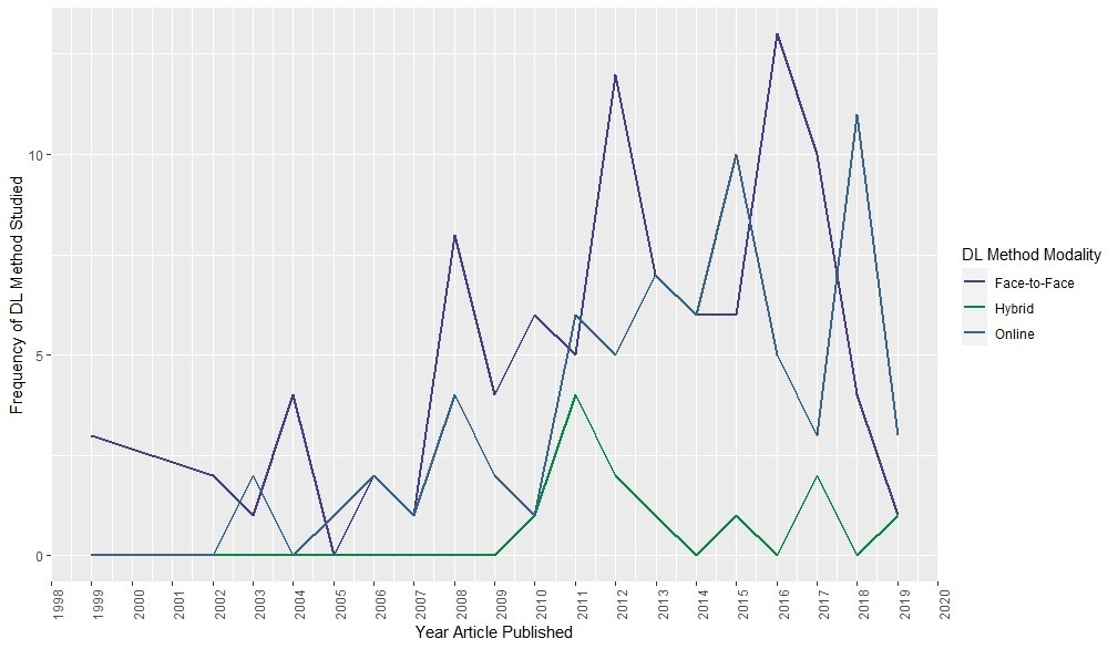

This chart was helpful for us to see if our anecdotal observation had any evidence behind it. Dr. Pereira’s data, when analyzed this way, seemed to validate our anecdotal observation. Even in recent years, there are more articles about face-to-face and hybrid than online deeper learning modalities.
The chart is clean, but includes many lines of code. It starts with a dataset I constructed just for plotting, which I put here for you. I always have trouble visualizing how to set up the plot dataframe in ggplot2, because this is something you usually don’t have to do in SAS, and that’s the first statistics program I learned. The dataframe really needs to be in an entity-attribute-value (EAV) format that ggplot2 uses when plotting.
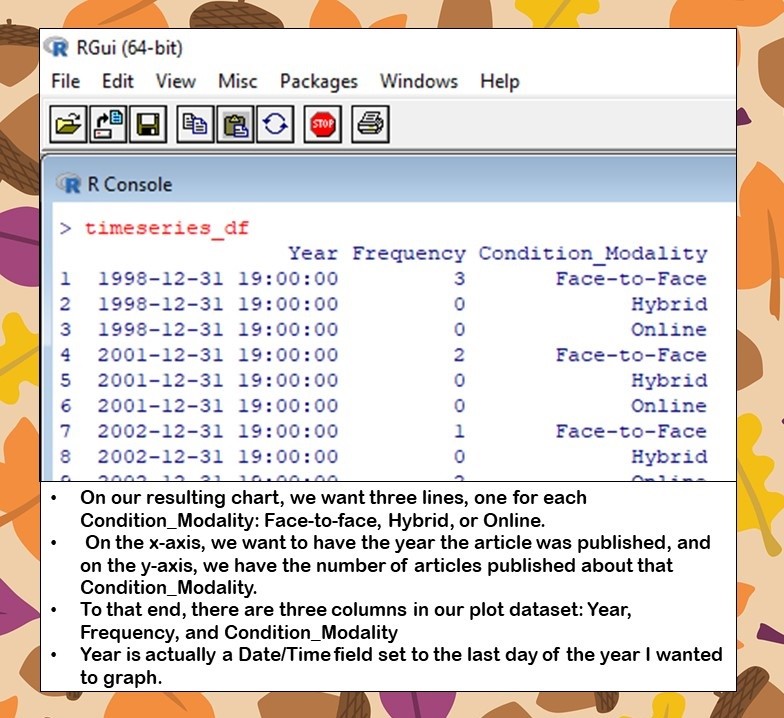
To that end, our dataframe has three columns: Year, Frequency, and Condition_Modality.
- Year actually is a Date/Time field set to the last day of the year I wanted to graph. You will see I had to fight with this field to get it to show up as a year on the x-axis.
- Frequency is the value I wanted to graph on the y-axis.
- Condition_Modality is a categorical variable that could take on one of three values: Face-to-face, Hybrid, or Online. The idea was to graph this variable, and produce three lines over time to compare the frequency of articles published about face-to-face, hybrid, and online deeper learning studies in higher education.
Now let’s start going through the code. I already have posted it here on Github – it is among other code, so just look at the code for the time series plot without error bars. You will see it starts with this:

timeseries_df <- readRDS("timeseries_df.rds")
library(ggplot2)
library(scales)
library(dplyr)
The name of the dataframe as I showed above is timeseries_df, and not only do we need the ggplot2 package, but we also need the scales package to deal with getting the year to display properly on the x-axis. We also need the dplyr package, and I’m not remembering why right now – I think the scales package uses it….?
Next, we have to be sure to set the colors for the lines in a vector, as I recommend when plotting with ggplot2.
line_colors <- c("slateblue4", "springgreen4", "steelblue4")
As you could see by our dataframe printout, we have three levels of Condition_Modality, so we will have three lines. Therefore, I needed to specify three colors. For guidance in selecting these colors, I looked at a printout of mapped R colors that I found on the web.
You will find that those who did the mapping used numbers to indicate where in a value gradation the hue was – as you can see above, I used four colors from the “4” level of gradation of slateblue, springgreen, and steelblue. I’ve found that sticking with the same number of level of gradation for each color is a quick way to select a group of compatible colors for a plot from an R mapping like this.
Finally, we have the ggplot code:
ggplot(timeseries_df, aes(x = Year, y = Frequency)) +
	geom_line(aes(color = Condition_Modality), size = 1) +
	scale_color_manual(values = line_colors) +
	labs(color="DL Method Modality") +
	ylab("Frequency of DL Method Studied") +
	xlab("Year Article Published") +
	scale_x_datetime(date_breaks = "1 year", labels = date_format("%Y")) +
	theme(axis.text.x = element_text(angle=90))

I will curate here some lines of code that I feel warrant further discussion:
- Notice that for the time series chart, the object declared in ggplot2 is geom_line (as opposed to geom_boxplot as I demonstrated in my box plot post), and Condition_Modality is the argument, because that determines the color of the line.
- How I got ggplot2 to use my line_colors vector for the colors was by using scale_color_manual and declaring the name of the vector as the argument. This is where things go wrong if you don’t have the same number of entries in your color vector as you have levels of your categorical variable.
- The labs argument puts a title on the legend (obviously, LOL!)
- ylab and xlab place axis labels
- scale_x_datetime is from the scales package. You actually need to use this hack if you want to use regular time increments (years, days, hours) on your x-axis. Otherwise, it normally does NOT show up right. When I say you stay up all night on ggplot2 – well, I spent all day trying to figure this scales thing out when we were writing the original article.
- Lastly, I apply a theme to turn the axis titles 90 degrees. You will see if you run the plot code without the last line, the year labels are horizontal and overlap each other.
Time Series Plots: Size of Inhibition Zones Over Time
Our second and final time series plot today is one I did for a laboratory study. In the study, the researcher used agar dishes and swabbed them with a solution containing an infective organism. Then, she put two different experimental antibiotic solutions in the middle of the plates: MS, and MSN. The idea is that over time, the bacteria would not grow in an area around where the solutions were placed, and those would create “inhibition zones”. The bigger the inhibition zone, the better the antibiotic was at killing the bacteria.
Measurements were taken at three (3) time increments: Time 1, Time 2, and Time 3. The researcher did not know if MS or MSN was better from just looking at the values in the data. There were very few agar plates in each condition, so I told the researcher that we would need to use median inhibition zone rather than means (and the interquartile range [IQR] for the lower and upper limits). If you are having a flashback to basic statistics, watch my videos below.
We used the visualization I proposed, which is here.
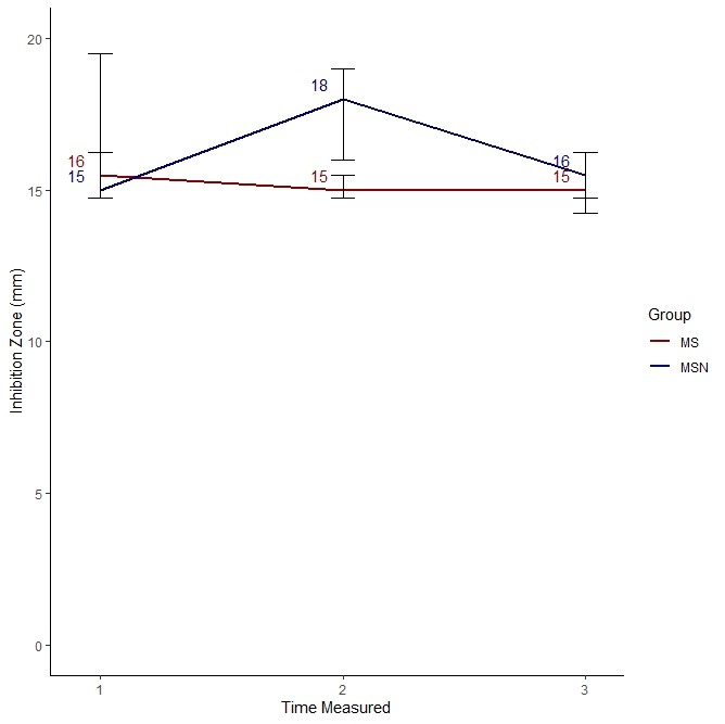
As you can see, it looks like MS was much better at killing bacteria compared to MSN only at Time 2. At Time 1 and Time 3, they performed pretty much the same.
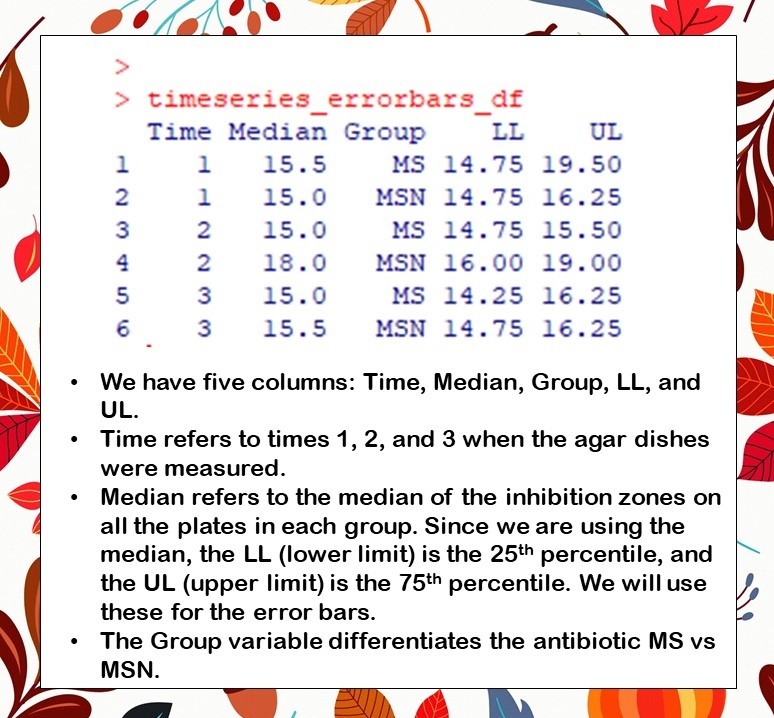
So, to get this plot, you will see I put some code and a dataframe on Github for you. The dataframe is called timeseries_error_colors.rds, and here is what it looks like.
As you can see, the plot dataset has five columns. The time column refers to the time the agar dish was measured – Times 1, 2, or 3 – and because this variable was an integer, I did not have to use the scale_x_datetime command as I did in the last plot. As I said before, we used the median as the measure of central tendency since there were so few plates per condition, so then I calculated the LL and UL variables (for lower and upper limits, respectively) as the 25th and 75th percentiles, respectively. The group variable indicates whether the row refers to measurements of inhibition zones for the MS group or the MSN group. We are making one line per group for a total of two lines.
Now, let’s look at the code.
timeseries_errorbars_df <- readRDS("timeseries_errorbars_df.rds")
library(ggplot2)
timeseries_error_colors <- c("red4", "navyblue")
These first few lines of code read in the plot dataframe, call up the ggplot2 library, and set a color vector called timeseries_error_colors to the colors mapped to red4 and navyblue. I am in the United States, and I was feeling patriotic.
Now, let’s look at the plot code.
ggplot(timeseries_errorbars_df, aes(x = Time, y = Median)) +
	geom_line(aes(color = Group), size = 1) +
	geom_text(data=timeseries_errorbars_df, show.legend = FALSE,
		aes(x= Time - .1, y = Median + .5,
		label = round(Median, 0), color = Group)) +
	scale_color_manual(values = timeseries_error_colors) +
	geom_errorbar(data=timeseries_errorbars_df,
		mapping=aes(x = Time, ymin=LL, ymax=UL),
		width=0.1, size=.5, color="black") +
	labs(color="Group") +
	ylab("Inhibition Zone (mm)") +
	xlab("Time Measured") +
	ylim(0, 20) +
	scale_x_continuous(breaks = c(1,2,3)) +
	theme(axis.text.x = element_text(angle=90)) +
	theme_classic()
Let’s walk through some nuances in this code:
- As you probably guessed, and as it shows in the aes argument, we are graphing the Time variable along the x-axis, and the Median variable along the y-axis.
- Again, we use the shape geom_line, and because we want one line for each group, MS and MSN, we set color equal to Group
- The next line, geom_text, tells R to put the data labels in. Basically, it says to place the value of the Median rounded to 0 decimal places at the coordinates designated by x= Time – .1, y = Median + .5. This approach is typically how data values are placed on a ggplot2 plot. The value is taken from a variable, and then the x and y coordinates of where to place the label are based on x and y coordinates being graphed plus some padding. This is so the labels are not overwriting each other or the line.
- Again, we use scale_color_manual to apply our manual color vector timeseries_error_colors.
- Next, we place the shape geom_errorbar to get our error bars. I use the mapping option and set the arguments for the aes, which are x, ymin, and ymax (to the Median, LL, and UL, respectively), which makes sense as the minimal definition of an error bar. I also add some formatting.
- Again, labs is “obviously” the command for naming the legend, and I place axis labels using ylab and xlab. Also, I set the limits of the y-axis using the ylim option. If you want to fuss with the y limits because you don’t know exactly what you want, you can always create a numeric vector with the values, and set the arguments to the name of the numeric vector, as I demonstrate in this blog post.
- You’d think an x-axis on a time series plot would be the least of your problems, but it’s a headache in ggplot2. Again, I was having trouble getting ggplot2 to make exactly three time points on the graph – 1, 2, and 3 – to match the study design. After fighting with it, I realized I had to use scale_x_continuous and set the breaks argument to 1, 2, and 3 to get it to display the way I wanted. Again, you can do this with a numeric vector instead of hardcoding it like I did.
- Finally, I needed the theme option to turn the x-axis text 90 degrees so it was horizontal, and I applied theme_classic() to give the chart a clean look.
Updated April 11, 2022. Added banners March 6, 2023. Revised banners June 26, 2023.
Read all of our data science blog posts!

Confidence Intervals are for Estimating a Range for the True Population-level Measure
Confidence intervals (CIs) help you get a solid estimate for the true population measure. Read [...]
1 Comment
Jun

Continuous Variable? You Can Categorize it!
Continuous variable categorized can open up a world of possibilities for analysis. Read about it [...]
2 Comments
Jun

Delete if the Row Meets Criteria? Do it in SAS!
Delete if rows meet a certain criteria is a common approach to paring down a [...]
May


Chi-square Test: Insight from Using Microsoft Excel
Chi-square test is hard to grasp – but doing it in Microsoft Excel can give [...]
May

Identify Elements of Research in Scientific Literature
Identify elements in research reports, and you’ll be able to understand them much more easily. [...]
May

Design the Most Useful Time Periods for Your Conversions
Time periods are important when creating a time series visualization that actually speaks to you! [...]
Apr

Apply Weights? It’s Easy in R with the Survey Package!
Apply weights to get weighted proportions and counts! Read my blog post to learn how [...]
Nov

Make Categorical Variable Out of Continuous Variable
Make categorical variables by cutting up continuous ones. But where to put the boundaries? Get [...]
Nov

Remove Rows in R with the Subset Command
Remove rows by criteria is a common ETL operation – and my blog post shows [...]
Oct

CDC Wonder for Studying Vaccine Adverse Events: The Shameful State of US Open Government Data
CDC Wonder is an online query portal that serves as a gateway to many government [...]
Jun

AI Careers: Riding the Bubble
AI careers are not easy to navigate. Read my blog post for foolproof advice for [...]
Jun

Descriptive Analysis of Black Friday Death Count Database: Creative Classification
Descriptive analysis of Black Friday Death Count Database provides an example of how creative classification [...]
Nov

Classification Crosswalks: Strategies in Data Transformation
Classification crosswalks are easy to make, and can help you reduce cardinality in categorical variables, [...]
Nov

FAERS Data: Getting Creative with an Adverse Event Surveillance Dashboard
FAERS data are like any post-market surveillance pharmacy data – notoriously messy. But if you [...]
4 Comments
Nov

Dataset Source Documentation: Necessary for Data Science Projects with Multiple Data Sources
Dataset source documentation is good to keep when you are doing an analysis with data [...]
Nov

Joins in Base R: Alternative to SQL-like dplyr
Joins in base R must be executed properly or you will lose data. Read my [...]
Nov

NHANES Data: Pitfalls, Pranks, Possibilities, and Practical Advice
NHANES data piqued your interest? It’s not all sunshine and roses. Read my blog post [...]
Nov

Color in Visualizations: Using it to its Full Communicative Advantage
Color in visualizations of data curation and other data science documentation can be used to [...]
Oct

Defaults in PowerPoint: Setting Them Up for Data Visualizations
Defaults in PowerPoint are set up for slides – not data visualizations. Read my blog [...]
Oct

Text and Arrows in Dataviz Can Greatly Improve Understanding
Text and arrows in dataviz, if used wisely, can help your audience understand something very [...]
Oct

Shapes and Images in Dataviz: Making Choices for Optimal Communication
Shapes and images in dataviz, if chosen wisely, can greatly enhance the communicative value of [...]
Oct

Table Editing in R is Easy! Here Are a Few Tricks…
Table editing in R is easier than in SAS, because you can refer to columns, [...]
Aug

R for Logistic Regression: Example from Epidemiology and Biostatistics
R for logistic regression in health data analytics is a reasonable choice, if you know [...]
272 Comments
Aug

Connecting SAS to Other Applications: Different Strategies
Connecting SAS to other applications is often necessary, and there are many ways to do [...]
Jul

Portfolio Project Examples for Independent Data Science Projects
Portfolio project examples are sometimes needed for newbies in data science who are looking to [...]
Jul

Project Management Terminology for Public Health Data Scientists
Project management terminology is often used around epidemiologists, biostatisticians, and health data scientists, and it’s [...]
Jun

Rapid Application Development Public Health Style
“Rapid application development” (RAD) refers to an approach to designing and developing computer applications. In [...]
Jun

Understanding Legacy Data in a Relational World
Understanding legacy data is necessary if you want to analyze datasets that are extracted from [...]
Jun

Front-end Decisions Impact Back-end Data (and Your Data Science Experience!)
Front-end decisions are made when applications are designed. They are even made when you design [...]
Jun

Reducing Query Cost (and Making Better Use of Your Time)
Reducing query cost is especially important in SAS – but do you know how to [...]
Jun

Curated Datasets: Great for Data Science Portfolio Projects!
Curated datasets are useful to know about if you want to do a data science [...]
May

Statistics Trivia for Data Scientists
Statistics trivia for data scientists will refresh your memory from the courses you’ve taken – [...]
Apr

Management Tips for Data Scientists
Management tips for data scientists can be used by anyone – at work and in [...]
Mar

REDCap Mess: How it Got There, and How to Clean it Up
REDCap mess happens often in research shops, and it’s an analysis showstopper! Read my blog [...]
Mar

GitHub Beginners in Data Science: Here’s an Easy Way to Start!
GitHub beginners – even in data science – often feel intimidated when starting their GitHub [...]
Feb

ETL Pipeline Documentation: Here are my Tips and Tricks!
ETL pipeline documentation is great for team communication as well as data stewardship! Read my [...]
Feb

Benchmarking Runtime is Different in SAS Compared to Other Programs
Benchmarking runtime is different in SAS compared to other programs, where you have to request [...]
Dec

End-to-End AI Pipelines: Can Academics Be Taught How to Do Them?
End-to-end AI pipelines are being created routinely in industry, and one complaint is that academics [...]
Nov

Referring to Columns in R by Name Rather than Number has Pros and Cons
Referring to columns in R can be done using both number and field name syntax. [...]
Oct

The Paste Command in R is Great for Labels on Plots and Reports
The paste command in R is used to concatenate strings. You can leverage the paste [...]
Oct

Coloring Plots in R using Hexadecimal Codes Makes Them Fabulous!
Recoloring plots in R? Want to learn how to use an image to inspire R [...]
5 Comments
Oct

Adding Error Bars to ggplot2 Plots Can be Made Easy Through Dataframe Structure
Adding error bars to ggplot2 in R plots is easiest if you include the width [...]
Oct

AI on the Edge: What it is, and Data Storage Challenges it Poses
“AI on the edge” was a new term for me that I learned from Marc [...]
Jun

Pie Chart ggplot Style is Surprisingly Hard! Here’s How I Did it
Pie chart ggplot style is surprisingly hard to make, mainly because ggplot2 did not give [...]
5 Comments
Apr

Time Series Plots in R Using ggplot2 Are Ultimately Customizable
Time series plots in R are totally customizable using the ggplot2 package, and can come [...]
Apr

Data Curation Solution to Confusing Options in R Package UpSetR
Data curation solution that I posted recently with my blog post showing how to do [...]
Apr

Making Upset Plots with R Package UpSetR Helps Visualize Patterns of Attributes
Making upset plots with R package UpSetR is an easy way to visualize patterns of [...]
11 Comments
Apr

Making Box Plots Different Ways is Easy in R!
Making box plots in R affords you many different approaches and features. My blog post [...]
Mar

Convert CSV to RDS When Using R for Easier Data Handling
Convert CSV to RDS is what you want to do if you are working with [...]
Mar

GPower Case Example Shows How to Calculate and Document Sample Size
GPower case example shows a use-case where we needed to select an outcome measure for [...]
Feb

Querying the GHDx Database: Demonstration and Review of Application
Querying the GHDx database is challenging because of its difficult user interface, but mastering it [...]
Feb

Variable Names in SAS and R Have Different Restrictions and Rules
Variable names in SAS and R are subject to different “rules and regulations”, and these [...]
Feb

Referring to Variables in Processing Data is Different in SAS Compared to R
Referring to variables in processing is different conceptually when thinking about SAS compared to R. [...]
Jan

Counting Rows in SAS and R Use Totally Different Strategies
Counting rows in SAS and R is approached differently, because the two programs process data [...]
Jan

Native Formats in SAS and R for Data Are Different: Here’s How!
Native formats in SAS and R of data objects have different qualities – and there [...]
Jan

SAS-R Integration Example: Transform in R, Analyze in SAS!
Looking for a SAS-R integration example that uses the best of both worlds? I show [...]
Dec

Dumbbell Plot for Comparison of Rated Items: Which is Rated More Highly – Harvard or the U of MN?
Want to compare multiple rankings on two competing items – like hotels, restaurants, or colleges? [...]
2 Comments
Sep

Data for Meta-analysis Need to be Prepared a Certain Way – Here’s How
Getting data for meta-analysis together can be challenging, so I walk you through the simple [...]
Jul

Sort Order, Formats, and Operators: A Tour of The SAS Documentation Page
Get to know three of my favorite SAS documentation pages: the one with sort order, [...]
Nov

Confused when Downloading BRFSS Data? Here is a Guide
I use the datasets from the Behavioral Risk Factor Surveillance Survey (BRFSS) to demonstrate in [...]
2 Comments
Oct

Doing Surveys? Try my R Likert Plot Data Hack!
I love the Likert package in R, and use it often to visualize data. The [...]
3 Comments
Oct

I Used the R Package EpiCurve to Make an Epidemiologic Curve. Here’s How It Turned Out.
With all this talk about “flattening the curve” of the coronavirus, I thought I would [...]
Mar

Which Independent Variables Belong in a Regression Equation? We Don’t All Agree, But Here’s What I Do.
During my failed attempt to get a PhD from the University of South Florida, my [...]
Aug
Time series plots in R are totally customizable using the ggplot2 package, and can come out with a look that is clean and sharp. However, you usually end up fighting with formatting the x-axis and other options, and I explain in my blog post.