
AI careers are not easy to navigate. Read my blog post for foolproof advice for those interested in building a career in AI.
Tag Archives: compare distributions
12
Apr
Apr
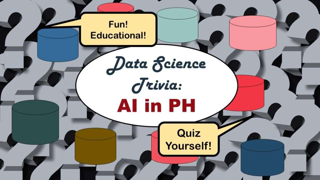
Statistics trivia for data scientists will refresh your memory from the courses you’ve taken – or maybe teach you something new! Visit my blog to find out!
07
Mar
Mar
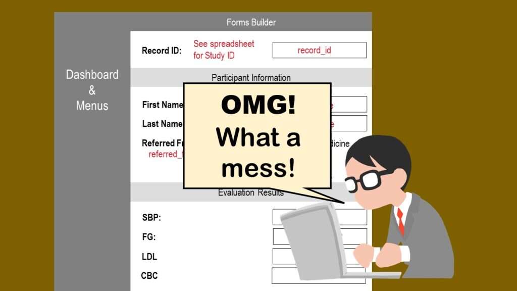
REDCap mess happens often in research shops, and it’s an analysis showstopper! Read my blog post to learn my secret tricks for breaking through the barriers and getting on with data analytics!
13
Dec
Dec
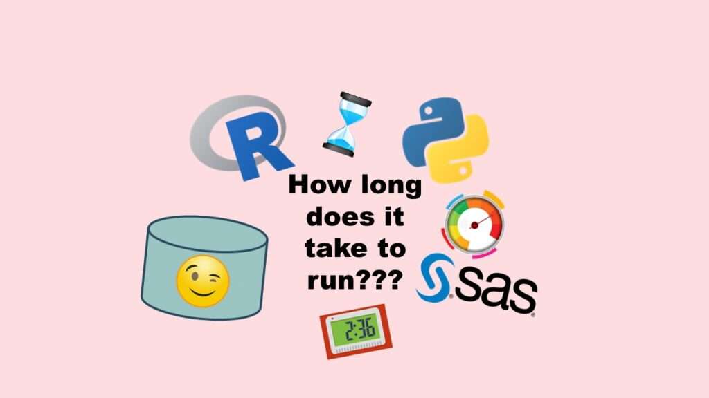
Benchmarking runtime is different in SAS compared to other programs, where you have to request the system time before and after the code you want to time and use variables to do subtraction, as I demonstrate in this blog post.
20
Apr
Apr
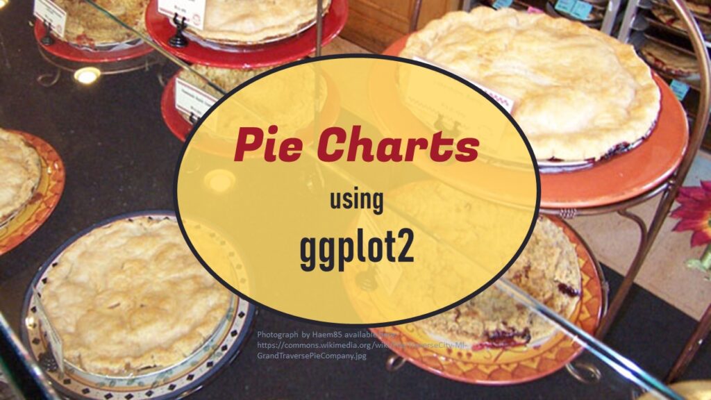
Pie chart ggplot style is surprisingly hard to make, mainly because ggplot2 did not give us a circle shape to deal with. But I explain how to get around it in my blog pot.
11
Apr
Apr
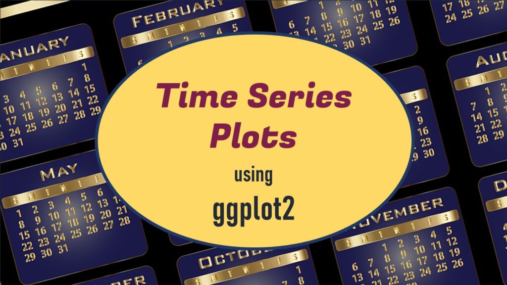
Time series plots in R are totally customizable using the ggplot2 package, and can come out with a look that is clean and sharp. However, you usually end up fighting with formatting the x-axis and other options, and I explain in my blog post.
31
Mar
Mar
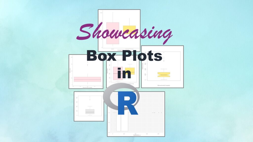
Making box plots in R affords you many different approaches and features. My blog post will show you easy ways to use both base R and ggplot2 to make box plots as you are proceeding with your data science projects.