Tag Archives: COVID-19 pandemic

Classification Crosswalks: Strategies in Data Transformation

What if you have too many categories in a categorical variable? Your cardinality is too high for a chi-square analysis.

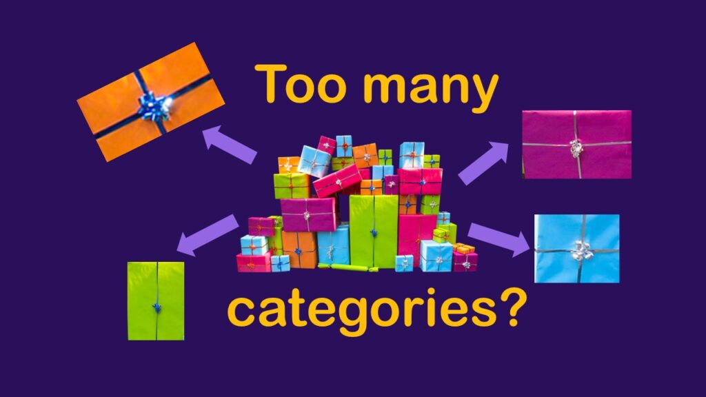
Classification crosswalks are easy to make, and can help you reduce cardinality in categorical variables, making for insightful data science portfolio projects with only descriptive statistics. Read my blog post for guidance!

Text and Arrows in Dataviz Can Greatly Improve Understanding

Adding text and arrows to diagrams can help your audience navigate the image, and understand what you are trying to communicate.

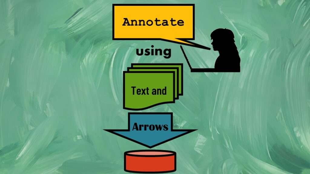
Text and arrows in dataviz, if used wisely, can help your audience understand something very abstract, like a data pipeline. Read my blog post for tips in choosing images for your data visualizations!

Benchmarking Runtime is Different in SAS Compared to Other Programs

How do you measure how long it takes for code to run in different programs? And why would you want to measure something like that? Mainly, the reason to benchmark runtime is so that you can figure out how to optimize your code.

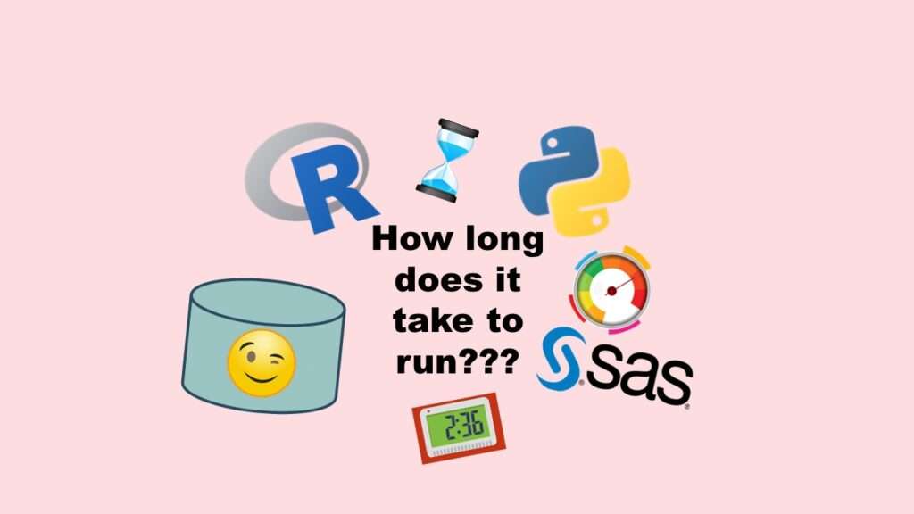
Benchmarking runtime is different in SAS compared to other programs, where you have to request the system time before and after the code you want to time and use variables to do subtraction, as I demonstrate in this blog post.

US Public Health Alphabet Soup Explained: What is the NACCHO?

You may have wondered if public health workers who are employed by local public health departments have a professional society devoted just to them. That's NACCHO.

You may already know that NACCHO is NOT cheese – but what is it? It’s a professional society for local public health officials. Read my blog post to learn what NACCHO does, and who it serves.

Data Curation Solution to Confusing Options in R Package UpSetR

It is possible to use data curation to solve the problem of a confusion vector containing options.

Data curation solution that I posted recently with my blog post showing how to do upset plots in R using the UpSetR package was itself kind of a masterpiece. Therefore, I thought I’d dedicate this blog post to explaining how and why I did it.

Why COVID-19 is Overrunning the US in Late 2020: Overlapping Epicurves

Data in simulated epicurves show frequencies and explain outbreak timing

While other countries have found a way to control their community spread of COVID-19 while waiting for the vaccine program to be implemented, the United States has totally failed at this. An epicurve is a diagram of the timing of an outbreak, and in other countries, this curve has been flattened. But in the United […]

Verified by MonsterInsights