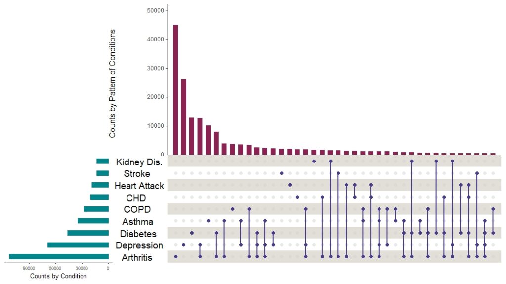
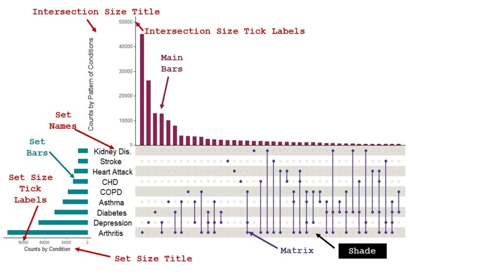
I recently published a blog post on how to use the UpSetR package to make upset plots in R. As I said in the post, UpSetR has a lot of great options you can set to format the text and color of the plot. However, the plot itself is complex, and has many different text objects and objects to which you can assign color. And these items don’t have obvious names. I put the plot below just to illustrate my point.
The specific data curation solution I created on the blog post was to document the structure of a complex vector that you can make that will set all the text options in the upset plot. R is very flexible in terms when making plots, in that it will easily take in variables and vectors. I decided to make an example for you based on the box plot example of comparing the distribution of number of staffed beds at hospitals in Boston and the Twin Cities area to illustrate this flexibility if you are not already familiar with it. That way you can be familiar with the particular challenge I faced, so you can better understand how I came up with my data curation solution.
Data Curation Solution Not Needed When Everything Is Hardcoded
I put the dataset and code I am using on Github for you. I’m using this just as a demonstration so you understand the concept I am talking about. If you open the code, you will see it starts with me using read.csv() to read in a CSV called CityCompare, which is a list of hospitals. It has a character variable HospCity (Hospital City) and a numeric variable StaffedBeds (Staffed Beds) which is the one used in my example box plot.
Here is some ggplot2 code where I make a box plot, and I hard code in all the values for the options.

ggplot(data = CityCompare, aes(x = StaffedBeds, y = HospCity)) +
	geom_boxplot(fill = c("pink", "gold")) +
	xlab(c("Staffed Beds")) +
	ylab(c("Compare Cities")) +
	xlim(c(20, 1500))
Now, let’s replace some of this hardcoding with variables and vectors. The fill for the geom_boxplot could become a character vector with colors listed in it. The x-limits option xlim could take a numeric vector. And the xlab and ylab could take character variables. So let’s make those:
fill_colors <- c("pink", "gold")
x_label <- c("Staffed Beds")
y_label <- c("Compare Cities")
x_limits <- c(20, 1500)
As you can see, we named our color vector fill_colors, our limit vector x_limits, and we created x_label and y_label variables with our label text. Now, let’s use those instead in the following code.
ggplot(data = CityCompare, aes(x = StaffedBeds, y = HospCity)) +
	geom_boxplot(fill = fill_colors) +
	xlab(x_label) +
	ylab(y_label) +
	xlim(x_limits)
You will see that the above code creates the same box plot as the hard-coded code. You will also see the pros and cons of doing things this way. Setting the variables seemed like overkill – but this is a good idea if you are not sure of the value you want. For example, let’s say I really didn’t know what I wanted to put as my x-axis label. I wanted to fuss with it after looking at how it looked on the plot. Then it would make sense to make a variable called x_label and to keep fussing with it.
On the other hand, with the vectors, it is clear from the example how they can be very useful. If we wanted to run multiple box plots comparing several variables about hospitals in these two cities, we could just keep reusing the fill_colors vector as a ready example.
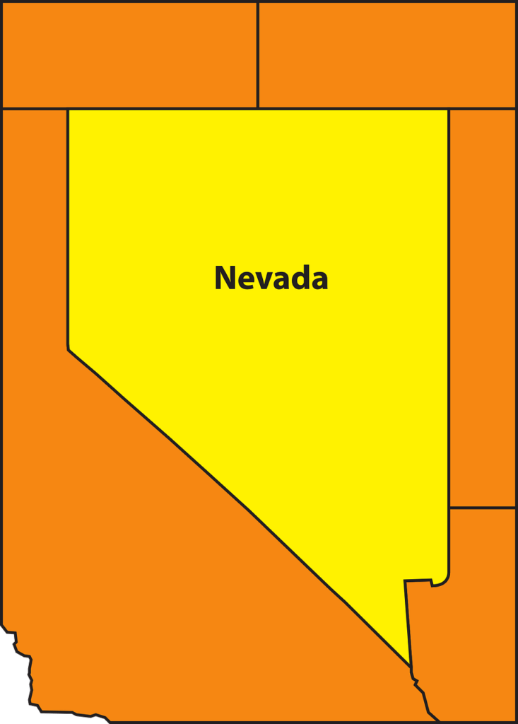
But just as a thought experiment, let’s say that x_limits were not just two points. Let’s say we were trying to define something that was like the shape of the state of Nevada – so it has four definable points: the top two and the bottom two. If you were using a package that needed you to create a vector to set these points, how would you know what order to put the points in? What would each point be called?
That is analogous to the problem I had with the upset plot. I had to make a vector that listed all of the text scale options for all the text in the plot, but there were multiple places where text was placed, and I didn’t know what those were called. That’s when I turned to developing a data curation solution.
Starting with the Best Documentation
After digging through StackOverflow and other documentation, the best I could do to write down in some communicative way what arguments went into the vector was this huge programming comment.
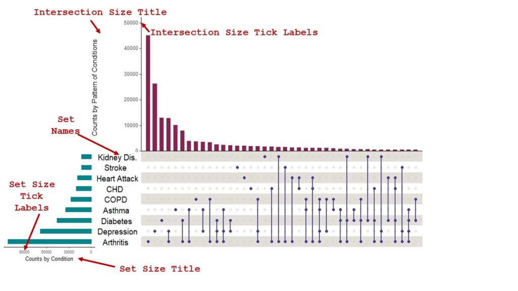
#This is a legend to the text_scale_options entries below.
#Text scale options are:
#c(intersection size title (Counts of Patterns of Conditions),
#	intersection size tick labels (numbers up vertical y-axis),
#	set size title (Counts by Single Chronic Condition),
#	set size tick labels (numbers across x-axis),
#	set names (disease names),
#	numbers above bars)
What I am doing in this comment is connecting each object listed as an argument in the documentation (e.g., intersection size title) with an example of an actual object from my plot (e.g., Counts of Patterns of Conditions). Because I understood my plot, I could backtrack to what text string was being identified in the term “intersection size title”. So this was the first set of curation I did – and this made it so I could understand everything.
But when I went to use this as a tool to help me develop my text scale options vector, it was not useful for that. I kept getting confused when I looked at it. I started considering making some sort of table. In one column, I could put the name of the object from the documentation (e.g., intersection size title), and in the next column, I could decode that to what it was on my plot, which was Counts of Patterns of Conditions.
Tabular Can Be a Data Curation Solution, but Not This Time
Trying to organize information into a table is often helpful in management, and especially in data curation. When I was younger, I probably would have organized these data into a two-column table with the object name (e.g., intersection size title) in one column, and the name of the example on my plot (e.g., Counts of Patterns of Conditions) in the other.
But because I was able to visualize that, I immediately knew I would still be confused if I looked at a table like that. The reason was that I could never remember where “intersection size title” actually was on the upset plot. I guess I just don’t think the way the author of the package does – somehow these logical names just didn’t sink into my brain.
That’s when I realized I really needed a graphical solution. So I put my plot on a PowerPoint slide and started marking it up with text boxes and arrows.
Curating the Text Scale Option Objects
My first goal was to curate the text scale option objects so I could make the vector without going crazy by not knowing what I was formatting in each position of the vector. So I picked a color and a font, and put arrows and labels on the plot with the names of each text label. I did not use data labels, so I could not curate that. If I was actually making documentation (e.g., for the package), I would have probably created a plot with all the options just so I had something to label for the curation – but I was just trying to do a real project, and I had decided against the data labels, so I did not include them in the diagram.
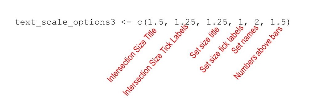
Now, between the code comment and the image, I was able to create three vectors with three sets of alternative text scale options.
text_scale_options1 <- c(1, 1, 1, 1, 0.75, 1)
text_scale_options2 <- c(1.3, 1.3, 1, 1, 2, 0.75)
text_scale_options3 <- c(1.5, 1.25, 1.25, 1, 2, 1.5)
As you can see, each one has six arguments, and each argument sets an option for the position in the vector denoted by the programming comment coupled with the labels on the diagram.
Actually, it is possible to make this even clearer with a graphic like this – an annotated vector.
Curating the Color Options
I thought I was done, but then I realized I could not tell where the colors belonged. I added more labels to the diagram for this, but it became busy. To make it clearer, I color-coded the labels for the colors – that way they would hopefully be different enough from the text object labels, and would be visually separate from them. I think my approach succeeded.
Summary and Reflection of Process and Data Curation Solution
I admit, I have a lot of trouble teaching people how to do advanced data curation like I did here. Basic data curation skills are easy to gain through my LinkedIn Learning course, but I do not really know how to teach these advanced skills. I’m going to try to learn by practicing, and this blog post is an example.
Here are some take-home messages I’d like you to glean from this about advanced data curation:
- You usually have to try many different things until you get to just the right visualization. Make sure you keep everything you try because you usually end up with some mix of everything, or possibly multiple different files.
- Tabular approaches are easy first-tries, but won’t work if you need a graphical solution. Still, it doesn’t hurt to make the table, because often you need it anyway to get to the graphical solution.
- If your curation file gets too busy, you probably need a few different curation files. However, they goal of the communication will be different, so they will likely be in totally different formats – as was my upset plot diagram vs. my annotated vector diagram.
- How much curation you should do depends on your audience. For this plot post, I showed the annotated vector, but I did not need to make one to guide myself. However, if I was mentoring one of my customers, I probably would have made the annotated vector diagram. Generally when there are multiple people involved, I tend to lean on the side of more curation. Good curation never hurts communication about data, and often helps.
- Try to use all the visual elements possible to your communicative advantage. You might notice that I used Courier New to annotate the diagram. Not only is Courier New sort of a visual cue that I’m talking about code, it’s also such an ugly font that it’s not usually used on a plot on purpose (unless you are using SAS – just kidding!). Courier New would stand out against the native plot font, and also culturally mean something to the audience – while using Courier New in another context might not communicate the same thing. Color-coding the color object annotations (but not the text object annotations) was another trick to leveraging visual communication as much as I could.
Updated April 7, 2022.
Read all of our data science blog posts!

Confidence Intervals are for Estimating a Range for the True Population-level Measure
Confidence intervals (CIs) help you get a solid estimate for the true population measure. Read [...]
1 Comment
Jun

Continuous Variable? You Can Categorize it!
Continuous variable categorized can open up a world of possibilities for analysis. Read about it [...]
2 Comments
Jun

Delete if the Row Meets Criteria? Do it in SAS!
Delete if rows meet a certain criteria is a common approach to paring down a [...]
May


Chi-square Test: Insight from Using Microsoft Excel
Chi-square test is hard to grasp – but doing it in Microsoft Excel can give [...]
May

Identify Elements of Research in Scientific Literature
Identify elements in research reports, and you’ll be able to understand them much more easily. [...]
May

Design the Most Useful Time Periods for Your Conversions
Time periods are important when creating a time series visualization that actually speaks to you! [...]
Apr

Apply Weights? It’s Easy in R with the Survey Package!
Apply weights to get weighted proportions and counts! Read my blog post to learn how [...]
Nov

Make Categorical Variable Out of Continuous Variable
Make categorical variables by cutting up continuous ones. But where to put the boundaries? Get [...]
Nov

Remove Rows in R with the Subset Command
Remove rows by criteria is a common ETL operation – and my blog post shows [...]
Oct

CDC Wonder for Studying Vaccine Adverse Events: The Shameful State of US Open Government Data
CDC Wonder is an online query portal that serves as a gateway to many government [...]
Jun

AI Careers: Riding the Bubble
AI careers are not easy to navigate. Read my blog post for foolproof advice for [...]
Jun

Descriptive Analysis of Black Friday Death Count Database: Creative Classification
Descriptive analysis of Black Friday Death Count Database provides an example of how creative classification [...]
Nov

Classification Crosswalks: Strategies in Data Transformation
Classification crosswalks are easy to make, and can help you reduce cardinality in categorical variables, [...]
Nov

FAERS Data: Getting Creative with an Adverse Event Surveillance Dashboard
FAERS data are like any post-market surveillance pharmacy data – notoriously messy. But if you [...]
4 Comments
Nov

Dataset Source Documentation: Necessary for Data Science Projects with Multiple Data Sources
Dataset source documentation is good to keep when you are doing an analysis with data [...]
Nov

Joins in Base R: Alternative to SQL-like dplyr
Joins in base R must be executed properly or you will lose data. Read my [...]
Nov

NHANES Data: Pitfalls, Pranks, Possibilities, and Practical Advice
NHANES data piqued your interest? It’s not all sunshine and roses. Read my blog post [...]
Nov

Color in Visualizations: Using it to its Full Communicative Advantage
Color in visualizations of data curation and other data science documentation can be used to [...]
Oct

Defaults in PowerPoint: Setting Them Up for Data Visualizations
Defaults in PowerPoint are set up for slides – not data visualizations. Read my blog [...]
Oct

Text and Arrows in Dataviz Can Greatly Improve Understanding
Text and arrows in dataviz, if used wisely, can help your audience understand something very [...]
Oct

Shapes and Images in Dataviz: Making Choices for Optimal Communication
Shapes and images in dataviz, if chosen wisely, can greatly enhance the communicative value of [...]
Oct

Table Editing in R is Easy! Here Are a Few Tricks…
Table editing in R is easier than in SAS, because you can refer to columns, [...]
Aug

R for Logistic Regression: Example from Epidemiology and Biostatistics
R for logistic regression in health data analytics is a reasonable choice, if you know [...]
272 Comments
Aug

Connecting SAS to Other Applications: Different Strategies
Connecting SAS to other applications is often necessary, and there are many ways to do [...]
Jul

Portfolio Project Examples for Independent Data Science Projects
Portfolio project examples are sometimes needed for newbies in data science who are looking to [...]
Jul

Project Management Terminology for Public Health Data Scientists
Project management terminology is often used around epidemiologists, biostatisticians, and health data scientists, and it’s [...]
Jun

Rapid Application Development Public Health Style
“Rapid application development” (RAD) refers to an approach to designing and developing computer applications. In [...]
Jun

Understanding Legacy Data in a Relational World
Understanding legacy data is necessary if you want to analyze datasets that are extracted from [...]
Jun

Front-end Decisions Impact Back-end Data (and Your Data Science Experience!)
Front-end decisions are made when applications are designed. They are even made when you design [...]
Jun

Reducing Query Cost (and Making Better Use of Your Time)
Reducing query cost is especially important in SAS – but do you know how to [...]
Jun

Curated Datasets: Great for Data Science Portfolio Projects!
Curated datasets are useful to know about if you want to do a data science [...]
May

Statistics Trivia for Data Scientists
Statistics trivia for data scientists will refresh your memory from the courses you’ve taken – [...]
Apr

Management Tips for Data Scientists
Management tips for data scientists can be used by anyone – at work and in [...]
Mar

REDCap Mess: How it Got There, and How to Clean it Up
REDCap mess happens often in research shops, and it’s an analysis showstopper! Read my blog [...]
Mar

GitHub Beginners in Data Science: Here’s an Easy Way to Start!
GitHub beginners – even in data science – often feel intimidated when starting their GitHub [...]
Feb

ETL Pipeline Documentation: Here are my Tips and Tricks!
ETL pipeline documentation is great for team communication as well as data stewardship! Read my [...]
Feb

Benchmarking Runtime is Different in SAS Compared to Other Programs
Benchmarking runtime is different in SAS compared to other programs, where you have to request [...]
Dec

End-to-End AI Pipelines: Can Academics Be Taught How to Do Them?
End-to-end AI pipelines are being created routinely in industry, and one complaint is that academics [...]
Nov

Referring to Columns in R by Name Rather than Number has Pros and Cons
Referring to columns in R can be done using both number and field name syntax. [...]
Oct

The Paste Command in R is Great for Labels on Plots and Reports
The paste command in R is used to concatenate strings. You can leverage the paste [...]
Oct

Coloring Plots in R using Hexadecimal Codes Makes Them Fabulous!
Recoloring plots in R? Want to learn how to use an image to inspire R [...]
5 Comments
Oct

Adding Error Bars to ggplot2 Plots Can be Made Easy Through Dataframe Structure
Adding error bars to ggplot2 in R plots is easiest if you include the width [...]
Oct

AI on the Edge: What it is, and Data Storage Challenges it Poses
“AI on the edge” was a new term for me that I learned from Marc [...]
Jun

Pie Chart ggplot Style is Surprisingly Hard! Here’s How I Did it
Pie chart ggplot style is surprisingly hard to make, mainly because ggplot2 did not give [...]
5 Comments
Apr

Time Series Plots in R Using ggplot2 Are Ultimately Customizable
Time series plots in R are totally customizable using the ggplot2 package, and can come [...]
Apr

Data Curation Solution to Confusing Options in R Package UpSetR
Data curation solution that I posted recently with my blog post showing how to do [...]
Apr

Making Upset Plots with R Package UpSetR Helps Visualize Patterns of Attributes
Making upset plots with R package UpSetR is an easy way to visualize patterns of [...]
11 Comments
Apr

Making Box Plots Different Ways is Easy in R!
Making box plots in R affords you many different approaches and features. My blog post [...]
Mar

Convert CSV to RDS When Using R for Easier Data Handling
Convert CSV to RDS is what you want to do if you are working with [...]
Mar

GPower Case Example Shows How to Calculate and Document Sample Size
GPower case example shows a use-case where we needed to select an outcome measure for [...]
Feb

Querying the GHDx Database: Demonstration and Review of Application
Querying the GHDx database is challenging because of its difficult user interface, but mastering it [...]
Feb

Variable Names in SAS and R Have Different Restrictions and Rules
Variable names in SAS and R are subject to different “rules and regulations”, and these [...]
Feb

Referring to Variables in Processing Data is Different in SAS Compared to R
Referring to variables in processing is different conceptually when thinking about SAS compared to R. [...]
Jan

Counting Rows in SAS and R Use Totally Different Strategies
Counting rows in SAS and R is approached differently, because the two programs process data [...]
Jan

Native Formats in SAS and R for Data Are Different: Here’s How!
Native formats in SAS and R of data objects have different qualities – and there [...]
Jan

SAS-R Integration Example: Transform in R, Analyze in SAS!
Looking for a SAS-R integration example that uses the best of both worlds? I show [...]
Dec

Dumbbell Plot for Comparison of Rated Items: Which is Rated More Highly – Harvard or the U of MN?
Want to compare multiple rankings on two competing items – like hotels, restaurants, or colleges? [...]
2 Comments
Sep

Data for Meta-analysis Need to be Prepared a Certain Way – Here’s How
Getting data for meta-analysis together can be challenging, so I walk you through the simple [...]
Jul

Sort Order, Formats, and Operators: A Tour of The SAS Documentation Page
Get to know three of my favorite SAS documentation pages: the one with sort order, [...]
Nov

Confused when Downloading BRFSS Data? Here is a Guide
I use the datasets from the Behavioral Risk Factor Surveillance Survey (BRFSS) to demonstrate in [...]
2 Comments
Oct

Doing Surveys? Try my R Likert Plot Data Hack!
I love the Likert package in R, and use it often to visualize data. The [...]
3 Comments
Oct

I Used the R Package EpiCurve to Make an Epidemiologic Curve. Here’s How It Turned Out.
With all this talk about “flattening the curve” of the coronavirus, I thought I would [...]
Mar

Which Independent Variables Belong in a Regression Equation? We Don’t All Agree, But Here’s What I Do.
During my failed attempt to get a PhD from the University of South Florida, my [...]
Aug
Data curation solution that I posted recently with my blog post showing how to do upset plots in R using the UpSetR package was itself kind of a masterpiece. Therefore, I thought I’d dedicate this blog post to explaining how and why I did it.