Making box plots was recently the topic of my livestream. I had been doing analytics on my YouTube channel, and it seemed that box plots and percentiles keep coming up as topics where learners are looking for answers. Therefore, I thought I’d put some practical information out there about making box plots – especially using R GUI.
I realized there are two main circumstances under which a data scientist would make a box plot (formally called box-and-whisker plot):
- She is in a hurry and wants to see the distribution of a quantitative variable on-the-fly while programming, so she runs a quick box plot, or
- She wants to present the box plot as final results in a report, so she makes a fancy one.
Basically, that’s what this blog post is about: Making box plots for these two different purposes.
Making Box Plots Scenario
Making box plots requires having a quantitative variable for which you are curious about the distribution. I find it hard to understand statistics without a real example, so I like to use public data from the American Hospital Directory (AHD.com) about hospitals, because people tend to understand hospitals in general.
For this blog post, I went to their list of hospitals in Massachusetts (where I live), and I copied the list of hospital names, and the number of staffed beds at each hospital. Just as a reminder, “staffed beds” means the number of inpatient beds the hospital has available for use for inpatient admissions. Hospitals are buildings with space, and they can use that space for many activities, including inpatient admissions – so the idea is that hospitals with more staffed beds are not only bigger, but they are doing more inpatient care delivery, which is the most expensive. If you want to know more about hospitals or healthcare finance, please take a look at these videos below.
I will show you the datasets below, but if you want them, you can download them from Github. I created an Excel *.xlsx file with two tabs – MAHosp and CityCompare – with the data on them. Then, I saved each dataset as a *.csv to read into R. Github wouldn’t let me upload the Excel file for some reason, so I just put the *.csvs in Github. I just find it easier to do it that way. I can groom the dataset in Excel – add formatting, freeze panes, and so on – and then just regenerate the *.csv when I want to put it in R. I admit, I had to do some work in Excel to get R to recognize my StaffedBeds variable as an integer. You will see in the livestream link one way to work through issues like this.
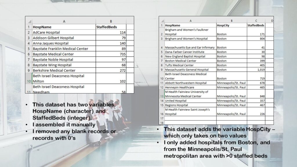
As you can see, there are two small datasets.
- The first dataset has all the Massachusetts hospitals that had nonzero StaffedBeds that I found when I went to AHD.com (they continuously update the data). Sometimes hospitals report 0 staffed beds due to delayed reporting or other reasons. I assembled this dataset to give you an idea of making a box plot of a population of values, so I cheated and removed the missing data, rather than trying to do anything scientific about it.
- The second dataset has only the hospitals with nonzero StaffedBeds from two metropolitan areas: Boston and Minneapolis/St. Paul. This was because I wanted to demonstrate a realistic comparison scenario. These two metro areas are about the same size population-wise (Boston is a little bigger). I had to look up the Minnesota hospitals for their data, and combine them into one HospCity level (so you won’t see this value in the original data from AHD.com).

Making Box Plots in Base R: Quick ‘n’ Dirty
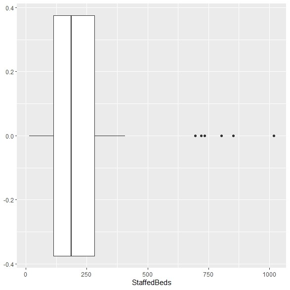
As you will see in the code on Github, I named the first dataset MAHosp, and after reading it into R GUI, all I had to do to get a base R box plot was this command:
boxplot(MAHosp$StaffedBeds)
…which produced this:
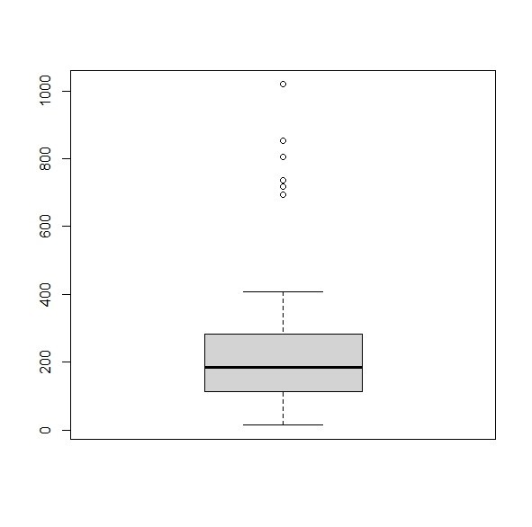
Notice how it is pretty sparse, and also, it is in a vertical orientation. This is what I normally do when I am speeding through data analytics and I just want to quickly know the distribution of a variable.
But base R also offers the opportunity to “deck out” your box plot. Here is just one example if what you can do to make it fancier and prettier:
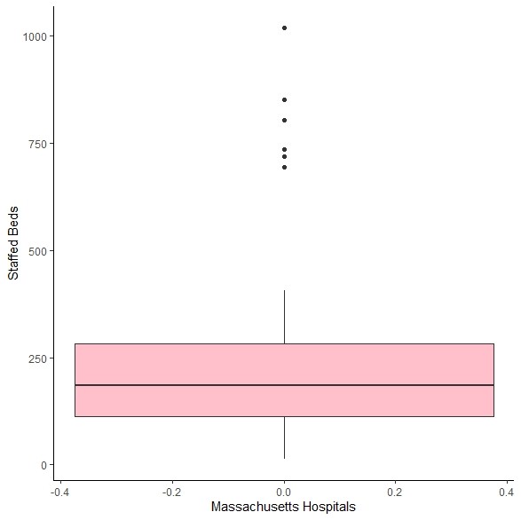
boxplot(MAHosp$StaffedBeds,
	col = c("gold"),
	xlab = c("Massachusetts Hospitals"),
	ylab = c("Staffed Beds"),
	notch = TRUE)
…which produced this:
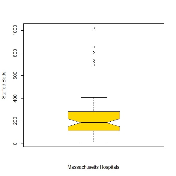
Maybe I went a little crazy with that notch = TRUE thing, but I wanted to show you the capabilities of base R. When I first started with R, I observed that many R users would “put down” plotting in base R, and say it was stupid to do. Why do that when you can use the ggplot2 package?
But I admit, I was very intimidated by the ggplot2 package. ggplot2 has its own set of syntax – think “data steps” in SAS. So it is very hard until you get used to the syntax, and how you have to do things in a certain order – again, not unlike data steps in SAS! But once you get used to ggplot2, you will realize it is extremely extensible, and the resulting plots are readily customizable. ggplot2 can do things that are way more amazing than base R – but this advanced visualization tool is only really necessary in certain circumstances.
Making Box Plots in gglot2
So let’s start by making the most basic box plot possible in ggplot2 with our MAHosp dataset and StaffedBeds variable. That would be this code here:
ggplot(data = MAHosp, aes(x = StaffedBeds)) +
	geom_boxplot()
…which produces this:
In a way, comparing base R’s vanilla box plot to ggplot2’s is instructive. I consider ggplot2 a snob. The base R plot is nice and neat and easy to interpret, even if it is sparse. But the vanilla ggplot2 plot is so over-the-top. So extravagant, high maintenance, and spoiled, expecting to be accessorized with expensive labels and formats. It’s like the plot washed its face and sat down on the toilet, expecting you to apply make-up. It really could not even go out to Publix or a predatory journal looking like that!
I’m more of a base R person myself. No matter what, I always look presentable, even without axis labels and a title (or make-up, for that matter). But then, kind of like base R, I always look pretty much the same. I make a better fashion designer than a model. And ggplot2 is for models – it’s for really showcasing your results, and putting them on display.
One point of contention I have is that the ggplot2 box plot comes out horizontally, and in healthcare, we usually put them vertically (for whatever reason). So in my data science makeover of my ggplot2 vanilla box plot, I use coordflip() to get it standing up straight! Here is the code:
ggplot(data = MAHosp, aes(x = StaffedBeds)) +
	geom_boxplot(fill = "pink") +
	xlab(c("Staffed Beds")) +
	ylab(c("Massachusetts Hospitals")) +
	coord_flip() +
	theme_classic()
…and here is the plot:
Observe the classic ggplot2 syntax, which was what confused me at first. I try to remember that aes apparently stands for “aesthetic”, and it tends to take the variable you are graphing as the main argument. But the trick is that if you don’t add a plus at the end of the line and then on the next line, declare some sort of shape (in our case, it’s geom_boxplot), you won’t see anything. You can validate this claim by just running the first line of ggplot2 code above without the plus. It will show you a blank graph.

Making Box Plots to Compare Groups
Most of the time, in healthcare, when we make box plots, we are trying to compare the distribution of some quantitative variable between various groups. For example, I will typically find myself making box plots of a certain lab value where I am comparing different diagnostic groups of patients.
The problem is that it’s not always obvious to know when making box plots how to modify the code above to get group comparisons. To get you a fair comparison, I assembled the CityCompare dataset as I described above, and imported that into R GUI (as you will see in the Github code).
boxplot(StaffedBeds ~ HospCity, data = CityCompare,
	col = c("pink", "gold"),
	xlab = c("Compare Cities"),
	ylab = c("Staffed Beds"))
You will see the main changes are adding the equation StaffedBeds ~ HospCity as the first argument, and adding another color so that R knows what color to make both the boxes. Here is the result:
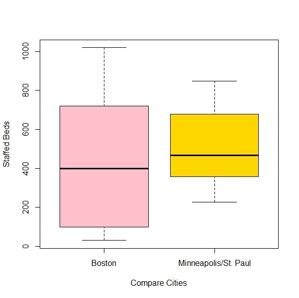
I am observing only now that ggplot2 is not big on the “whiskers” part of the box-and-whisker plot, but base R delivers. Let’s look at the ggplot2 code for the fancy comparison box plot.
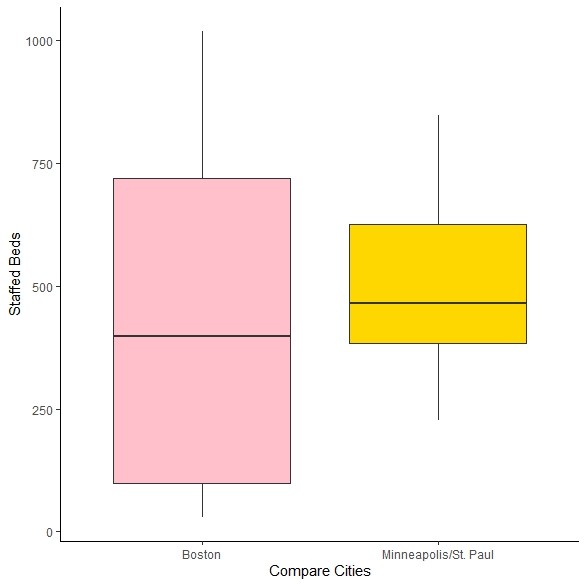
ggplot(data = CityCompare, aes(x = StaffedBeds, y = HospCity)) +
	geom_boxplot(fill = c("pink", "gold")) +
	xlab(c("Staffed Beds")) +
	ylab(c("Compare Cities")) +
	coord_flip() +
	theme_classic()
Like with base R, we had to add another color, but in this case, we added the color to the geom_boxplot argument. Here is the plot:
So in summary:
Is ggplot2 super complicated? Yes. But is it easy to Google for code and just kludge together something totally sexy in ggplot2? Dangerously, the answer to that question is also, “Yes”.
Making Box Plots in R: How I Do it
This is how I do it:
- If I am busy programming and I need to know the distribution of a variable, it’s base R all the way. I just throw up a box plot, or a set of comparison box plots.
- But if the project gets involved, and I think I’m going to have to actually present these box plots in a report, I switch and rebuild them in ggplot2. That way, I can keep using the ggplot2 tools – including ggsave – and all the packages that connect to ggplot2 and work with its objects, like the likert package.
Updated March 31, 2022. Added video April 2, 2022. Added banners March 6, 2023.
Read all of our data science blog posts!

Confidence Intervals are for Estimating a Range for the True Population-level Measure
Confidence intervals (CIs) help you get a solid estimate for the true population measure. Read [...]
1 Comment
Jun

Continuous Variable? You Can Categorize it!
Continuous variable categorized can open up a world of possibilities for analysis. Read about it [...]
2 Comments
Jun

Delete if the Row Meets Criteria? Do it in SAS!
Delete if rows meet a certain criteria is a common approach to paring down a [...]
May


Chi-square Test: Insight from Using Microsoft Excel
Chi-square test is hard to grasp – but doing it in Microsoft Excel can give [...]
May

Identify Elements of Research in Scientific Literature
Identify elements in research reports, and you’ll be able to understand them much more easily. [...]
May

Design the Most Useful Time Periods for Your Conversions
Time periods are important when creating a time series visualization that actually speaks to you! [...]
Apr

Apply Weights? It’s Easy in R with the Survey Package!
Apply weights to get weighted proportions and counts! Read my blog post to learn how [...]
Nov

Make Categorical Variable Out of Continuous Variable
Make categorical variables by cutting up continuous ones. But where to put the boundaries? Get [...]
Nov

Remove Rows in R with the Subset Command
Remove rows by criteria is a common ETL operation – and my blog post shows [...]
Oct

CDC Wonder for Studying Vaccine Adverse Events: The Shameful State of US Open Government Data
CDC Wonder is an online query portal that serves as a gateway to many government [...]
Jun

AI Careers: Riding the Bubble
AI careers are not easy to navigate. Read my blog post for foolproof advice for [...]
Jun

Descriptive Analysis of Black Friday Death Count Database: Creative Classification
Descriptive analysis of Black Friday Death Count Database provides an example of how creative classification [...]
Nov

Classification Crosswalks: Strategies in Data Transformation
Classification crosswalks are easy to make, and can help you reduce cardinality in categorical variables, [...]
Nov

FAERS Data: Getting Creative with an Adverse Event Surveillance Dashboard
FAERS data are like any post-market surveillance pharmacy data – notoriously messy. But if you [...]
4 Comments
Nov

Dataset Source Documentation: Necessary for Data Science Projects with Multiple Data Sources
Dataset source documentation is good to keep when you are doing an analysis with data [...]
Nov

Joins in Base R: Alternative to SQL-like dplyr
Joins in base R must be executed properly or you will lose data. Read my [...]
Nov

NHANES Data: Pitfalls, Pranks, Possibilities, and Practical Advice
NHANES data piqued your interest? It’s not all sunshine and roses. Read my blog post [...]
Nov

Color in Visualizations: Using it to its Full Communicative Advantage
Color in visualizations of data curation and other data science documentation can be used to [...]
Oct

Defaults in PowerPoint: Setting Them Up for Data Visualizations
Defaults in PowerPoint are set up for slides – not data visualizations. Read my blog [...]
Oct

Text and Arrows in Dataviz Can Greatly Improve Understanding
Text and arrows in dataviz, if used wisely, can help your audience understand something very [...]
Oct

Shapes and Images in Dataviz: Making Choices for Optimal Communication
Shapes and images in dataviz, if chosen wisely, can greatly enhance the communicative value of [...]
Oct

Table Editing in R is Easy! Here Are a Few Tricks…
Table editing in R is easier than in SAS, because you can refer to columns, [...]
Aug

R for Logistic Regression: Example from Epidemiology and Biostatistics
R for logistic regression in health data analytics is a reasonable choice, if you know [...]
272 Comments
Aug

Connecting SAS to Other Applications: Different Strategies
Connecting SAS to other applications is often necessary, and there are many ways to do [...]
Jul

Portfolio Project Examples for Independent Data Science Projects
Portfolio project examples are sometimes needed for newbies in data science who are looking to [...]
Jul

Project Management Terminology for Public Health Data Scientists
Project management terminology is often used around epidemiologists, biostatisticians, and health data scientists, and it’s [...]
Jun

Rapid Application Development Public Health Style
“Rapid application development” (RAD) refers to an approach to designing and developing computer applications. In [...]
Jun

Understanding Legacy Data in a Relational World
Understanding legacy data is necessary if you want to analyze datasets that are extracted from [...]
Jun

Front-end Decisions Impact Back-end Data (and Your Data Science Experience!)
Front-end decisions are made when applications are designed. They are even made when you design [...]
Jun

Reducing Query Cost (and Making Better Use of Your Time)
Reducing query cost is especially important in SAS – but do you know how to [...]
Jun

Curated Datasets: Great for Data Science Portfolio Projects!
Curated datasets are useful to know about if you want to do a data science [...]
May

Statistics Trivia for Data Scientists
Statistics trivia for data scientists will refresh your memory from the courses you’ve taken – [...]
Apr

Management Tips for Data Scientists
Management tips for data scientists can be used by anyone – at work and in [...]
Mar

REDCap Mess: How it Got There, and How to Clean it Up
REDCap mess happens often in research shops, and it’s an analysis showstopper! Read my blog [...]
Mar

GitHub Beginners in Data Science: Here’s an Easy Way to Start!
GitHub beginners – even in data science – often feel intimidated when starting their GitHub [...]
Feb

ETL Pipeline Documentation: Here are my Tips and Tricks!
ETL pipeline documentation is great for team communication as well as data stewardship! Read my [...]
Feb

Benchmarking Runtime is Different in SAS Compared to Other Programs
Benchmarking runtime is different in SAS compared to other programs, where you have to request [...]
Dec

End-to-End AI Pipelines: Can Academics Be Taught How to Do Them?
End-to-end AI pipelines are being created routinely in industry, and one complaint is that academics [...]
Nov

Referring to Columns in R by Name Rather than Number has Pros and Cons
Referring to columns in R can be done using both number and field name syntax. [...]
Oct

The Paste Command in R is Great for Labels on Plots and Reports
The paste command in R is used to concatenate strings. You can leverage the paste [...]
Oct

Coloring Plots in R using Hexadecimal Codes Makes Them Fabulous!
Recoloring plots in R? Want to learn how to use an image to inspire R [...]
5 Comments
Oct

Adding Error Bars to ggplot2 Plots Can be Made Easy Through Dataframe Structure
Adding error bars to ggplot2 in R plots is easiest if you include the width [...]
Oct

AI on the Edge: What it is, and Data Storage Challenges it Poses
“AI on the edge” was a new term for me that I learned from Marc [...]
Jun

Pie Chart ggplot Style is Surprisingly Hard! Here’s How I Did it
Pie chart ggplot style is surprisingly hard to make, mainly because ggplot2 did not give [...]
5 Comments
Apr

Time Series Plots in R Using ggplot2 Are Ultimately Customizable
Time series plots in R are totally customizable using the ggplot2 package, and can come [...]
Apr

Data Curation Solution to Confusing Options in R Package UpSetR
Data curation solution that I posted recently with my blog post showing how to do [...]
Apr

Making Upset Plots with R Package UpSetR Helps Visualize Patterns of Attributes
Making upset plots with R package UpSetR is an easy way to visualize patterns of [...]
11 Comments
Apr

Making Box Plots Different Ways is Easy in R!
Making box plots in R affords you many different approaches and features. My blog post [...]
Mar

Convert CSV to RDS When Using R for Easier Data Handling
Convert CSV to RDS is what you want to do if you are working with [...]
Mar

GPower Case Example Shows How to Calculate and Document Sample Size
GPower case example shows a use-case where we needed to select an outcome measure for [...]
Feb

Querying the GHDx Database: Demonstration and Review of Application
Querying the GHDx database is challenging because of its difficult user interface, but mastering it [...]
Feb

Variable Names in SAS and R Have Different Restrictions and Rules
Variable names in SAS and R are subject to different “rules and regulations”, and these [...]
Feb

Referring to Variables in Processing Data is Different in SAS Compared to R
Referring to variables in processing is different conceptually when thinking about SAS compared to R. [...]
Jan

Counting Rows in SAS and R Use Totally Different Strategies
Counting rows in SAS and R is approached differently, because the two programs process data [...]
Jan

Native Formats in SAS and R for Data Are Different: Here’s How!
Native formats in SAS and R of data objects have different qualities – and there [...]
Jan

SAS-R Integration Example: Transform in R, Analyze in SAS!
Looking for a SAS-R integration example that uses the best of both worlds? I show [...]
Dec

Dumbbell Plot for Comparison of Rated Items: Which is Rated More Highly – Harvard or the U of MN?
Want to compare multiple rankings on two competing items – like hotels, restaurants, or colleges? [...]
2 Comments
Sep

Data for Meta-analysis Need to be Prepared a Certain Way – Here’s How
Getting data for meta-analysis together can be challenging, so I walk you through the simple [...]
Jul

Sort Order, Formats, and Operators: A Tour of The SAS Documentation Page
Get to know three of my favorite SAS documentation pages: the one with sort order, [...]
Nov

Confused when Downloading BRFSS Data? Here is a Guide
I use the datasets from the Behavioral Risk Factor Surveillance Survey (BRFSS) to demonstrate in [...]
2 Comments
Oct

Doing Surveys? Try my R Likert Plot Data Hack!
I love the Likert package in R, and use it often to visualize data. The [...]
3 Comments
Oct

I Used the R Package EpiCurve to Make an Epidemiologic Curve. Here’s How It Turned Out.
With all this talk about “flattening the curve” of the coronavirus, I thought I would [...]
Mar

Which Independent Variables Belong in a Regression Equation? We Don’t All Agree, But Here’s What I Do.
During my failed attempt to get a PhD from the University of South Florida, my [...]
Aug
Making box plots in R affords you many different approaches and features. My blog post will show you easy ways to use both base R and ggplot2 to make box plots as you are proceeding with your data science projects.