
REDCap mess or “REDCap hell” is a very common phenomenon in research shops that use REDCap. REDCap (short for Research Electronic Data Capture) is basically “SurveyMonkey for researchers”, in that it’s an online forms- and survey-based software that is often used at academic research centers.
Of course, this begs the question: Why don’t they just use SurveyMonkey? The answer is not simple – so I’ll get to it a little later, after providing more background information.
REDCap mess happens because REDCap was designed to replace SurveyMonkey, but it does not function exactly like SurveyMonkey. If you’ve used SurveyMonkey, you probably know you can easily make a SurveyMonkey mess (or a Qualtrics mess). However, usually with some patience, you can figure out how to clean it up on your own, using the tools in the app. Because REDCap is designed slightly differently, the REDCap mess is substantially harder to clean up. But never fear – this blog post will explain to you a foolproof way to clean up your REDCap mess and get on with analysis!
REDCap Mess: Why Messes Aren’t as Bad in SurveyMonkey
In survey research, we have a fundamental problem which I call “connecting the front-end to the back-end,” but there is probably a better name for it. If you want to learn more about how applications are built, I encourage you to take my boutique online course in Application Basics.
I’ll help you understand by creating a scenario. Imagine you create a survey with a field that asks you to choose what country you live in. Maybe it has a label on it that says, “Country of Residence”, and next to it is a dropdown box or a set of radio buttons, and you choose whatever country you are from in it.
Now, imagine you download the survey data after a lot of people (including you) have filled out the survey (which is the “front-end” in this scenario). What is the name of the data field for “Country of Residence” going to be? And what values are going to be in it? If I put “United States” as my home country, will I see the words “United States” in there? Or will there be some numerical code?

It’s possible to make a mess of Qualtrics and SurveyMonkey, but those applications make it harder to make those types of messes than it is to make a REDCap mess. In my hypothetical, if you went to SurveyMonkey and downloaded the data and just kept the default settings, it would make the field name be “Country of Residence”, and it would make the entry say “United States”. SurveyMonkey can do that for you because it is very strict about what kinds of fields you can create in your survey, and how you create them. In fact, you have to be very careful preparing certain documents before you approach programming SurveyMonkey. You can learn more about this from my video tutorial.
Why You Have a REDCap Mess on Your Hands
In REDCap, the survey programming interface is much less strict than SurveyMonkey. In the video I link you to below, you can see an example of someone using the “forms builder” in REDCap.

See an example of the REDCap forms builder in this video tutorial.
I also made a diagram so I can explain what’s going on in the REDCap forms builder.
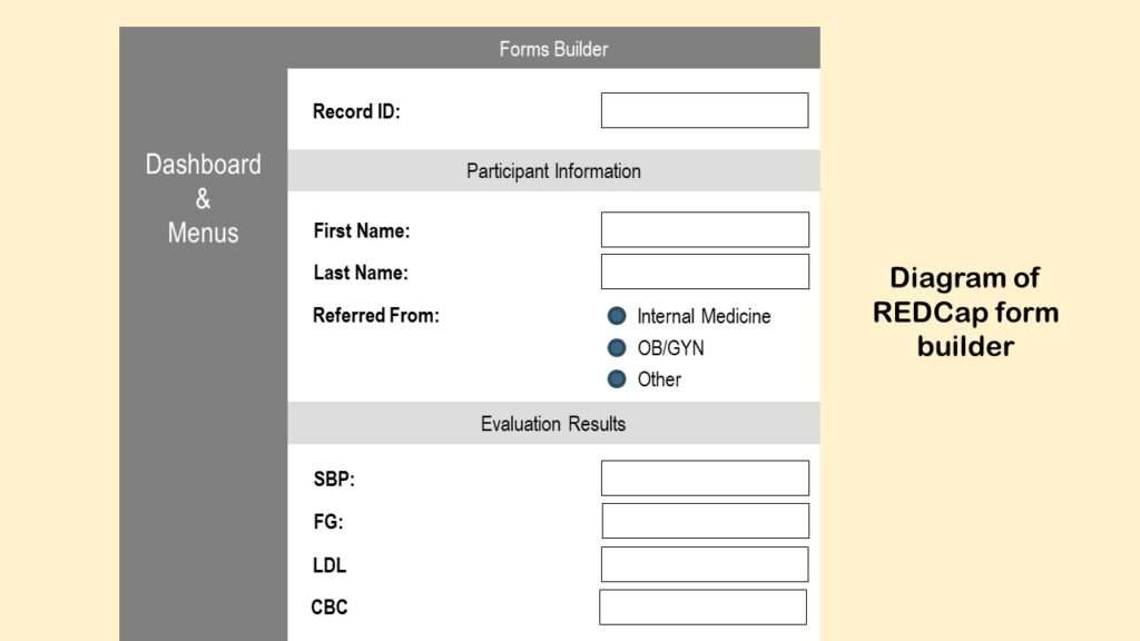
So far, this forms builder looks a lot like SurveyMonkey. But look at what happens when we try to add a new field – as you can see in the video below.
See an example of the “Add new field” dialogue box in REDCap.

As is shown in the video, the “add new field” dialogue box opens, and you get to configure the new field. I made a diagram of that dialogue box so I can talk about it.
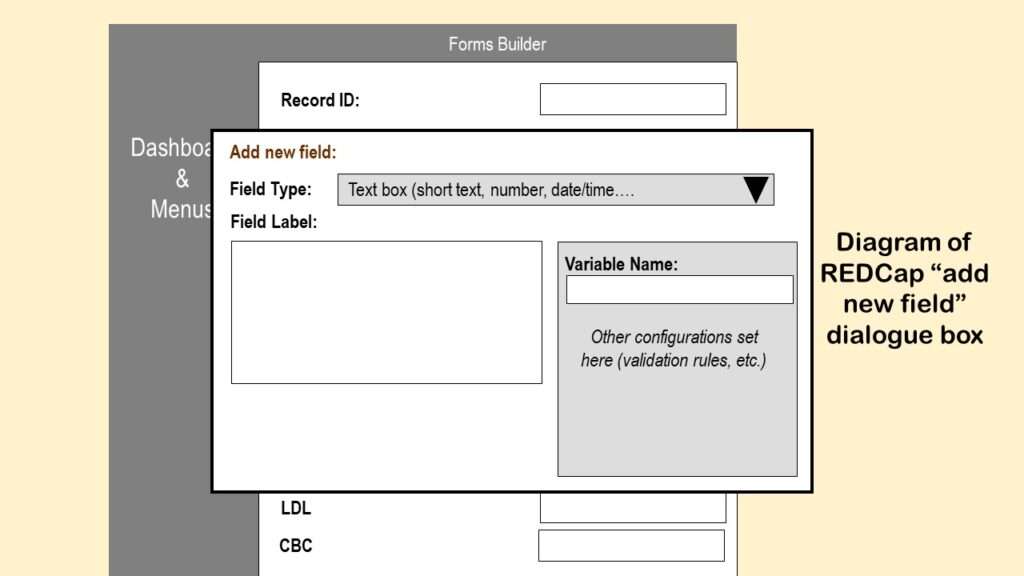
I’ve simplified the diagram to focus on three main entries in this dialogue box:
Field Type: Notice that this is a dropdown box that allows you to select the format or type of field you are adding to REDCap, and if you look in the documentation, the choices are kind of odd. Even if you just look at the default choice, there are red flags. “Short text”, “number”, and “date/time” should not be the same field type – anyone who uses SAS knows this. So, because REDCap has weird (and somewhat unrestricted) field types, it can’t provide the functionality that SurveyMonkey does with documentation because it’s just too “loosey goosey”, to use a technical term.
Field Label: In REDCap, when you create a field (e.g., back-end), it creates a “label” for you (e.g., front-end). These two are born together, and are forever linked. Basically, the “field label” is the automatic name that will be placed on a REDCap form when you want that variable to be available for data entry.
So in my diagram above, the label for the first variable under “Evaluation Results” is “SBP” – but we do not know the field name. But let’s say that we didn’t need labels on this part – we knew what those fields were, so we just erased the labels. Shame on you if you ever erase the label, or somehow decouple it from the field! Let’s say you erase the labels, then regret it, and put new labels back by hand. Then you definitely do not know what variable you are talking about anymore.
Again, this doesn’t happen in SurveyMonkey because it doesn’t operate with this “married couple” of an official field label paired with a variable name. It basically forces the field label to be the variable name, and makes the analyst sort it out after downloading the data.
Variable Name: The variable name is the other half of the “married couple” of the field label and variable name. The field label is what shows up on the form, and the variable name is what shows up in the back-end – it’s the column name when you download the data.
Notice in my diagram above of the “add new field” dialogue box that “variable name” is off to the right side on a menu with other configuration items. REDCap does NOT require you to enter a variable name at this point. If you do not enter one, it makes one up!
And that, my friend, is probably just one of the various sources of the REDCap mess on your hands.

Can a Codebook Help a REDCap Mess?
You are probably an analyst who has received REDCap data with confusing or mysterious column names and you have no idea what the columns are. The only sets of clues you have for your forensic investigation are: 1) Whatever field names actually came out in the extract, and 2) whatever values are actually in the fields (like, are they blank? Do they have 1s and 0s? Or yesses and nos?).
One thing you can do is try to download the “codebook” from REDCap. It’s a function on their dashboard. Here is an example I found of a REDCap codebook online – but I also made a diagram below so I can talk about its limitations.
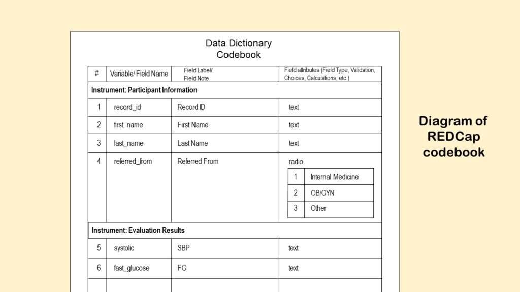
As you can see from the codebook diagram, the function outputs the “field label” and “variable name” defined above into a table. It also outputs the potential values in a variable where there are choices (like “Country of Residence”). But imagine we had meaningless variable names – like, instead of “SBP” and “FG” it said “var1” and “var2” under the “variable/ field name” column? Then our only hint at what the variable actually meant would be the actual name of the variable, which in my diagram is systolic and fast_glucose.
Okay, we can play a guessing game and determine maybe systolic is some measurement of systolic blood pressure, and fast_glucose means some sort of fasting glucose measurement. But what if we didn’t have that background knowledge? And “guessing games” are not science! All of these data fields relate to some research operation described a research protocol that was reviewed by at least one IRB or other ethics board. Maybe SBP and FG were measured more than once in the study! If so, which measurements were these? And how were they measured – like how was the SBP taken (manual? digital? arm? ankle?) and how was laboratory work on the glucose done (how long did they fast? what assay did you they use?)? Because all this can impact the actual values in the data we need to analyze.
In other words, we need more than a codebook to straighten out this REDCap mess if we want to analyze it and answer any research questions!
Foolproof Approach to Fixing a REDCap Mess
Step 1: Make a Real Data Dictionary – Not a Codebook
Before you start your fix, you want to make a real data dictionary of the native extract from REDCap of this dataset in Excel for yourself – not a “codebook” (although the codebook can help you get started, so definitely download that puppy!). Watch my video below to learn how to turn your codebook into a data dictionary format in Excel:
Watch Monika demonstrate how to make a data dictionary in Excel.
Now that you have your data dictionary ready in Excel, you are ready to add documentation. As you will see in the video above, the data dictionary in Excel uses different documentation for dropdown lists (“picklists”) than shown in the codebook output. These details are important, because you want your Excel data dictionary to be ready for you to add all the documentation you need to straighten out this REDCap mess. Remember, you may be able to share the data dictionary with others (including other analysts), and that might also be able to lighten your workload once you do straighten out the data.

Step 2: Make a Set of Annotated Screen Shots of the Survey Front-end in PowerPoint
As a data analyst, you are going to have to get friendly with the front-end “form” folks. What you want to do is see if you can get one of them to show you how they do data entry. As they do it, take a screen shot of each form they fill out, and take extensive notes about what they are doing. (Believe it or not, I usually just take a picture with my iPhone of their screen – but you have to make sure there is no glare, and that you get a clear image that you can annotate on a slide later.)
If the form is actually in the format of a survey they sent out to a mailing list, ask if you can receive the survey, and just take screen shots of what you would be filling out. If it’s multiple pages, you might have to fill it out to see all the screens – so make sure whoever is maintaining the data system removes the data from your test survey, or otherwise do not capture your test data in the live data environment.

Hot tip!
If workers are doing data entry from a filled out paper form, try to get a copy of an example. It’s best to get a real filled-out form or packet of forms – you can photocopy it, and when you do the photocopying, if you put a piece of dark paper or opaque tape between the photocopier and any sensitive information on the form (but keep the study ID visible), no one can de-identify it if they steal the photocopy. If paper data are involved, then this step can be critical to decoding REDCap mess mysteries!
This is literally how you make annotated screen shots of a REDCap (or any other) front-end:
- Take your first screen shot of one screen of data entry. This can be a picture with your smart phone or a camera of the screen, or it can be taken as a screen shot by whoever is using the computer. This should result in a graphics file (e.g., a *.jpg).
- Open a PowerPoint slide presentation and save it. This presentation is where you will be annotating each screen shot you take.
- Upload the image of the screen into the PowerPoint (the same way you would import clip art or other *.jpgs into PowerPoint).
- Place text boxes on the image in PowerPoint, and write in them in red (so the writing jumps out). I like to use Arial Narrow because it fits a lot of information in a small space. You want to annotate field names over the data entry fields, and any other information you want to remember about the field.
I don’t have access to a REDCap front-end right now, so I just made a diagram below to show you how I do this when someone hires me to straighten out a messed up REDCap.
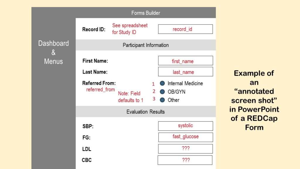
You can see in the diagram what I annotated. First, I put a note about where to get the record ID – from some sort of spreadsheet where they must be keeping track of this. Then I annotated the variables names first_name and last_name where those variables are. As you can see, I also annotated in the referred_from field what the values are of the different choices, and a note about the default value.
In the diagram, under Evaluation Results, we see that there is something funky. The SBP field is not called SBP – it’s called systolic. So let’s say that I did not know that SBP stood for “systolic blood pressure”, and I did not realize that systolic meant an SBP measurement (because it’s not really fair nor is it good science or data management to make all these assumptions, actually). But if someone told me that when you measure SBP, it’s usually between 100 and 150, I’d probably be able to find that field in the data by just looking for it. So we are pretending that that’s the way I was able to match up SBP with the word systolic, and the mysterious FG with fast_glucose, which, by the way, is a secret code for “fasting glucose measurement”.

As you can see at the bottom of the diagram, we have more mysteries on our hands. What is LDL? What is CBC? Again, forensics can help. Let’s say you see that the values in LDL are mostly in the 100s, but you find someone with a very high value – like 250. You can ask the front-end people to look that person up – you can be sure you have the right one by the record ID. Then, even on the phone or over Zoom, you can say, “Okay, what does LDL mean? Why is this guy’s LDL so high? What’s going on here?” and they can tell you the story. And then you can say, “And by the way, what is CBC?” And then you can make notes on your Excel data dictionary and your annotated PowerPoints.
Often you have to go slow with these people, and not overwhelm them with questions. So I like to alternate between gathering forensic information and making clear documentation. Eventually, when the documentation is mostly complete and clear, I share both the data dictionary and the annotated screen shots with the entire research team to just make sure I didn’t get anything wrong.
And then, finally – woo hoo! REDCap mess all cleaned up! Time for analysis!
Why Not Avoid the REDCap Mess and Use SurveyMonkey?
I promised you at the beginning of the post that I would explain this, so here goes.
The original logic that birthed REDCap went like this: SurveyMonkey is not designed with the same level of cybersecurity you would expect on a clinical system (e.g., one that must adhere to HIPAA – even though research data are not HIPAA data). Therefore, REDCap will be the alternative that has that level of security on it.
What was missed in this whole conception was the idea of “data stewardship”. With proper data stewardship, it is possible to store personal information in SurveyMonkey and still have it be de-identified. Imagine extracting some random notes from a medical records database from different records. If you simply redact all the personal information from the notes, the notes are meaningless. Or let’s say you have a dataset with a bunch of dates of birth in it with study IDs, and the rest of the data are sensitive clinical data – like laboratory values, or notes about a cancerous tumor. Even if that dataset gets stolen, no one will be able to tell whose clinical data they are because many people have the same date of birth, many people have weird lab values, and many people have tumors.

SurveyMonkey is not perfect, but the way the software is designed, it kind of forces you to do some data stewardship and governance tasks (e.g., strict configuration of fields). But the concepts of data stewardship and governance are all but missing from the training we get in public health and health research. We learn research ethics, but we don’t learn about data ethics, per se. The only times I’ve heard the terms “data stewardship” and “governance” are in business settings, like when I worked for an insurance, or ran a data warehouse at the Army. I have observed that people doing research studies do not regularly use these terms, nor understand what they mean.
This is probably why REDCap was not designed to increase or encourage strong data stewardship. Instead, it appears to have been designed to be a “cybersecure SurveyMonkey” – which ironically, it is not. Because of these design “features” I described, a lot of REDCap projects have devolved into holy messes, and it’s impossible to figure out how the data are connected. As you can see from that instructional video, the person demonstrating is just making up field labels and variables names as he goes. He’s not referring to some well-crafted documentation like I do when I program SurveyMonkey (demonstrated in this video).
These REDCap messes ironically lead to people downloading the data repeatedly and passing it around a lot – as I have had to do when straightening out these messes! So REDCap’s original mission backfired, I believe.
You are probably thinking, “Okay, well, I’ll just avoid using REDCap then.” Unfortunately, you often can’t opt out of REDCap. If you work at an institution that has a REDCap instance running – like most universities, or the many sites of the United States Veterans Administration – the IRB rules will force you to use REDCap. So you are pretty much doomed to be fighting with this software for the rest of your life, or until something better takes its place.
So the take-home message is:
Takehome message
To prevent a REDCap mess, plan your survey documentation before you program REDCap, like I demonstrate in the SurveyMonkey video above.
To clean up a REDCap mess, make annotated screen shots and a custom data dictionary, like I describe above.
Updated March 7, 2023. Revised banners June 17, 2023.
Read all of our data science blog posts!

Confidence Intervals are for Estimating a Range for the True Population-level Measure
Confidence intervals (CIs) help you get a solid estimate for the true population measure. Read [...]
1 Comment
Jun

Continuous Variable? You Can Categorize it!
Continuous variable categorized can open up a world of possibilities for analysis. Read about it [...]
2 Comments
Jun

Delete if the Row Meets Criteria? Do it in SAS!
Delete if rows meet a certain criteria is a common approach to paring down a [...]
May


Chi-square Test: Insight from Using Microsoft Excel
Chi-square test is hard to grasp – but doing it in Microsoft Excel can give [...]
May

Identify Elements of Research in Scientific Literature
Identify elements in research reports, and you’ll be able to understand them much more easily. [...]
May

Design the Most Useful Time Periods for Your Conversions
Time periods are important when creating a time series visualization that actually speaks to you! [...]
Apr

Apply Weights? It’s Easy in R with the Survey Package!
Apply weights to get weighted proportions and counts! Read my blog post to learn how [...]
Nov

Make Categorical Variable Out of Continuous Variable
Make categorical variables by cutting up continuous ones. But where to put the boundaries? Get [...]
Nov

Remove Rows in R with the Subset Command
Remove rows by criteria is a common ETL operation – and my blog post shows [...]
Oct

CDC Wonder for Studying Vaccine Adverse Events: The Shameful State of US Open Government Data
CDC Wonder is an online query portal that serves as a gateway to many government [...]
Jun

AI Careers: Riding the Bubble
AI careers are not easy to navigate. Read my blog post for foolproof advice for [...]
Jun

Descriptive Analysis of Black Friday Death Count Database: Creative Classification
Descriptive analysis of Black Friday Death Count Database provides an example of how creative classification [...]
Nov

Classification Crosswalks: Strategies in Data Transformation
Classification crosswalks are easy to make, and can help you reduce cardinality in categorical variables, [...]
Nov

FAERS Data: Getting Creative with an Adverse Event Surveillance Dashboard
FAERS data are like any post-market surveillance pharmacy data – notoriously messy. But if you [...]
4 Comments
Nov

Dataset Source Documentation: Necessary for Data Science Projects with Multiple Data Sources
Dataset source documentation is good to keep when you are doing an analysis with data [...]
Nov

Joins in Base R: Alternative to SQL-like dplyr
Joins in base R must be executed properly or you will lose data. Read my [...]
Nov

NHANES Data: Pitfalls, Pranks, Possibilities, and Practical Advice
NHANES data piqued your interest? It’s not all sunshine and roses. Read my blog post [...]
Nov

Color in Visualizations: Using it to its Full Communicative Advantage
Color in visualizations of data curation and other data science documentation can be used to [...]
Oct

Defaults in PowerPoint: Setting Them Up for Data Visualizations
Defaults in PowerPoint are set up for slides – not data visualizations. Read my blog [...]
Oct

Text and Arrows in Dataviz Can Greatly Improve Understanding
Text and arrows in dataviz, if used wisely, can help your audience understand something very [...]
Oct

Shapes and Images in Dataviz: Making Choices for Optimal Communication
Shapes and images in dataviz, if chosen wisely, can greatly enhance the communicative value of [...]
Oct

Table Editing in R is Easy! Here Are a Few Tricks…
Table editing in R is easier than in SAS, because you can refer to columns, [...]
Aug

R for Logistic Regression: Example from Epidemiology and Biostatistics
R for logistic regression in health data analytics is a reasonable choice, if you know [...]
272 Comments
Aug

Connecting SAS to Other Applications: Different Strategies
Connecting SAS to other applications is often necessary, and there are many ways to do [...]
Jul

Portfolio Project Examples for Independent Data Science Projects
Portfolio project examples are sometimes needed for newbies in data science who are looking to [...]
Jul

Project Management Terminology for Public Health Data Scientists
Project management terminology is often used around epidemiologists, biostatisticians, and health data scientists, and it’s [...]
Jun

Rapid Application Development Public Health Style
“Rapid application development” (RAD) refers to an approach to designing and developing computer applications. In [...]
Jun

Understanding Legacy Data in a Relational World
Understanding legacy data is necessary if you want to analyze datasets that are extracted from [...]
Jun

Front-end Decisions Impact Back-end Data (and Your Data Science Experience!)
Front-end decisions are made when applications are designed. They are even made when you design [...]
Jun

Reducing Query Cost (and Making Better Use of Your Time)
Reducing query cost is especially important in SAS – but do you know how to [...]
Jun

Curated Datasets: Great for Data Science Portfolio Projects!
Curated datasets are useful to know about if you want to do a data science [...]
May

Statistics Trivia for Data Scientists
Statistics trivia for data scientists will refresh your memory from the courses you’ve taken – [...]
Apr

Management Tips for Data Scientists
Management tips for data scientists can be used by anyone – at work and in [...]
Mar

REDCap Mess: How it Got There, and How to Clean it Up
REDCap mess happens often in research shops, and it’s an analysis showstopper! Read my blog [...]
Mar

GitHub Beginners in Data Science: Here’s an Easy Way to Start!
GitHub beginners – even in data science – often feel intimidated when starting their GitHub [...]
Feb

ETL Pipeline Documentation: Here are my Tips and Tricks!
ETL pipeline documentation is great for team communication as well as data stewardship! Read my [...]
Feb

Benchmarking Runtime is Different in SAS Compared to Other Programs
Benchmarking runtime is different in SAS compared to other programs, where you have to request [...]
Dec

End-to-End AI Pipelines: Can Academics Be Taught How to Do Them?
End-to-end AI pipelines are being created routinely in industry, and one complaint is that academics [...]
Nov

Referring to Columns in R by Name Rather than Number has Pros and Cons
Referring to columns in R can be done using both number and field name syntax. [...]
Oct

The Paste Command in R is Great for Labels on Plots and Reports
The paste command in R is used to concatenate strings. You can leverage the paste [...]
Oct

Coloring Plots in R using Hexadecimal Codes Makes Them Fabulous!
Recoloring plots in R? Want to learn how to use an image to inspire R [...]
5 Comments
Oct

Adding Error Bars to ggplot2 Plots Can be Made Easy Through Dataframe Structure
Adding error bars to ggplot2 in R plots is easiest if you include the width [...]
Oct

AI on the Edge: What it is, and Data Storage Challenges it Poses
“AI on the edge” was a new term for me that I learned from Marc [...]
Jun

Pie Chart ggplot Style is Surprisingly Hard! Here’s How I Did it
Pie chart ggplot style is surprisingly hard to make, mainly because ggplot2 did not give [...]
5 Comments
Apr

Time Series Plots in R Using ggplot2 Are Ultimately Customizable
Time series plots in R are totally customizable using the ggplot2 package, and can come [...]
Apr

Data Curation Solution to Confusing Options in R Package UpSetR
Data curation solution that I posted recently with my blog post showing how to do [...]
Apr

Making Upset Plots with R Package UpSetR Helps Visualize Patterns of Attributes
Making upset plots with R package UpSetR is an easy way to visualize patterns of [...]
11 Comments
Apr

Making Box Plots Different Ways is Easy in R!
Making box plots in R affords you many different approaches and features. My blog post [...]
Mar

Convert CSV to RDS When Using R for Easier Data Handling
Convert CSV to RDS is what you want to do if you are working with [...]
Mar

GPower Case Example Shows How to Calculate and Document Sample Size
GPower case example shows a use-case where we needed to select an outcome measure for [...]
Feb

Querying the GHDx Database: Demonstration and Review of Application
Querying the GHDx database is challenging because of its difficult user interface, but mastering it [...]
Feb

Variable Names in SAS and R Have Different Restrictions and Rules
Variable names in SAS and R are subject to different “rules and regulations”, and these [...]
Feb

Referring to Variables in Processing Data is Different in SAS Compared to R
Referring to variables in processing is different conceptually when thinking about SAS compared to R. [...]
Jan

Counting Rows in SAS and R Use Totally Different Strategies
Counting rows in SAS and R is approached differently, because the two programs process data [...]
Jan

Native Formats in SAS and R for Data Are Different: Here’s How!
Native formats in SAS and R of data objects have different qualities – and there [...]
Jan

SAS-R Integration Example: Transform in R, Analyze in SAS!
Looking for a SAS-R integration example that uses the best of both worlds? I show [...]
Dec

Dumbbell Plot for Comparison of Rated Items: Which is Rated More Highly – Harvard or the U of MN?
Want to compare multiple rankings on two competing items – like hotels, restaurants, or colleges? [...]
2 Comments
Sep

Data for Meta-analysis Need to be Prepared a Certain Way – Here’s How
Getting data for meta-analysis together can be challenging, so I walk you through the simple [...]
Jul

Sort Order, Formats, and Operators: A Tour of The SAS Documentation Page
Get to know three of my favorite SAS documentation pages: the one with sort order, [...]
Nov

Confused when Downloading BRFSS Data? Here is a Guide
I use the datasets from the Behavioral Risk Factor Surveillance Survey (BRFSS) to demonstrate in [...]
2 Comments
Oct

Doing Surveys? Try my R Likert Plot Data Hack!
I love the Likert package in R, and use it often to visualize data. The [...]
3 Comments
Oct

I Used the R Package EpiCurve to Make an Epidemiologic Curve. Here’s How It Turned Out.
With all this talk about “flattening the curve” of the coronavirus, I thought I would [...]
Mar

Which Independent Variables Belong in a Regression Equation? We Don’t All Agree, But Here’s What I Do.
During my failed attempt to get a PhD from the University of South Florida, my [...]
Aug
REDCap mess happens often in research shops, and it’s an analysis showstopper! Read my blog post to learn my secret tricks for breaking through the barriers and getting on with data analytics!