Data for meta-analysis need to be assembled into a dataset before you can import it into statistical software and start your analytic work. This post will show you how to prepare your dataframe for meta-analysis in the package rmeta for R.
Data for Meta-analysis Are Challenging Because of the Underlying Scientific Literature
The most important point I want to make is that if you bring me a dataset and ask me to analyze it for a meta-analysis, I’m going to sit you down and start interrogating you. You will feel like a criminal accused of a felony! It’s a harrowing process. Here is what I am going to ask you:
- Are you sure you found absolutely all the academic papers with a study on your topic? If so, show me the evidence.
- Are you sure you applied the inclusion and exclusion criteria properly? If so, show me the evidence.
- Are you sure the articles that qualified and made it into your meta-analysis have the exact right numbers reported in them to fairly include in our analysis? If so, show me.
- Are you sure there are not a bunch of other meta-analyses on this subject? Because if there are, then you really are in trouble, because you didn’t do your homework before contacting me!
All of this is not because I want to play professor and quiz you to death (although I admit that can be fun!). It’s because we will have to write about all this in the methods section of any peer-reviewed article we write, so we might as well get this stuff out of the way immediately when we first meet.
The Most Common Problem with Meta-Analysis
The most common problem with trying to prepare data for meta-analysis is that when you try, you find you actually can’t do a meta-analysis the way you had planned. The reason why you can’t do one is either that there are no studies on your topic in the literature, or else, the studies that are there are so badly designed you can’t use them.
I like to tell this joke. My joke goes like this: Every Cochrane Collaboration report ends with the same generic finding: “We narrowed our search down to four, semi-crappy studies, so we can’t make any recommendations. Please, if any scientists out there are reading this, for the love of God, do some quality studies so we can say something next time we do this!”

Preparing Data for Meta-Analysis in Package rmeta
Assuming you get over all the scientific literature and study design hurdles and are actually able to narrow your articles down to a handful (I had 15 in a systematic review I did), you are ready to extract the data from them. I’m going to come up with a simple scenario, and demonstrate an outcome that is a percentage, as is done on this example from rdrr.io.
Scenario for Meta-Analysis
Let’s use Disney characters for this one. Imagine in 2007, Goofy has a philosophical difference with Minnie Mouse and Daisy Duck, who are all researching what flavor of ice cream is most likely to induce happiness. Goofy believes that vanilla should always be used as the control flavor, and Minnie and Daisy believe that it depends on the situation. Therefore, they part ways, and Goofy founds his research institute dedicated to ice cream and happiness research: the Goofy Institute.
Here is the timeline of the literature:
- In 2008, unrelated team Bugs Bunny and Daffy Duck conduct lab studies suggesting that chocolate flavor increases risk of happiness.
- Minnie and Daisy jump on this finding. In 2008, they complete a clinical trial (of which Minnie is the head) on about 300 participants. They randomize them to either chocolate (treatment) or vanilla (control) and measure happiness as an outcome (yes/no).
- Findings are weak and mixed, so Minnie and Daisy obtain funding for a much bigger study led by Daisy in 2012, including about 1,000 participants (about 500 in each treatment group). Again, chocolate is the treatment, vanilla is control, and results are inconclusive.
- During this time, the Goofy Institute, located in New England, had been chasing the “Berry hypothesis”. Most of the testing done there had been on strawberry-flavored ice cream, but now that Goofy’s old colleagues were getting findings, he contacted them. They decided to do a multicenter study on chocolate.
- In 2015, the Goofy Institute underwrote a multi-center study of chocolate vs. vanilla ice cream in terms of rates of happiness. Daisy and Minnie were collaborators, and over four sites, they enrolled around 2,000 participants.
I put all the data and code from this project on Github.
Data Dictionary
Below is a screen shot of our data dictionary.
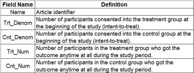
This dictionary represents a minimum dataset needed to run the meta-analysis.
- Name: This is a character string representing the article. In our example dataset, you will see I put the first author followed by the year. This is the field you imagine printing out on the left side along the y-axis of the Forrest plot.
- Trt_Denom: This stands for “treatment denominator”. This is the number of participants in the treatment group – so in our scenario, the number of participants randomized to chocolate. Notice that we are including those enrolled in the study in the chocolate group – not necessarily those finishing the study. It is possible to have “death by chocolate” during the study – as evidence, a local restaurant had that on the dessert menu. So, we have to do an intent-to-treat analysis.
- Cnt_Denom: As you probably guessed, this stands for “control denominator”. This would be the number of participants enrolled and randomized to vanilla, philosophical issues with calling vanilla “control” aside. Just a reminder – you can die from too much vanilla ice cream as well!
- Trt_Num: This stands for “treatment numerator”. This is the number of people in the treatment group – the chocolate group – that got the outcome (got happy). Another way of saying it is it’s the number of people reported in the Trt_Denom field that actually got the outcome – so if you put Trt_Num over Trt_Denom in a fraction, you get the rate of the outcome in the treatment group.
- Cnt_Num: This stands for “control numerator”, and as you probably guessed, this is the number of people in the control group – vanilla – who got the outcome – happy. Again, this has to be a number smaller than or equal to Cnt_Denom, because this is the rate of the outcome in the control group.
Data Entry
When I do the data entry into the spreadsheet, I like to put the articles in order of publication. That way, I can see any trends over time in the Forrest plot. Also, make sure that you designate the numeric fields as integer with no decimals or commas, so that R reads them in as numeric.
I usually do data entry into an *.xlsx, and then, I save that as a *.csv to read into R. Here is a screen shot of our *.xlsx:
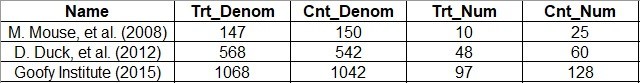
What’s interesting about these data is that you never really see the total number of people in the study – it’s just the denominator for each group. Another thing you have to contend with is that in real life, you don’t just gather one outcome – you gather many. In fact, the example data I linked you to from rdrr.io included two outcomes.
Two outcomes essentially mean two different numerators. Let’s say that our team also asked about whether the ice cream made the participant sleepy (as well as happy). Then rates of sleepy would be in their own Forrest Plot. We’d have to have two sets of columns for the data (e.g., Trt_Num_Happy, Cnt_Num_Happy, Trt_Num_Sleepy, and Cnt_Num_Sleepy). We could use the same dataset for each Forrest plot, we’d just have to make sure we were calling up the right fields in our analysis.
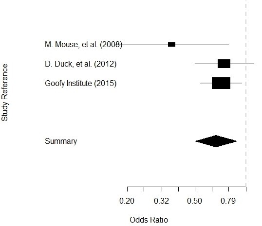
Running the Plot
The whole point of preparing data for meta-analysis is running the plot! And luckily, if you prepare the data properly, running the plot is straightforward. I will place the code here.
#read in data
goofy <- read.csv(file = "Goofy Data.csv",
   header = TRUE, sep = ",")

#call library
library(rmeta)

#make calculations
calc <- meta.DSL(Trt_Denom, Cnt_Denom, Trt_Num,
   Cnt_Num, data=goofy, names=Name)
summary(calc)

#make plot
plot(calc)

Let’s examine this code:
- As you can see, we start by reading in the *.csv of the data I showed you above into a dataset called goofy.
- Next, we call the rmeta package.
- After that, we make an object called calc which has our calculations in it. As you can see, we use the command meta.DSL. In the argument, we list all of our numeric columns, set our data to goofy, and set the names that will be used in the plot as our Name variable.
- Then we run a summary of the calc. I didn’t show you the output, but if you run it, you will see that it reports the odds ratios (ORs) for each article based on the data we gave it (which is essentially a 2 x 2 table), with 95% confidence intervals.
- Finally, we plot the calc object and get our Forrest plot.
Plot is below:
Updated July 30, 2021. Spaghetti junction photograph by JimmyGuano. Added video on September 13, 2021. Reformatted code and added video slider April 3, 2022.

Read all of our data science blog posts!

Confidence Intervals are for Estimating a Range for the True Population-level Measure
Confidence intervals (CIs) help you get a solid estimate for the true population measure. Read [...]
1 Comment
Jun

Continuous Variable? You Can Categorize it!
Continuous variable categorized can open up a world of possibilities for analysis. Read about it [...]
2 Comments
Jun

Delete if the Row Meets Criteria? Do it in SAS!
Delete if rows meet a certain criteria is a common approach to paring down a [...]
May


Chi-square Test: Insight from Using Microsoft Excel
Chi-square test is hard to grasp – but doing it in Microsoft Excel can give [...]
May

Identify Elements of Research in Scientific Literature
Identify elements in research reports, and you’ll be able to understand them much more easily. [...]
May

Design the Most Useful Time Periods for Your Conversions
Time periods are important when creating a time series visualization that actually speaks to you! [...]
Apr

Apply Weights? It’s Easy in R with the Survey Package!
Apply weights to get weighted proportions and counts! Read my blog post to learn how [...]
Nov

Make Categorical Variable Out of Continuous Variable
Make categorical variables by cutting up continuous ones. But where to put the boundaries? Get [...]
Nov

Remove Rows in R with the Subset Command
Remove rows by criteria is a common ETL operation – and my blog post shows [...]
Oct

CDC Wonder for Studying Vaccine Adverse Events: The Shameful State of US Open Government Data
CDC Wonder is an online query portal that serves as a gateway to many government [...]
Jun

AI Careers: Riding the Bubble
AI careers are not easy to navigate. Read my blog post for foolproof advice for [...]
Jun

Descriptive Analysis of Black Friday Death Count Database: Creative Classification
Descriptive analysis of Black Friday Death Count Database provides an example of how creative classification [...]
Nov

Classification Crosswalks: Strategies in Data Transformation
Classification crosswalks are easy to make, and can help you reduce cardinality in categorical variables, [...]
Nov

FAERS Data: Getting Creative with an Adverse Event Surveillance Dashboard
FAERS data are like any post-market surveillance pharmacy data – notoriously messy. But if you [...]
4 Comments
Nov

Dataset Source Documentation: Necessary for Data Science Projects with Multiple Data Sources
Dataset source documentation is good to keep when you are doing an analysis with data [...]
Nov

Joins in Base R: Alternative to SQL-like dplyr
Joins in base R must be executed properly or you will lose data. Read my [...]
Nov

NHANES Data: Pitfalls, Pranks, Possibilities, and Practical Advice
NHANES data piqued your interest? It’s not all sunshine and roses. Read my blog post [...]
Nov

Color in Visualizations: Using it to its Full Communicative Advantage
Color in visualizations of data curation and other data science documentation can be used to [...]
Oct

Defaults in PowerPoint: Setting Them Up for Data Visualizations
Defaults in PowerPoint are set up for slides – not data visualizations. Read my blog [...]
Oct

Text and Arrows in Dataviz Can Greatly Improve Understanding
Text and arrows in dataviz, if used wisely, can help your audience understand something very [...]
Oct

Shapes and Images in Dataviz: Making Choices for Optimal Communication
Shapes and images in dataviz, if chosen wisely, can greatly enhance the communicative value of [...]
Oct

Table Editing in R is Easy! Here Are a Few Tricks…
Table editing in R is easier than in SAS, because you can refer to columns, [...]
Aug

R for Logistic Regression: Example from Epidemiology and Biostatistics
R for logistic regression in health data analytics is a reasonable choice, if you know [...]
272 Comments
Aug

Connecting SAS to Other Applications: Different Strategies
Connecting SAS to other applications is often necessary, and there are many ways to do [...]
Jul

Portfolio Project Examples for Independent Data Science Projects
Portfolio project examples are sometimes needed for newbies in data science who are looking to [...]
Jul

Project Management Terminology for Public Health Data Scientists
Project management terminology is often used around epidemiologists, biostatisticians, and health data scientists, and it’s [...]
Jun

Rapid Application Development Public Health Style
“Rapid application development” (RAD) refers to an approach to designing and developing computer applications. In [...]
Jun

Understanding Legacy Data in a Relational World
Understanding legacy data is necessary if you want to analyze datasets that are extracted from [...]
Jun

Front-end Decisions Impact Back-end Data (and Your Data Science Experience!)
Front-end decisions are made when applications are designed. They are even made when you design [...]
Jun

Reducing Query Cost (and Making Better Use of Your Time)
Reducing query cost is especially important in SAS – but do you know how to [...]
Jun

Curated Datasets: Great for Data Science Portfolio Projects!
Curated datasets are useful to know about if you want to do a data science [...]
May

Statistics Trivia for Data Scientists
Statistics trivia for data scientists will refresh your memory from the courses you’ve taken – [...]
Apr

Management Tips for Data Scientists
Management tips for data scientists can be used by anyone – at work and in [...]
Mar

REDCap Mess: How it Got There, and How to Clean it Up
REDCap mess happens often in research shops, and it’s an analysis showstopper! Read my blog [...]
Mar

GitHub Beginners in Data Science: Here’s an Easy Way to Start!
GitHub beginners – even in data science – often feel intimidated when starting their GitHub [...]
Feb

ETL Pipeline Documentation: Here are my Tips and Tricks!
ETL pipeline documentation is great for team communication as well as data stewardship! Read my [...]
Feb

Benchmarking Runtime is Different in SAS Compared to Other Programs
Benchmarking runtime is different in SAS compared to other programs, where you have to request [...]
Dec

End-to-End AI Pipelines: Can Academics Be Taught How to Do Them?
End-to-end AI pipelines are being created routinely in industry, and one complaint is that academics [...]
Nov

Referring to Columns in R by Name Rather than Number has Pros and Cons
Referring to columns in R can be done using both number and field name syntax. [...]
Oct

The Paste Command in R is Great for Labels on Plots and Reports
The paste command in R is used to concatenate strings. You can leverage the paste [...]
Oct

Coloring Plots in R using Hexadecimal Codes Makes Them Fabulous!
Recoloring plots in R? Want to learn how to use an image to inspire R [...]
5 Comments
Oct

Adding Error Bars to ggplot2 Plots Can be Made Easy Through Dataframe Structure
Adding error bars to ggplot2 in R plots is easiest if you include the width [...]
Oct

AI on the Edge: What it is, and Data Storage Challenges it Poses
“AI on the edge” was a new term for me that I learned from Marc [...]
Jun

Pie Chart ggplot Style is Surprisingly Hard! Here’s How I Did it
Pie chart ggplot style is surprisingly hard to make, mainly because ggplot2 did not give [...]
5 Comments
Apr

Time Series Plots in R Using ggplot2 Are Ultimately Customizable
Time series plots in R are totally customizable using the ggplot2 package, and can come [...]
Apr

Data Curation Solution to Confusing Options in R Package UpSetR
Data curation solution that I posted recently with my blog post showing how to do [...]
Apr

Making Upset Plots with R Package UpSetR Helps Visualize Patterns of Attributes
Making upset plots with R package UpSetR is an easy way to visualize patterns of [...]
11 Comments
Apr

Making Box Plots Different Ways is Easy in R!
Making box plots in R affords you many different approaches and features. My blog post [...]
Mar

Convert CSV to RDS When Using R for Easier Data Handling
Convert CSV to RDS is what you want to do if you are working with [...]
Mar

GPower Case Example Shows How to Calculate and Document Sample Size
GPower case example shows a use-case where we needed to select an outcome measure for [...]
Feb

Querying the GHDx Database: Demonstration and Review of Application
Querying the GHDx database is challenging because of its difficult user interface, but mastering it [...]
Feb

Variable Names in SAS and R Have Different Restrictions and Rules
Variable names in SAS and R are subject to different “rules and regulations”, and these [...]
Feb

Referring to Variables in Processing Data is Different in SAS Compared to R
Referring to variables in processing is different conceptually when thinking about SAS compared to R. [...]
Jan

Counting Rows in SAS and R Use Totally Different Strategies
Counting rows in SAS and R is approached differently, because the two programs process data [...]
Jan

Native Formats in SAS and R for Data Are Different: Here’s How!
Native formats in SAS and R of data objects have different qualities – and there [...]
Jan

SAS-R Integration Example: Transform in R, Analyze in SAS!
Looking for a SAS-R integration example that uses the best of both worlds? I show [...]
Dec

Dumbbell Plot for Comparison of Rated Items: Which is Rated More Highly – Harvard or the U of MN?
Want to compare multiple rankings on two competing items – like hotels, restaurants, or colleges? [...]
2 Comments
Sep

Data for Meta-analysis Need to be Prepared a Certain Way – Here’s How
Getting data for meta-analysis together can be challenging, so I walk you through the simple [...]
Jul

Sort Order, Formats, and Operators: A Tour of The SAS Documentation Page
Get to know three of my favorite SAS documentation pages: the one with sort order, [...]
Nov

Confused when Downloading BRFSS Data? Here is a Guide
I use the datasets from the Behavioral Risk Factor Surveillance Survey (BRFSS) to demonstrate in [...]
2 Comments
Oct

Doing Surveys? Try my R Likert Plot Data Hack!
I love the Likert package in R, and use it often to visualize data. The [...]
3 Comments
Oct

I Used the R Package EpiCurve to Make an Epidemiologic Curve. Here’s How It Turned Out.
With all this talk about “flattening the curve” of the coronavirus, I thought I would [...]
Mar

Which Independent Variables Belong in a Regression Equation? We Don’t All Agree, But Here’s What I Do.
During my failed attempt to get a PhD from the University of South Florida, my [...]
Aug
Getting data for meta-analysis together can be challenging, so I walk you through the simple steps I take, starting with the scientific literature, and ending with a gorgeous and evidence-based Forrest plot!