Like many R packages, the Likert package in R is awesome, but it is particular about how you make you Likert plot data before you put it in the plot. I’ve gotten it down to nine steps.
Using Features of Likert Plot Data to Improve Plot Appearance
- The first six steps are a workaround to get it so that you can use the levels in factor variables in the Likert plot data as labels in the legend without getting any data errors.
- Steps seven and eight are to make it so the plot prints the full original Likert statements next to the bar by copying them the actual names of dataframe columns.
- The final step shows how I like to formulate my Likert plot code with options that uses the Likert plot data we created.
Download the data and code from my repository on Github.

Step 1: Create Minimal Dataset of Likert Plot Data
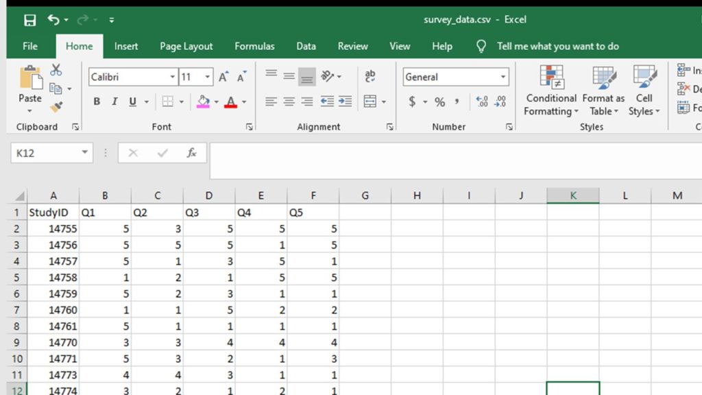
The minimal dataset of Likert plot data has only a study ID (numeric), and the Likert variables you need for your plot. The variable names should be short and easy to type, but unintuitive to the statement (e.g., Q1, Q2, Q3, etc.). All variables should be in numeric format.
survey1 <- read.csv("survey_data.csv", header = TRUE, sep = ",")


Step 2: Prepare to make a fake dataset, append it to the real dataframe, do some processing, then remove the fake records.
This is the hack to make it so the Likert plot works even if one or more of your statements has a level that wasn’t said by a respondent.
Imagine you have a Likert scale of
- 1 = Strongly Disagree
- 2 = Somewhat Disagree
- 3 = Neither Agree nor Disagree
- 4 = Somewhat Agree, and
- 5 = Strongly Agree.
Imagine you had a statement everyone agreed with – so in the dataset, there are only answers 4 and 5 to that statement. That means that levels 1, 2, and 3 are not represented, and this would create a complication when plotting. This is the hack to prevent this.

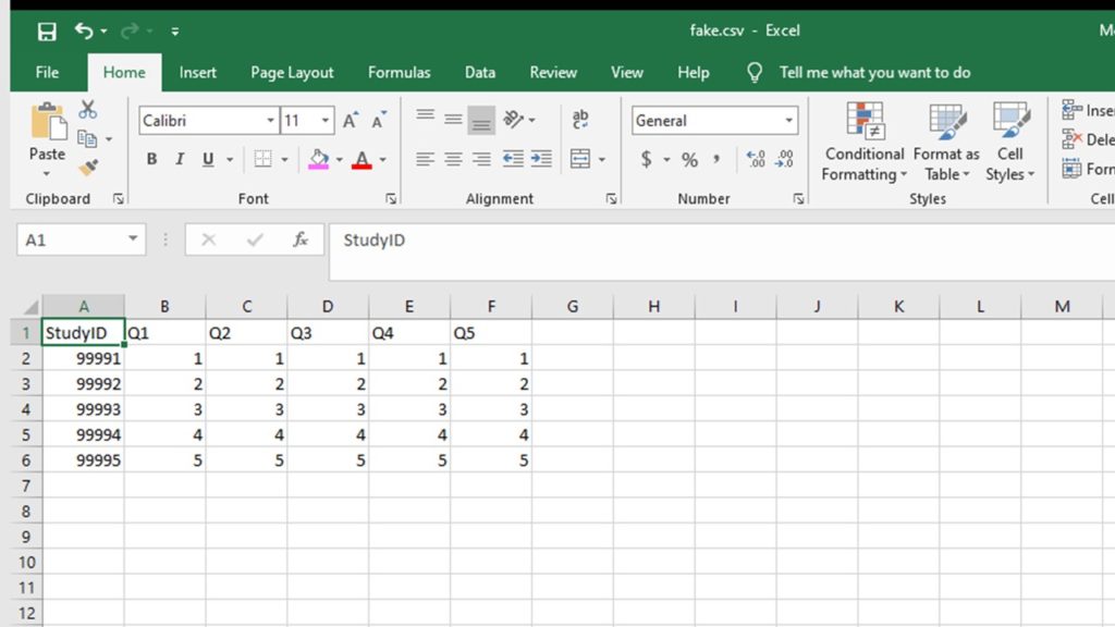
Step 3: Create fake dataset of Likert plot data in the same format as the minimal dataset with a row for each level of the Likert scale.
With our example scenario, it means we have five levels, so the fake dataset will have five rows. Each row should have a study ID within a known range (e.g. between 9991 and 9995) that is not in the range of the real study IDs, so you can remove these fake data rows later. Each row of the Likert plot data should be all coded with one of the levels. So, for us, we’d have row 9991 and make every answer be 1, then a row for 9992 and make every answer be 2, etc.
StudyID <- c("99991", "99992", "99993", "99994", "99995")
Q2 <- c(1, 2, 3, 4, 5)
Q3 <- c(1, 2, 3, 4, 5)
Q4 <- c(1, 2, 3, 4, 5)
Q5 <- c(1, 2, 3, 4, 5)
fake <- data.frame(StudyID, Q1, Q2, Q3, Q4, Q5)


Step 4: Append the fake dataframe to the real dataframe, and convert all of the variables to factor format.
Factor data format is really specific to R. It’s meant for codes for ordinal or nominal variables (exactly what we are doing). That way, R sees the values not as numbers, but as codes, and can attach labels to each code; these labels are called “levels”. See this information page from UC Berkeley for more on the factors in R concept. For SAS users, the parallel is attaching formats to numerical variables using PROC FORMAT. Now that we have appended the fake data on, and every level is represented in the dataset for each Likert variable, we can convert them all to factor. I like to put them all in new variables with the _f suffix (e.g., Q1_f, Q2_f, Q3_f).
survey2 <- rbind(survey1, fake)
survey2$Q1_f <- as.factor(survey2$Q1)
survey2$Q2_f <- as.factor(survey2$Q2)
survey2$Q3_f <- as.factor(survey2$Q3)
survey2$Q4_f <- as.factor(survey2$Q4)
survey2$Q5_f <- as.factor(survey2$Q5)

Step 5: Attach factor levels to each of the Likert statement variables you just converted to a factor.
As I said above, the factor levels are essentially labels for each level in the Likert plot data. Because we added the fake data, we can be sure that none of the levels are missing in any of the data, and the levels will get properly attached.
factor_levels <- c("Strongly Disagree","Somewhat Disagree","Neither Agree nor Disagree",
     "Somewhat Agree","Strongly Agree")

levels(survey2$Q1_f) <- factor_levels
levels(survey2$Q2_f) <- factor_levels
levels(survey2$Q3_f) <- factor_levels
levels(survey2$Q4_f) <- factor_levels
levels(survey2$Q5_f) <- factor_levels


Step 6: Remove the fake data.
This is easily done by filtering a saving a new dataframe without the rows with the study IDs assigned to the fake data (in our case, rows 9991 to 9995).
nrow(survey2)
survey3 <- subset(survey2, StudyID < 99991)
nrow(survey3)

Step 7: Remove the study ID column, and all the original numeric columns without the _f suffix.
In other words, make a plotting dataframe of just the variables with the _f suffix. This is because we need the entire dataset to have only the factor format Likert variables with the levels attached, or the plot doesn’t work.
colnames(survey3)
survey4 <- survey3[,7:11]
colnames(survey4)

Step 8: Replace the Likert plot data column headings with the actual Likert statement
This is easiest done by making a vector, and then replacing the dataframe headings with the vector. Now you are done with your Likert plot data!
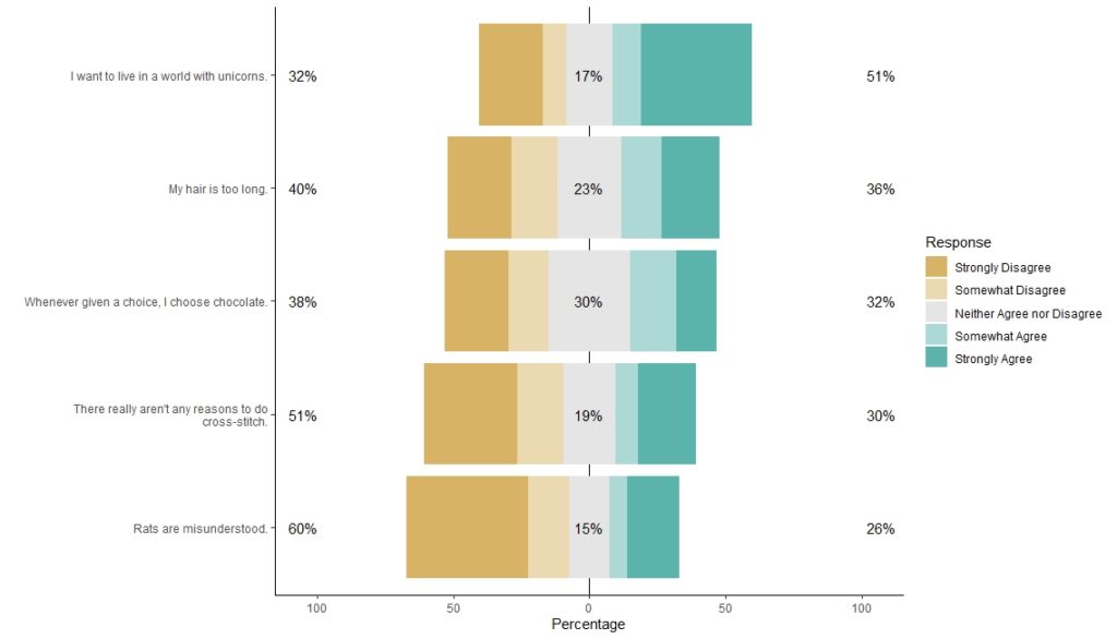
VarHeadings <- c("I want to live in a world with unicorns.",
"Whenever given a choice, I choose chocolate.","My hair is too long.",
"There really aren't any reasons to do cross-stitch.","Rats are misunderstood.")

names(survey4) <- VarHeadings
colnames(survey4)

Step 9: Plot the dataset with a legend.
Through our machinations, the plot is labeled clearly with the Likert statements, and the legend is labeled clearly with the levels.
library(likert)
p <- likert(survey4)
a <- likert.bar.plot(p, legend.position = "right", text.size = 4) +
   theme(text = element_text(size = rel(4)),axis.text.y = element_text(size = rel(2))) +
   theme_update(legend.text = element_text(size = rel(0.7))) +
   theme_classic()
plot(a)
Updated October 10, 2020. Added FTC disclaimer and other edits on December 5, 2020. Formatting edits September 12, 2021 and October 11, 2022. Added banners March 6, 2023. Revised banners June 19, 2023. Revised banners June 24, 2024. Updated banners May 3, 2025.
Read all of our data science blog posts!

Confidence Intervals are for Estimating a Range for the True Population-level Measure
Confidence intervals (CIs) help you get a solid estimate for the true population measure. Read [...]
1 Comment
Jun

Continuous Variable? You Can Categorize it!
Continuous variable categorized can open up a world of possibilities for analysis. Read about it [...]
2 Comments
Jun

Delete if the Row Meets Criteria? Do it in SAS!
Delete if rows meet a certain criteria is a common approach to paring down a [...]
May


Chi-square Test: Insight from Using Microsoft Excel
Chi-square test is hard to grasp – but doing it in Microsoft Excel can give [...]
May

Identify Elements of Research in Scientific Literature
Identify elements in research reports, and you’ll be able to understand them much more easily. [...]
May

Design the Most Useful Time Periods for Your Conversions
Time periods are important when creating a time series visualization that actually speaks to you! [...]
Apr

Apply Weights? It’s Easy in R with the Survey Package!
Apply weights to get weighted proportions and counts! Read my blog post to learn how [...]
Nov

Make Categorical Variable Out of Continuous Variable
Make categorical variables by cutting up continuous ones. But where to put the boundaries? Get [...]
Nov

Remove Rows in R with the Subset Command
Remove rows by criteria is a common ETL operation – and my blog post shows [...]
Oct

CDC Wonder for Studying Vaccine Adverse Events: The Shameful State of US Open Government Data
CDC Wonder is an online query portal that serves as a gateway to many government [...]
Jun

AI Careers: Riding the Bubble
AI careers are not easy to navigate. Read my blog post for foolproof advice for [...]
Jun

Descriptive Analysis of Black Friday Death Count Database: Creative Classification
Descriptive analysis of Black Friday Death Count Database provides an example of how creative classification [...]
Nov

Classification Crosswalks: Strategies in Data Transformation
Classification crosswalks are easy to make, and can help you reduce cardinality in categorical variables, [...]
Nov

FAERS Data: Getting Creative with an Adverse Event Surveillance Dashboard
FAERS data are like any post-market surveillance pharmacy data – notoriously messy. But if you [...]
4 Comments
Nov

Dataset Source Documentation: Necessary for Data Science Projects with Multiple Data Sources
Dataset source documentation is good to keep when you are doing an analysis with data [...]
Nov

Joins in Base R: Alternative to SQL-like dplyr
Joins in base R must be executed properly or you will lose data. Read my [...]
Nov

NHANES Data: Pitfalls, Pranks, Possibilities, and Practical Advice
NHANES data piqued your interest? It’s not all sunshine and roses. Read my blog post [...]
Nov

Color in Visualizations: Using it to its Full Communicative Advantage
Color in visualizations of data curation and other data science documentation can be used to [...]
Oct

Defaults in PowerPoint: Setting Them Up for Data Visualizations
Defaults in PowerPoint are set up for slides – not data visualizations. Read my blog [...]
Oct

Text and Arrows in Dataviz Can Greatly Improve Understanding
Text and arrows in dataviz, if used wisely, can help your audience understand something very [...]
Oct

Shapes and Images in Dataviz: Making Choices for Optimal Communication
Shapes and images in dataviz, if chosen wisely, can greatly enhance the communicative value of [...]
Oct

Table Editing in R is Easy! Here Are a Few Tricks…
Table editing in R is easier than in SAS, because you can refer to columns, [...]
Aug

R for Logistic Regression: Example from Epidemiology and Biostatistics
R for logistic regression in health data analytics is a reasonable choice, if you know [...]
272 Comments
Aug

Connecting SAS to Other Applications: Different Strategies
Connecting SAS to other applications is often necessary, and there are many ways to do [...]
Jul

Portfolio Project Examples for Independent Data Science Projects
Portfolio project examples are sometimes needed for newbies in data science who are looking to [...]
Jul

Project Management Terminology for Public Health Data Scientists
Project management terminology is often used around epidemiologists, biostatisticians, and health data scientists, and it’s [...]
Jun

Rapid Application Development Public Health Style
“Rapid application development” (RAD) refers to an approach to designing and developing computer applications. In [...]
Jun

Understanding Legacy Data in a Relational World
Understanding legacy data is necessary if you want to analyze datasets that are extracted from [...]
Jun

Front-end Decisions Impact Back-end Data (and Your Data Science Experience!)
Front-end decisions are made when applications are designed. They are even made when you design [...]
Jun

Reducing Query Cost (and Making Better Use of Your Time)
Reducing query cost is especially important in SAS – but do you know how to [...]
Jun

Curated Datasets: Great for Data Science Portfolio Projects!
Curated datasets are useful to know about if you want to do a data science [...]
May

Statistics Trivia for Data Scientists
Statistics trivia for data scientists will refresh your memory from the courses you’ve taken – [...]
Apr

Management Tips for Data Scientists
Management tips for data scientists can be used by anyone – at work and in [...]
Mar

REDCap Mess: How it Got There, and How to Clean it Up
REDCap mess happens often in research shops, and it’s an analysis showstopper! Read my blog [...]
Mar

GitHub Beginners in Data Science: Here’s an Easy Way to Start!
GitHub beginners – even in data science – often feel intimidated when starting their GitHub [...]
Feb

ETL Pipeline Documentation: Here are my Tips and Tricks!
ETL pipeline documentation is great for team communication as well as data stewardship! Read my [...]
Feb

Benchmarking Runtime is Different in SAS Compared to Other Programs
Benchmarking runtime is different in SAS compared to other programs, where you have to request [...]
Dec

End-to-End AI Pipelines: Can Academics Be Taught How to Do Them?
End-to-end AI pipelines are being created routinely in industry, and one complaint is that academics [...]
Nov

Referring to Columns in R by Name Rather than Number has Pros and Cons
Referring to columns in R can be done using both number and field name syntax. [...]
Oct

The Paste Command in R is Great for Labels on Plots and Reports
The paste command in R is used to concatenate strings. You can leverage the paste [...]
Oct

Coloring Plots in R using Hexadecimal Codes Makes Them Fabulous!
Recoloring plots in R? Want to learn how to use an image to inspire R [...]
5 Comments
Oct

Adding Error Bars to ggplot2 Plots Can be Made Easy Through Dataframe Structure
Adding error bars to ggplot2 in R plots is easiest if you include the width [...]
Oct

AI on the Edge: What it is, and Data Storage Challenges it Poses
“AI on the edge” was a new term for me that I learned from Marc [...]
Jun

Pie Chart ggplot Style is Surprisingly Hard! Here’s How I Did it
Pie chart ggplot style is surprisingly hard to make, mainly because ggplot2 did not give [...]
5 Comments
Apr

Time Series Plots in R Using ggplot2 Are Ultimately Customizable
Time series plots in R are totally customizable using the ggplot2 package, and can come [...]
Apr

Data Curation Solution to Confusing Options in R Package UpSetR
Data curation solution that I posted recently with my blog post showing how to do [...]
Apr

Making Upset Plots with R Package UpSetR Helps Visualize Patterns of Attributes
Making upset plots with R package UpSetR is an easy way to visualize patterns of [...]
11 Comments
Apr

Making Box Plots Different Ways is Easy in R!
Making box plots in R affords you many different approaches and features. My blog post [...]
Mar

Convert CSV to RDS When Using R for Easier Data Handling
Convert CSV to RDS is what you want to do if you are working with [...]
Mar

GPower Case Example Shows How to Calculate and Document Sample Size
GPower case example shows a use-case where we needed to select an outcome measure for [...]
Feb

Querying the GHDx Database: Demonstration and Review of Application
Querying the GHDx database is challenging because of its difficult user interface, but mastering it [...]
Feb

Variable Names in SAS and R Have Different Restrictions and Rules
Variable names in SAS and R are subject to different “rules and regulations”, and these [...]
Feb

Referring to Variables in Processing Data is Different in SAS Compared to R
Referring to variables in processing is different conceptually when thinking about SAS compared to R. [...]
Jan

Counting Rows in SAS and R Use Totally Different Strategies
Counting rows in SAS and R is approached differently, because the two programs process data [...]
Jan

Native Formats in SAS and R for Data Are Different: Here’s How!
Native formats in SAS and R of data objects have different qualities – and there [...]
Jan

SAS-R Integration Example: Transform in R, Analyze in SAS!
Looking for a SAS-R integration example that uses the best of both worlds? I show [...]
Dec

Dumbbell Plot for Comparison of Rated Items: Which is Rated More Highly – Harvard or the U of MN?
Want to compare multiple rankings on two competing items – like hotels, restaurants, or colleges? [...]
2 Comments
Sep

Data for Meta-analysis Need to be Prepared a Certain Way – Here’s How
Getting data for meta-analysis together can be challenging, so I walk you through the simple [...]
Jul

Sort Order, Formats, and Operators: A Tour of The SAS Documentation Page
Get to know three of my favorite SAS documentation pages: the one with sort order, [...]
Nov

Confused when Downloading BRFSS Data? Here is a Guide
I use the datasets from the Behavioral Risk Factor Surveillance Survey (BRFSS) to demonstrate in [...]
2 Comments
Oct

Doing Surveys? Try my R Likert Plot Data Hack!
I love the Likert package in R, and use it often to visualize data. The [...]
3 Comments
Oct

I Used the R Package EpiCurve to Make an Epidemiologic Curve. Here’s How It Turned Out.
With all this talk about “flattening the curve” of the coronavirus, I thought I would [...]
Mar

Which Independent Variables Belong in a Regression Equation? We Don’t All Agree, But Here’s What I Do.
During my failed attempt to get a PhD from the University of South Florida, my [...]
Aug
I love the Likert package in R, and use it often to visualize data. The problem is that sometimes, I have sparse data, and this can cause problems with the package. This blog post shows you a workaround, and also, a way to format the final plot that I think looks really great!
This was excellent! Thank you for being my collaborator. I really wanted to use this package and was getting so frustrated with how to make it work; adding in the fake data did the trick 🙂
Awesome! If you go to the video, you will see one of the commenters wrote some more complex code to solve the problem. I’m not smart enough for that – so adding fake data does the trick!
Hi! I loved this step-by-step tutorial on how lo plot likert data. I am wondering how I could modify some aspects, like the colors or the font size of the questions. I tried adding code in “theme”, but the plot didn´t change. Any thoughts? Thank you!