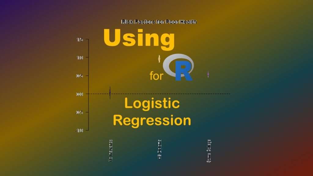
R for logistic regression often does not come up as a topic in public health, especially when you are taking courses for your master’s degree. That’s because SAS is so good at logistic regression, professors and others often do not really think about teaching R for logistic regression.
Why R for Logistic Regression?
Even though SAS is good at it, there are many arguments for using R for logistic regression. First, R results are identical to SAS results out to many more decimals than most people report, so there are no issues with different results from different software. Second, it is much easier to load external datasets of most sizes into R GUI or RStudio interfaces compared to any interface in SAS (even SAS ODA). Third, once your dataset is in R, it is easier to utilize R’s functionality to create objects to do fancy things like graphing with the resulting model.
The main downside to R for logistic regression has to do with the fact that it is sort of a piecemeal operation. In public health, we care about odds ratios (ORs) and their 95% confidence intervals (CIs), which means we care about not having the resulting slopes from the logistic regression equation remain on the log scale. SAS’s PROC LOGISTIC lets you add the /risklimits option to do this, and it comes out on the output. But in R, this is a manual operation!

Using R for Logistic Regression: 6 Steps
Here are the steps I will go over.
- Prepare the analytic dataset you will use for the logistic regression equation. Designate an outcome variable, and make a list of candidate covariates you will consider including in the model based on model fit. We are assuming you will do multiple iterations as you fit the model; this tutorial just demonstrates presumably the first iteration.
- Create a glm object in R. This object contains the estimates resulting from the model (slope, y-intercept, etc.).
- Turn the object into a tidy object. This essentially converts the glm object to a dataframe – basically, a dataset in R that has the slopes, y-intercept, and the other metrics as actual editable and graphable data values.
- Edit the tidy object to add other data. This is where you basically run data editing commands on the tidy dataframe to add the OR and confidence limits as data values in the dataframe.
- Export the tidy dataframe. If you export it as a *.csv. you can open it in MS Excel, and graph the contents by hand, make tables of the data, import these results into another program, or anything you want!
- BONUS! Make a coefficient plot! I show you how to make a quick and dirty one that can help you develop an interpretation.
The dataset I am using to demonstrate this is from my LinkedIn Learning courses, but you can access it here on GitHub – download the dataset named BRFSS_i.rds (the last one in the folder). The data originated from the BRFSS.
Next, if you want the code I demonstrate below, go to this folder in GitHub and download the code titled 100_Logistic example.R.

Step 1: Prepare the Analytic Dataset and Modeling Plan
If you put the dataset in a folder, open R, and then point R to the directory with the dataset in it, you can run the following code.

BRFSS <- readRDS(file="BRFSS_i.rds")
colnames(BRFSS)
nrow(BRFSS)
This will create the dataset BRFSS in R, and show you the column names with the colnames command, and the number of rows with the nrows command. There are about 58,000 rows in the dataset and several different columns. We will just make up a hypothesis for this demonstration.
If you look at the results from the colnames command, you’ll see there is a variable called NOPLAN which is binary (1 or 0). This means that the respondent has no health insurance plan if it is a 1, and if it is 0, they have a plan. In the US, not having a plan means you pretty much do not have access to healthcare, so NOPLAN = 1 is a bad exposure. That’s what we will be modeling as our hypothesized exposure in our logistic regression model.
Our outcome variable is POORHLTH, which is an indicator variable for the respondent indicating that their health was “poor” on the general health question (e.g., how the respondent would rate their own health). If they said their health was “poor”, the variable has a value of 1, and if they said anything else, it is 0.
So the hypothesis is that after controlling for education level, having NOPLAN puts you at higher risk for having POORHLTH. For education level, you will notice there is a categorical variable called EDGROUP. This is a recode of native variable EDUCA. As you can see if you run a crosstabs (table command), LOWED is an indicator variable for the lowest education level (less than high school and high school graduates), and SOMECOLL is an indicator variable for having attended some college or vocational school without graduating. The highest level of education in EDUCA and EDGROUP then serves as the reference group in the model when these two indicator variables are used as covariates.
Now that we have our hypothesis and our analytic dataset (and presumably our modeling plan), let’s proceed to modeling.

Step 2: Create the Model
Like SAS, R has a “base”, and like with SAS components, you have to add R “packages” to get certain functionality. Luckily with R, the command for the general linear model (glm) is in the base. So, we will just call it with our code.
LogisticModel <- glm(POORHLTH ~ NOPLAN + LOWED + SOMECOLL,
	data = BRFSS, family = "binomial")
As you can see, this code sets up our glm command, specifies the model equation in the argument, specifies the dataset BRFSS as an option, and sets the family option to binomial” so we get a logistic model.
In the code above, we save the results of our model in an object named LogisticModel. If you just run the code to the right of the arrow, it will output results to the console in R GUI, but if you specify for it to save the results in a model like we do above, then you can run code on that model.
If you just run the glm code on the right side of the arrow, you will see that the output gives you the values of the intercept and slopes, and some model fit statistics (including the Akaike Information Criterion, or AIC). One reason why you want to create an object is that you can run the summary command on the object and get a lot more information out of the object, as we do here.
CODE:
summary(LogisticModel)

OUTPUT:
glm(formula = POORHLTH ~ NOPLAN + LOWED + SOMECOLL, family = "binomial",
    data = BRFSS)

Deviance Residuals:
    Min       1Q   Median       3Q      Max
-0.4417  -0.4351  -0.3550  -0.2732   2.5716

Coefficients:
            Estimate Std. Error z value Pr(>|z|)
(Intercept) -3.26924    0.03603 -90.726   <2e-16 ***
NOPLAN       0.03156    0.08470   0.373    0.709
LOWED        0.95962    0.04421  21.706   <2e-16 ***
SOMECOLL     0.53673    0.04789  11.208   <2e-16 ***
---
Signif. codes:  0 ‘***’ 0.001 ‘**’ 0.01 ‘*’ 0.05 ‘.’ 0.1 ‘ ’ 1

(Dispersion parameter for binomial family taken to be 1)

    Null deviance: 26832  on 58130  degrees of freedom
Residual deviance: 26321  on 58127  degrees of freedom
AIC: 26329

Number of Fisher Scoring iterations: 6

Step 3: Turn Model into Tidy Object
Let’s observe two things about that output above. First, we see that our first covariate – NOPLAN – was not statistically significant. In real life, we’d probably have more variables than just education to introduce in the model, so you can imagine we would start iterating our models and trying to see if there was more variation not accounted for by the covariates we have. We have the AIC to help us. So we are off to a good start.
But second, we will want to document that we ran this model. We will want to keep track of what happens when you run this specific model as part of modeling for this project. So we will want to get the data that is displayed in R’s console out of R, and into MS Excel so we can make tables out of it, or otherwise have the raw values of the slopes to graph and consider in what I like to call “post-processing”.
This is where I like R better than SAS. It isn’t actually that hard to do this “model – calculate – export – import into Excel” pipeline in R. And the reason I added “calculate” to that pipeline is because if you are going to export the model statistics, why not add the ones you want before export it? Why not add the OR and the 95% limits, too? So that’s basically the big picture of what we are doing next.
In Step 3, we will just turn this model object into a tidy object so it will become an editable dataset called a dataframe. For that, we need to first install and load two packages – devtools and broom. Then we just run the tidy command on our LogicModel object. In the code, I save the resulting object under the name TidyModel.
library (devtools)
library (broom)

TidyModel <- tidy(LogisticModel)
If at this point, you just run the TidyModel object, you will see it looks in the R console a lot like normal SAS output from logistic regression, with the slope estimate, the standard error, the value of the test statistic, and the p-value. It’s in tabular format, so there are no headers and footers with model fit statistics and whatnot.

Step 4: Add Calculations to the Tidy Object
At this point, TidyModel is a dataframe in tibble format. The first row has the data about the y-intercept, and each other row has data about the slope on that row for that covariate. Since we have one intercept and three covariates, we have a total of four rows.
Now, all you statistics buffs will recognize what is going on here, in this next code!
TidyModel$OR <- exp(TidyModel$estimate)
TidyModel$LL <- exp(TidyModel$estimate - (1.96 * TidyModel$std.error))
TidyModel$UL <- exp(TidyModel$estimate + (1.96 * TidyModel$std.error))
Well, although it’s probably obvious, I’ll explain what is going on in the code. In these three lines of code, I have added three variables to this dataset: OR, LL, and UL. In the TidyModel dataset that is created from the using the tidy command in Step 3, the column named estimate holds the value of the slope on the log odds scale. So, by running the exp command on that variable, I create the odds ratio for each slope, and store it in a variable called OR. Using the same approach and involving the slope’s standard error as stored in the std.error field of TidyModel, I create the 95% lower and upper limits for the confidence intervals, and store them in LL and UL respectively. Here is what the final dataset looks like.
# A tibble: 4 × 8
  term        estimate std.error statistic   p.value     OR     LL     UL

1 (Intercept)  -3.27      0.0360   -90.7   0         0.0380 0.0354 0.0408
2 NOPLAN        0.0316    0.0847     0.373 7.09e-  1 1.03   0.874  1.22
3 LOWED         0.960     0.0442    21.7   1.82e-104 2.61   2.39   2.85
4 SOMECOLL      0.537     0.0479    11.2   3.72e- 29 1.71   1.56   1.88

Step 5: Export the Dataset so You Can Use it in Other Programs
This is the number one reason I love R for logistic regression – you can easily export the values from your analysis. This is something that is pretty hard to do in SAS, and it’s literally a breeze in R, as you will see by the code.
write.csv(TidyModel, "TidyModel.csv")
This line of code will convert the TidyModel from tibble to *.csv format, then export it as file Tibble.csv into the folder mapped to that R session (probably the one where you put the original BRFSS_i.rds dataset that you read in in the first step). If you go look there, find it, and open it, you will see it contains the same values as shown in the output above!

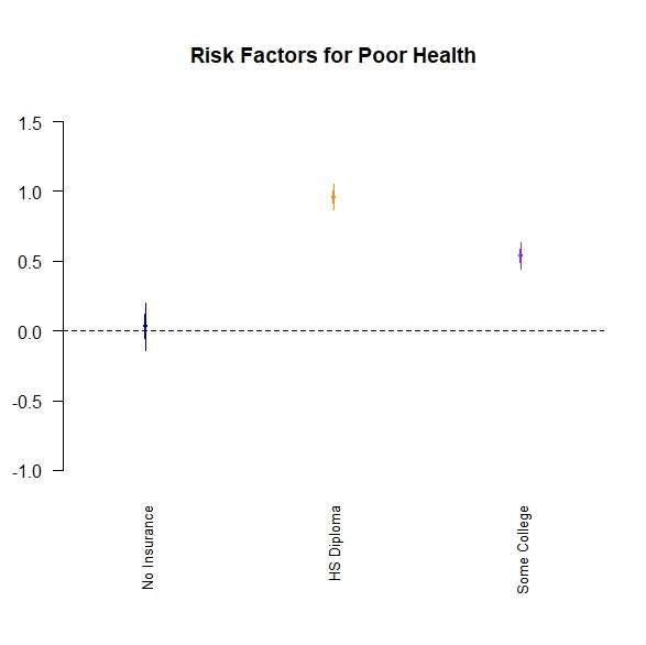
BONUS! Step 6: Coefficient Plot
Here’s another advantage you have if you use R for logistic regression: Graphing! If you have made it this far, you have both LogisticModel (object that is not tidy) and TidyModel (model that is tidy).
Let’s go back to LogisticModel. Let’s say you are writing about the results. It can be hard to look at a table of ORs and confidence limits to formulate your thinking, so I like to use this quick and dirty coefficient plot, which you can run on an object like LogisticModel.
Please be advised that this particular coefficient plot – from the arm package – does NOT use OR, LL, and UL in the plot. In fact, it only uses the log odds (original slope in the model), and automatically graphs two standard errors from the log odds. Nevertheless, I find it helpful to look at when trying to interpret the model, and write about it in my results sections.
Let’s look at the code.
library(arm)
VarLabels=c("Intercept", "No Insurance", "HS Diploma", "Some College")
par(mai=c(1.5,0,0,0))
coefplot(LogisticModel,
	vertical=FALSE,
	ylim=c(-1, 1.5),
	main="Risk Factors for Poor Health",
	varnames=VarLabels,
	col=c("darkblue", "darkorange", "blueviolet", "darkgreen"))
First we call up the arm package. Then, I make a vector called VarLabels that has the labels of the rows – but please note that even though I include a label position for the intercept, it never shows up on the graph. The par command sets inner and outer margins for the plot that will output.
After that, you will see the coefplot command. It is run on the object LogisticModel, and by setting vertical to FALSE, we get a horizontal line of unity. We set the y limits to be logical for the log odds scale using the ylim option, and add a title using the main option. We also label our variables by setting varnames to the vector we made earlier called VarLabels, and we designate colors by setting col to the four colors spelled out in the character vector.
Here is the plot.
Updated August 18, 2023. Added livestream video September 6, 2023.
Read all of our data science blog posts!

Confidence Intervals are for Estimating a Range for the True Population-level Measure
Confidence intervals (CIs) help you get a solid estimate for the true population measure. Read [...]
1 Comment
Jun

Continuous Variable? You Can Categorize it!
Continuous variable categorized can open up a world of possibilities for analysis. Read about it [...]
2 Comments
Jun

Delete if the Row Meets Criteria? Do it in SAS!
Delete if rows meet a certain criteria is a common approach to paring down a [...]
May


Chi-square Test: Insight from Using Microsoft Excel
Chi-square test is hard to grasp – but doing it in Microsoft Excel can give [...]
May

Identify Elements of Research in Scientific Literature
Identify elements in research reports, and you’ll be able to understand them much more easily. [...]
May

Design the Most Useful Time Periods for Your Conversions
Time periods are important when creating a time series visualization that actually speaks to you! [...]
Apr

Apply Weights? It’s Easy in R with the Survey Package!
Apply weights to get weighted proportions and counts! Read my blog post to learn how [...]
Nov

Make Categorical Variable Out of Continuous Variable
Make categorical variables by cutting up continuous ones. But where to put the boundaries? Get [...]
Nov

Remove Rows in R with the Subset Command
Remove rows by criteria is a common ETL operation – and my blog post shows [...]
Oct

CDC Wonder for Studying Vaccine Adverse Events: The Shameful State of US Open Government Data
CDC Wonder is an online query portal that serves as a gateway to many government [...]
Jun

AI Careers: Riding the Bubble
AI careers are not easy to navigate. Read my blog post for foolproof advice for [...]
Jun

Descriptive Analysis of Black Friday Death Count Database: Creative Classification
Descriptive analysis of Black Friday Death Count Database provides an example of how creative classification [...]
Nov

Classification Crosswalks: Strategies in Data Transformation
Classification crosswalks are easy to make, and can help you reduce cardinality in categorical variables, [...]
Nov

FAERS Data: Getting Creative with an Adverse Event Surveillance Dashboard
FAERS data are like any post-market surveillance pharmacy data – notoriously messy. But if you [...]
4 Comments
Nov

Dataset Source Documentation: Necessary for Data Science Projects with Multiple Data Sources
Dataset source documentation is good to keep when you are doing an analysis with data [...]
Nov

Joins in Base R: Alternative to SQL-like dplyr
Joins in base R must be executed properly or you will lose data. Read my [...]
Nov

NHANES Data: Pitfalls, Pranks, Possibilities, and Practical Advice
NHANES data piqued your interest? It’s not all sunshine and roses. Read my blog post [...]
Nov

Color in Visualizations: Using it to its Full Communicative Advantage
Color in visualizations of data curation and other data science documentation can be used to [...]
Oct

Defaults in PowerPoint: Setting Them Up for Data Visualizations
Defaults in PowerPoint are set up for slides – not data visualizations. Read my blog [...]
Oct

Text and Arrows in Dataviz Can Greatly Improve Understanding
Text and arrows in dataviz, if used wisely, can help your audience understand something very [...]
Oct

Shapes and Images in Dataviz: Making Choices for Optimal Communication
Shapes and images in dataviz, if chosen wisely, can greatly enhance the communicative value of [...]
Oct

Table Editing in R is Easy! Here Are a Few Tricks…
Table editing in R is easier than in SAS, because you can refer to columns, [...]
Aug

R for Logistic Regression: Example from Epidemiology and Biostatistics
R for logistic regression in health data analytics is a reasonable choice, if you know [...]
272 Comments
Aug

Connecting SAS to Other Applications: Different Strategies
Connecting SAS to other applications is often necessary, and there are many ways to do [...]
Jul

Portfolio Project Examples for Independent Data Science Projects
Portfolio project examples are sometimes needed for newbies in data science who are looking to [...]
Jul

Project Management Terminology for Public Health Data Scientists
Project management terminology is often used around epidemiologists, biostatisticians, and health data scientists, and it’s [...]
Jun

Rapid Application Development Public Health Style
“Rapid application development” (RAD) refers to an approach to designing and developing computer applications. In [...]
Jun

Understanding Legacy Data in a Relational World
Understanding legacy data is necessary if you want to analyze datasets that are extracted from [...]
Jun

Front-end Decisions Impact Back-end Data (and Your Data Science Experience!)
Front-end decisions are made when applications are designed. They are even made when you design [...]
Jun

Reducing Query Cost (and Making Better Use of Your Time)
Reducing query cost is especially important in SAS – but do you know how to [...]
Jun

Curated Datasets: Great for Data Science Portfolio Projects!
Curated datasets are useful to know about if you want to do a data science [...]
May

Statistics Trivia for Data Scientists
Statistics trivia for data scientists will refresh your memory from the courses you’ve taken – [...]
Apr

Management Tips for Data Scientists
Management tips for data scientists can be used by anyone – at work and in [...]
Mar

REDCap Mess: How it Got There, and How to Clean it Up
REDCap mess happens often in research shops, and it’s an analysis showstopper! Read my blog [...]
Mar

GitHub Beginners in Data Science: Here’s an Easy Way to Start!
GitHub beginners – even in data science – often feel intimidated when starting their GitHub [...]
Feb

ETL Pipeline Documentation: Here are my Tips and Tricks!
ETL pipeline documentation is great for team communication as well as data stewardship! Read my [...]
Feb

Benchmarking Runtime is Different in SAS Compared to Other Programs
Benchmarking runtime is different in SAS compared to other programs, where you have to request [...]
Dec

End-to-End AI Pipelines: Can Academics Be Taught How to Do Them?
End-to-end AI pipelines are being created routinely in industry, and one complaint is that academics [...]
Nov

Referring to Columns in R by Name Rather than Number has Pros and Cons
Referring to columns in R can be done using both number and field name syntax. [...]
Oct

The Paste Command in R is Great for Labels on Plots and Reports
The paste command in R is used to concatenate strings. You can leverage the paste [...]
Oct

Coloring Plots in R using Hexadecimal Codes Makes Them Fabulous!
Recoloring plots in R? Want to learn how to use an image to inspire R [...]
5 Comments
Oct

Adding Error Bars to ggplot2 Plots Can be Made Easy Through Dataframe Structure
Adding error bars to ggplot2 in R plots is easiest if you include the width [...]
Oct

AI on the Edge: What it is, and Data Storage Challenges it Poses
“AI on the edge” was a new term for me that I learned from Marc [...]
Jun

Pie Chart ggplot Style is Surprisingly Hard! Here’s How I Did it
Pie chart ggplot style is surprisingly hard to make, mainly because ggplot2 did not give [...]
5 Comments
Apr

Time Series Plots in R Using ggplot2 Are Ultimately Customizable
Time series plots in R are totally customizable using the ggplot2 package, and can come [...]
Apr

Data Curation Solution to Confusing Options in R Package UpSetR
Data curation solution that I posted recently with my blog post showing how to do [...]
Apr

Making Upset Plots with R Package UpSetR Helps Visualize Patterns of Attributes
Making upset plots with R package UpSetR is an easy way to visualize patterns of [...]
11 Comments
Apr

Making Box Plots Different Ways is Easy in R!
Making box plots in R affords you many different approaches and features. My blog post [...]
Mar

Convert CSV to RDS When Using R for Easier Data Handling
Convert CSV to RDS is what you want to do if you are working with [...]
Mar

GPower Case Example Shows How to Calculate and Document Sample Size
GPower case example shows a use-case where we needed to select an outcome measure for [...]
Feb

Querying the GHDx Database: Demonstration and Review of Application
Querying the GHDx database is challenging because of its difficult user interface, but mastering it [...]
Feb

Variable Names in SAS and R Have Different Restrictions and Rules
Variable names in SAS and R are subject to different “rules and regulations”, and these [...]
Feb

Referring to Variables in Processing Data is Different in SAS Compared to R
Referring to variables in processing is different conceptually when thinking about SAS compared to R. [...]
Jan

Counting Rows in SAS and R Use Totally Different Strategies
Counting rows in SAS and R is approached differently, because the two programs process data [...]
Jan

Native Formats in SAS and R for Data Are Different: Here’s How!
Native formats in SAS and R of data objects have different qualities – and there [...]
Jan

SAS-R Integration Example: Transform in R, Analyze in SAS!
Looking for a SAS-R integration example that uses the best of both worlds? I show [...]
Dec

Dumbbell Plot for Comparison of Rated Items: Which is Rated More Highly – Harvard or the U of MN?
Want to compare multiple rankings on two competing items – like hotels, restaurants, or colleges? [...]
2 Comments
Sep

Data for Meta-analysis Need to be Prepared a Certain Way – Here’s How
Getting data for meta-analysis together can be challenging, so I walk you through the simple [...]
Jul

Sort Order, Formats, and Operators: A Tour of The SAS Documentation Page
Get to know three of my favorite SAS documentation pages: the one with sort order, [...]
Nov

Confused when Downloading BRFSS Data? Here is a Guide
I use the datasets from the Behavioral Risk Factor Surveillance Survey (BRFSS) to demonstrate in [...]
2 Comments
Oct

Doing Surveys? Try my R Likert Plot Data Hack!
I love the Likert package in R, and use it often to visualize data. The [...]
3 Comments
Oct

I Used the R Package EpiCurve to Make an Epidemiologic Curve. Here’s How It Turned Out.
With all this talk about “flattening the curve” of the coronavirus, I thought I would [...]
Mar

Which Independent Variables Belong in a Regression Equation? We Don’t All Agree, But Here’s What I Do.
During my failed attempt to get a PhD from the University of South Florida, my [...]
Aug
R for logistic regression in health data analytics is a reasonable choice, if you know what packages to use. You don’t have to use SAS! My blog post provides you example R code and a tutorial!