
Color in visualizations can actually help you understand what the visualization means. Sometimes I see documentation with no color in visualizations, and it’s actually hard to read. Even people with colorblindness perceive differences between colors that can help them navigate the world. On the other hand, sometimes I see documentation for data that uses color in a very distracting way, and does not leverage it for communication.
Color in Visualizations: What are the considerations?
First, it is important to consider the components of color. These lead to requirements of a color theme for data science visualizations.
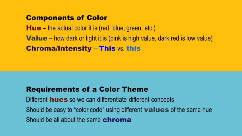
As shown in the graphic, the components of each color are hue, value, and chroma. So, when setting up a color theme for a data visualization, you should have different hues so we can color code and differentiate different concepts. However, you should be able to use multiple values of the same hues to help you in your color coding. Finally, when it comes to chroma, all the colors should have approximately the same chroma.

Want to learn how to set default color palettes in PowerPoint? Watch my livestream for a demonstration!
Color in Visualizations: What are the Strategies?
In my online course, “PowerPoint for Visualizations” (which is part of my online group mentoring program), I demonstrate how I use color for communication. Here are a few strategies:
- To indicate something is intensifying, use increasing values of color. For example, to show something is going from cool to cold, you could have arrows that proceed from light blue to dark blue.
- Use green and red to indicate “go” and “stop”, respectively. Yellow can also indicate “caution”. You can also use red for “no”, green for “yes”, and yellow for “maybe”.
- To indicate something is evolving you can use a gradation – like making something go from blue to red to indicate it is heating up.
- You can color-code items. That way, you can create visual groupings.
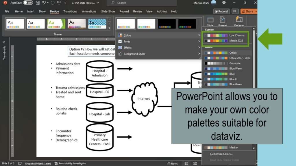
As you can see above, if you want to be able to use these strategies, you will need to create a palette with a variety of different hues, and each hue should have many values to choose from. If you take the online course, I’ll show you how to set up such a palette in PowerPoint that you can use for visualizations.
Updated October 1, 2023. Added video October 28, 2023.
Try all of our courses and learning programs!

Data Curation Course: Learn Data Curation Online from LinkedIn Learning!
Curation files are especially helpful for communicating about data on teams. Learn more about what [...]
Oct

Announcing the Publication of my New SAS Book on Data Warehousing
SAS is known for big data and data warehousing, but how do you actually design [...]
Oct
Testimonials for Monika Wahi’s Linked In Data Science Courses
Testimonials for Monika Wahi’s data science courses on LinkedIn Learning are posted here. Read what [...]
Apr
Color in visualizations of data curation and other data science documentation can be used to enhance communication – I show you how!