
Making upset plots with R package UpSetR is an easy way to visualize patterns of attributes in your data. My blog post demonstrates making patterns of co-morbidities in health survey respondents from the BRFSS, and walks you through setting text and color options in the code.
Tag Archives: teach data science
28
Jan
Jan
Referring to variables in processing is different conceptually when thinking about SAS compared to R. I explain the differences in my blog post.
26
Dec
Dec
Looking for a SAS-R integration example that uses the best of both worlds? I show you a use-case where I was in a hurry, and did transformation in R with the analysis in SAS!
Data Science
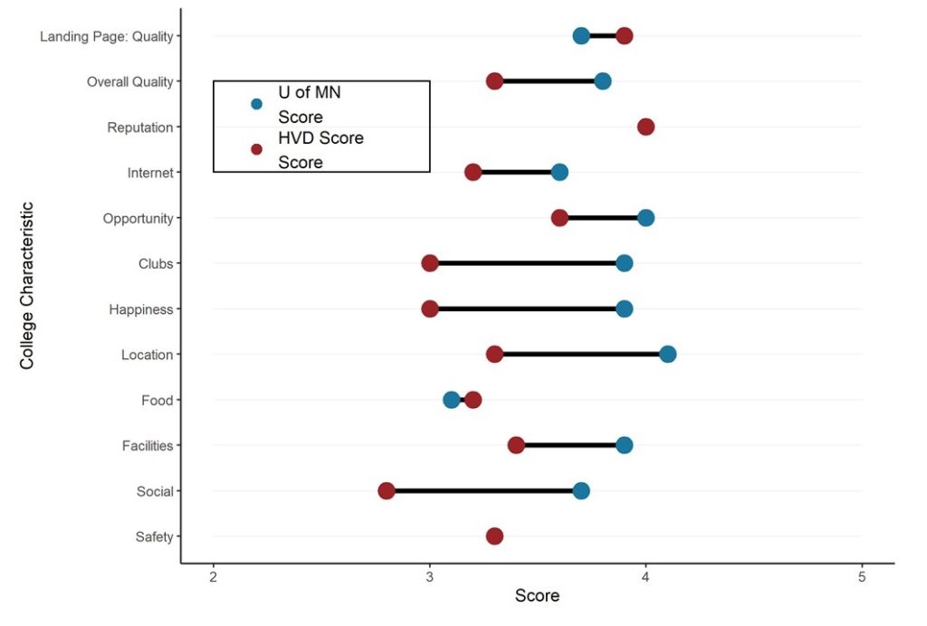
Dumbbell Plot for Comparison of Rated Items: Which is Rated More Highly – Harvard or the U of MN?
20
Sep
Sep
Want to compare multiple rankings on two competing items – like hotels, restaurants, or colleges? I show you an example of using a dumbbell plot for comparison in R with the ggalt package for this exact use-case!
03
Aug
Aug
You might wonder what CMS – the Centers for Medicare and Medicaid Services – actually does. This blog post provides an overview of CMS’s role and activity in the US healthcare system.
30
Jul
Jul
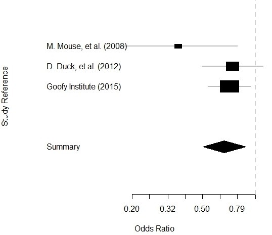
Getting data for meta-analysis together can be challenging, so I walk you through the simple steps I take, starting with the scientific literature, and ending with a gorgeous and evidence-based Forrest plot!
29
Jul
Jul
The United States (US) Center for Disease Control and Prevention (CDC) was in the spotlight during the COVID-19 pandemic. But as I describe in this blog post, it is only as good as its director.
Quality Assurance/Quality Improvement (QA/QI)
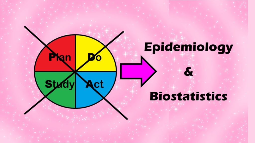
Recommended Model for QA/QI in Healthcare: Epidemiology and Biostatistics, not PDSA! Part 5 of 5
14
Jul
Jul
I describe the three steps of my alternative model to the Plan-Do-Study-Act (PDSA) model for quality assurance/quality improvement (QA/QI) in healthcare.
Quality Assurance/Quality Improvement (QA/QI)
Alternative to the PDSA Model for QA/QI in Healthcare? Old-fashioned Epidemiology and Biostatistics! Part 4 of 5

07
Jul
Jul
Want an alternative to the Plan-Do-Study-Act (PDSA) model for quality assurance/quality improvement (QA/QI) in healthcare? I recommend approaching QA/QI a different way, by thinking about the various functions of the QA/QI department.

21
Jun
Jun
Monika posts her “data science newbie do-it-yourself starter kit”, with links to cheap or free learning resources for the data science newbie who wants to get started in healthcare analytics.
- 1
- 2