Apply weights to get weighted proportions and counts! Read my blog post to learn how to use the survey package in R.
Tag Archives: ggplot2 plots
Data Science
Dataset Source Documentation: Necessary for Data Science Projects with Multiple Data Sources
09
Nov
Nov
Dataset source documentation is good to keep when you are doing an analysis with data from multiple datasets. Read my blog to learn how easy it is to throw together some quick dataset source documentation in PowerPoint so that you don’t forget what you did.
11
Oct
Oct
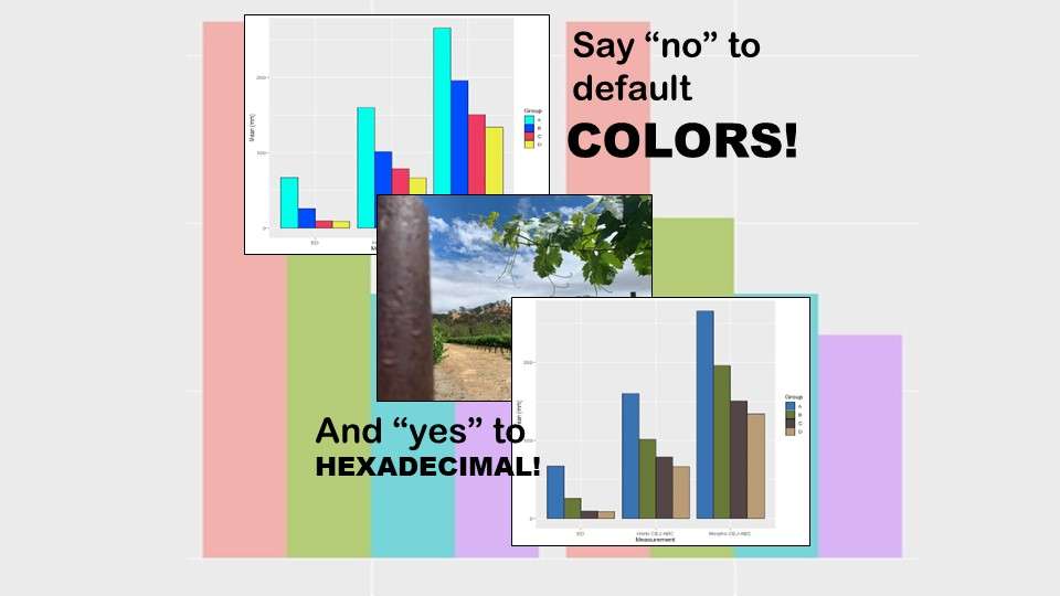
Recoloring plots in R? Want to learn how to use an image to inspire R color palettes you can use in ggplot2 plots? Read my blog post to learn how.
11
Apr
Apr
Time series plots in R are totally customizable using the ggplot2 package, and can come out with a look that is clean and sharp. However, you usually end up fighting with formatting the x-axis and other options, and I explain in my blog post.
03
Apr
Apr
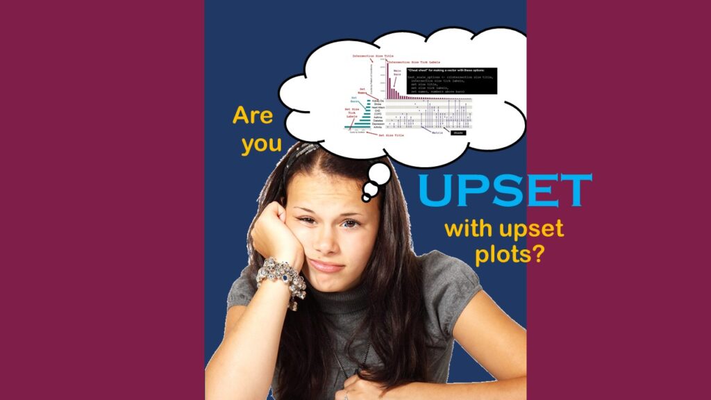
Making upset plots with R package UpSetR is an easy way to visualize patterns of attributes in your data. My blog post demonstrates making patterns of co-morbidities in health survey respondents from the BRFSS, and walks you through setting text and color options in the code.
31
Mar
Mar
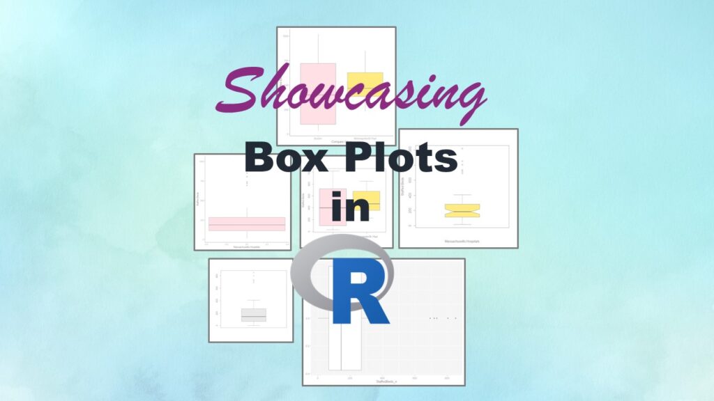
Making box plots in R affords you many different approaches and features. My blog post will show you easy ways to use both base R and ggplot2 to make box plots as you are proceeding with your data science projects.
Data Science
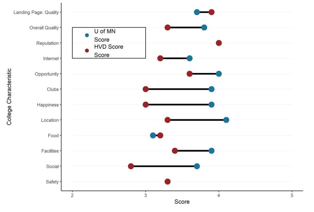
Dumbbell Plot for Comparison of Rated Items: Which is Rated More Highly – Harvard or the U of MN?
20
Sep
Sep
Want to compare multiple rankings on two competing items – like hotels, restaurants, or colleges? I show you an example of using a dumbbell plot for comparison in R with the ggalt package for this exact use-case!