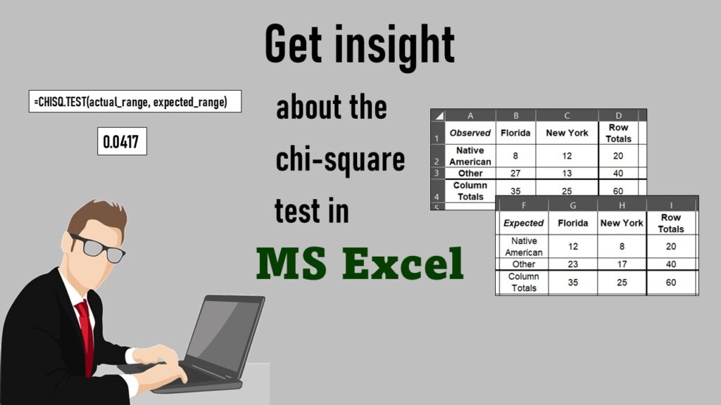
Chi-square test is hard to grasp – but doing it in Microsoft Excel can give you special insight. Read about it on my blog!
Tag Archives: chi-square test
Data Science
CDC Wonder for Studying Vaccine Adverse Events: The Shameful State of US Open Government Data

24
Jun
Jun
CDC Wonder is an online query portal that serves as a gateway to many government datasets. Although antiquated, it still works for extracting data, and my blog post shows you how.

06
Oct
Oct
Defaults in PowerPoint are set up for slides – not data visualizations. Read my blog post for tips on reconfiguring PowerPoint to make it easy for dataviz!
24
Aug
Aug
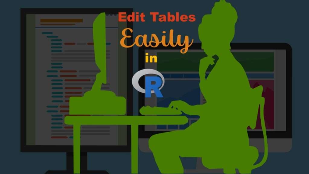
Table editing in R is easier than in SAS, because you can refer to columns, rows, and individual cells in the same way you do in MS Excel. Read my blog post for example R table editing code.

19
Jun
Jun
Understanding legacy data is necessary if you want to analyze datasets that are extracted from old systems. This knowledge is still relevant, as we still use these old systems today, as I discuss in my blog post.
12
Apr
Apr
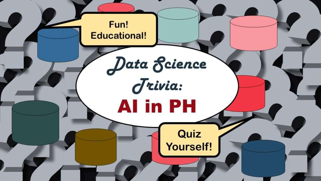
Statistics trivia for data scientists will refresh your memory from the courses you’ve taken – or maybe teach you something new! Visit my blog to find out!
28
Feb
Feb
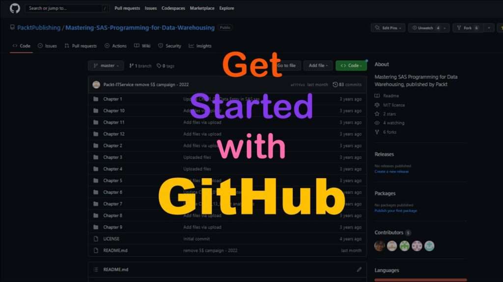
GitHub beginners – even in data science – often feel intimidated when starting their GitHub accounts and trying to interact with the web page. Don’t be shy! Catch the highlights from a recent GitHub beginners workshop I held!

11
Apr
Apr
Time series plots in R are totally customizable using the ggplot2 package, and can come out with a look that is clean and sharp. However, you usually end up fighting with formatting the x-axis and other options, and I explain in my blog post.

18
Feb
Feb
GPower case example shows a use-case where we needed to select an outcome measure for our study, then do a power calculation for sample size required under different outcome effect size scenarios. My blog post shows what I did, and how I documented/curated the results.
Educational Resources
If You Want to Increase Conversions, Try my A/B Testing Course on LinkedIn Learning

26
Oct
Oct
A/B testing seems straightforward, but there are a lot of picky details. What A and B conditions do you actually test? How long do you run the test? How do you calculate the statistics for the test? Answer your questions by taking this LinkedIn Learning course.