
AI careers are not easy to navigate. Read my blog post for foolproof advice for those interested in building a career in AI.
Tag Archives: artificial intelligence

09
Oct
Oct
Color in visualizations of data curation and other data science documentation can be used to enhance communication – I show you how!
06
Oct
Oct
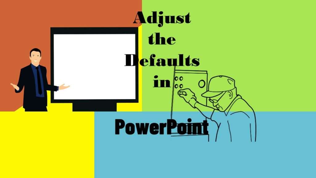
Defaults in PowerPoint are set up for slides – not data visualizations. Read my blog post for tips on reconfiguring PowerPoint to make it easy for dataviz!
01
Oct
Oct
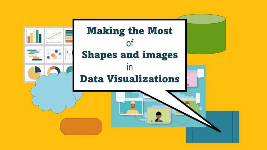
Shapes and images in dataviz, if chosen wisely, can greatly enhance the communicative value of the visualization. Read my blog post for tips in selecting shapes for data visualizations!
30
Jul
Jul
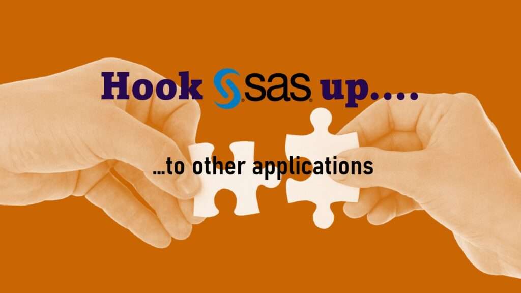
Connecting SAS to other applications is often necessary, and there are many ways to do it. Read this blog post for a couple of use-cases of SAS data integration using various SAS components.
10
Jul
Jul
Internship strategy for data science is not obvious, and even if you are in a college program, they often expect you to find your own internship. Download our internship strategy guide and get the experience you want!
12
Apr
Apr
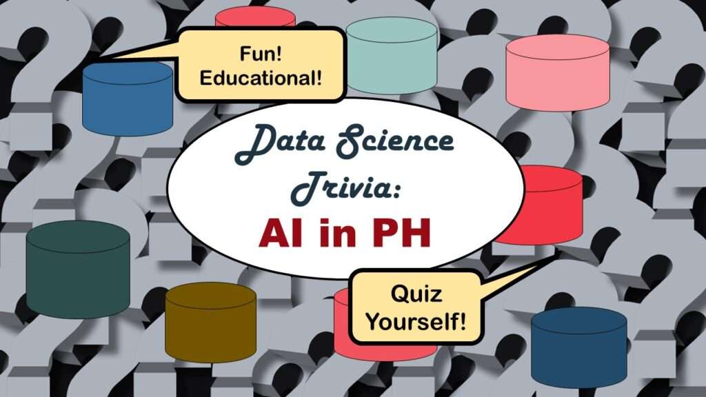
Statistics trivia for data scientists will refresh your memory from the courses you’ve taken – or maybe teach you something new! Visit my blog to find out!
07
Mar
Mar
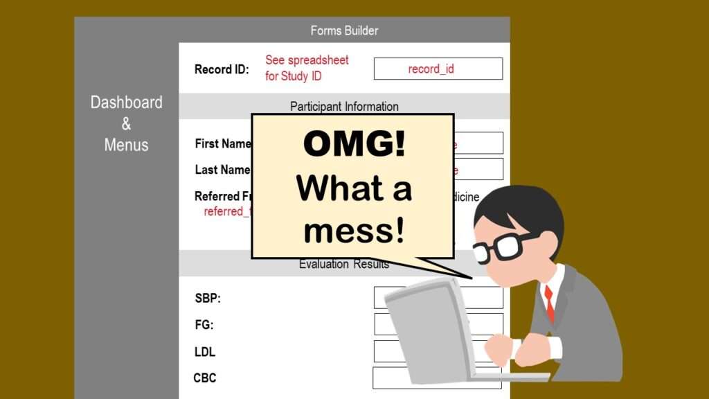
REDCap mess happens often in research shops, and it’s an analysis showstopper! Read my blog post to learn my secret tricks for breaking through the barriers and getting on with data analytics!
25
Nov
Nov
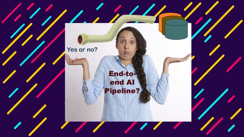
End-to-end AI pipelines are being created routinely in industry, and one complaint is that academics can only contribute to one component of the pipeline. Really? Read my blog post for an alternative viewpoint!
12
Oct
Oct
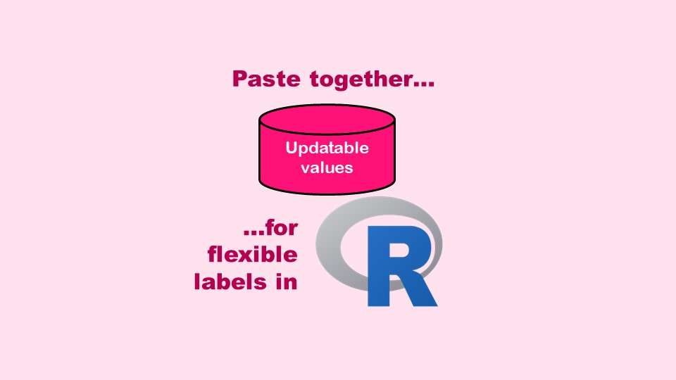
The paste command in R is used to concatenate strings. You can leverage the paste command to make refreshable label objects for reports and plots, as I describe in my blog post.
- 1
- 2