
Mixed methods research is trending now, with doctoral students and academics being pressured to do it. But is it always the right approach? Read my blog and find out!
Tag Archives: Biostatistics
25
Sep
Sep
AI or statistics – two different, interrelated approaches you can use in your scientific publication. But which one should you pick? Read my blog post and find out!

12
Sep
Sep
Learn R online and tackle statistical problems easily with open source software! Take my LinkedIn Learning courses and complete your own unique research projects.
Courses
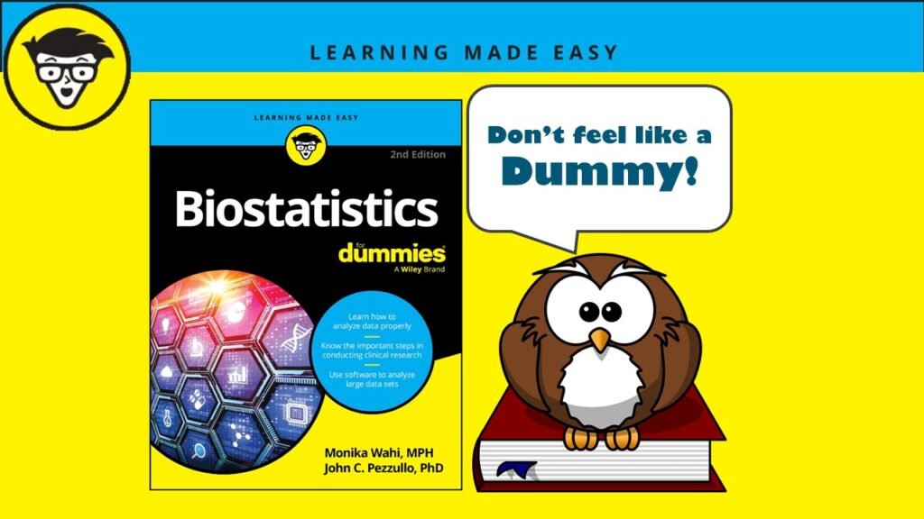
Biostatistics for Dummies: The Thinking Data Scientist’s Quintessential Professional Reference
07
Sep
Sep
“Biostatistics for Dummies” is the thinking data scientist’s essential reference. Check out the updated 2024 version, which adds epidemiologic inference topics and modeling advice!
09
Jun
Jun
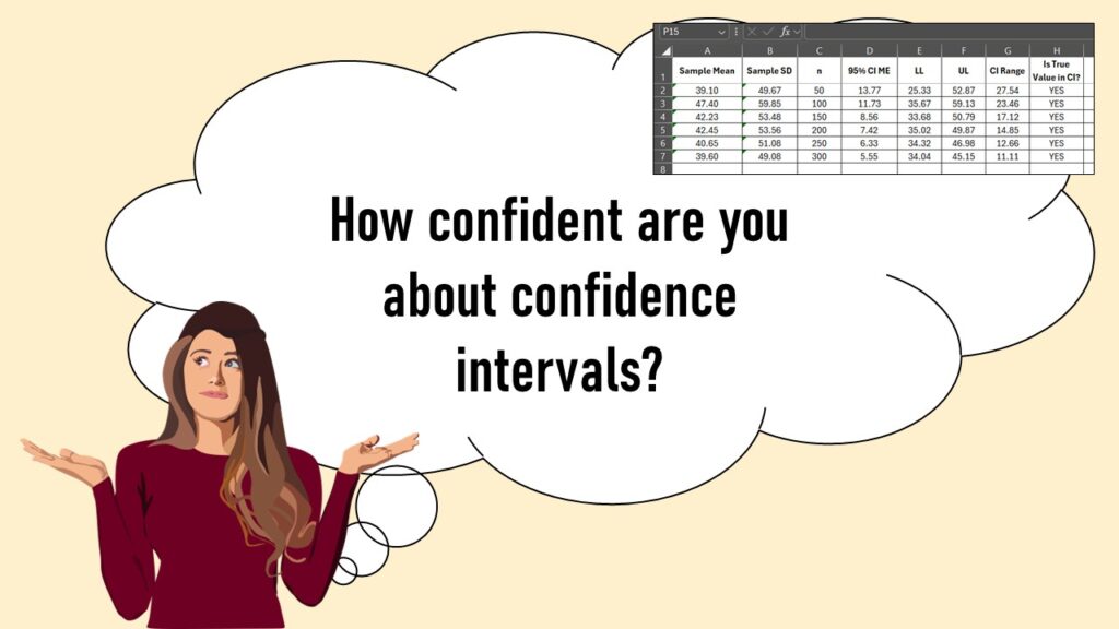
Confidence intervals (CIs) help you get a solid estimate for the true population measure. Read my blog and try my CI calculator!
12
May
May
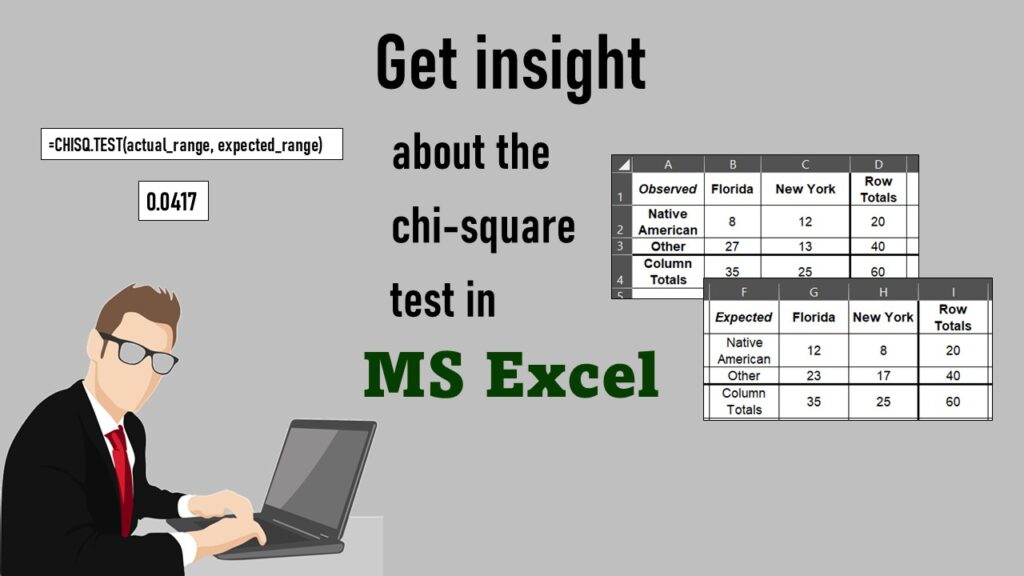
Chi-square test is hard to grasp – but doing it in Microsoft Excel can give you special insight. Read about it on my blog!
12
Oct
Oct
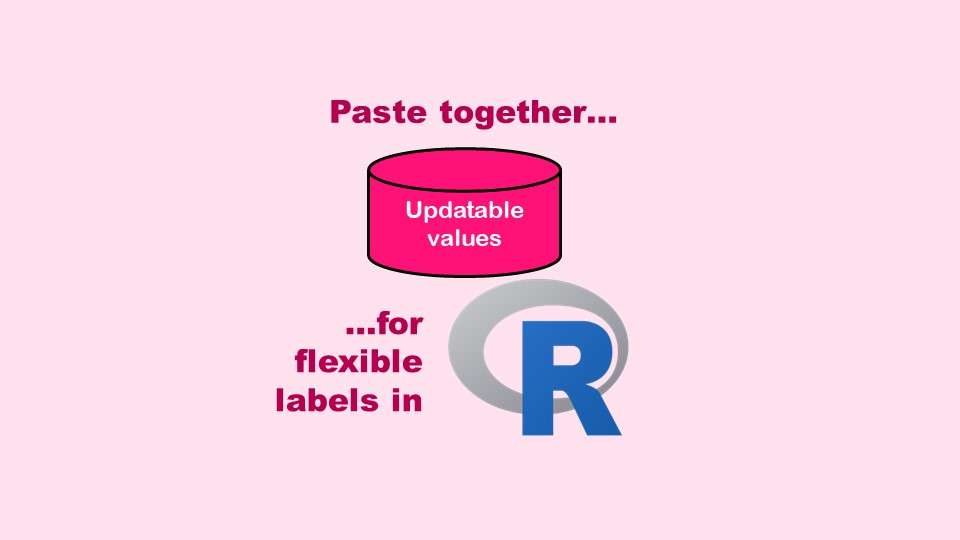
The paste command in R is used to concatenate strings. You can leverage the paste command to make refreshable label objects for reports and plots, as I describe in my blog post.
21
Apr
Apr
Testimonials for Monika Wahi’s data science courses on LinkedIn Learning are posted here. Read what learners are saying to help you decide if you want to take the courses!
11
Apr
Apr
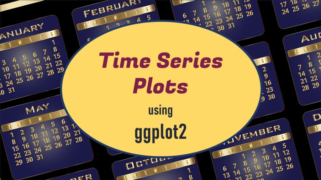
Time series plots in R are totally customizable using the ggplot2 package, and can come out with a look that is clean and sharp. However, you usually end up fighting with formatting the x-axis and other options, and I explain in my blog post.
31
Mar
Mar
Making box plots in R affords you many different approaches and features. My blog post will show you easy ways to use both base R and ggplot2 to make box plots as you are proceeding with your data science projects.
- 1
- 2