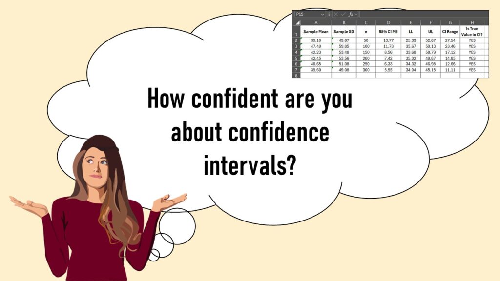
Confidence intervals (CIs) help you get a solid estimate for the true population measure. Read my blog and try my CI calculator!
Tag Archives: web page conversions
28
Apr
Apr
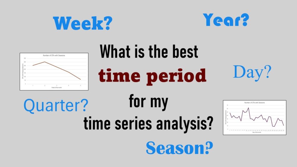
Time periods are important when creating a time series visualization that actually speaks to you! Get advice on my blog.
04
Oct
Oct
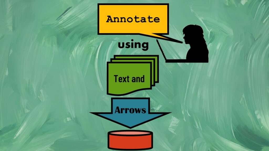
Text and arrows in dataviz, if used wisely, can help your audience understand something very abstract, like a data pipeline. Read my blog post for tips in choosing images for your data visualizations!
30
Sep
Sep
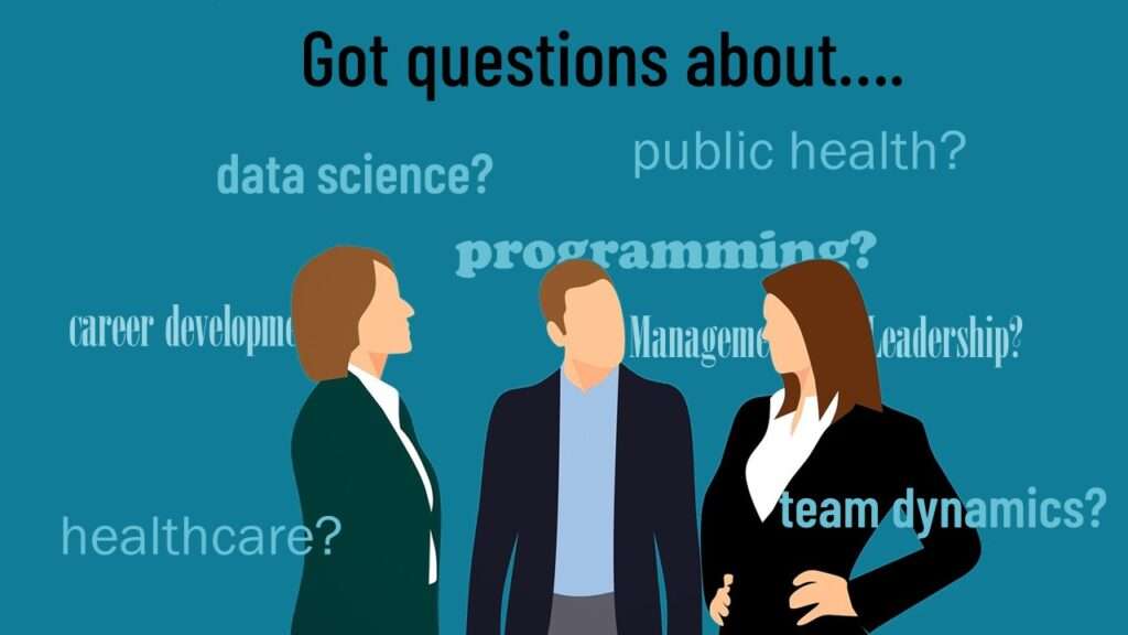
Ask me anything about data science or public health every month! Subscribe to my “Ask Me Anything” membership, and get all your questions answered in real time!
11
Apr
Apr
Time series plots in R are totally customizable using the ggplot2 package, and can come out with a look that is clean and sharp. However, you usually end up fighting with formatting the x-axis and other options, and I explain in my blog post.
Educational Resources
If You Want to Increase Conversions, Try my A/B Testing Course on LinkedIn Learning

26
Oct
Oct
A/B testing seems straightforward, but there are a lot of picky details. What A and B conditions do you actually test? How long do you run the test? How do you calculate the statistics for the test? Answer your questions by taking this LinkedIn Learning course.