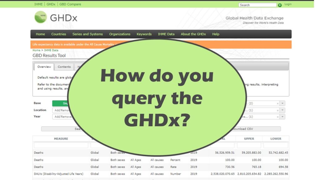
Querying the GHDx database was requested by one of my customers. The GHDx database is online and is the data repository behind the Global Burden of Disease Study, which is sponsored by the Lancet and the Institute of Health Metrics and Evaluation (IHME) at the University of Washington.
Querying the GHDx database is very challenging, which is why my customer asked me for help. I could not believe how awkward it was. We fought with it for about an hour before I could come up with a process. The process I recommended included serial individual queries and abstracting data from the retrieved database results onto spreadsheets. You know if you are doing that, your GUI is a fail.
I’ll show you annotated screen shot below, but it might be easier for you to watch me demonstrate the GUI, which I did in a recent livestream.
Querying the GHDx Database Requires You to Understand the GUI
Querying the GHDx database is quite complicated, so it requires you to plan your actions before you take them. You can imagine why when you look at this annotated screen shot I made of the GHDx query interface.
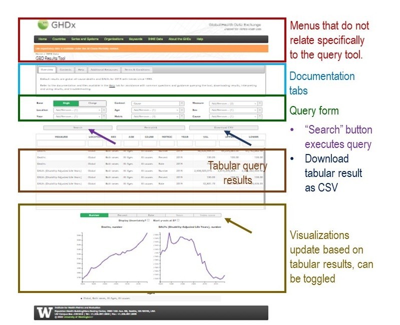

As you can see, the query form is quite small. The rest of the real estate is taken up by visualizations and information that could be on other pages. Let’s take a close-up of the query form – see my annotated screen shot here.
Let me give you a quick unpacking of the annotated screen shot of the query form.
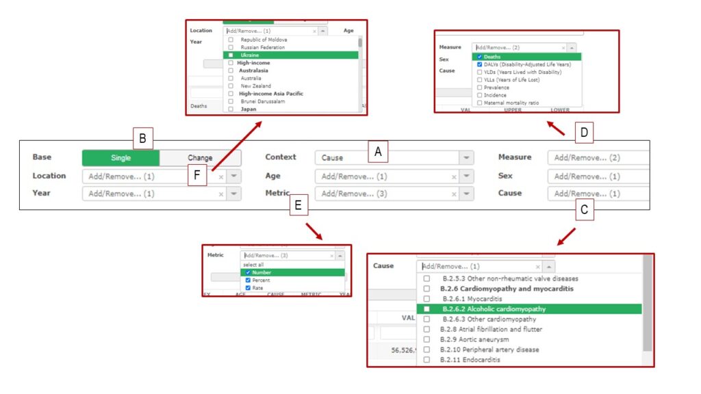
A
Context: This is a dropdown that you want to address first in your query. That is because if you change it from the default, which is “cause”, it changes the fields on the query form! I think there are different flat tables behind the GUI, and this dropdown toggles what set of tables you are querying. Of course, without knowing anything about the underlying dataset – like the source of it, or what columns it has – it’s not possible to figure out how to fill out the query form.
In my video above, I only demonstrate myself querying using the “cause” query form. That’s because it lets you query about rates of health conditions. I encourage you to explore the other forms yourself.
B
Base: This changes your results from being an estimate (“single”) to an estimate of change (“change”). As you probably know, when you calculate percent-change, you have to have a baseline, and the percent change is of that baseline.
Because this query form is so unclear, I would be hesitant to use the “change” function. I would instead suggest you just use the “base” function and calculate your own change percentages.
C
Cause: This is the list of conditions – but there are serious classification issues, as you can see by the screen shot. It would be very hard to prepare for a query of this database, because the results would be per entry, and the entries are stratified at very low levels. Further, there is not an obvious place to click to get the full list.
For example, if you only wanted some selections under “Cardiomyopathy and myocarditis” and not the whole category, your individual selections would not group together in the results pane after your query. Again, you would have to do some post-processing to calculate your estimates.
D
Measure: Here are where common “burden of disease” measures (such as DALYs) are, but there isn’t any readily-available documentation about how they were calculated. From this pane, I would only trust “prevalence” myself without looking more into the source data and the source calculations. Even “incidence” is questionable, because many countries do not do a good job of tracking incident cases of chronic disease.
E
Metric: If you noticed that the term “metric” and “measure” mean the same thing, then you are probably as confused as I am as to why there are two dropdowns. Since this includes “rate” and “percent”, it seems redundant to include “prevalence” under Measure – doesn’t it?
F
Location: This has countries in it, and it also has some higher-level groupings, such as “high-income” countries. Again, this suffers from classification limitations. It would be very hard to get an estimate for a group of countries selected by the user. You essentially would have to use this GUI for data collection into a spreadsheet and then make summary statistics.

Why is Querying the GHDx Database So Hard?
There are a few answers to this question. First, no one really cared to design a user interface, because if you do that, then you have to consider who your users are, and it appears that no one at the Lancet and IHME was interested in doing this. I guess I’m a user, and I find it horrendous. I cannot imagine a user who would find the experience satisfying. So, the first lesson is that if you don’t consider who your user is, your user interface will probably be bad.
Second, it looks to me like their back-end is in SAS, for whatever reason, when it probably should be in some flavor of SQL. That’s because SQL is for querying, and SAS is for analytics. SAS has some great tools for publishing to the web – however, whatever tool these people used is not one of them! Just because SAS makes a tool doesn’t mean you should use it. To me, this situation looks like a great use-case for some integration. SAS could still be used for creating estimates (like confidence intervals), but SQL could be used for storage, and R or Python could be used to create more customized output. There are so many possibilities for dashboards in R, and this GHDx could essentially be seen as a dashboard for querying a bunch of tables.
If you want more information on these concepts, here is what I recommend:
- Please watch my recorded livestream where I demonstrate the GHDx. I also lecture a little about data warehouse principles I cover in my book “Mastering SAS Programming for Data Warehousing”.
- Gain skills at design so that when it’s your turn to make a dashboard or a GUI, you can at least use your imagination and produce something better than this example. My course on LinkedIn Learning on data curation can help you with this, as well as my description of dashboard design in a book chapter I co-authored with my intern, “Framework to Evaluate Level of Good Faith in Implementations of Public Dashboards”
Read all of our data science blog posts!

Confidence Intervals are for Estimating a Range for the True Population-level Measure
Confidence intervals (CIs) help you get a solid estimate for the true population measure. Read [...]
1 Comment
Jun

Continuous Variable? You Can Categorize it!
Continuous variable categorized can open up a world of possibilities for analysis. Read about it [...]
2 Comments
Jun

Delete if the Row Meets Criteria? Do it in SAS!
Delete if rows meet a certain criteria is a common approach to paring down a [...]
May


Chi-square Test: Insight from Using Microsoft Excel
Chi-square test is hard to grasp – but doing it in Microsoft Excel can give [...]
May

Identify Elements of Research in Scientific Literature
Identify elements in research reports, and you’ll be able to understand them much more easily. [...]
May

Design the Most Useful Time Periods for Your Conversions
Time periods are important when creating a time series visualization that actually speaks to you! [...]
Apr

Apply Weights? It’s Easy in R with the Survey Package!
Apply weights to get weighted proportions and counts! Read my blog post to learn how [...]
Nov

Make Categorical Variable Out of Continuous Variable
Make categorical variables by cutting up continuous ones. But where to put the boundaries? Get [...]
Nov

Remove Rows in R with the Subset Command
Remove rows by criteria is a common ETL operation – and my blog post shows [...]
Oct

CDC Wonder for Studying Vaccine Adverse Events: The Shameful State of US Open Government Data
CDC Wonder is an online query portal that serves as a gateway to many government [...]
Jun

AI Careers: Riding the Bubble
AI careers are not easy to navigate. Read my blog post for foolproof advice for [...]
Jun

Descriptive Analysis of Black Friday Death Count Database: Creative Classification
Descriptive analysis of Black Friday Death Count Database provides an example of how creative classification [...]
Nov

Classification Crosswalks: Strategies in Data Transformation
Classification crosswalks are easy to make, and can help you reduce cardinality in categorical variables, [...]
Nov

FAERS Data: Getting Creative with an Adverse Event Surveillance Dashboard
FAERS data are like any post-market surveillance pharmacy data – notoriously messy. But if you [...]
4 Comments
Nov

Dataset Source Documentation: Necessary for Data Science Projects with Multiple Data Sources
Dataset source documentation is good to keep when you are doing an analysis with data [...]
Nov

Joins in Base R: Alternative to SQL-like dplyr
Joins in base R must be executed properly or you will lose data. Read my [...]
Nov

NHANES Data: Pitfalls, Pranks, Possibilities, and Practical Advice
NHANES data piqued your interest? It’s not all sunshine and roses. Read my blog post [...]
Nov

Color in Visualizations: Using it to its Full Communicative Advantage
Color in visualizations of data curation and other data science documentation can be used to [...]
Oct

Defaults in PowerPoint: Setting Them Up for Data Visualizations
Defaults in PowerPoint are set up for slides – not data visualizations. Read my blog [...]
Oct

Text and Arrows in Dataviz Can Greatly Improve Understanding
Text and arrows in dataviz, if used wisely, can help your audience understand something very [...]
Oct

Shapes and Images in Dataviz: Making Choices for Optimal Communication
Shapes and images in dataviz, if chosen wisely, can greatly enhance the communicative value of [...]
Oct

Table Editing in R is Easy! Here Are a Few Tricks…
Table editing in R is easier than in SAS, because you can refer to columns, [...]
Aug

R for Logistic Regression: Example from Epidemiology and Biostatistics
R for logistic regression in health data analytics is a reasonable choice, if you know [...]
272 Comments
Aug

Connecting SAS to Other Applications: Different Strategies
Connecting SAS to other applications is often necessary, and there are many ways to do [...]
Jul

Portfolio Project Examples for Independent Data Science Projects
Portfolio project examples are sometimes needed for newbies in data science who are looking to [...]
Jul

Project Management Terminology for Public Health Data Scientists
Project management terminology is often used around epidemiologists, biostatisticians, and health data scientists, and it’s [...]
Jun

Rapid Application Development Public Health Style
“Rapid application development” (RAD) refers to an approach to designing and developing computer applications. In [...]
Jun

Understanding Legacy Data in a Relational World
Understanding legacy data is necessary if you want to analyze datasets that are extracted from [...]
Jun

Front-end Decisions Impact Back-end Data (and Your Data Science Experience!)
Front-end decisions are made when applications are designed. They are even made when you design [...]
Jun

Reducing Query Cost (and Making Better Use of Your Time)
Reducing query cost is especially important in SAS – but do you know how to [...]
Jun

Curated Datasets: Great for Data Science Portfolio Projects!
Curated datasets are useful to know about if you want to do a data science [...]
May

Statistics Trivia for Data Scientists
Statistics trivia for data scientists will refresh your memory from the courses you’ve taken – [...]
Apr

Management Tips for Data Scientists
Management tips for data scientists can be used by anyone – at work and in [...]
Mar

REDCap Mess: How it Got There, and How to Clean it Up
REDCap mess happens often in research shops, and it’s an analysis showstopper! Read my blog [...]
Mar

GitHub Beginners in Data Science: Here’s an Easy Way to Start!
GitHub beginners – even in data science – often feel intimidated when starting their GitHub [...]
Feb

ETL Pipeline Documentation: Here are my Tips and Tricks!
ETL pipeline documentation is great for team communication as well as data stewardship! Read my [...]
Feb

Benchmarking Runtime is Different in SAS Compared to Other Programs
Benchmarking runtime is different in SAS compared to other programs, where you have to request [...]
Dec

End-to-End AI Pipelines: Can Academics Be Taught How to Do Them?
End-to-end AI pipelines are being created routinely in industry, and one complaint is that academics [...]
Nov

Referring to Columns in R by Name Rather than Number has Pros and Cons
Referring to columns in R can be done using both number and field name syntax. [...]
Oct

The Paste Command in R is Great for Labels on Plots and Reports
The paste command in R is used to concatenate strings. You can leverage the paste [...]
Oct

Coloring Plots in R using Hexadecimal Codes Makes Them Fabulous!
Recoloring plots in R? Want to learn how to use an image to inspire R [...]
5 Comments
Oct

Adding Error Bars to ggplot2 Plots Can be Made Easy Through Dataframe Structure
Adding error bars to ggplot2 in R plots is easiest if you include the width [...]
Oct

AI on the Edge: What it is, and Data Storage Challenges it Poses
“AI on the edge” was a new term for me that I learned from Marc [...]
Jun

Pie Chart ggplot Style is Surprisingly Hard! Here’s How I Did it
Pie chart ggplot style is surprisingly hard to make, mainly because ggplot2 did not give [...]
5 Comments
Apr

Time Series Plots in R Using ggplot2 Are Ultimately Customizable
Time series plots in R are totally customizable using the ggplot2 package, and can come [...]
Apr

Data Curation Solution to Confusing Options in R Package UpSetR
Data curation solution that I posted recently with my blog post showing how to do [...]
Apr

Making Upset Plots with R Package UpSetR Helps Visualize Patterns of Attributes
Making upset plots with R package UpSetR is an easy way to visualize patterns of [...]
11 Comments
Apr

Making Box Plots Different Ways is Easy in R!
Making box plots in R affords you many different approaches and features. My blog post [...]
Mar

Convert CSV to RDS When Using R for Easier Data Handling
Convert CSV to RDS is what you want to do if you are working with [...]
Mar

GPower Case Example Shows How to Calculate and Document Sample Size
GPower case example shows a use-case where we needed to select an outcome measure for [...]
Feb

Querying the GHDx Database: Demonstration and Review of Application
Querying the GHDx database is challenging because of its difficult user interface, but mastering it [...]
Feb

Variable Names in SAS and R Have Different Restrictions and Rules
Variable names in SAS and R are subject to different “rules and regulations”, and these [...]
Feb

Referring to Variables in Processing Data is Different in SAS Compared to R
Referring to variables in processing is different conceptually when thinking about SAS compared to R. [...]
Jan

Counting Rows in SAS and R Use Totally Different Strategies
Counting rows in SAS and R is approached differently, because the two programs process data [...]
Jan

Native Formats in SAS and R for Data Are Different: Here’s How!
Native formats in SAS and R of data objects have different qualities – and there [...]
Jan

SAS-R Integration Example: Transform in R, Analyze in SAS!
Looking for a SAS-R integration example that uses the best of both worlds? I show [...]
Dec

Dumbbell Plot for Comparison of Rated Items: Which is Rated More Highly – Harvard or the U of MN?
Want to compare multiple rankings on two competing items – like hotels, restaurants, or colleges? [...]
2 Comments
Sep

Data for Meta-analysis Need to be Prepared a Certain Way – Here’s How
Getting data for meta-analysis together can be challenging, so I walk you through the simple [...]
Jul

Sort Order, Formats, and Operators: A Tour of The SAS Documentation Page
Get to know three of my favorite SAS documentation pages: the one with sort order, [...]
Nov

Confused when Downloading BRFSS Data? Here is a Guide
I use the datasets from the Behavioral Risk Factor Surveillance Survey (BRFSS) to demonstrate in [...]
2 Comments
Oct

Doing Surveys? Try my R Likert Plot Data Hack!
I love the Likert package in R, and use it often to visualize data. The [...]
3 Comments
Oct

I Used the R Package EpiCurve to Make an Epidemiologic Curve. Here’s How It Turned Out.
With all this talk about “flattening the curve” of the coronavirus, I thought I would [...]
Mar

Which Independent Variables Belong in a Regression Equation? We Don’t All Agree, But Here’s What I Do.
During my failed attempt to get a PhD from the University of South Florida, my [...]
Aug
Querying the GHDx database is challenging because of its difficult user interface, but mastering it will allow you to access country-level health data for comparisons! See my demonstration!