Data reduction diagram development is not routinely taught in public health or data science programs, but if you publish in the peer-reviewed literature like I do, you see these diagrams from time to time. In fact, if there are a lot of records excluded from an analysis for various reasons, and I don’t see a data reduction diagram, I get irritated. This diagram helps you understand how the original dataset gets pared down step by step to the analytic dataset used in an analysis. So without it, it is hard to evaluate how much selection bias might be impacting the results.
Data Reduction Diagram for Identifying Selection Bias
Selection bias happens when you are trying to draw a sample from a background population, but for biased reasons, you have a higher probability of selecting certain members of the population than others. Back in the 1990s, when phone surveys were done by landline, we would see selection bias in that our surveys would miss people without a phone. Those people would tend to be poorer, or would live in locations where phone service was not good. That would make our sample not representative of the background population. This happens all the time, and you can’t get away from it. So you just need to be transparent about it when it happens to your study.
Course Information

13 lessons

0.5 hours of video content

2 case studies

1 challenge with solution

3 chapter quizzes

Cost: $25.00

Putting Together the Data for the Data Reduction Diagram
To better understand the diagram, it’s best to start by demonstrating a use-case, and explaining how to collect data for the diagram. This use-case comes from a real life scenario I cover in my online course, “How to Make a Data Reduction Diagram in PowerPoint” which is part of my online data science mentoring program.
It’s based on a community survey. I made set it fictitiously in Florida. The idea was that patients were approached at multiple clinical centers, and asked questions about their demographics, a few behavioral risk factors like drinking alcohol and using tobacco, and whether or not they had undergone Type II diabetes screening. These surveys are huge, both with respect to rows and columns. By that, I mean they had a dataset of over 400,000 respondents, and additionally, they asked about a lot of other topics to do with health and healthcare utilization. But the instructions were to develop an analytic dataset to support a descriptive analysis of these behavioral risk factors and Type II diabetes screening in this sample.
Before starting our data reduction diagram, I like to assemble the information on a spreadsheet. Here is a screen shot of the spreadsheet I made for this use-case.
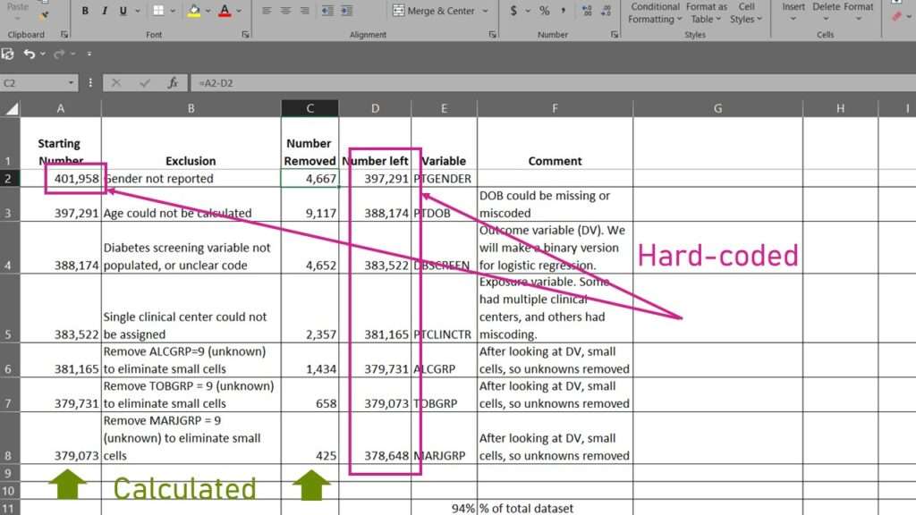
Looking at the spreadsheet, we see that I put several columns on it from left to right. The first column I labeled “Starting Number”. You’ll notice that this has a relationship with the fourth column, labeled “Number Left”. You will see that each “number left” from one row is carried over to the next row into the “starting number” column. This is a strategy I use to make sure that all the numbers add up. You will see that the “Number Left” column is hard-coded, and the “Starting Number” column is actually calculated (by making it equal the number left from the previous row).

You might wonder why “Number Left” I hard-coded, and the column to the left of it – Number Removed – is calculated. It’s because it’s just easier in every statistical program to count the rows in a dataset rather than count the rows NOT in a dataset (meaning rows that were deleted from the dataset). So in this spreadsheet, I start by counting the rows in the source dataset and hard-coding that in the upper left under Starting Number. Then I apply my first exclusion (in the spreadsheet, it’s “gender not reported”) and remove the records that meet those criteria. I keep note of the exclusion on the spreadsheet. After I remove the data, I count the rows in the new dataset, then enter that under “Number Left”. Then, I just use Excel to subtract Number Left from Strating Number, and that gets me Number Removed. I’ll need that for the diagram.
Make the Data Reduction Diagram Using Spreadsheet Data
The next step is to actually make the diagram, and populate it with data from the spreadsheet. I use PowerPoint for this, and if you want a foundation in using PowerPoint for diagrams like this, I encourage you to take our online course, “PowerPoint for Visualizations”.
Here is the diagram I made:
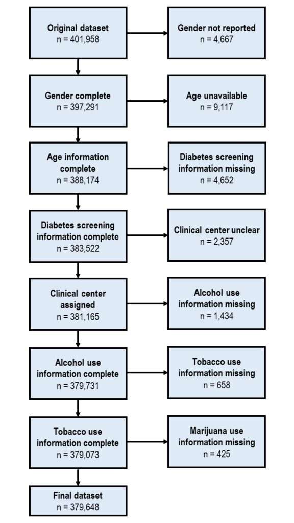
As you can see, this diagram is very long. That is because there were a lot of different exclusion steps, and each one needed to be documented separately. As you can see, the left column of boxes follows the “inclusion” numbers as we pare down the dataset, and the box on the right reports the “number removed”. Notice how you have to come up with labels for the inclusion boxes based on the last exclusion that was executed. For example, after the exclusion for “clinical center unclear” with n = 2,357, the next inclusion box is labeled “clinical center assigned”, meaning that we know what it is so we are including it.

Using a Data Reduction Diagram to Identify Selection Bias
The purpose of making this diagram is to evaluate – were too many rows (meaning a disproportionate number of rows) removed at any exclusion step? As you can see at the bottom of the data reduction spreadsheet, it says “94% of total dataset”, meaning even with all these exclusions only 6% of the data were removed. That means there is a very low probability of selection bias.
If you look at the research question, you can do a simulation in your mind. One point of the analysis was to look at rates of Type II diabetes screening. Imagine that they had a target goal of 66% of this population should get a Type II diabetes screening, and they found that only 50% of them did. We could argue it’s a problem no matter what. Even if all 6% had gotten screened and are missing from this dataset, that would only bump that number up to 56% – well below the 66% goal.
But what if at one exclusion step, almost a third of the dataset was removed? Imagine we could potentially subtract 33% from 50% – that means we are not screening nearly enough people. When large proportions of the dataset are removed in an exclusion step, we are at very high risk for selection bias. If you want to learn the real-life consequences of one survey that suffered from severe selection bias, and you want to gain the skills to solve this problem, take the online course, where I lay out the steps for dealing with extreme selection bias in your analytic dataset. Through taking this online course and applying these skills you will increase the scientific rigor of you methods, and be seen as a highly trustable and competent data scientist.
May 7, 2024 revised course information, added offer.
Try all of our courses and learning programs!

Applications Basics for Data Analysts and Statisticians
Applications basics are now essential knowledge if you want to do data science in healthcare. [...]
3 Comments
Jun

Data Curation Course: Learn Data Curation Online from LinkedIn Learning!
Curation files are especially helpful for communicating about data on teams. Learn more about what [...]
Oct

Data Reduction Diagram Enables Data Scientists to Evaluate Selection Bias
Data reduction diagram is used for evaluating selection bias. If you want to be seen [...]
Apr

Data Science of Data Collection: Free Course and Course Series!
Learn the “data science of data collection” through my free introductory course! If you want [...]
May

Data Close-out Course: Learn How to do Data Close-out Online!
Data close-out course is what you need if you want to combine data from multiple [...]
May

Bivariate Table: How to Make a Descriptive Statistical Summary in Excel
Bivariate table is full descriptive summaries of the variables in the analytic dataset being used [...]
Jun

PowerPoint for Visualizations: A Simple Tool for Minimizing Complexity
PowerPoint for visualizations is an easy choice – but you have to do a lot [...]
Sep

Excel for Managing Research: Learn How to Use Microsoft Excel as a Research Management Tool
Excel for Managing Research is a short, practical course that will give you the skills [...]
May
Data reduction diagram is used for evaluating selection bias. If you want to be seen as a data scientist who is transparent and uses rigorous methods, learn how to make a data reduction diagram from reading our blog post or taking our online course!