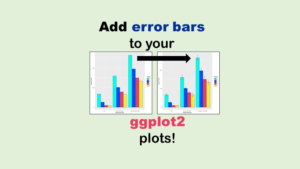
Adding error bars to ggplot2 in R plots is easiest if you include the width of the error bar as a variable in your plot data. Read my blog post to see an example.
08
Oct
Oct
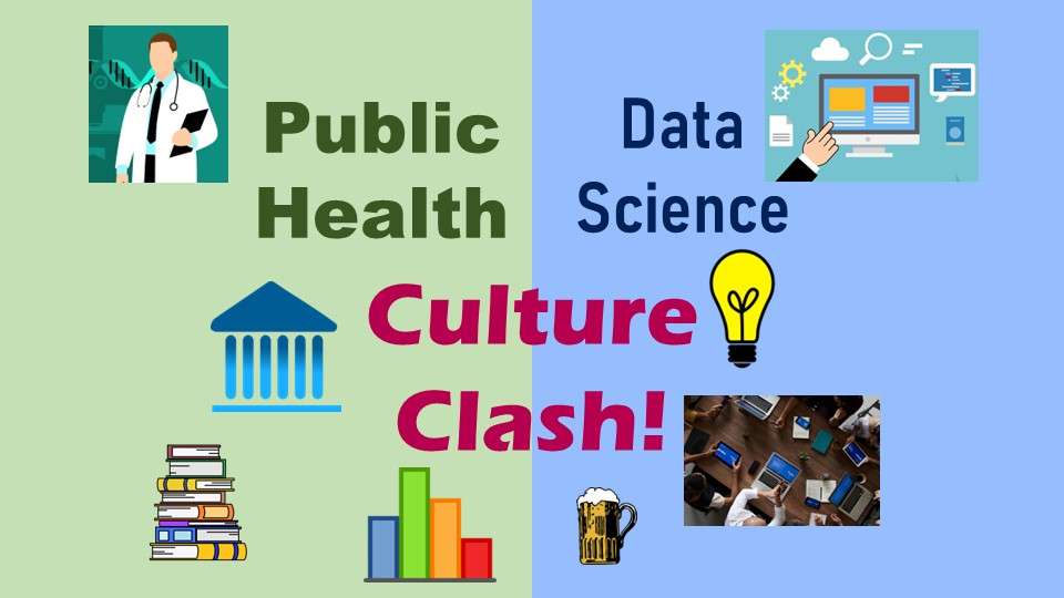
Data science culture is much faster-paced than the more academic and governmental culture in the public health field. Read my blog post for recommendations as to how public health practitioners can overcome the culture clash!
06
Jun
Jun
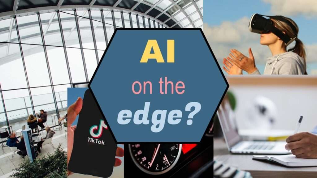
“AI on the edge” was a new term for me that I learned from Marc Staimer, founder of Dragon Slayer Consulting, who was interviewed in a podcast. Marc explained how AI on the edge poses a data storage problem, and my blog post proposes a solution!
13
May
May
“What is the ONC?” is what I used to ask before I realized it involves health technology. Although ONC just means “Office of the National Coordinator”, this agency is now known as HealthIT.gov, as I explain in my blog post.
06
May
May
What does the SAMHSA actually do for mental health and substance abuse patients in the US? The answer is, “nothing directly” – however, indirectly, SAMHSA has had a profound impact on behavioral health patients, and the result has not always been positive, as you can read in my blog post.
29
Apr
Apr
You may already know that NACCHO is NOT cheese – but what is it? It’s a professional society for local public health officials. Read my blog post to learn what NACCHO does, and who it serves.
Public Health Alphabet Soup
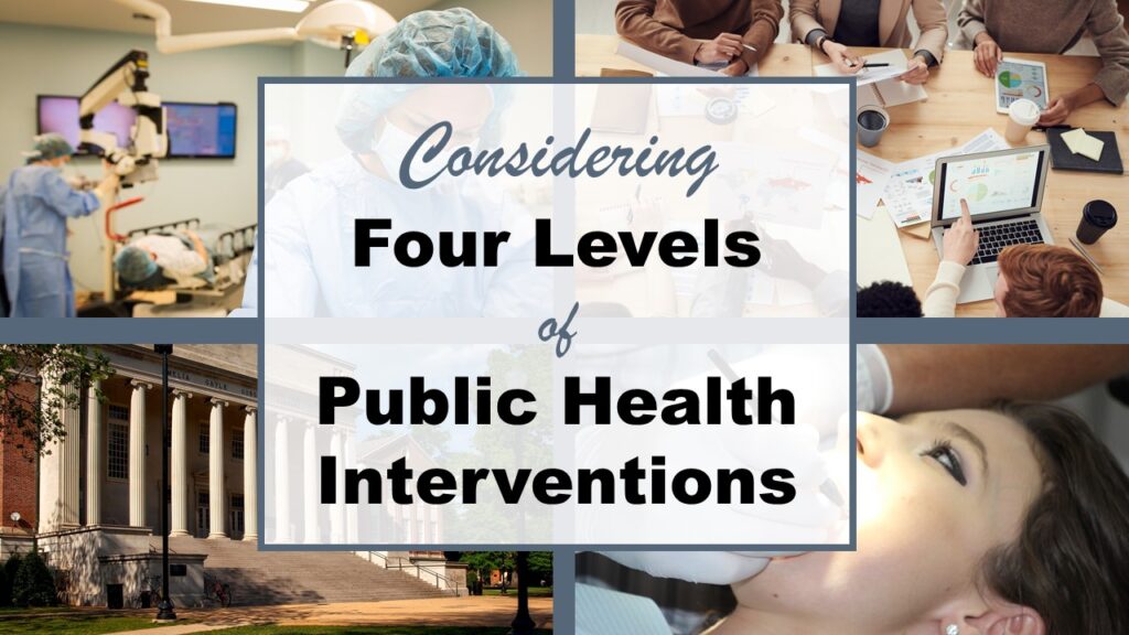
Four Levels of Intervention for Public Health: How to Apply This Framework
25
Apr
Apr
Four levels of intervention is a framework we use in public health to think about how to attack a problem. I explain it and give a few examples of application in my blog post (along with a video).
22
Apr
Apr
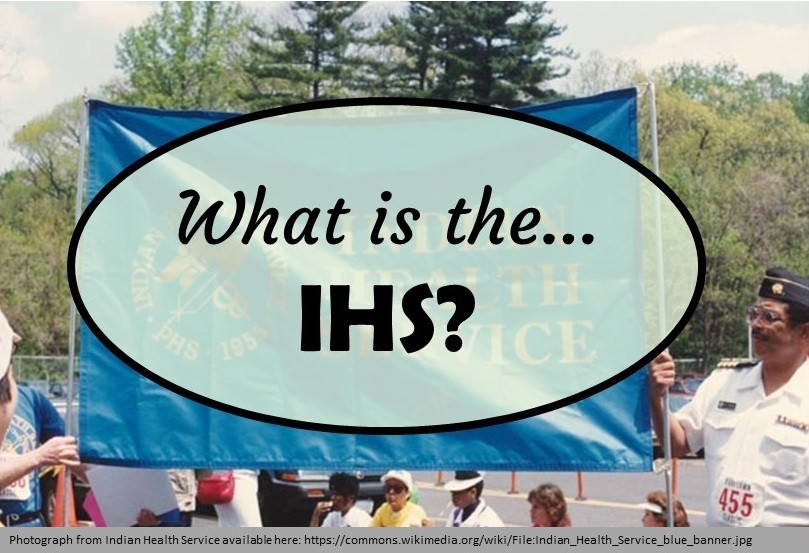
“What is the IHS?” is a reasonable question to ask, because there are a few things that are very special about the IHS and its healthcare facilities. At first glance, these special characteristics may seem positive, but they actually have devastating unintended consequences, as I describe in my blog post.
21
Apr
Apr
Testimonials for Monika Wahi’s data science courses on LinkedIn Learning are posted here. Read what learners are saying to help you decide if you want to take the courses!
20
Apr
Apr
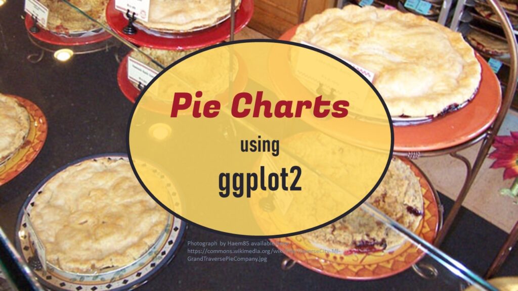
Pie chart ggplot style is surprisingly hard to make, mainly because ggplot2 did not give us a circle shape to deal with. But I explain how to get around it in my blog pot.