WISE Summit was started by two alumna of Northeastern University (NU) in Boston while they were still attending – co-founders Eliana Berger and Mia Nguyen. WISE Summit stands for “Women’s Interdisciplinary Society of Entrepreneurship”, and that name basically centers its mission.
WISE Summit is annual and aimed at women students at Northeastern interested in entrepreneurship, but when I attended the WISE Summit 2023 on March 18, 2023, additional guests were among the attendees, increasing the value of the experience. There was a contingent of business-minded students women students from Université Paris-Saclay in France. I also met students from Dartmouth who attended for the day.
The intention of WISE Summit is to connect the students with a diverse collective of female and non-binary founders and entrepreneurs. Their initial movement has evolved into several different programs, including WeLearn, WeSupport, WeBuild, and WeLaunch. Mainly, WISE is attempt to event the playing field, because according to their web site:

“In 2020, startups led by all-women founding teams only accounted for 2.3% of funding raised, and there are more men named James leading Fortune 500 companies than women leading Fortune 500 companies.”
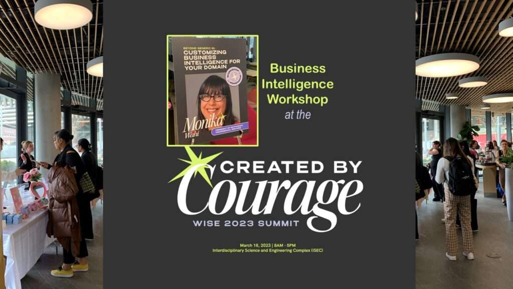
I am “Business Intelligent” and “Created by Courage!”
Thanks to Co-Director of Outreach, Srishti Kundu, I was invited to deliver a workshop on business intelligence (BI)! This year, the summit theme was “Created by Courage”, and I really could feel the courage in the room. It was a great experience! I went through a few use-cases in BI, and then the audience broke up into small groups to try to solve a BI challenge presented to the group. It was fun to see the different solutions everyone contemplated, and how they brought their personal experience to the table with their creativity!
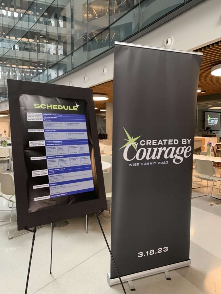
WISE Summit 2023 was a Great Experience
I was so grateful to be invited to host a workshop at WISE Summit 2023, and I was also honored to be able to participate in the rest of the conference. The conference itself was extremely well-organized and satisfying to attend, with excellent snacks and atmosphere, nicely-arranged space, and events at just the right pace.
I strongly recommend women college students who are considering entrepreneurship to consider attending Northeastern University, as the college appears to be ramping up its support for women entrepreneurs. WISE – a student-founded effort – has grown exponentially in just a few years, partly due to enthusiastic support from Northeastern. I felt WISE Summit 2023 was a positive, nurturing, and inclusive space that facilitated women helping each other grow in the entrepreneurship space. I hope to be invited back to future WISE Summits!
Updated March 20, 2023.
WISE Summit 2023 at Northeastern University was the biggest and best one so far! I was honored to lead a business intelligence workshop, as I talk about in my blog post.
Read all of our data science blog posts!

Confidence Intervals are for Estimating a Range for the True Population-level Measure
Confidence intervals (CIs) help you get a solid estimate for the true population measure. Read [...]
1 Comment
Jun

Continuous Variable? You Can Categorize it!
Continuous variable categorized can open up a world of possibilities for analysis. Read about it [...]
2 Comments
Jun

Delete if the Row Meets Criteria? Do it in SAS!
Delete if rows meet a certain criteria is a common approach to paring down a [...]
May


Chi-square Test: Insight from Using Microsoft Excel
Chi-square test is hard to grasp – but doing it in Microsoft Excel can give [...]
May

Identify Elements of Research in Scientific Literature
Identify elements in research reports, and you’ll be able to understand them much more easily. [...]
May

Design the Most Useful Time Periods for Your Conversions
Time periods are important when creating a time series visualization that actually speaks to you! [...]
Apr

Apply Weights? It’s Easy in R with the Survey Package!
Apply weights to get weighted proportions and counts! Read my blog post to learn how [...]
Nov

Make Categorical Variable Out of Continuous Variable
Make categorical variables by cutting up continuous ones. But where to put the boundaries? Get [...]
Nov

Remove Rows in R with the Subset Command
Remove rows by criteria is a common ETL operation – and my blog post shows [...]
Oct

CDC Wonder for Studying Vaccine Adverse Events: The Shameful State of US Open Government Data
CDC Wonder is an online query portal that serves as a gateway to many government [...]
Jun

AI Careers: Riding the Bubble
AI careers are not easy to navigate. Read my blog post for foolproof advice for [...]
Jun

Descriptive Analysis of Black Friday Death Count Database: Creative Classification
Descriptive analysis of Black Friday Death Count Database provides an example of how creative classification [...]
Nov

Classification Crosswalks: Strategies in Data Transformation
Classification crosswalks are easy to make, and can help you reduce cardinality in categorical variables, [...]
Nov

FAERS Data: Getting Creative with an Adverse Event Surveillance Dashboard
FAERS data are like any post-market surveillance pharmacy data – notoriously messy. But if you [...]
4 Comments
Nov

Dataset Source Documentation: Necessary for Data Science Projects with Multiple Data Sources
Dataset source documentation is good to keep when you are doing an analysis with data [...]
Nov

Joins in Base R: Alternative to SQL-like dplyr
Joins in base R must be executed properly or you will lose data. Read my [...]
Nov

NHANES Data: Pitfalls, Pranks, Possibilities, and Practical Advice
NHANES data piqued your interest? It’s not all sunshine and roses. Read my blog post [...]
Nov

Color in Visualizations: Using it to its Full Communicative Advantage
Color in visualizations of data curation and other data science documentation can be used to [...]
Oct

Defaults in PowerPoint: Setting Them Up for Data Visualizations
Defaults in PowerPoint are set up for slides – not data visualizations. Read my blog [...]
Oct

Text and Arrows in Dataviz Can Greatly Improve Understanding
Text and arrows in dataviz, if used wisely, can help your audience understand something very [...]
Oct

Shapes and Images in Dataviz: Making Choices for Optimal Communication
Shapes and images in dataviz, if chosen wisely, can greatly enhance the communicative value of [...]
Oct

Table Editing in R is Easy! Here Are a Few Tricks…
Table editing in R is easier than in SAS, because you can refer to columns, [...]
Aug

R for Logistic Regression: Example from Epidemiology and Biostatistics
R for logistic regression in health data analytics is a reasonable choice, if you know [...]
272 Comments
Aug

Connecting SAS to Other Applications: Different Strategies
Connecting SAS to other applications is often necessary, and there are many ways to do [...]
Jul

Portfolio Project Examples for Independent Data Science Projects
Portfolio project examples are sometimes needed for newbies in data science who are looking to [...]
Jul

Project Management Terminology for Public Health Data Scientists
Project management terminology is often used around epidemiologists, biostatisticians, and health data scientists, and it’s [...]
Jun

Rapid Application Development Public Health Style
“Rapid application development” (RAD) refers to an approach to designing and developing computer applications. In [...]
Jun

Understanding Legacy Data in a Relational World
Understanding legacy data is necessary if you want to analyze datasets that are extracted from [...]
Jun

Front-end Decisions Impact Back-end Data (and Your Data Science Experience!)
Front-end decisions are made when applications are designed. They are even made when you design [...]
Jun

Reducing Query Cost (and Making Better Use of Your Time)
Reducing query cost is especially important in SAS – but do you know how to [...]
Jun

Curated Datasets: Great for Data Science Portfolio Projects!
Curated datasets are useful to know about if you want to do a data science [...]
May

Statistics Trivia for Data Scientists
Statistics trivia for data scientists will refresh your memory from the courses you’ve taken – [...]
Apr

Management Tips for Data Scientists
Management tips for data scientists can be used by anyone – at work and in [...]
Mar

REDCap Mess: How it Got There, and How to Clean it Up
REDCap mess happens often in research shops, and it’s an analysis showstopper! Read my blog [...]
Mar

GitHub Beginners in Data Science: Here’s an Easy Way to Start!
GitHub beginners – even in data science – often feel intimidated when starting their GitHub [...]
Feb

ETL Pipeline Documentation: Here are my Tips and Tricks!
ETL pipeline documentation is great for team communication as well as data stewardship! Read my [...]
Feb

Benchmarking Runtime is Different in SAS Compared to Other Programs
Benchmarking runtime is different in SAS compared to other programs, where you have to request [...]
Dec

End-to-End AI Pipelines: Can Academics Be Taught How to Do Them?
End-to-end AI pipelines are being created routinely in industry, and one complaint is that academics [...]
Nov

Referring to Columns in R by Name Rather than Number has Pros and Cons
Referring to columns in R can be done using both number and field name syntax. [...]
Oct

The Paste Command in R is Great for Labels on Plots and Reports
The paste command in R is used to concatenate strings. You can leverage the paste [...]
Oct

Coloring Plots in R using Hexadecimal Codes Makes Them Fabulous!
Recoloring plots in R? Want to learn how to use an image to inspire R [...]
5 Comments
Oct

Adding Error Bars to ggplot2 Plots Can be Made Easy Through Dataframe Structure
Adding error bars to ggplot2 in R plots is easiest if you include the width [...]
Oct

AI on the Edge: What it is, and Data Storage Challenges it Poses
“AI on the edge” was a new term for me that I learned from Marc [...]
Jun

Pie Chart ggplot Style is Surprisingly Hard! Here’s How I Did it
Pie chart ggplot style is surprisingly hard to make, mainly because ggplot2 did not give [...]
5 Comments
Apr

Time Series Plots in R Using ggplot2 Are Ultimately Customizable
Time series plots in R are totally customizable using the ggplot2 package, and can come [...]
Apr

Data Curation Solution to Confusing Options in R Package UpSetR
Data curation solution that I posted recently with my blog post showing how to do [...]
Apr

Making Upset Plots with R Package UpSetR Helps Visualize Patterns of Attributes
Making upset plots with R package UpSetR is an easy way to visualize patterns of [...]
11 Comments
Apr

Making Box Plots Different Ways is Easy in R!
Making box plots in R affords you many different approaches and features. My blog post [...]
Mar

Convert CSV to RDS When Using R for Easier Data Handling
Convert CSV to RDS is what you want to do if you are working with [...]
Mar

GPower Case Example Shows How to Calculate and Document Sample Size
GPower case example shows a use-case where we needed to select an outcome measure for [...]
Feb

Querying the GHDx Database: Demonstration and Review of Application
Querying the GHDx database is challenging because of its difficult user interface, but mastering it [...]
Feb

Variable Names in SAS and R Have Different Restrictions and Rules
Variable names in SAS and R are subject to different “rules and regulations”, and these [...]
Feb

Referring to Variables in Processing Data is Different in SAS Compared to R
Referring to variables in processing is different conceptually when thinking about SAS compared to R. [...]
Jan

Counting Rows in SAS and R Use Totally Different Strategies
Counting rows in SAS and R is approached differently, because the two programs process data [...]
Jan

Native Formats in SAS and R for Data Are Different: Here’s How!
Native formats in SAS and R of data objects have different qualities – and there [...]
Jan

SAS-R Integration Example: Transform in R, Analyze in SAS!
Looking for a SAS-R integration example that uses the best of both worlds? I show [...]
Dec

Dumbbell Plot for Comparison of Rated Items: Which is Rated More Highly – Harvard or the U of MN?
Want to compare multiple rankings on two competing items – like hotels, restaurants, or colleges? [...]
2 Comments
Sep

Data for Meta-analysis Need to be Prepared a Certain Way – Here’s How
Getting data for meta-analysis together can be challenging, so I walk you through the simple [...]
Jul

Sort Order, Formats, and Operators: A Tour of The SAS Documentation Page
Get to know three of my favorite SAS documentation pages: the one with sort order, [...]
Nov

Confused when Downloading BRFSS Data? Here is a Guide
I use the datasets from the Behavioral Risk Factor Surveillance Survey (BRFSS) to demonstrate in [...]
2 Comments
Oct

Doing Surveys? Try my R Likert Plot Data Hack!
I love the Likert package in R, and use it often to visualize data. The [...]
3 Comments
Oct

I Used the R Package EpiCurve to Make an Epidemiologic Curve. Here’s How It Turned Out.
With all this talk about “flattening the curve” of the coronavirus, I thought I would [...]
Mar

Which Independent Variables Belong in a Regression Equation? We Don’t All Agree, But Here’s What I Do.
During my failed attempt to get a PhD from the University of South Florida, my [...]
Aug