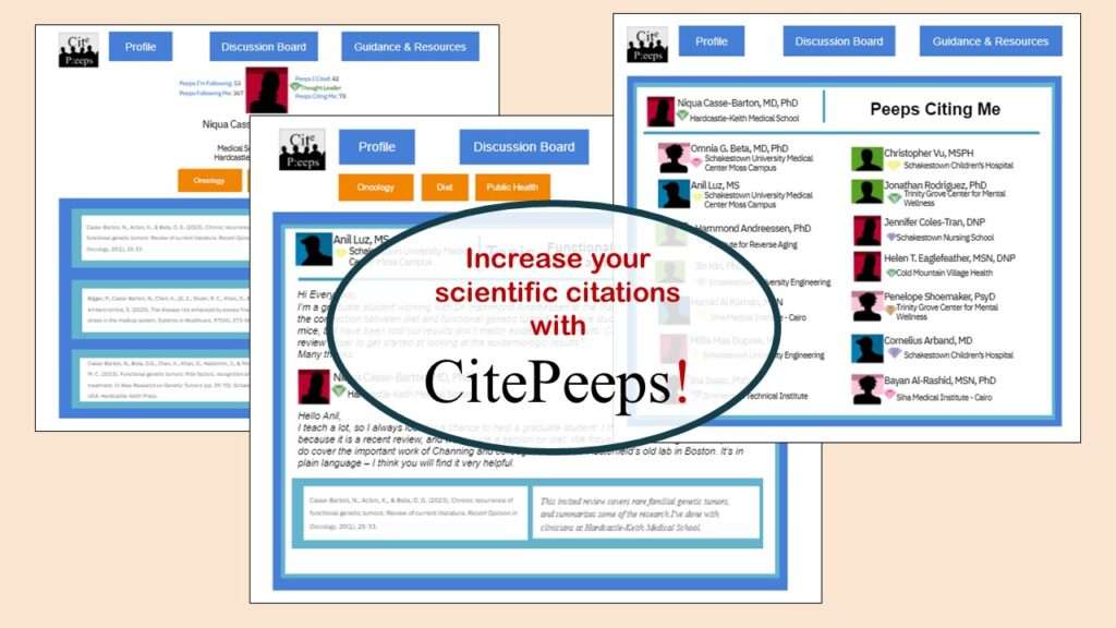
CitePeeps is a new online community of scientific authors focused on increasing the number of citations to their published works. Join us!
07
Mar
Mar
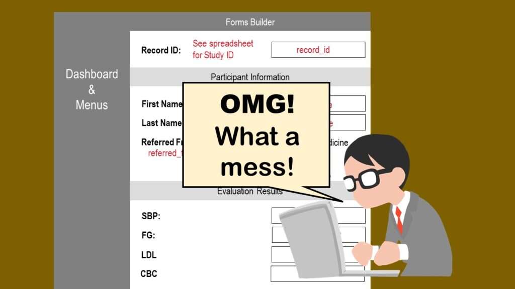
REDCap mess happens often in research shops, and it’s an analysis showstopper! Read my blog post to learn my secret tricks for breaking through the barriers and getting on with data analytics!
28
Feb
Feb
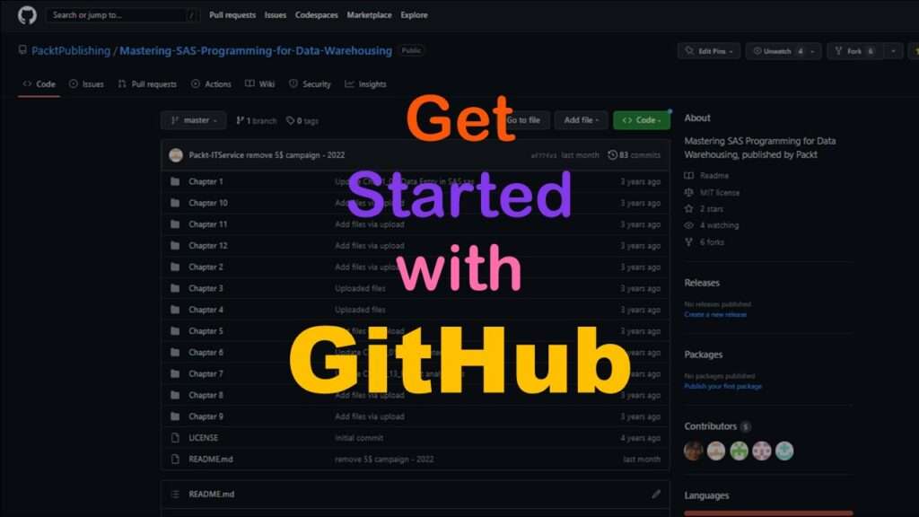
GitHub beginners – even in data science – often feel intimidated when starting their GitHub accounts and trying to interact with the web page. Don’t be shy! Catch the highlights from a recent GitHub beginners workshop I held!
22
Feb
Feb
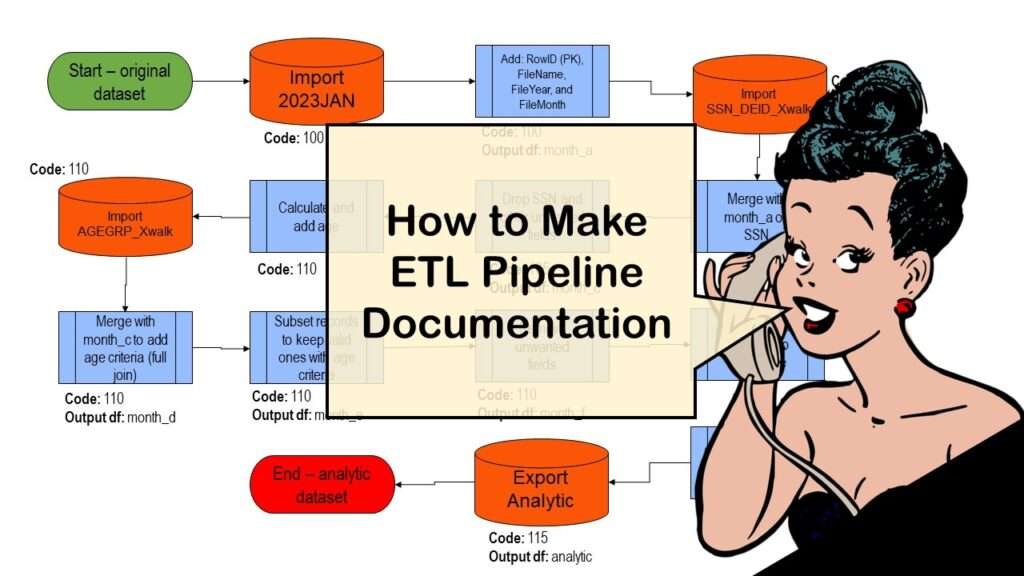
ETL pipeline documentation is great for team communication as well as data stewardship! Read my blog post to learn my tips and tricks.
13
Dec
Dec
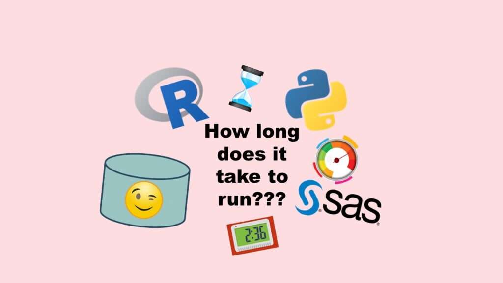
Benchmarking runtime is different in SAS compared to other programs, where you have to request the system time before and after the code you want to time and use variables to do subtraction, as I demonstrate in this blog post.
25
Nov
Nov
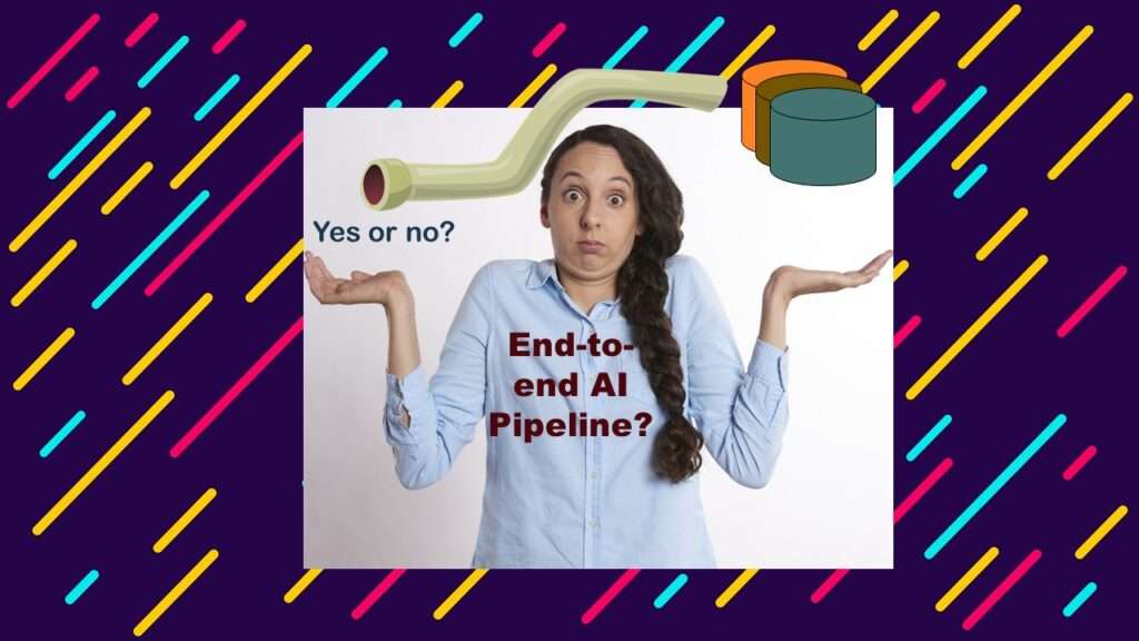
End-to-end AI pipelines are being created routinely in industry, and one complaint is that academics can only contribute to one component of the pipeline. Really? Read my blog post for an alternative viewpoint!
22
Nov
Nov
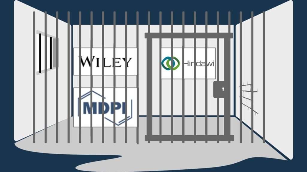
Wiley’s predatory behavior recently with a colleague’s scientific manuscript makes me want to avoid publishing in their journals. Read about our experience.
17
Oct
Oct
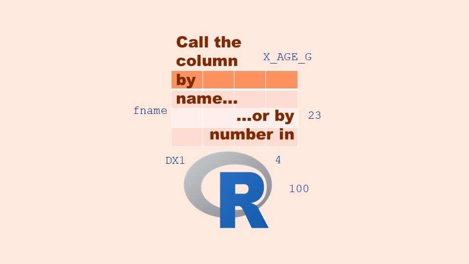
Referring to columns in R can be done using both number and field name syntax. Although field name syntax is easier to use in programming, my blog demonstrates how you can use column numbers to make automation easier.
12
Oct
Oct
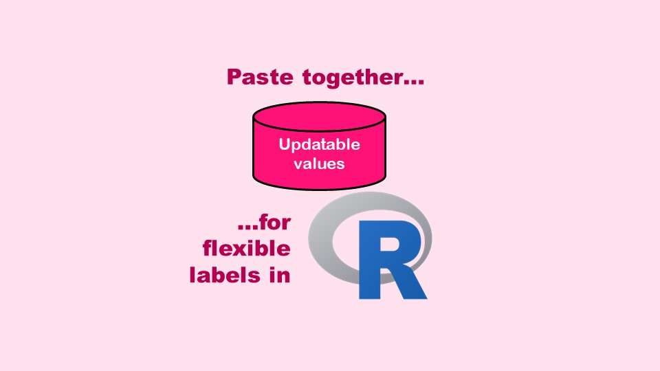
The paste command in R is used to concatenate strings. You can leverage the paste command to make refreshable label objects for reports and plots, as I describe in my blog post.
11
Oct
Oct
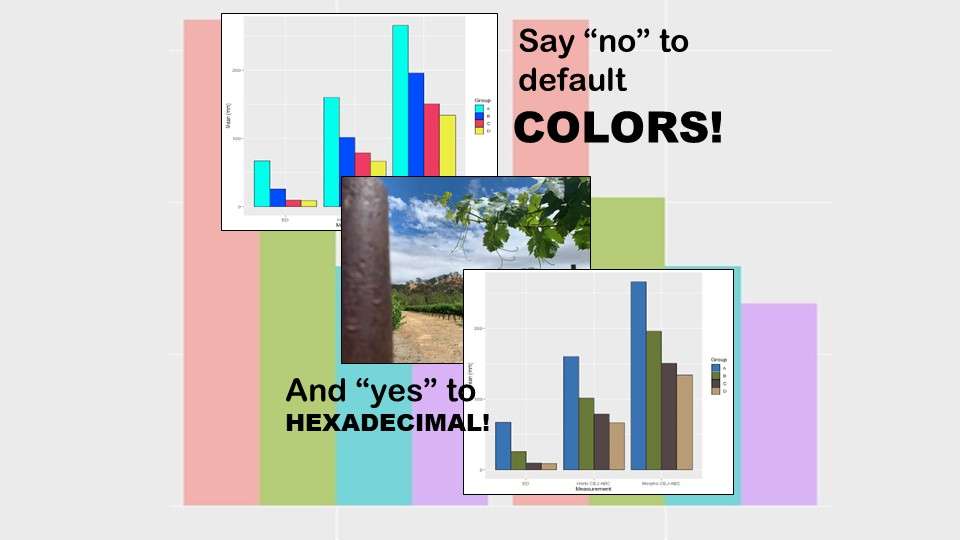
Recoloring plots in R? Want to learn how to use an image to inspire R color palettes you can use in ggplot2 plots? Read my blog post to learn how.