Tag Archives: career development

Statistics Trivia for Data Scientists

Public health, artificial intelligence, and data science trivia! Fun! Educational! Test your knowledge!

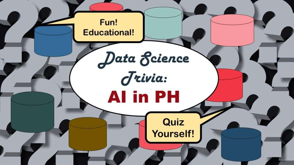
Statistics trivia for data scientists will refresh your memory from the courses you’ve taken – or maybe teach you something new! Visit my blog to find out!

Management Tips for Data Scientists

When working in data science, there are some tips and tricks to managing your communication and relationship with superiors that can help you advance in your career.

Management tips for data scientists can be used by anyone – at work and in your personal life! Get the details in my blog post.

REDCap Mess: How it Got There, and How to Clean it Up

REDCap mess on your hands? The REDCap designers made the application so loosey goosey, you can really program yourself into a messy corner if you don't plan well.

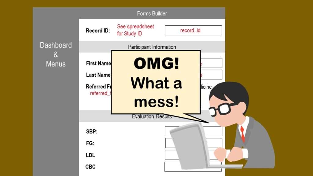
REDCap mess happens often in research shops, and it’s an analysis showstopper! Read my blog post to learn my secret tricks for breaking through the barriers and getting on with data analytics!

GitHub Beginners in Data Science: Here’s an Easy Way to Start!

If you are an aspiring data scientist, you will need to know how GitHub works. You will probably want to use it for your projects.

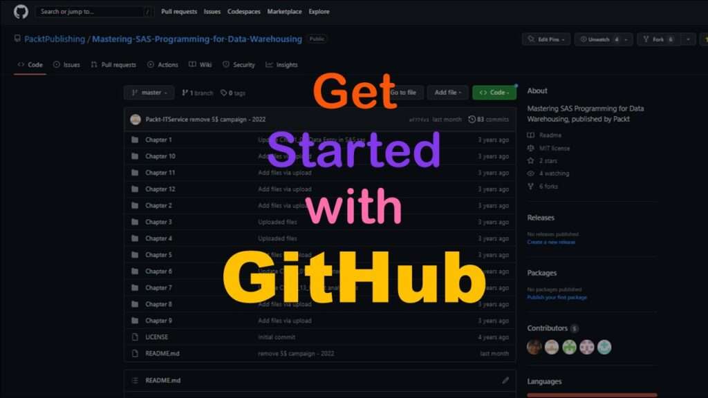
GitHub beginners – even in data science – often feel intimidated when starting their GitHub accounts and trying to interact with the web page. Don’t be shy! Catch the highlights from a recent GitHub beginners workshop I held!

ETL Pipeline Documentation: Here are my Tips and Tricks!

This blog post shows you how to properly document your extract, transform, and load code.

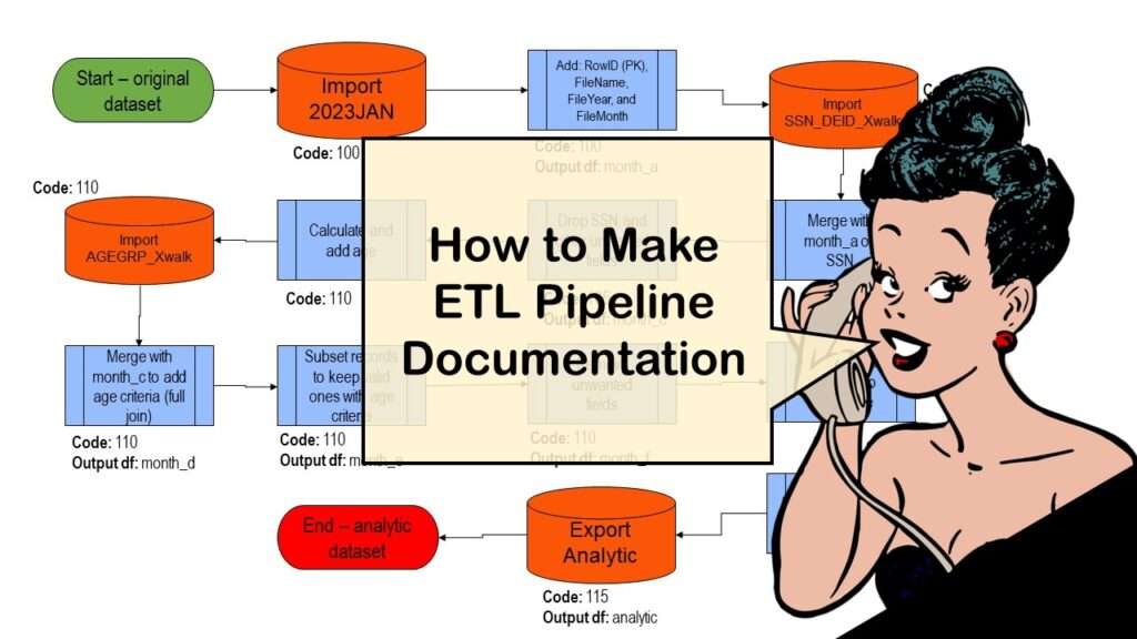
ETL pipeline documentation is great for team communication as well as data stewardship! Read my blog post to learn my tips and tricks.

End-to-End AI Pipelines: Can Academics Be Taught How to Do Them?

What is an end-to-end AI pipeline? And why are academics so bad at making one? These are different ideas we will examine in this blog post.

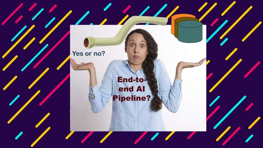
End-to-end AI pipelines are being created routinely in industry, and one complaint is that academics can only contribute to one component of the pipeline. Really? Read my blog post for an alternative viewpoint!

The Paste Command in R is Great for Labels on Plots and Reports

The paste command is used to concatenate strings in R. You can use it different ways, which is what I demonstrate in my blog and videos.

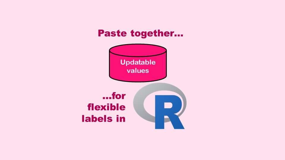
The paste command in R is used to concatenate strings. You can leverage the paste command to make refreshable label objects for reports and plots, as I describe in my blog post.

Coloring Plots in R using Hexadecimal Codes Makes Them Fabulous!

You do not need to use the default R colors on your plot. You don't even need to limit yourself to named colors on cheat sheets.

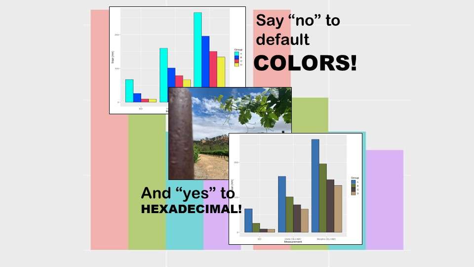
Recoloring plots in R? Want to learn how to use an image to inspire R color palettes you can use in ggplot2 plots? Read my blog post to learn how.

Adding Error Bars to ggplot2 Plots Can be Made Easy Through Dataframe Structure

Error bars on plots can provide the audience an estimate of the amount of certainty you have with your estimates.

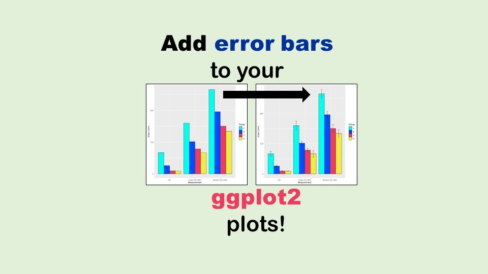
Adding error bars to ggplot2 in R plots is easiest if you include the width of the error bar as a variable in your plot data. Read my blog post to see an example.

US Public Health Alphabet Soup Explained: What is the NACCHO?

You may have wondered if public health workers who are employed by local public health departments have a professional society devoted just to them. That's NACCHO.

You may already know that NACCHO is NOT cheese – but what is it? It’s a professional society for local public health officials. Read my blog post to learn what NACCHO does, and who it serves.

Verified by MonsterInsights