Tag Archives: academic training

Classification Crosswalks: Strategies in Data Transformation

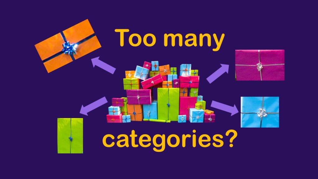
What if you have too many categories in a categorical variable? Your cardinality is too high for a chi-square analysis.

Classification crosswalks are easy to make, and can help you reduce cardinality in categorical variables, making for insightful data science portfolio projects with only descriptive statistics. Read my blog post for guidance!

NHANES Data: Pitfalls, Pranks, Possibilities, and Practical Advice

If you are interested in population-level surveillance data, you might have thought about using NHANES data in portfolio projects.

NHANES data piqued your interest? It’s not all sunshine and roses. Read my blog post to see the pitfalls of NHANES data, and get practical advice about using them in a project.

Shapes and Images in Dataviz: Making Choices for Optimal Communication

If you use good judgment in choosing chapes and images to add to your data visualizations, your audience will be enlightened.

Shapes and images in dataviz, if chosen wisely, can greatly enhance the communicative value of the visualization. Read my blog post for tips in selecting shapes for data visualizations!

Connecting SAS to Other Applications: Different Strategies

Did you know it is possible to integrate SAS with other data environments, like Microsoft SQL or Excel?

Connecting SAS to other applications is often necessary, and there are many ways to do it. Read this blog post for a couple of use-cases of SAS data integration using various SAS components.

Portfolio Project Examples for Independent Data Science Projects

Are you a data scientist who is interested in doing independent portfolio projects to sharpen your skills? Then I strongly suggest you get a coach or a mentor.

Portfolio project examples are sometimes needed for newbies in data science who are looking to complete independent projects. This blog post provides some great examples of independent projects you can do with datasets available online!

Understanding Legacy Data in a Relational World

Data systems started being in use in the 1960s and 1970s, but these were flat systems, usually using IBM mainframes.

Understanding legacy data is necessary if you want to analyze datasets that are extracted from old systems. This knowledge is still relevant, as we still use these old systems today, as I discuss in my blog post.

CitePeeps: Want to Increase Citations to Your Research? Join our Online Community!

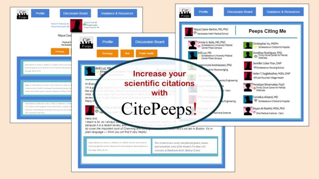
CitePeeps is an online community of scientific authors who are interested in increasing the number of citations to their written works.

CitePeeps is a new online community of scientific authors focused on increasing the number of citations to their published works. Join us!

End-to-End AI Pipelines: Can Academics Be Taught How to Do Them?

What is an end-to-end AI pipeline? And why are academics so bad at making one? These are different ideas we will examine in this blog post.

End-to-end AI pipelines are being created routinely in industry, and one complaint is that academics can only contribute to one component of the pipeline. Really? Read my blog post for an alternative viewpoint!

Coloring Plots in R using Hexadecimal Codes Makes Them Fabulous!

You do not need to use the default R colors on your plot. You don't even need to limit yourself to named colors on cheat sheets.

Recoloring plots in R? Want to learn how to use an image to inspire R color palettes you can use in ggplot2 plots? Read my blog post to learn how.

Adding Error Bars to ggplot2 Plots Can be Made Easy Through Dataframe Structure

Error bars on plots can provide the audience an estimate of the amount of certainty you have with your estimates.

Adding error bars to ggplot2 in R plots is easiest if you include the width of the error bar as a variable in your plot data. Read my blog post to see an example.

Verified by MonsterInsights