
Reducing query cost is especially important in SAS – but do you know how to do it, or what it even means? Read my blog post to learn why this is important in health data analytics.
Category Archives: Data Science
Posts about data science topics.
31
May
May
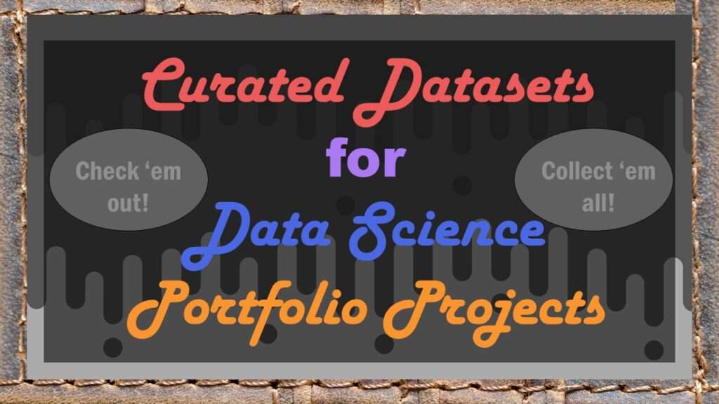
Curated datasets are useful to know about if you want to do a data science portfolio project on your own. I made this blog post for our group mentoring program. Check out the ones I am promoting on my blog!
12
Apr
Apr
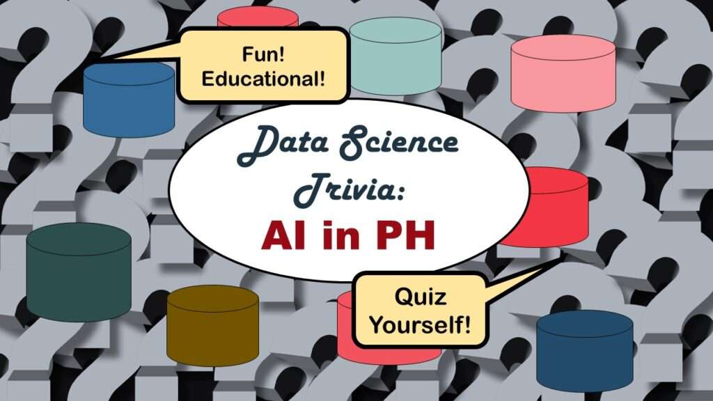
Statistics trivia for data scientists will refresh your memory from the courses you’ve taken – or maybe teach you something new! Visit my blog to find out!

23
Mar
Mar
Management tips for data scientists can be used by anyone – at work and in your personal life! Get the details in my blog post.
07
Mar
Mar
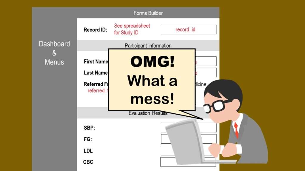
REDCap mess happens often in research shops, and it’s an analysis showstopper! Read my blog post to learn my secret tricks for breaking through the barriers and getting on with data analytics!
28
Feb
Feb
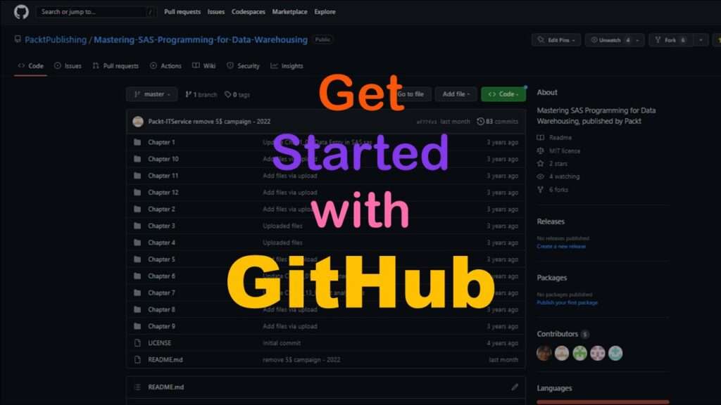
GitHub beginners – even in data science – often feel intimidated when starting their GitHub accounts and trying to interact with the web page. Don’t be shy! Catch the highlights from a recent GitHub beginners workshop I held!
22
Feb
Feb
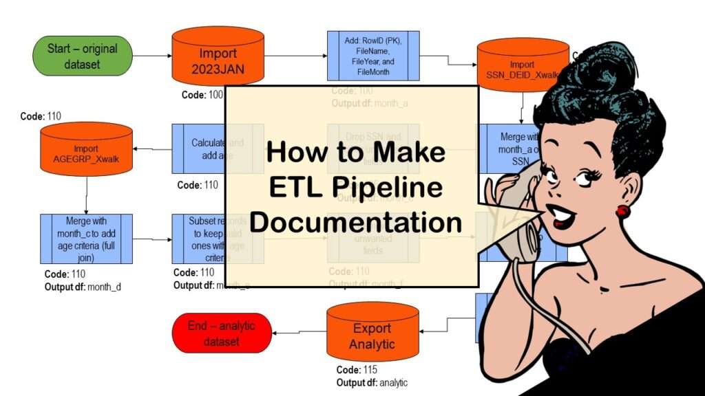
ETL pipeline documentation is great for team communication as well as data stewardship! Read my blog post to learn my tips and tricks.
13
Dec
Dec
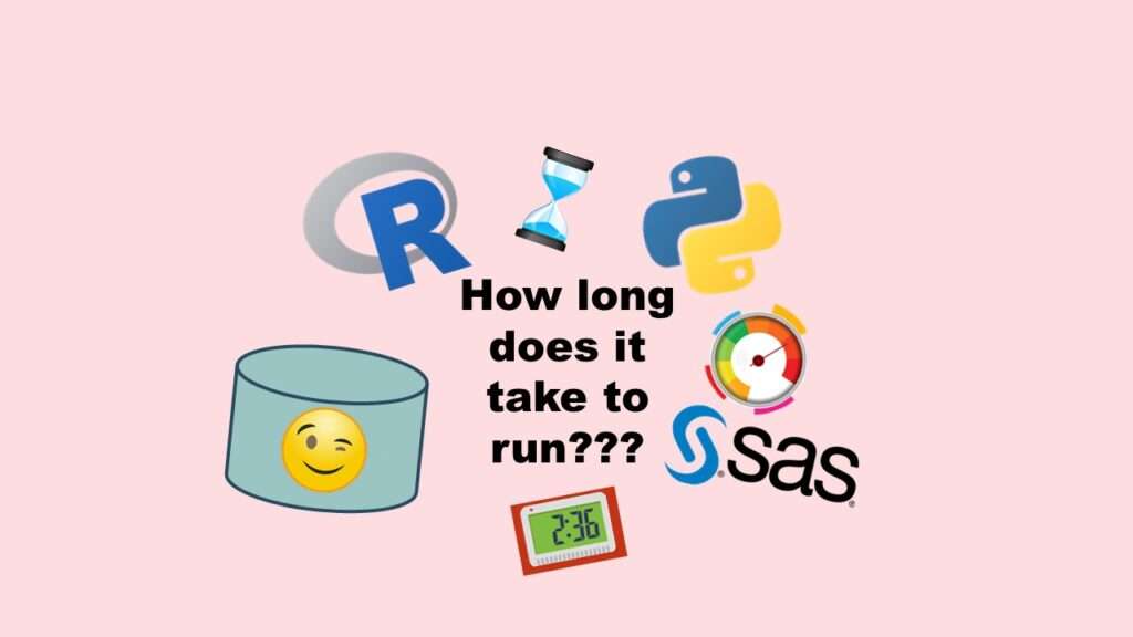
Benchmarking runtime is different in SAS compared to other programs, where you have to request the system time before and after the code you want to time and use variables to do subtraction, as I demonstrate in this blog post.
25
Nov
Nov
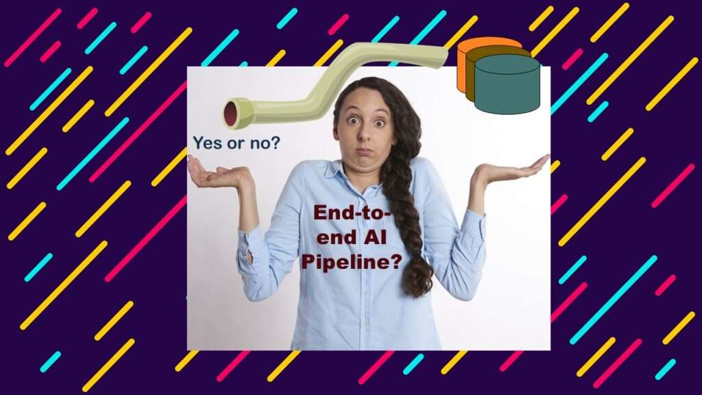
End-to-end AI pipelines are being created routinely in industry, and one complaint is that academics can only contribute to one component of the pipeline. Really? Read my blog post for an alternative viewpoint!
17
Oct
Oct
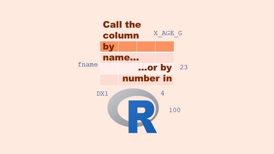
Referring to columns in R can be done using both number and field name syntax. Although field name syntax is easier to use in programming, my blog demonstrates how you can use column numbers to make automation easier.