
Make categorical variables by cutting up continuous ones. But where to put the boundaries? Get advice on my blog!
Author Archives: Monika Wahi

28
Oct
Oct
Remove rows by criteria is a common ETL operation – and my blog post shows you how to do it using the subset command.

01
Oct
Oct
Measuring integrativeness is helpful in second-language learning, but how do you do it? This blog post highlights an article that provides an example.
Data Science
CDC Wonder for Studying Vaccine Adverse Events: The Shameful State of US Open Government Data

24
Jun
Jun
CDC Wonder is an online query portal that serves as a gateway to many government datasets. Although antiquated, it still works for extracting data, and my blog post shows you how.

16
Jun
Jun
AI careers are not easy to navigate. Read my blog post for foolproof advice for those interested in building a career in AI.

27
Nov
Nov
Descriptive analysis of Black Friday Death Count Database provides an example of how creative classification can make a quick and easy data science portfolio project!
24
Nov
Nov
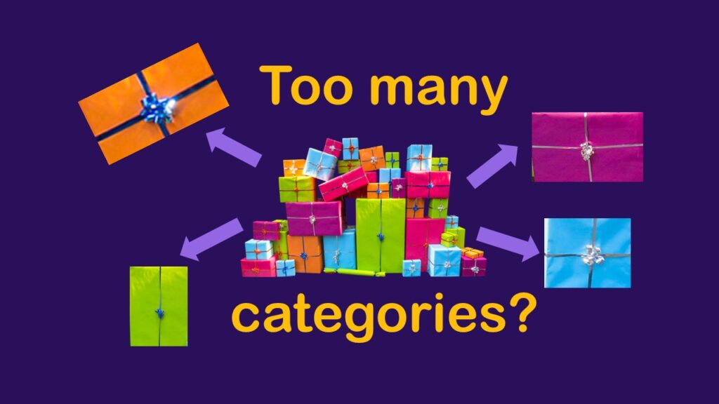
Classification crosswalks are easy to make, and can help you reduce cardinality in categorical variables, making for insightful data science portfolio projects with only descriptive statistics. Read my blog post for guidance!

22
Nov
Nov
FAERS data are like any post-market surveillance pharmacy data – notoriously messy. But if you apply strong study design skills and a scientific approach, you can use the FAERS online dashboard to obtain a dataset and develop an enlightening portfolio project. I show you how in my blog post!
Data Science
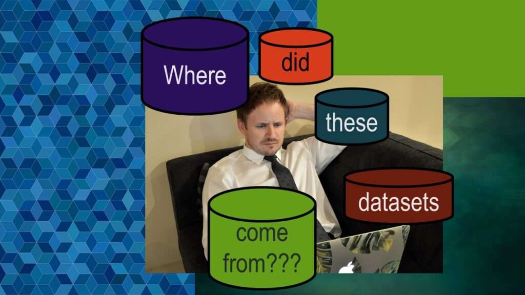
Dataset Source Documentation: Necessary for Data Science Projects with Multiple Data Sources
09
Nov
Nov
Dataset source documentation is good to keep when you are doing an analysis with data from multiple datasets. Read my blog to learn how easy it is to throw together some quick dataset source documentation in PowerPoint so that you don’t forget what you did.
07
Nov
Nov
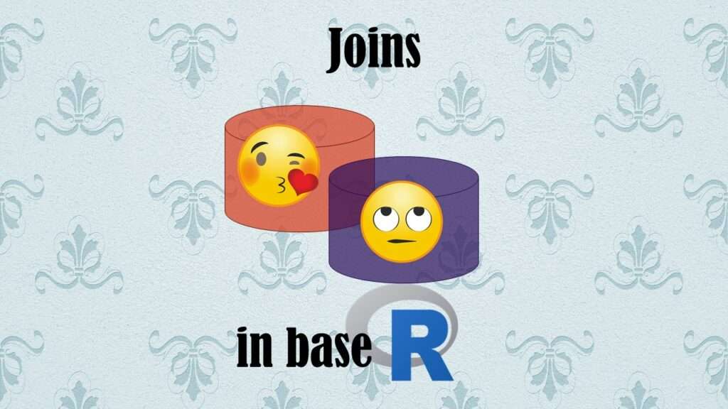
Joins in base R must be executed properly or you will lose data. Read my tutorial on how to correctly execute left joins in base R.