
CDC Wonder is a set of online databases of public health data in the United States (US) that can be queried using an online query tool published by the federal Centers for Disease Control and Prevention (CDC). While it is technically possible to obtain the data other ways, this is the main way the government has set up for epidemiologists like me to access the data publicly.
The help file is very old, because apparently, CDC Wonder is very old. One feature of CDC Wonder mentioned in the help file the need to log into an account was removed in August 2003, so now everyone in the world can use it without an account. Since August 2003 is over 20 years ago, it makes sense that the following description from their help file sounds extremely dated:
“Welcome to CDC WONDER … an easy-to-use, menu-driven system that makes the information resources of the Centers for Disease Control and Prevention (CDC) available to public health professionals and the public at large… CDC WONDER is valuable in public health research, decision making, priority setting, program evaluation, and resource allocation.”
One of the participants of our online data science mentoring program asked about doing a portfolio project with data on adverse reactions from vaccines because she found the Vaccine Adverse Event Reporting System (VAERS). But since she had found the data set as it is served up on the CDC Wonder site, she immediately became confused. She said she wasn’t sure if she needed to do a formal data request to look at the vaccine data, so I tried a query with her.

What is CDC Wonder?
To be clear, CDC Wonder is query interface – basically, a user interface designed for analysts like us to use for querying underlying datasets so we can extract the data we need for ourselves. That way, we can import those exported datasets into a statistical program like R or SAS and finish our analysis. I mention user interfaces like this in my online course and workshop, “Application Basics”.
CDC Wonder is an online query portal that serves up many government datasets, including VAERS, as seen in the graphic.
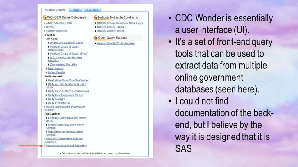
As shown in the graphic, there are many datasets available. The mentoring program participant was interested Vaccine Adverse Event Reporting (lower left in graphic). If you click on that link, after agreeing to a disclaimer, you will be ushered to the landing page for the VAERS queries.
The VAERS Query Form
The learner who wanted to query VAERS directed me to the landing page in CDC Wonder, as shown in the graphic.
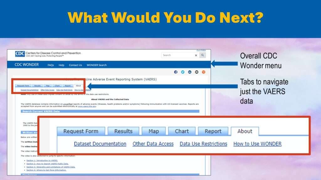
So, the learner told me once she got to this landing page, she felt confused. She saw the tab that said “Request Form”, and wondered – do I have to fill out a data request form for these data? It didn’t seem logical to either of us.
Then I realized that this web interface must be so antiquated that it is using old-fashioned terminology.
In statistical software, when we run a procedure like a two-way frequency table and set options for extra output (e.g., row and column percents), we say we are “requesting the row and column percents” in our code. So the “request form” is actually a query form, not a form you fill out to submit your request to have them give you access to the data.

Trying the Request Form
I decided to try out the Request Form, so I clicked on it. I encountered a form that was extremely confusing both visually and in terms of how to use it. It was a very long form with a lot of form fields and dropdown selections. The form was divided into twelve sections and numbered, and each section allowed you to do a function (e.g., “3. Select vaccine characteristics”). This graphic shows the top of the query form.
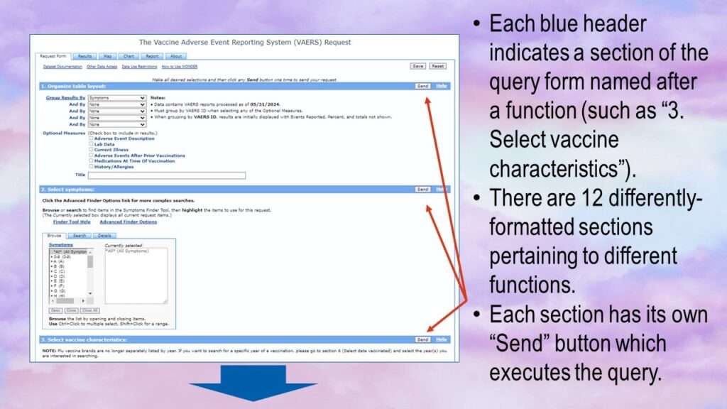
This is confusing for a number of reasons. First, it’s not clear if you have to fill out each of the sections to run a query, or you can get away with just filling out certain ones. Next, the query form itself is very confusing. The panel under the first blue heading looks like it has several dropdown lists and checkboxes, and the values from the dropdown controls are linked with an “and” operator. But the next one clearly has a totally different interface, with instead two different boxes with a series of buttons under it.
Under the “Recent Form” tab, there are four links: Dataset Documentation, Other Data Access, Data Use Restrictions, and How to Use Wonder. The first of these links – Dataset Documentation – leads to an impossibly long text document that explains each of these sections of this query form. The last of the links – How to Use Wonder – is essentially the help file, and is also one long text page.
The trick is that for each of these headings, in order to specify query parameters, you have to read the documentation and figure out how. Since we recently have new COVID-19 vaccines (with a lot of anti-vax misinformation), I thought maybe I could look at adverse events from COVID-19 vaccines.
Like the mentoring program participant, I also was confused about what to fill out, and I really didn’t want to dig into the documentation. I noticed that the default setting on the first section titled “1. Organize table layout” was “Group Results By: Symptoms”. This seemed reasonable to me, so I just clicked the send button on that heading.
When I clicked the send button, a box formed at the top of the form that said, “Processing Request, please wait for results…”. A progress bar formed, but it kept stretching across the screen multiple times, so it was just a useless graphic that didn’t represent the real amount of time. After over a minute, the query resolved, and the page refreshed, this time with the Results tab highlighted, and results.
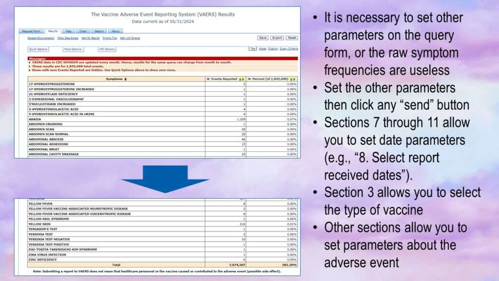
As can be seen by the graphic, a raw frequency of different vaccine adverse events with no other parameters set is useless. You have to set other parameters. The most obvious parameters you might want to set are type of vaccine. You also might want to look at certain adverse events, or certain time periods.

Adding Parameters to the Request Form
The first most obvious parameter to add would be under section “3. Select vaccine characteristics”. However, that’s not going to be easy.
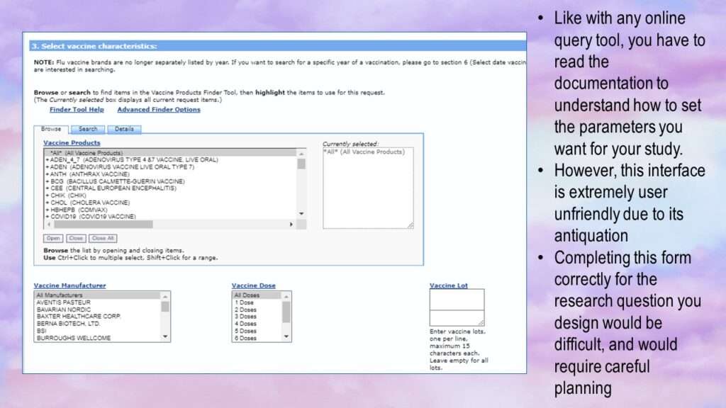
The form has several parameters you can set. First, you can choose one or more “vaccine products” (while the default is “all products”). If you click on an item in this list, it moves over to the right in the “currently selected” box. You need to hold down “control” to select multiples. I started by selectin the entry for the COVID-19 vaccine.
You also have the option of choosing a vaccine manufacturer. It looks like you can only choose one, so on a whim, I selected “Bavarian Nordic”. I could also choose the number of vaccine doses, but I left it on the default of “all doses”. I also didn’t enter anything for vaccine lot. Then I clicked send.
Unsurprisingly, there were no results. That’s because Bavarian Nordic does not make a COVID-19 vaccine. This tells us that this query form does not have a lot of front-end validation on it. I decided to try my query again, and this time I noticed something I didn’t notice last time, and that is that there is an “open” button under the vaccine products list. I clicked on it and it changed the display.
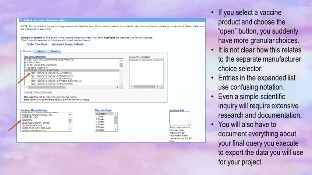
As you can see, the form got even more confusing. Now, under vaccine products, you can select specific entries under COVID-19 – except, they have goofy names. For example:
1203 (COVID19 (COVID19 (JANSSEN)))
This makes it unclear as to how one is supposed to use this part of the query form. What role does the manufacturer selector play? So while all query platforms require you to do extensive documentation and curation when planning to do a query, this one makes these tasks especially onerous.

Planning a Project with VAERS Using CDC Wonder
This experience reminds me how underfunded public health has been in the US over the last 20 years. Government data that serves Big Pharma and Big Healthcare always have efficient, up-to-date query portals. This looks like it was built in SAS, the interface is unintuitive, and the input/output (I/O) is terrible. If you are a health data science or public health professional in the US, see that this is what our lobbying money got us. I don’t know how we can get government public health to stop serving industry and instead start serving the population. Voting is definitely the first step, but I’m not sure how to ultimately topple this medical industrial complex that has formed at our highest echelons of what is supposed to be a democratic government.
Public health leaders in the US at the federal level who – over the last 20 years – allowed this CDC Wonder platform to continue to look like it does today should hang their heads in shame!
This is one big problem with the Open Government Data (OGD) movement. Governments comply only begrudgingly. A co-author and I wrote about it more extensively here.

The bottom line is if you are planning a project with any of these online query tools, you have to do a exorbitant amount of reading documentation and experimenting with the platform to figure out exactly what you are going to do and how you are going to do it. Then, you have to document somehow exactly what you do to pull the data when you eventually extract it. This is necessary in science for replicability and transparency, and you will have to write about it in your method section.
This is a challenge with any online query portal, but the CDC Wonder makes this unnecessarily difficult. It makes them look like they are hiding behind this query portal to escape accountability. It is not unusual for governments to do this in general, but it’s unneeded fuel for the anti-vax misinformation movement. The terrible state of this query portal shows what a low priority ensuring they succeed in elevating human health is to the CDC.
Read all of our data science blog posts!

Confidence Intervals are for Estimating a Range for the True Population-level Measure
Confidence intervals (CIs) help you get a solid estimate for the true population measure. Read [...]
1 Comment
Jun

Continuous Variable? You Can Categorize it!
Continuous variable categorized can open up a world of possibilities for analysis. Read about it [...]
2 Comments
Jun

Delete if the Row Meets Criteria? Do it in SAS!
Delete if rows meet a certain criteria is a common approach to paring down a [...]
May


Chi-square Test: Insight from Using Microsoft Excel
Chi-square test is hard to grasp – but doing it in Microsoft Excel can give [...]
May

Identify Elements of Research in Scientific Literature
Identify elements in research reports, and you’ll be able to understand them much more easily. [...]
May

Design the Most Useful Time Periods for Your Conversions
Time periods are important when creating a time series visualization that actually speaks to you! [...]
Apr

Apply Weights? It’s Easy in R with the Survey Package!
Apply weights to get weighted proportions and counts! Read my blog post to learn how [...]
Nov

Make Categorical Variable Out of Continuous Variable
Make categorical variables by cutting up continuous ones. But where to put the boundaries? Get [...]
Nov

Remove Rows in R with the Subset Command
Remove rows by criteria is a common ETL operation – and my blog post shows [...]
Oct

CDC Wonder for Studying Vaccine Adverse Events: The Shameful State of US Open Government Data
CDC Wonder is an online query portal that serves as a gateway to many government [...]
Jun

AI Careers: Riding the Bubble
AI careers are not easy to navigate. Read my blog post for foolproof advice for [...]
Jun

Descriptive Analysis of Black Friday Death Count Database: Creative Classification
Descriptive analysis of Black Friday Death Count Database provides an example of how creative classification [...]
Nov

Classification Crosswalks: Strategies in Data Transformation
Classification crosswalks are easy to make, and can help you reduce cardinality in categorical variables, [...]
Nov

FAERS Data: Getting Creative with an Adverse Event Surveillance Dashboard
FAERS data are like any post-market surveillance pharmacy data – notoriously messy. But if you [...]
4 Comments
Nov

Dataset Source Documentation: Necessary for Data Science Projects with Multiple Data Sources
Dataset source documentation is good to keep when you are doing an analysis with data [...]
Nov

Joins in Base R: Alternative to SQL-like dplyr
Joins in base R must be executed properly or you will lose data. Read my [...]
Nov

NHANES Data: Pitfalls, Pranks, Possibilities, and Practical Advice
NHANES data piqued your interest? It’s not all sunshine and roses. Read my blog post [...]
Nov

Color in Visualizations: Using it to its Full Communicative Advantage
Color in visualizations of data curation and other data science documentation can be used to [...]
Oct

Defaults in PowerPoint: Setting Them Up for Data Visualizations
Defaults in PowerPoint are set up for slides – not data visualizations. Read my blog [...]
Oct

Text and Arrows in Dataviz Can Greatly Improve Understanding
Text and arrows in dataviz, if used wisely, can help your audience understand something very [...]
Oct

Shapes and Images in Dataviz: Making Choices for Optimal Communication
Shapes and images in dataviz, if chosen wisely, can greatly enhance the communicative value of [...]
Oct

Table Editing in R is Easy! Here Are a Few Tricks…
Table editing in R is easier than in SAS, because you can refer to columns, [...]
Aug

R for Logistic Regression: Example from Epidemiology and Biostatistics
R for logistic regression in health data analytics is a reasonable choice, if you know [...]
272 Comments
Aug

Connecting SAS to Other Applications: Different Strategies
Connecting SAS to other applications is often necessary, and there are many ways to do [...]
Jul

Portfolio Project Examples for Independent Data Science Projects
Portfolio project examples are sometimes needed for newbies in data science who are looking to [...]
Jul

Project Management Terminology for Public Health Data Scientists
Project management terminology is often used around epidemiologists, biostatisticians, and health data scientists, and it’s [...]
Jun

Rapid Application Development Public Health Style
“Rapid application development” (RAD) refers to an approach to designing and developing computer applications. In [...]
Jun

Understanding Legacy Data in a Relational World
Understanding legacy data is necessary if you want to analyze datasets that are extracted from [...]
Jun

Front-end Decisions Impact Back-end Data (and Your Data Science Experience!)
Front-end decisions are made when applications are designed. They are even made when you design [...]
Jun

Reducing Query Cost (and Making Better Use of Your Time)
Reducing query cost is especially important in SAS – but do you know how to [...]
Jun

Curated Datasets: Great for Data Science Portfolio Projects!
Curated datasets are useful to know about if you want to do a data science [...]
May

Statistics Trivia for Data Scientists
Statistics trivia for data scientists will refresh your memory from the courses you’ve taken – [...]
Apr

Management Tips for Data Scientists
Management tips for data scientists can be used by anyone – at work and in [...]
Mar

REDCap Mess: How it Got There, and How to Clean it Up
REDCap mess happens often in research shops, and it’s an analysis showstopper! Read my blog [...]
Mar

GitHub Beginners in Data Science: Here’s an Easy Way to Start!
GitHub beginners – even in data science – often feel intimidated when starting their GitHub [...]
Feb

ETL Pipeline Documentation: Here are my Tips and Tricks!
ETL pipeline documentation is great for team communication as well as data stewardship! Read my [...]
Feb

Benchmarking Runtime is Different in SAS Compared to Other Programs
Benchmarking runtime is different in SAS compared to other programs, where you have to request [...]
Dec

End-to-End AI Pipelines: Can Academics Be Taught How to Do Them?
End-to-end AI pipelines are being created routinely in industry, and one complaint is that academics [...]
Nov

Referring to Columns in R by Name Rather than Number has Pros and Cons
Referring to columns in R can be done using both number and field name syntax. [...]
Oct

The Paste Command in R is Great for Labels on Plots and Reports
The paste command in R is used to concatenate strings. You can leverage the paste [...]
Oct

Coloring Plots in R using Hexadecimal Codes Makes Them Fabulous!
Recoloring plots in R? Want to learn how to use an image to inspire R [...]
5 Comments
Oct

Adding Error Bars to ggplot2 Plots Can be Made Easy Through Dataframe Structure
Adding error bars to ggplot2 in R plots is easiest if you include the width [...]
Oct

AI on the Edge: What it is, and Data Storage Challenges it Poses
“AI on the edge” was a new term for me that I learned from Marc [...]
Jun

Pie Chart ggplot Style is Surprisingly Hard! Here’s How I Did it
Pie chart ggplot style is surprisingly hard to make, mainly because ggplot2 did not give [...]
5 Comments
Apr

Time Series Plots in R Using ggplot2 Are Ultimately Customizable
Time series plots in R are totally customizable using the ggplot2 package, and can come [...]
Apr

Data Curation Solution to Confusing Options in R Package UpSetR
Data curation solution that I posted recently with my blog post showing how to do [...]
Apr

Making Upset Plots with R Package UpSetR Helps Visualize Patterns of Attributes
Making upset plots with R package UpSetR is an easy way to visualize patterns of [...]
11 Comments
Apr

Making Box Plots Different Ways is Easy in R!
Making box plots in R affords you many different approaches and features. My blog post [...]
Mar

Convert CSV to RDS When Using R for Easier Data Handling
Convert CSV to RDS is what you want to do if you are working with [...]
Mar

GPower Case Example Shows How to Calculate and Document Sample Size
GPower case example shows a use-case where we needed to select an outcome measure for [...]
Feb

Querying the GHDx Database: Demonstration and Review of Application
Querying the GHDx database is challenging because of its difficult user interface, but mastering it [...]
Feb

Variable Names in SAS and R Have Different Restrictions and Rules
Variable names in SAS and R are subject to different “rules and regulations”, and these [...]
Feb

Referring to Variables in Processing Data is Different in SAS Compared to R
Referring to variables in processing is different conceptually when thinking about SAS compared to R. [...]
Jan

Counting Rows in SAS and R Use Totally Different Strategies
Counting rows in SAS and R is approached differently, because the two programs process data [...]
Jan

Native Formats in SAS and R for Data Are Different: Here’s How!
Native formats in SAS and R of data objects have different qualities – and there [...]
Jan

SAS-R Integration Example: Transform in R, Analyze in SAS!
Looking for a SAS-R integration example that uses the best of both worlds? I show [...]
Dec

Dumbbell Plot for Comparison of Rated Items: Which is Rated More Highly – Harvard or the U of MN?
Want to compare multiple rankings on two competing items – like hotels, restaurants, or colleges? [...]
2 Comments
Sep

Data for Meta-analysis Need to be Prepared a Certain Way – Here’s How
Getting data for meta-analysis together can be challenging, so I walk you through the simple [...]
Jul

Sort Order, Formats, and Operators: A Tour of The SAS Documentation Page
Get to know three of my favorite SAS documentation pages: the one with sort order, [...]
Nov

Confused when Downloading BRFSS Data? Here is a Guide
I use the datasets from the Behavioral Risk Factor Surveillance Survey (BRFSS) to demonstrate in [...]
2 Comments
Oct

Doing Surveys? Try my R Likert Plot Data Hack!
I love the Likert package in R, and use it often to visualize data. The [...]
3 Comments
Oct

I Used the R Package EpiCurve to Make an Epidemiologic Curve. Here’s How It Turned Out.
With all this talk about “flattening the curve” of the coronavirus, I thought I would [...]
Mar

Which Independent Variables Belong in a Regression Equation? We Don’t All Agree, But Here’s What I Do.
During my failed attempt to get a PhD from the University of South Florida, my [...]
Aug
CDC Wonder is an online query portal that serves as a gateway to many government datasets. Although antiquated, it still works for extracting data, and my blog post shows you how.