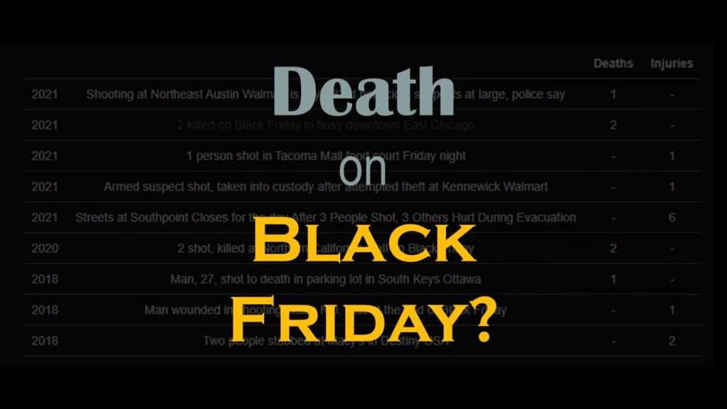
Descriptive analysis of Black Friday Death Count Database provides an example of how creative classification can make a quick and easy data science portfolio project!
Tag Archives: American Public Health Association
Color in visualizations of data curation and other data science documentation can be used to enhance communication – I show you how!
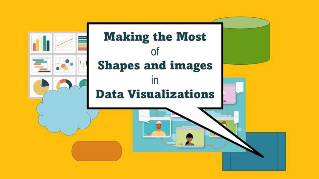
Shapes and images in dataviz, if chosen wisely, can greatly enhance the communicative value of the visualization. Read my blog post for tips in selecting shapes for data visualizations!
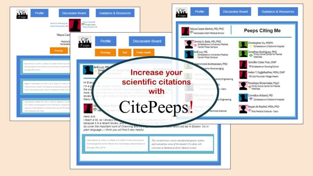
CitePeeps is a new online community of scientific authors focused on increasing the number of citations to their published works. Join us!
GitHub beginners – even in data science – often feel intimidated when starting their GitHub accounts and trying to interact with the web page. Don’t be shy! Catch the highlights from a recent GitHub beginners workshop I held!
Wiley’s predatory behavior recently with a colleague’s scientific manuscript makes me want to avoid publishing in their journals. Read about our experience.
“What is the ONC?” is what I used to ask before I realized it involves health technology. Although ONC just means “Office of the National Coordinator”, this agency is now known as HealthIT.gov, as I explain in my blog post.
What does the SAMHSA actually do for mental health and substance abuse patients in the US? The answer is, “nothing directly” – however, indirectly, SAMHSA has had a profound impact on behavioral health patients, and the result has not always been positive, as you can read in my blog post.
Four levels of intervention is a framework we use in public health to think about how to attack a problem. I explain it and give a few examples of application in my blog post (along with a video).
Pie chart ggplot style is surprisingly hard to make, mainly because ggplot2 did not give us a circle shape to deal with. But I explain how to get around it in my blog pot.
- 1
- 2

