

Since the coronavirus (COVID-19) registered on our public health radar as a communicable infectious disease amongst humans, countries try to calculate their coronavirus mortality rate (otherwise known as case fatality rate). As a result, many different mortality rates have been reported, causing confusion. This article from Business Insider reports country-wide mortality rates that range from a low of 0.5% in Switzerland to a high of 5.9% in the United States (US).
What about China, where it is believed the epidemic started? In second place, with mortality rate of 3.8%.
So which is it? And why is the range so wide?
There’s actually a statistical reason for this range being so wide that probably has more influence than any biological reason, and it has to do with an intersection between measurement and public policy. When considering the equation behind the coronavirus mortality rate, the reason is actually pretty logical. I’ll link you to a page from the US Center for Disease Control and Prevention (CDC) with information about these outbreak equations we epidemiologists use.
How is the Coronavirus Mortality Rate Calculated?
Like any rate, the coronavirus mortality rate has a numerator and a denominator. The numerator is “number of deaths due to coronavirus”, and the denominator is “everyone positive for coronavirus”. It seems simple enough, but let’s unpack what can go wrong with this picture.
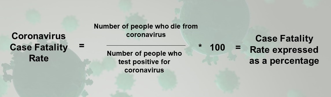
In epidemiology, we have this concept of “misclassification”, which is when we classify something in the wrong category due to mismeasurement. So, let’s say a person testing positive for coronavirus dies in a car accident. Counting them in the mortality rate numerator would be misclassification, because her death would not have been “due to coronavirus”.
Just from this example, you can see how misclassification could make both the numerator and denominator artificially large or artificially small. Artificially inflating or decreasing either of these numbers – or both – can result in an incorrect rate, which is either artificially inflated or artificially decreased.

How to Artificially Inflate or Decrease the Coronavirus Mortality Rate Through Misclassification
Now that I’ve explained how the mortality rate is calculated, I can explain how sensitive it is to misclassification. Here are ways misclassification can impact the resulting rate:
- Let’s pretend a country decides not to test any of ifs citizens for coronavirus. The mortality rate would be 0%. This would be because both the numerator and denominator will be 0, as all deaths will be misclassified as non-coronavirus deaths (numerator), and no one will be diagnosed as a case (denominator).
- Let’s pretend a country tests all suspected deaths for coronavirus, but has low levels of testing in the general population. The mortality rate will be artificially high. That’s because the numerator will likely not be misclassified, since all deaths are being tested, but the denominator will be artificially small, because of low levels of general population testing. Because the death rate from coronavirus is relatively low (like influenza), by not doing a good job of testing cases that aren’t dying and counting them in the denominator, scientists can artificially inflate the mortality rate.
- Let’s pretend that the country does a bad job testing deaths for coronavirus, but does a great job testing the general population. The mortality rate will be artificially low. This is because the denominator will be accurately measured, meaning it will be big. But many coronavirus deaths would be missing from the numerator, making the resulting rate artificially low.
Why it’s so hard to Calculate an Accurate Mortality Rate
Calculating an accurate mortality rate is both simple and hard at the same time. It’s simple to calculate in terms of the actual equation, but it’s hard to measure both the numerator and the denominator. This is because a whole infrastructure is required for accurately measuring both numerators and denominators for mortality rates when an infectious disease comes through. Further, different parts of the infrastructures are deployed to accurately measure each number.
For both numbers in the equation, pathology labs are involved, because they do the testing. However, different labs are typically involved depending on which part of the fraction they are trying to measure. When it comes to the numerator, testing is likely handled by the lab at the hospital where the person who died was inpatient, and is assisted or directed by (in the US) by the state’s department of public health, and/or the federal CDC.
Community-based testing (e.g., measuring the denominator) is generally not in the purview of healthcare, but is entirely in under the authority of the state’s public health department. In the US, these departments tend to be underfunded, but it depends on the state. Certainly, outpatient healthcare settings could do testing of the community in the US, but because of the way our super-expensive and questionable-quality healthcare system is set up, testing in healthcare in the US has concentrated on inpatient settings up to now. That is because inpatient is a high risk setting where people are already using healthcare, so it is easy to implement a test.
Also, since people in the US might have to pay for their own coronavirus test, they are unlikely to do it unless they think they are infected.
Misclassification May be Inflating the US’s Mortality Rate
The difficulty in measuring the numerator and denominator in an outbreak can be illustrated with an example from the US, where I am. Remember, the US had the highest rate in the article. Part of that could be explained by misclassification, and I’ll explain how that can happen.
In the US, there has been a shortage of test kits. Therefore, the few test kits available have been routed toward the healthcare infrastructure. This is for practical reasons – clinicians with coronavirus who continue to work could infect patients, so we need to know who they are. But this means that most of the test kits are being used on “high risk” populations, so they are likely to find positive cases. But these positive cases are from the healthcare setting – not the general population. Remember, all the positive cases of COVID-19 go in the denominator of the mortality rate.
I’m not a fan of the Chinese government, but because they are an autocratic country, they can crack down and do public health things we could not do in the US, and we can learn from observing what ultimately happens as a result. China had the capacity to test a lot of their general population. For that reason, as a result of their testing crack down, they have a larger (and more accurate) denominator than we do in the US.
In contrast, given the shortage of community-based testing, in the US, we likely have a lot of community-based COVID-19 and just don’t know it. This means we are artificially decreasing our denominator by not testing the general population at a high rate.
Now let’s look at the US numerator. We are doing a very good job of testing deaths for COVID-19. Therefore, I think we are measuring the US numerator very accurately – but if we are undercounting the denominator, then that could lead to an inflated mortality rate.
Eventually, like all epidemics, this one will end. Hopefully, after it passes, scholars from different countries who were involved can author open source peer-reviewed literature, so we can all learn from their experiences trying to calculate an accurate coronavirus mortality rate during the course of an epidemic.
Updated March 2020
Read all of our data science blog posts!

Prevent Research Misconduct, and Avoid the Drama
Prevent research misconduct, and the consequences and drama that goes with it. Use some simple, [...]
Oct

Mixed Methods Research: The Hot New Trend in Graduate School
Mixed methods research is trending now, with doctoral students and academics being pressured to do [...]
Oct

AI or Statistics – Which Modeling Approach Should You Use?
AI or statistics – two different, interrelated approaches you can use in your scientific publication. [...]
Sep

Confidence Intervals are for Estimating a Range for the True Population-level Measure
Confidence intervals (CIs) help you get a solid estimate for the true population measure. Read [...]
1 Comment
Jun
Continuous Variable? You Can Categorize it!
Continuous variable categorized can open up a world of possibilities for analysis. Read about it [...]
2 Comments
Jun
Delete if the Row Meets Criteria? Do it in SAS!
Delete if rows meet a certain criteria is a common approach to paring down a [...]
May


Chi-square Test: Insight from Using Microsoft Excel
Chi-square test is hard to grasp – but doing it in Microsoft Excel can give [...]
May

Identify Elements of Research in Scientific Literature
Identify elements in research reports, and you’ll be able to understand them much more easily. [...]
May
Design the Most Useful Time Periods for Your Conversions
Time periods are important when creating a time series visualization that actually speaks to you! [...]
Apr

Apply Weights? It’s Easy in R with the Survey Package!
Apply weights to get weighted proportions and counts! Read my blog post to learn how [...]
Nov

Make Categorical Variable Out of Continuous Variable
Make categorical variables by cutting up continuous ones. But where to put the boundaries? Get [...]
Nov

Remove Rows in R with the Subset Command
Remove rows by criteria is a common ETL operation – and my blog post shows [...]
Oct

CDC Wonder for Studying Vaccine Adverse Events: The Shameful State of US Open Government Data
CDC Wonder is an online query portal that serves as a gateway to many government [...]
Jun

AI Careers: Riding the Bubble
AI careers are not easy to navigate. Read my blog post for foolproof advice for [...]
Jun

Descriptive Analysis of Black Friday Death Count Database: Creative Classification
Descriptive analysis of Black Friday Death Count Database provides an example of how creative classification [...]
Nov

Classification Crosswalks: Strategies in Data Transformation
Classification crosswalks are easy to make, and can help you reduce cardinality in categorical variables, [...]
Nov

FAERS Data: Getting Creative with an Adverse Event Surveillance Dashboard
FAERS data are like any post-market surveillance pharmacy data – notoriously messy. But if you [...]
4 Comments
Nov
Dataset Source Documentation: Necessary for Data Science Projects with Multiple Data Sources
Dataset source documentation is good to keep when you are doing an analysis with data [...]
Nov

Joins in Base R: Alternative to SQL-like dplyr
Joins in base R must be executed properly or you will lose data. Read my [...]
Nov

NHANES Data: Pitfalls, Pranks, Possibilities, and Practical Advice
NHANES data piqued your interest? It’s not all sunshine and roses. Read my blog post [...]
Nov

Color in Visualizations: Using it to its Full Communicative Advantage
Color in visualizations of data curation and other data science documentation can be used to [...]
Oct

Defaults in PowerPoint: Setting Them Up for Data Visualizations
Defaults in PowerPoint are set up for slides – not data visualizations. Read my blog [...]
Oct

Text and Arrows in Dataviz Can Greatly Improve Understanding
Text and arrows in dataviz, if used wisely, can help your audience understand something very [...]
Oct

Shapes and Images in Dataviz: Making Choices for Optimal Communication
Shapes and images in dataviz, if chosen wisely, can greatly enhance the communicative value of [...]
Oct

Table Editing in R is Easy! Here Are a Few Tricks…
Table editing in R is easier than in SAS, because you can refer to columns, [...]
Aug
R for Logistic Regression: Example from Epidemiology and Biostatistics
R for logistic regression in health data analytics is a reasonable choice, if you know [...]
272 Comments
Aug

Connecting SAS to Other Applications: Different Strategies
Connecting SAS to other applications is often necessary, and there are many ways to do [...]
Jul

Portfolio Project Examples for Independent Data Science Projects
Portfolio project examples are sometimes needed for newbies in data science who are looking to [...]
Jul

Project Management Terminology for Public Health Data Scientists
Project management terminology is often used around epidemiologists, biostatisticians, and health data scientists, and it’s [...]
Jun

Rapid Application Development Public Health Style
“Rapid application development” (RAD) refers to an approach to designing and developing computer applications. In [...]
Jun

Understanding Legacy Data in a Relational World
Understanding legacy data is necessary if you want to analyze datasets that are extracted from [...]
Jun

Front-end Decisions Impact Back-end Data (and Your Data Science Experience!)
Front-end decisions are made when applications are designed. They are even made when you design [...]
Jun

Reducing Query Cost (and Making Better Use of Your Time)
Reducing query cost is especially important in SAS – but do you know how to [...]
Jun

Curated Datasets: Great for Data Science Portfolio Projects!
Curated datasets are useful to know about if you want to do a data science [...]
May

Statistics Trivia for Data Scientists
Statistics trivia for data scientists will refresh your memory from the courses you’ve taken – [...]
Apr

Management Tips for Data Scientists
Management tips for data scientists can be used by anyone – at work and in [...]
Mar

REDCap Mess: How it Got There, and How to Clean it Up
REDCap mess happens often in research shops, and it’s an analysis showstopper! Read my blog [...]
Mar

GitHub Beginners in Data Science: Here’s an Easy Way to Start!
GitHub beginners – even in data science – often feel intimidated when starting their GitHub [...]
Feb

ETL Pipeline Documentation: Here are my Tips and Tricks!
ETL pipeline documentation is great for team communication as well as data stewardship! Read my [...]
Feb

Benchmarking Runtime is Different in SAS Compared to Other Programs
Benchmarking runtime is different in SAS compared to other programs, where you have to request [...]
Dec

End-to-End AI Pipelines: Can Academics Be Taught How to Do Them?
End-to-end AI pipelines are being created routinely in industry, and one complaint is that academics [...]
Nov
Referring to Columns in R by Name Rather than Number has Pros and Cons
Referring to columns in R can be done using both number and field name syntax. [...]
Oct

The Paste Command in R is Great for Labels on Plots and Reports
The paste command in R is used to concatenate strings. You can leverage the paste [...]
Oct

Coloring Plots in R using Hexadecimal Codes Makes Them Fabulous!
Recoloring plots in R? Want to learn how to use an image to inspire R [...]
5 Comments
Oct
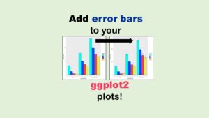
Adding Error Bars to ggplot2 Plots Can be Made Easy Through Dataframe Structure
Adding error bars to ggplot2 in R plots is easiest if you include the width [...]
Oct

AI on the Edge: What it is, and Data Storage Challenges it Poses
“AI on the edge” was a new term for me that I learned from Marc [...]
Jun

Pie Chart ggplot Style is Surprisingly Hard! Here’s How I Did it
Pie chart ggplot style is surprisingly hard to make, mainly because ggplot2 did not give [...]
5 Comments
Apr

Time Series Plots in R Using ggplot2 Are Ultimately Customizable
Time series plots in R are totally customizable using the ggplot2 package, and can come [...]
Apr

Data Curation Solution to Confusing Options in R Package UpSetR
Data curation solution that I posted recently with my blog post showing how to do [...]
Apr

Making Upset Plots with R Package UpSetR Helps Visualize Patterns of Attributes
Making upset plots with R package UpSetR is an easy way to visualize patterns of [...]
11 Comments
Apr

Making Box Plots Different Ways is Easy in R!
Making box plots in R affords you many different approaches and features. My blog post [...]
Mar

Convert CSV to RDS When Using R for Easier Data Handling
Convert CSV to RDS is what you want to do if you are working with [...]
Mar

GPower Case Example Shows How to Calculate and Document Sample Size
GPower case example shows a use-case where we needed to select an outcome measure for [...]
Feb
Querying the GHDx Database: Demonstration and Review of Application
Querying the GHDx database is challenging because of its difficult user interface, but mastering it [...]
Feb

Variable Names in SAS and R Have Different Restrictions and Rules
Variable names in SAS and R are subject to different “rules and regulations”, and these [...]
Feb
Referring to Variables in Processing Data is Different in SAS Compared to R
Referring to variables in processing is different conceptually when thinking about SAS compared to R. [...]
Jan
Counting Rows in SAS and R Use Totally Different Strategies
Counting rows in SAS and R is approached differently, because the two programs process data [...]
Jan

Native Formats in SAS and R for Data Are Different: Here’s How!
Native formats in SAS and R of data objects have different qualities – and there [...]
Jan

SAS-R Integration Example: Transform in R, Analyze in SAS!
Looking for a SAS-R integration example that uses the best of both worlds? I show [...]
Dec
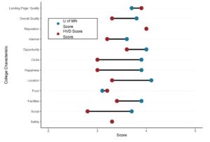
Dumbbell Plot for Comparison of Rated Items: Which is Rated More Highly – Harvard or the U of MN?
Want to compare multiple rankings on two competing items – like hotels, restaurants, or colleges? [...]
2 Comments
Sep
Data for Meta-analysis Need to be Prepared a Certain Way – Here’s How
Getting data for meta-analysis together can be challenging, so I walk you through the simple [...]
Jul

Sort Order, Formats, and Operators: A Tour of The SAS Documentation Page
Get to know three of my favorite SAS documentation pages: the one with sort order, [...]
Nov

Confused when Downloading BRFSS Data? Here is a Guide
I use the datasets from the Behavioral Risk Factor Surveillance Survey (BRFSS) to demonstrate in [...]
2 Comments
Oct
Doing Surveys? Try my R Likert Plot Data Hack!
I love the Likert package in R, and use it often to visualize data. The [...]
3 Comments
Oct
I Used the R Package EpiCurve to Make an Epidemiologic Curve. Here’s How It Turned Out.
With all this talk about “flattening the curve” of the coronavirus, I thought I would [...]
Mar
Which Independent Variables Belong in a Regression Equation? We Don’t All Agree, But Here’s What I Do.
Trying to decide what independent variables belong in a regression can be daunting. My blog [...]
Aug
Why is it so hard to calculate the mortality rate for coronavirus? Read my blog post to find out!

This is a very interesting reading. The answer is that we don’t know the real rate, it is just an estimate most likely inflated.
Thanks for your comment! You are right, but the question is – what are the right numbers? If just the denominator goes up, our rate will go down. But with testing, probably both the numerator and the denominator will go up, so it’s anyone’s guess where the rate will land!
I am not good at guessing. All I can is to hope it will be very low … under 1% if you want a number
Well, I’d love it to be that low, but the mortality rate for our last flu season estimated by the CDC ranged from 0.4 per 100,000 among 5-17 year olds to a high of 48.7 per 100,000 for those aged 65 and older. Rates are here: https://www.cdc.gov/flu/about/burden/2018-2019.html When you have to say “per 100,000” you know it is super duper low, because % is essentially “per 100”, and right now, we are using % when talking about coronavirus. So let’s hope the COVID-19 mortality ends up being even lower than 1%, like influenza.