End-to-end AI pipelines are not things that most academics learn about when studying for their master’s or doctoral degrees, especially in public health. However, almost everyone with a doctoral degree had to study statistics, and most graduate students have to use statistics in their theses or dissertations. So academics tend to be well-versed in statistics, and people with degrees in public health are specifically well-versed in biostatistics. In an end-to-end AI pipeline, statistics is an important component, so academics can make critical contributions to end-to-end AI pipelines.
End-to-end AI pipelines, however, involve artificial intelligence (AI) algorithms, which are mathematical things that are not routinely generated as part of doing a thesis or dissertation. This page from Intel provides some diagrams of various end-to-end AI pipelines, and you can see in these diagrams the part where the AI algorithm comes in. One could see these AI algorithms as higher-level statistics, or computational statistics; perhaps a better way to see these algorithms as higher-level mathematical equations. How ever you see AI algorithms, you are probably not going to be very good at making them if you don’t have a good command of both statistics and math. Some academics study developing AI on purpose in graduate school, but it is not widely studied, especially in public health.
This is why I was particularly intrigued by this commentary – rant? – I watched on YouTube from a person who apparently builds end-to-end AI pipelines, and was particularly frustrated with the academics who need to be called upon for statistical knowhow as part of the process.

Here is a quote from the video that I think sums up what he is trying to say:
In the real world, we don’t need any more pontificating statisticians. We need programmers with serious data skills that can understand and work the end-to-end machine learning pipeline.
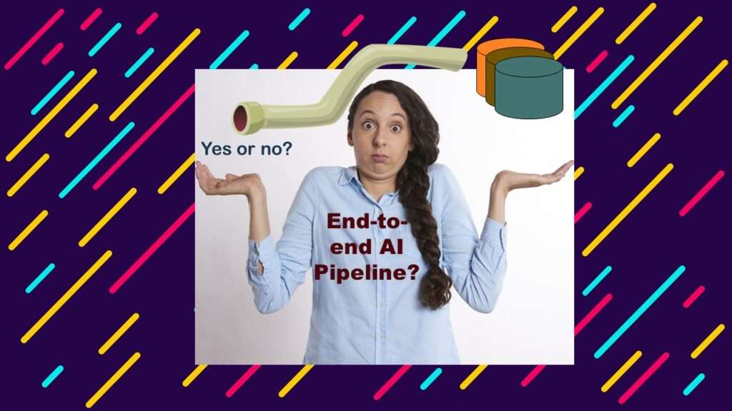
End-to-End AI Pipeline: What Academics Are Missing
If you look at some of those diagrams on the Intel page, you will see that the basic problem being solved goes like this:
- We want to make a decision about something (e.g., what choice of videos to display on YouTube according to user preference)
- We import relevant live data from the production environment into a work area
- We transform the data in the work area so we can run the AI algorithm on it
- We run the algorithm, and we get the decision (e.g., here are the videos to display)
- We return the decision to the production environment where it can be acted upon.
The person in the video is basically complaining that academics seem to only be able to work on steps 2 through 4. They are actually necessary to develop step 4, so you can’t get rid of them. They are best at step 4, and not that good at steps 2 and 3, but can do them. In my opinion, most academics could not easily figure out what happens before we get to step 2, nor do they have a very good command on what happens after we figure out 4 and go forward.
The person in the video bemoans that academics have problems with “real world” data, but I don’t think that’s the issue. What I think academics are really missing from end-to-end AI pipeline development skills is a strong understanding of the production environment – how it got there, what it is doing, why the data are in it, and what users are trying to do with it.
In other words, I think all academics are missing is a comprehensive understanding of the production environment of which the AI pipeline is supposed to be a part. If that’s the case, then how do we solve this?

Example of an Academic Helping with End-to-End AI Pipeline
If you ever work on a data science team, you can learn from the other people on the team. Back in about 2006, I worked at a non-profit research institute funded through state funding that had a bad reputation for being poorly managed. Probably as evidence of this, they put me in the IT department to keep me out of the research department. In addition to me, we had a CIO, a web designer, a security engineer, an applications programmer, and a helpdesk technician.
After developing our institute’s web page, we decided we wanted to have current relevant news display on the front of it dynamically. We tried setting up filters on Google News to see if we could filter in daily news that related to our institute’s mission (we were studying a particular disease), and specifically related to our institute. Unfortunately, due to our bad reputation, we saw a lot of bad news come in through the filter. Also, we realized that when some of the good news about our institute came through, we wanted it to linger longer on the web page than the other news.
I sat with the applications programmer, and we reviewed the results from the Google News filters. Using what I had learned from developing epidemiologic risk scores, we came up with a scoring algorithm for the articles, as you can see in this graphic.
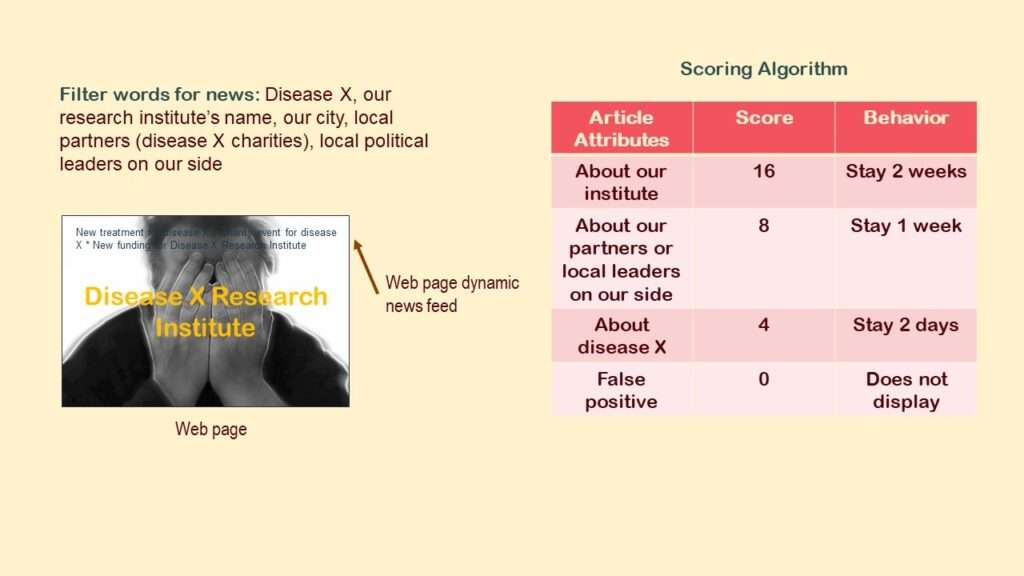
As you may observe, we wanted to import the articles from Google News that met the filter criteria, and then assign them scores so that the ones we really liked – about our research institute – would display on the web page the longest. The ones that were less relevant – about our disease of study in general – would display for the shortest amount of time. If we gave the score of 0 (or no score), it would not display.
We tested this system, and unfortunately, it couldn’t be automated. Why? Because we had a bad reputation.

Why We Could Not Automate the AI
Unfortunately, our institute was in the news a lot for both good and bad reasons. This made it very difficult to tell between news about us we wanted to keep on the web site, and news about us we wanted to suppress (see graphic).
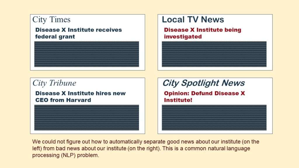
We’d often see bad news articles getting scored with the highest score – meaning to display on our web site the longest. The CIO, graphic designer, applications programmer and I discussed what to do about it. I suggested that we set up the system as a supervised rather than unsupervised system. Basically, before we allowed the articles to display on the web site, we’d have our helpdesk technician go in and look at the scores that were assigned the articles. That way, he could adjust the scores manually – and manually set all the “bad news” articles to 0 so they’d never display!
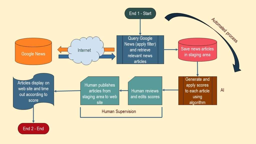
As you can see in the graphic, I labeled the part of the flow where the human – our helpdesk technician – manually adjusted the scores. You can also see where I labeled the ends – End 1 is the start, and End 2 is the end.
There you go! It’s an end-to-end AI pipeline! And it was designed with an academic on the team – me!
How Did an Academic Help Design an End-to-End AI Pipeline?
As you can see, I didn’t design it alone – we all designed it as part of a team. And the person in the video implied this – that he wanted academics to make better team members, so they can help with the whole pipeline. Clearly, all academics have to do is start functioning as part of one of these types of teams. What’s the problem?
The problem is silos in academia. Remember how I mentioned that I’d been banished to the IT department from the research department? This was meant to oppress me, but I took it as an opportunity to work on an IT team, which is basically how data science teams work. Our Harvard-trained CEO had cast me out of academia and into data science, and I just adapted.
I published an article on LinkedIn about how I have recently been advising a lot of academics to do what I did, and just start serving on a data science team. I call it the “sink or swim” approach to gaining data science teamwork culture. There are a few critical problems with my advice, I have found.
- Some academics do not have data science teams in their environment into which they could integrate.
- Others have teams around, but there are structural barriers (mainly reporting lines) that prevent them from trying to serve on a team.
- Many academics are just plain intimidated about trying to integrate into a data science team without any special computer science training or background.
End-to-End AI Pipelines: How to Be an Academic Expert
Are you a professional experienced in academic healthcare or public health who wants to become an expert at designing end-to-end AI pipelines? Do you want to try doing projects like the one I did with my IT department? Then read about my “Public Health to Data Science Rebrand” mentoring program, and see if it’s right for you!
Updated November 25, 2022. Revised banners June 18, 2023.

Read all of our data science blog posts!

Confidence Intervals are for Estimating a Range for the True Population-level Measure
Confidence intervals (CIs) help you get a solid estimate for the true population measure. Read [...]
1 Comment
Jun

Continuous Variable? You Can Categorize it!
Continuous variable categorized can open up a world of possibilities for analysis. Read about it [...]
184 Comments
Jun

Delete if the Row Meets Criteria? Do it in SAS!
Delete if rows meet a certain criteria is a common approach to paring down a [...]
May


Chi-square Test: Insight from Using Microsoft Excel
Chi-square test is hard to grasp – but doing it in Microsoft Excel can give [...]
May

Identify Elements of Research in Scientific Literature
Identify elements in research reports, and you’ll be able to understand them much more easily. [...]
May

Design the Most Useful Time Periods for Your Conversions
Time periods are important when creating a time series visualization that actually speaks to you! [...]
Apr

Apply Weights? It’s Easy in R with the Survey Package!
Apply weights to get weighted proportions and counts! Read my blog post to learn how [...]
Nov

Make Categorical Variable Out of Continuous Variable
Make categorical variables by cutting up continuous ones. But where to put the boundaries? Get [...]
Nov

Remove Rows in R with the Subset Command
Remove rows by criteria is a common ETL operation – and my blog post shows [...]
Oct

CDC Wonder for Studying Vaccine Adverse Events: The Shameful State of US Open Government Data
CDC Wonder is an online query portal that serves as a gateway to many government [...]
Jun

AI Careers: Riding the Bubble
AI careers are not easy to navigate. Read my blog post for foolproof advice for [...]
Jun

Descriptive Analysis of Black Friday Death Count Database: Creative Classification
Descriptive analysis of Black Friday Death Count Database provides an example of how creative classification [...]
Nov

Classification Crosswalks: Strategies in Data Transformation
Classification crosswalks are easy to make, and can help you reduce cardinality in categorical variables, [...]
Nov

FAERS Data: Getting Creative with an Adverse Event Surveillance Dashboard
FAERS data are like any post-market surveillance pharmacy data – notoriously messy. But if you [...]
4 Comments
Nov

Dataset Source Documentation: Necessary for Data Science Projects with Multiple Data Sources
Dataset source documentation is good to keep when you are doing an analysis with data [...]
Nov

Joins in Base R: Alternative to SQL-like dplyr
Joins in base R must be executed properly or you will lose data. Read my [...]
Nov

NHANES Data: Pitfalls, Pranks, Possibilities, and Practical Advice
NHANES data piqued your interest? It’s not all sunshine and roses. Read my blog post [...]
Nov

Color in Visualizations: Using it to its Full Communicative Advantage
Color in visualizations of data curation and other data science documentation can be used to [...]
Oct

Defaults in PowerPoint: Setting Them Up for Data Visualizations
Defaults in PowerPoint are set up for slides – not data visualizations. Read my blog [...]
Oct

Text and Arrows in Dataviz Can Greatly Improve Understanding
Text and arrows in dataviz, if used wisely, can help your audience understand something very [...]
Oct

Shapes and Images in Dataviz: Making Choices for Optimal Communication
Shapes and images in dataviz, if chosen wisely, can greatly enhance the communicative value of [...]
Oct

Table Editing in R is Easy! Here Are a Few Tricks…
Table editing in R is easier than in SAS, because you can refer to columns, [...]
Aug

R for Logistic Regression: Example from Epidemiology and Biostatistics
R for logistic regression in health data analytics is a reasonable choice, if you know [...]
272 Comments
Aug

Connecting SAS to Other Applications: Different Strategies
Connecting SAS to other applications is often necessary, and there are many ways to do [...]
Jul

Portfolio Project Examples for Independent Data Science Projects
Portfolio project examples are sometimes needed for newbies in data science who are looking to [...]
Jul

Project Management Terminology for Public Health Data Scientists
Project management terminology is often used around epidemiologists, biostatisticians, and health data scientists, and it’s [...]
Jun

Rapid Application Development Public Health Style
“Rapid application development” (RAD) refers to an approach to designing and developing computer applications. In [...]
Jun

Understanding Legacy Data in a Relational World
Understanding legacy data is necessary if you want to analyze datasets that are extracted from [...]
Jun

Front-end Decisions Impact Back-end Data (and Your Data Science Experience!)
Front-end decisions are made when applications are designed. They are even made when you design [...]
Jun

Reducing Query Cost (and Making Better Use of Your Time)
Reducing query cost is especially important in SAS – but do you know how to [...]
Jun

Curated Datasets: Great for Data Science Portfolio Projects!
Curated datasets are useful to know about if you want to do a data science [...]
May

Statistics Trivia for Data Scientists
Statistics trivia for data scientists will refresh your memory from the courses you’ve taken – [...]
Apr

Management Tips for Data Scientists
Management tips for data scientists can be used by anyone – at work and in [...]
Mar

REDCap Mess: How it Got There, and How to Clean it Up
REDCap mess happens often in research shops, and it’s an analysis showstopper! Read my blog [...]
Mar

GitHub Beginners in Data Science: Here’s an Easy Way to Start!
GitHub beginners – even in data science – often feel intimidated when starting their GitHub [...]
Feb

ETL Pipeline Documentation: Here are my Tips and Tricks!
ETL pipeline documentation is great for team communication as well as data stewardship! Read my [...]
Feb

Benchmarking Runtime is Different in SAS Compared to Other Programs
Benchmarking runtime is different in SAS compared to other programs, where you have to request [...]
Dec

End-to-End AI Pipelines: Can Academics Be Taught How to Do Them?
End-to-end AI pipelines are being created routinely in industry, and one complaint is that academics [...]
Nov

Referring to Columns in R by Name Rather than Number has Pros and Cons
Referring to columns in R can be done using both number and field name syntax. [...]
Oct

The Paste Command in R is Great for Labels on Plots and Reports
The paste command in R is used to concatenate strings. You can leverage the paste [...]
Oct

Coloring Plots in R using Hexadecimal Codes Makes Them Fabulous!
Recoloring plots in R? Want to learn how to use an image to inspire R [...]
5 Comments
Oct

Adding Error Bars to ggplot2 Plots Can be Made Easy Through Dataframe Structure
Adding error bars to ggplot2 in R plots is easiest if you include the width [...]
Oct

AI on the Edge: What it is, and Data Storage Challenges it Poses
“AI on the edge” was a new term for me that I learned from Marc [...]
Jun

Pie Chart ggplot Style is Surprisingly Hard! Here’s How I Did it
Pie chart ggplot style is surprisingly hard to make, mainly because ggplot2 did not give [...]
5 Comments
Apr

Time Series Plots in R Using ggplot2 Are Ultimately Customizable
Time series plots in R are totally customizable using the ggplot2 package, and can come [...]
Apr

Data Curation Solution to Confusing Options in R Package UpSetR
Data curation solution that I posted recently with my blog post showing how to do [...]
Apr

Making Upset Plots with R Package UpSetR Helps Visualize Patterns of Attributes
Making upset plots with R package UpSetR is an easy way to visualize patterns of [...]
11 Comments
Apr

Making Box Plots Different Ways is Easy in R!
Making box plots in R affords you many different approaches and features. My blog post [...]
Mar

Convert CSV to RDS When Using R for Easier Data Handling
Convert CSV to RDS is what you want to do if you are working with [...]
Mar

GPower Case Example Shows How to Calculate and Document Sample Size
GPower case example shows a use-case where we needed to select an outcome measure for [...]
Feb

Querying the GHDx Database: Demonstration and Review of Application
Querying the GHDx database is challenging because of its difficult user interface, but mastering it [...]
Feb

Variable Names in SAS and R Have Different Restrictions and Rules
Variable names in SAS and R are subject to different “rules and regulations”, and these [...]
Feb

Referring to Variables in Processing Data is Different in SAS Compared to R
Referring to variables in processing is different conceptually when thinking about SAS compared to R. [...]
Jan

Counting Rows in SAS and R Use Totally Different Strategies
Counting rows in SAS and R is approached differently, because the two programs process data [...]
Jan

Native Formats in SAS and R for Data Are Different: Here’s How!
Native formats in SAS and R of data objects have different qualities – and there [...]
Jan

SAS-R Integration Example: Transform in R, Analyze in SAS!
Looking for a SAS-R integration example that uses the best of both worlds? I show [...]
Dec

Dumbbell Plot for Comparison of Rated Items: Which is Rated More Highly – Harvard or the U of MN?
Want to compare multiple rankings on two competing items – like hotels, restaurants, or colleges? [...]
2 Comments
Sep

Data for Meta-analysis Need to be Prepared a Certain Way – Here’s How
Getting data for meta-analysis together can be challenging, so I walk you through the simple [...]
Jul

Sort Order, Formats, and Operators: A Tour of The SAS Documentation Page
Get to know three of my favorite SAS documentation pages: the one with sort order, [...]
Nov

Confused when Downloading BRFSS Data? Here is a Guide
I use the datasets from the Behavioral Risk Factor Surveillance Survey (BRFSS) to demonstrate in [...]
2 Comments
Oct

Doing Surveys? Try my R Likert Plot Data Hack!
I love the Likert package in R, and use it often to visualize data. The [...]
3 Comments
Oct

I Used the R Package EpiCurve to Make an Epidemiologic Curve. Here’s How It Turned Out.
With all this talk about “flattening the curve” of the coronavirus, I thought I would [...]
Mar

Which Independent Variables Belong in a Regression Equation? We Don’t All Agree, But Here’s What I Do.
During my failed attempt to get a PhD from the University of South Florida, my [...]
Aug
End-to-end AI pipelines are being created routinely in industry, and one complaint is that academics can only contribute to one component of the pipeline. Really? Read my blog post for an alternative viewpoint!